Benvenuto nelle Font Più Popolari — dove popolarità e qualità si incontrano. Qui trovi i font più scaricati e usati dell'anno. Se cerchi scelte sicure per logo, web o social, inizia da qui.
Ogni font top si distingue per equilibrio, leggibilità e versatilità. Troverai sans serif moderne, script eleganti, serif vintage e display minimalisti.
-
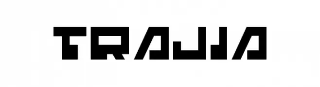
( Fonts by Daniel Zadorozny - www.iconian.com - Free for personal use )
A bold, geometric font with a futuristic and digital style.
 Scaricare 206 Downloads@WebFont
 -
Caratteri di danny91194. For commercial use please contact the owner.
( tricky )
Abstract, geometric design with bold lines and sharp angles.
![sabotage drawing font caratteri gratis]() Scaricare 206 Downloads@WebFont
Scaricare 206 Downloads@WebFont -
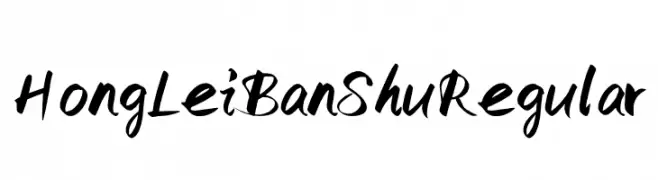
( Fonts by Hong Lei - mp.weixin.qq.com/s/LRKYtTIghVSNX2pY4w-mZA - Personal-use only. For commercial use please contact owner. )
A dynamic, brush-style font with expressive, calligraphic strokes.
![HongLeiBanShu Regular font caratteri gratis]() Scaricare 206 Downloads@WebFont
Scaricare 206 Downloads@WebFont -
![Glooper font caratteri gratis]() Scaricare 206 Downloads@WebFont
Scaricare 206 Downloads@WebFont -
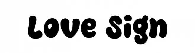
( Fonts by Khurasan )
A bold, playful font with thick, rounded characters and a bubbly appearance.
![Love Sign font caratteri gratis]() Scaricare 206 Downloads@WebFont
Scaricare 206 Downloads@WebFont -
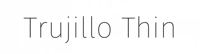
( Fonts by Fira Sans original fonts by bBox Type GmbH, Carrois Corporate GbR, & Edenspiekermann AG / Changes by Cristiano Sobral - Personal-use only. For commercial use please contact owner. )
A sleek, modern font with thin, elegant strokes and a minimalistic design.
![Trujillo Thin font caratteri gratis]() Scaricare 206 Downloads@WebFont
Scaricare 206 Downloads@WebFont -
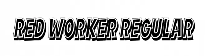
( Fonts by Vladimir Nikolic )
A bold, dynamic font with a 3D shadow effect and tight spacing.
![Red Worker Regular font caratteri gratis]() Scaricare 206 Downloads@WebFont
Scaricare 206 Downloads@WebFont -
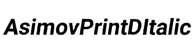
( Fonts by CannotIntoSpaceFonts - KineticPlasma Fonts - Personal-use only. For commercial use please contact owner. )
A bold, italic font with a modern and dynamic style.
![Asimov Print D Italic font caratteri gratis]() Scaricare 206 Downloads@WebFont
Scaricare 206 Downloads@WebFont -
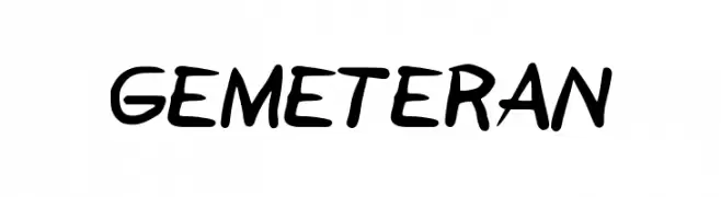
( Fonts by Agung Sudiarnata )
A playful, handwritten font with dynamic and fluid strokes.
![GEMETERAN font caratteri gratis]() Scaricare 206 Downloads@WebFont
Scaricare 206 Downloads@WebFont -
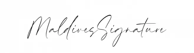
( Fonts by Timur Type )
A cursive, handwritten font with elegant, flowing lines.
![Maldives Signature font caratteri gratis]() Scaricare 206 Downloads@WebFont
Scaricare 206 Downloads@WebFont -
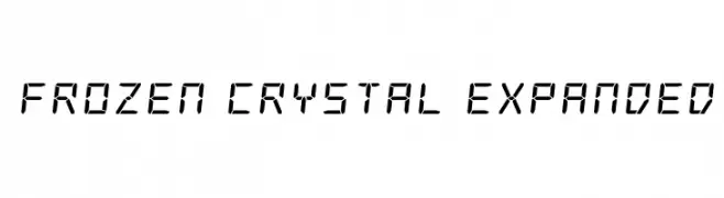
( Fonts by Iconian Fonts )
A digital, segmented font with a futuristic, technical appearance.
![Frozen Crystal Expanded font caratteri gratis]() Scaricare 206 Downloads@WebFont
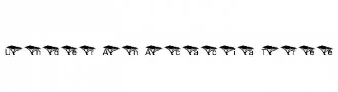
Scaricare 206 Downloads@WebFont -
![Under An Acacia Tree font caratteri gratis]() Scaricare 206 Downloads@WebFont
Scaricare 206 Downloads@WebFont -
![Ellipses font caratteri gratis]() Scaricare 206 Downloads@WebFont
Scaricare 206 Downloads@WebFont -
( Fonts by a Max Infeld - XEROGRAPHER FONTS - xerographer.blogspot.com . Personal-use only. For commercial use please contact owner. )
A bold, distressed font with an eerie, hand-drawn style.
![ChiefScare font caratteri gratis]() Scaricare 206 Downloads@WebFont
Scaricare 206 Downloads@WebFont -
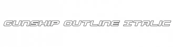
( Fonts by Daniel Zadorozny - www.iconian.com )
A futuristic, italicized outline font with bold, geometric characters.
![Gunship Outline Italic font caratteri gratis]() Scaricare 206 Downloads@WebFont
Scaricare 206 Downloads@WebFont -
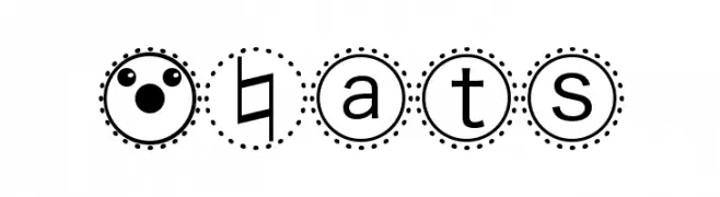
( Fonts by Manfred Klein - manfred-klein.ina-mar.com )
A playful decorative font with characters and symbols enclosed in dotted circles.
![MBats font caratteri gratis]() Scaricare 206 Downloads@WebFont
Scaricare 206 Downloads@WebFont -
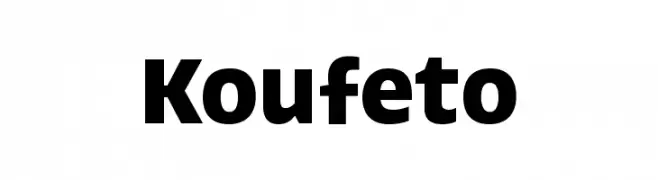
Caratteri di HammerBro101. For commercial use please contact the owner.
![Koufeto font caratteri gratis]() Scaricare 206 Downloads@WebFont
Scaricare 206 Downloads@WebFont -
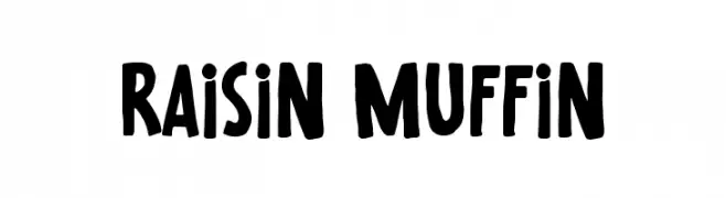
( Fonts by Gassstype )
A playful, bold, hand-drawn style font with a casual and friendly vibe.
![Raisin Muffin font caratteri gratis]() Scaricare 206 Downloads@WebFont
Scaricare 206 Downloads@WebFont -
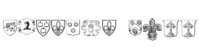
( new.myfonts.com/foundry/Intellecta_Design/?refby=paulow )
Ornate heraldic shield illustrations with medieval motifs.
![Blasons Free font caratteri gratis]() Scaricare 206 Downloads@WebFont
Scaricare 206 Downloads@WebFont -
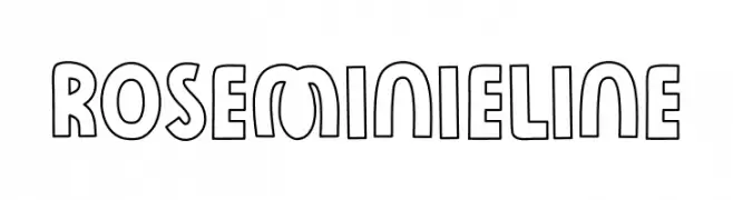
( Fonts by The Docallisme )
A playful, bold outline font with rounded edges and uniform strokes.
![Rose Minie Line font caratteri gratis]() Scaricare 206 Downloads@WebFont
Scaricare 206 Downloads@WebFont -
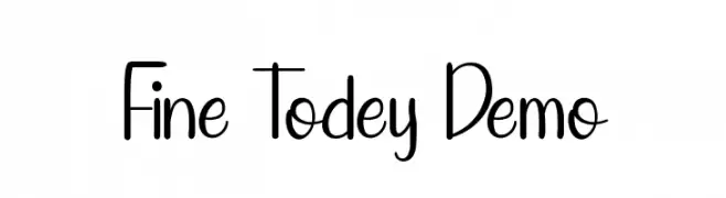
( Fonts by Edric Studio - Personal-use only. For commercial use please contact owner. )
A playful, hand-drawn font with tall, narrow letters and a whimsical style.
![Fine Todey Demo font caratteri gratis]() Scaricare 206 Downloads@WebFont
Scaricare 206 Downloads@WebFont -
![HFF Code Deco font caratteri gratis]() Scaricare 206 Downloads@WebFont
Scaricare 206 Downloads@WebFont -
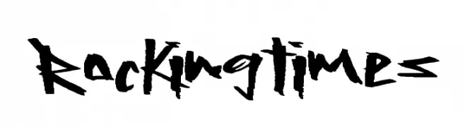
( Fonts by a Max Infeld - XEROGRAPHER FONTS - xerographer.blogspot.com . Personal-use only. For commercial use please contact owner. )
A bold, edgy font with a hand-drawn, rebellious style.
![RockingTimes font caratteri gratis]() Scaricare 206 Downloads@WebFont
Scaricare 206 Downloads@WebFont -
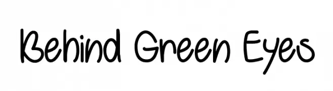
( Fonts by Misti`s Fonts - mistifonts.com - Personal-use only. For commercial use please contact owner. )
A playful, handwritten font with a casual and friendly style.
![Behind Green Eyes font caratteri gratis]() Scaricare 206 Downloads@WebFont
Scaricare 206 Downloads@WebFont -
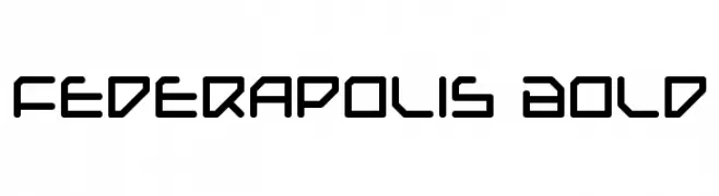
( Fonts by Daniel Zadorozny - www.iconian.com - Free for personal use )
A futuristic, geometric font with bold, rounded edges and consistent stroke widths.
![Federapolis Bold font caratteri gratis]() Scaricare 206 Downloads@WebFont
Scaricare 206 Downloads@WebFont -
![LoKinderDingsbums Links font caratteri gratis]() Scaricare 206 Downloads@WebFont
Scaricare 206 Downloads@WebFont -
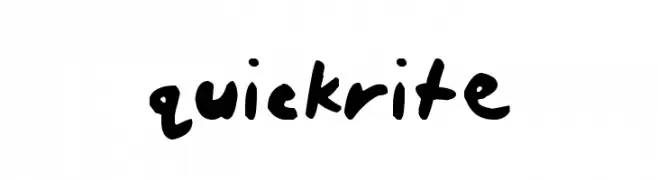
( Fonts by Kirk Shelton - www.kirkshelton.com )
A bold, expressive handwritten font with thick strokes and a playful style.
![quickrite font caratteri gratis]() Scaricare 206 Downloads@WebFont
Scaricare 206 Downloads@WebFont -
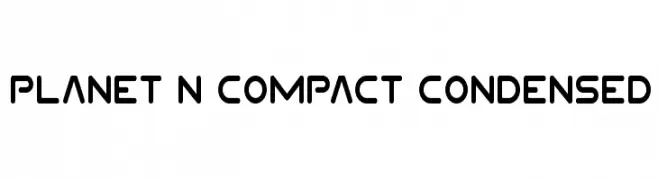
( Fonts by Iconian Fonts )
A modern, geometric font with rounded edges and a compact, condensed style.
![Planet N Compact Condensed font caratteri gratis]() Scaricare 206 Downloads@WebFont
Scaricare 206 Downloads@WebFont -
( Fonts by Manfred Klein. Free for private and charity use. Free for commercial with donation to organizations )
A geometric, pixelated font with a futuristic and digital aesthetic.
![AbstractaGrid font caratteri gratis]() Scaricare 206 Downloads@WebFont
Scaricare 206 Downloads@WebFont -
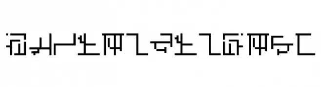
( Fonts by Jeffrey Visser )
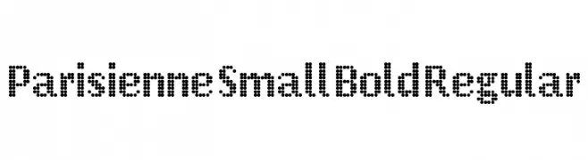
A dotted, pixelated font with a retro digital aesthetic.
![Parisienne Small Bold Regular font caratteri gratis]() Scaricare 206 Downloads@WebFont
Scaricare 206 Downloads@WebFont -
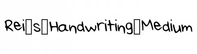
( Fonts by Rei K )
A playful, casual handwritten font with smooth, rounded letterforms.
![Rei_s_Handwriting_Medium font caratteri gratis]() Scaricare 206 Downloads@WebFont
Scaricare 206 Downloads@WebFont -
( Fonts by Bumbayo Font Fabrik - bumbayo.blogspot.com )
A distressed, decorative font with vintage flourishes.
![Matejo font caratteri gratis]() Scaricare 206 Downloads@WebFont
Scaricare 206 Downloads@WebFont -
( Fonts by Arkandis Digital Foundry )
A modern, geometric font with uniform strokes and rounded edges.
![Solothurn-Medium font caratteri gratis]() Scaricare 206 Downloads@WebFont
Scaricare 206 Downloads@WebFont -
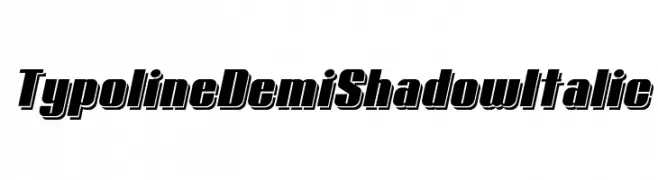
( Fonts by www.studiotypo.com - Personal-use only. For commercial use please contact owner. )
A bold, italic font with a shadow effect, perfect for dynamic and eye-catching designs.
![Typoline Demi Shadow Italic font caratteri gratis]() Scaricare 206 Downloads@WebFont
Scaricare 206 Downloads@WebFont -
![PopticsOne font caratteri gratis]() Scaricare 206 Downloads@WebFont
Scaricare 206 Downloads@WebFont


Quali sono i font più popolari adesso?
Poppins, Roboto, Montserrat, Open Sans e Lato sono molto usati per le forme pulite e l'ampia applicabilità — dall'identità di marca alle landing page e ai poster.
Quali font si usano spesso nei loghi?
Le sans serif geometriche (es. Poppins, famiglie in stile Gotham) sono scelte comuni per un branding pulito e scalabile. Per un tocco personale restano valide script e stili manoscritti. Abbina un display deciso per i titoli a un corpo testo neutro per riconoscibilità ed equilibrio.
Ogni quanto si aggiorna la lista?
Con regolarità, in base ai download e all'attività reale. Torna spesso per scoprire in anticipo le nuove preferite.
💡 Consiglio: aggiungi ai preferiti — le tendenze cambiano in fretta e i font top di oggi possono ispirare il rebranding di domani.