Benvenuto nelle Font Più Popolari — dove popolarità e qualità si incontrano. Qui trovi i font più scaricati e usati dell'anno. Se cerchi scelte sicure per logo, web o social, inizia da qui.
Ogni font top si distingue per equilibrio, leggibilità e versatilità. Troverai sans serif moderne, script eleganti, serif vintage e display minimalisti.
-
( Fonts by Syaf Rizal - www.creativefabrica.com/ref/53/ - Personal-use only. For commercial use please contact owner. )
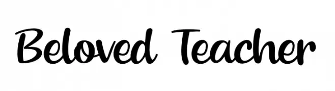
A playful, flowing script font with a handwritten appearance.
 Scaricare 2985 Downloads@WebFont
 -
( Fonts by Philipp H. Poll - Personal-use only. For commercial use please contact owner. )
A bold, classic serif typeface with strong, elegant strokes.
![Libertinus Serif Bold font caratteri gratis]() Scaricare 2985 Downloads@WebFont
Scaricare 2985 Downloads@WebFont -
( Copyright 2011, Tsong-Min Wu, Tsong-Huey Wu, Edward G.J. Lee and Seventeen. )
A geometric, monospaced font with uniform character width and clean lines.
![cwTeXHei font caratteri gratis]() Scaricare 2985 Downloads@WebFont
Scaricare 2985 Downloads@WebFont -
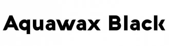
( Fonts by a kmzero font foundry - www.zetafonts.com. Personal-use only. For commercial use please contact owner. )
A bold, modern font with clean, geometric lines and strong visual impact.
![Aquawax Black font caratteri gratis]() Scaricare 2984 Downloads@WebFont
Scaricare 2984 Downloads@WebFont -
( Copyright (c) 2014 Dan Reynolds. )
A modern, clean typeface with uniform stroke width and excellent readability.
![Martel Sans SemiBold font caratteri gratis]() Scaricare 2984 Downloads@WebFont
Scaricare 2984 Downloads@WebFont -
-
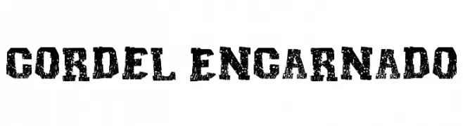
( Fonts by Galdino Otten - galdinootten.com )
A rugged, textured font with a vintage, woodcut print style.
![Cordel Encarnado font caratteri gratis]() Scaricare 2984 Downloads@WebFont
Scaricare 2984 Downloads@WebFont -
( Fonts by www.blambot.com )
A playful, italicized handwritten font with smooth, rounded strokes.
![Anime Ace 2.0 BB Italic font caratteri gratis]() Scaricare 2984 Downloads@WebFont
Scaricare 2984 Downloads@WebFont -
![DJ Love font caratteri gratis]() Scaricare 2984 Downloads@WebFont
Scaricare 2984 Downloads@WebFont -
( Fonts by Daniel Zadorozny - www.iconian.com - Free for personal use )
A bold, angular serif font with a commanding presence and geometric style.
![Earthrealm Regular font caratteri gratis]() Scaricare 2983 Downloads@WebFont
Scaricare 2983 Downloads@WebFont -
![ETH Large Expanded Black font caratteri gratis]() Scaricare 2983 Downloads@WebFont
Scaricare 2983 Downloads@WebFont -
( Fonts by Jacob Fisher - www.pizzadude.dk )
A bold, 3D slanted font with a futuristic and playful design.
![Bionic Kid Slanted 3d font caratteri gratis]() Scaricare 2983 Downloads@WebFont
Scaricare 2983 Downloads@WebFont -
Caratteri di glyphstyle. For commercial use please contact the owner.
( NOTE: This demo font is for PERSONAL USE ONLY! But any donation are very appreciated. Paypal account for donation : https://www.paypal.me/dimasardhi full version: https://www.glyphstyle.net/treova/ contact us at styleglyph@gmail.com And follow my in )
A modern, clean sans-serif font with a balanced and professional appearance.
![Treova Demo font caratteri gratis]() Scaricare 2982 Downloads@WebFont
Scaricare 2982 Downloads@WebFont -
( Fonts by Quentin Grebeude - https://www.behance.net/gallery/20090589/PIROU-Free-Font Personal-use only. For commercial use please contact owner. )
A classic serif font with a modern, elegant twist.
![Pirou font caratteri gratis]() Scaricare 2982 Downloads@WebFont
Scaricare 2982 Downloads@WebFont -
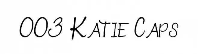
![003 Katie Caps font caratteri gratis]() Scaricare 2982 Downloads@WebFont
Scaricare 2982 Downloads@WebFont -
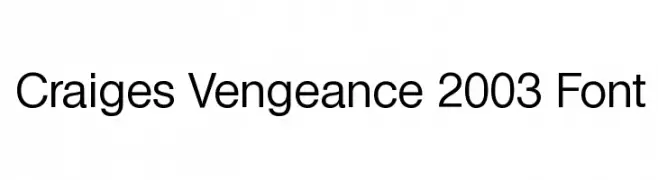
![Craiges Vengeance 2003 Font font caratteri gratis]() Scaricare 2982 Downloads@WebFont
Scaricare 2982 Downloads@WebFont -
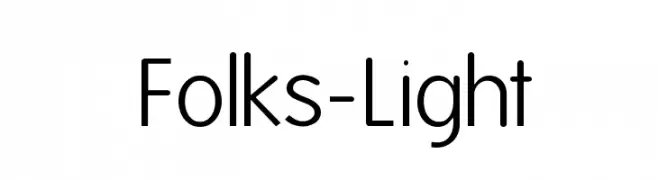
( Fonts by Manfred Klein - manfred-klein.ina-mar.com )
A clean, modern sans-serif font with uniform strokes and geometric influence.
![Folks-Light font caratteri gratis]() Scaricare 2982 Downloads@WebFont
Scaricare 2982 Downloads@WebFont -
Caratteri di HammerBro101. For commercial use please contact the owner.
![Mario Kart Position Font Regular font caratteri gratis]() Scaricare 2981 Downloads@WebFont
Scaricare 2981 Downloads@WebFont -
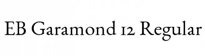
( Fonts by Georg Duffner - Personal-use only. For commercial use please contact owner. )
A classic serif font with elegant, balanced letterforms and refined details.
![EB Garamond 12 Regular font caratteri gratis]() Scaricare 2981 Downloads@WebFont
Scaricare 2981 Downloads@WebFont -
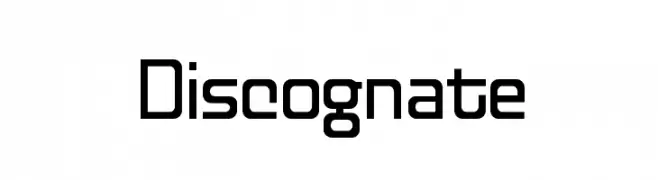
( Fonts by www.tepidmonkey.net )
A modern, geometric font with clean lines and a slightly condensed style.
![Discognate font caratteri gratis]() Scaricare 2981 Downloads@WebFont
Scaricare 2981 Downloads@WebFont -
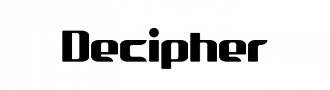
( THESE ARE SHAREWARE FONTS ! NOT FREEWARE ! PLEASE VISIT www.fuelfonts.com )
A bold, modern font with a geometric and futuristic style.
![Decipher font caratteri gratis]() Scaricare 2981 Downloads@WebFont
Scaricare 2981 Downloads@WebFont -
![Black Metal G font caratteri gratis]() Scaricare 2980 Downloads@WebFont
Scaricare 2980 Downloads@WebFont -
![I Am font caratteri gratis]() Scaricare 2980 Downloads@WebFont
Scaricare 2980 Downloads@WebFont -
( Fonts by Gassstype )
A bold, playful handwritten font with rounded edges and thick strokes.
![Bloopers font caratteri gratis]() Scaricare 2979 Downloads@WebFont
Scaricare 2979 Downloads@WebFont -
![Blood Of Dracula font caratteri gratis]() Scaricare 2979 Downloads@WebFont
Scaricare 2979 Downloads@WebFont -
( Fonts by Daniel Midgley )
A clean, modern sans-serif font with balanced proportions and excellent readability.
![PerspectiveSans-Regular font caratteri gratis]() Scaricare 2978 Downloads@WebFont
Scaricare 2978 Downloads@WebFont -
![Kimberley-Regular font caratteri gratis]() Scaricare 2978 Downloads@WebFont
Scaricare 2978 Downloads@WebFont -
![Cheap Fire font caratteri gratis]() Scaricare 2978 Downloads@WebFont
Scaricare 2978 Downloads@WebFont -
( Copyright 2020 The Manrope Project Authors (https://github.com/sharanda/manrope) )
A modern, geometric sans-serif typeface with balanced stroke widths and high legibility.
![Manrope Medium font caratteri gratis]() Scaricare 2977 Downloads@WebFont
Scaricare 2977 Downloads@WebFont -
( Sharkshock - Dennis Ludlow - www.sharkshock.net )
A modern sans-serif font with rounded edges and uniform stroke width.
![Knigsberg font caratteri gratis]() Scaricare 2975 Downloads@WebFont
Scaricare 2975 Downloads@WebFont -
( Copyright (c) 2015, Christian Thalmann and the Cormorant Project Authors (github.com/CatharsisFonts/Cormorant) )
A classic serif font with high contrast and elegant, refined letterforms.
![Cormorant Garamond Regular font caratteri gratis]() Scaricare 2975 Downloads@WebFont
Scaricare 2975 Downloads@WebFont -
![Los Angeles Homies font caratteri gratis]() Scaricare 2975 Downloads@WebFont
Scaricare 2975 Downloads@WebFont -
![Augustus font caratteri gratis]() Scaricare 2975 Downloads
Scaricare 2975 Downloads -
( Fonts by Zetafonts - Personal-use only. For commercial use please contact owner. )
A bold, modern font with thick, uniform strokes and geometric structure.
![Heading Now Trial 46 Bold font caratteri gratis]() Scaricare 2974 Downloads@WebFont
Scaricare 2974 Downloads@WebFont -
( Fonts by MadeType - Personal-use only. For commercial use please contact owner. )
A bold, geometric sans-serif font with a modern and striking appearance.
![MADEOuterSansAlt-Black font caratteri gratis]() Scaricare 2974 Downloads@WebFont
Scaricare 2974 Downloads@WebFont -
( Copyright (c) 2011, Pablo Impallari (www.impallari.com|impallari@gmail.com) )
A playful and elegant script font with a handwritten feel.
![LobsterTwo font caratteri gratis]() Scaricare 2974 Downloads@WebFont
Scaricare 2974 Downloads@WebFont


Quali sono i font più popolari adesso?
Poppins, Roboto, Montserrat, Open Sans e Lato sono molto usati per le forme pulite e l'ampia applicabilità — dall'identità di marca alle landing page e ai poster.
Quali font si usano spesso nei loghi?
Le sans serif geometriche (es. Poppins, famiglie in stile Gotham) sono scelte comuni per un branding pulito e scalabile. Per un tocco personale restano valide script e stili manoscritti. Abbina un display deciso per i titoli a un corpo testo neutro per riconoscibilità ed equilibrio.
Ogni quanto si aggiorna la lista?
Con regolarità, in base ai download e all'attività reale. Torna spesso per scoprire in anticipo le nuove preferite.
💡 Consiglio: aggiungi ai preferiti — le tendenze cambiano in fretta e i font top di oggi possono ispirare il rebranding di domani.