Benvenuto nelle Font Più Popolari — dove popolarità e qualità si incontrano. Qui trovi i font più scaricati e usati dell'anno. Se cerchi scelte sicure per logo, web o social, inizia da qui.
Ogni font top si distingue per equilibrio, leggibilità e versatilità. Troverai sans serif moderne, script eleganti, serif vintage e display minimalisti.
-
 Scaricare 986 Downloads@WebFont
 -
( Fonts by wep )
A bold, playful handwritten font with thick, rounded strokes.
![Damel font caratteri gratis]() Scaricare 985 Downloads@WebFont
Scaricare 985 Downloads@WebFont -
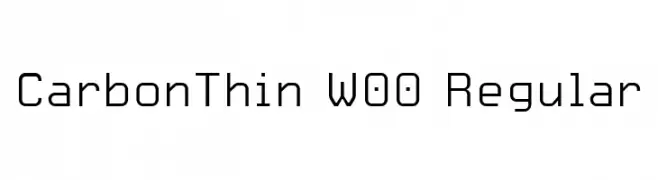
Caratteri di HammerBro101. For commercial use please contact the owner.
![CarbonThin W00 Regular font caratteri gratis]() Scaricare 985 Downloads@WebFont
Scaricare 985 Downloads@WebFont -
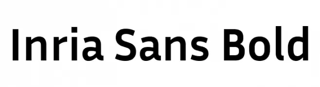
( Copyright 2017 The Inria Sans Project Authors (https://github.com/BlackFoundryCom/InriaFonts) )
A bold, modern sans-serif font with excellent readability and versatility.
![Inria Sans Bold font caratteri gratis]() Scaricare 985 Downloads@WebFont
Scaricare 985 Downloads@WebFont -
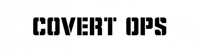
( Iconian Fonts - Daniel Zadorozny - www.iconian.com )
A bold, geometric stencil font with a strong, authoritative presence.
![Covert Ops font caratteri gratis]() Scaricare 985 Downloads@WebFont
Scaricare 985 Downloads@WebFont -
-
( Fonts by a Neale Davidson - www.pixelsagas.com. Personal-use only. For commercial use please contact owner. )
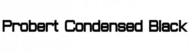
A bold, condensed font with a modern, geometric style.
![Probert Condensed Black font caratteri gratis]() Scaricare 985 Downloads@WebFont
Scaricare 985 Downloads@WebFont -
( Copyright (c) 2014, Indian Type Foundry (info@indiantypefoundry.com). )
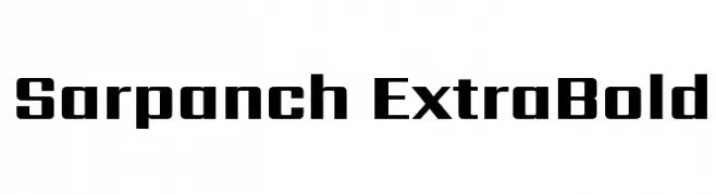
A bold, geometric font with strong, thick strokes and a modern aesthetic.
![Sarpanch ExtraBold font caratteri gratis]() Scaricare 985 Downloads@WebFont
Scaricare 985 Downloads@WebFont -
( Fonts by Chris Vile )
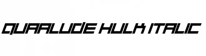
A bold, italicized font with a futuristic and angular design.
![Quaalude hulk Italic font caratteri gratis]() Scaricare 985 Downloads@WebFont
Scaricare 985 Downloads@WebFont -
( Fonts by Andrew McCluskey - nalgames.com. Personal-use only. For commercial use please contact owner. )
A bold, modern sans-serif font with geometric shapes and consistent stroke widths.
![PrimarySchool font caratteri gratis]() Scaricare 985 Downloads@WebFont
Scaricare 985 Downloads@WebFont -
( Fonts by www.stimuleyefonts.com )
A playful, modern font with tall, narrow characters and rounded edges.
![Noodletee font caratteri gratis]() Scaricare 985 Downloads@WebFont
Scaricare 985 Downloads@WebFont


Quali sono i font più popolari adesso?
Poppins, Roboto, Montserrat, Open Sans e Lato sono molto usati per le forme pulite e l'ampia applicabilità — dall'identità di marca alle landing page e ai poster.
Quali font si usano spesso nei loghi?
Le sans serif geometriche (es. Poppins, famiglie in stile Gotham) sono scelte comuni per un branding pulito e scalabile. Per un tocco personale restano valide script e stili manoscritti. Abbina un display deciso per i titoli a un corpo testo neutro per riconoscibilità ed equilibrio.
Ogni quanto si aggiorna la lista?
Con regolarità, in base ai download e all'attività reale. Torna spesso per scoprire in anticipo le nuove preferite.
💡 Consiglio: aggiungi ai preferiti — le tendenze cambiano in fretta e i font top di oggi possono ispirare il rebranding di domani.