Benvenuto nelle Font Più Popolari — dove popolarità e qualità si incontrano. Qui trovi i font più scaricati e usati dell'anno. Se cerchi scelte sicure per logo, web o social, inizia da qui.
Ogni font top si distingue per equilibrio, leggibilità e versatilità. Troverai sans serif moderne, script eleganti, serif vintage e display minimalisti.
-
 Scaricare 203 Downloads@WebFont
 -
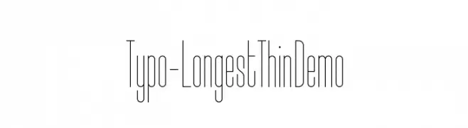
( Studio Typo - www.studiotypo.com )
A modern, ultra-thin, elongated font with a sleek and elegant style.
![Typo-Longest Thin Demo font caratteri gratis]() Scaricare 203 Downloads@WebFont
Scaricare 203 Downloads@WebFont -
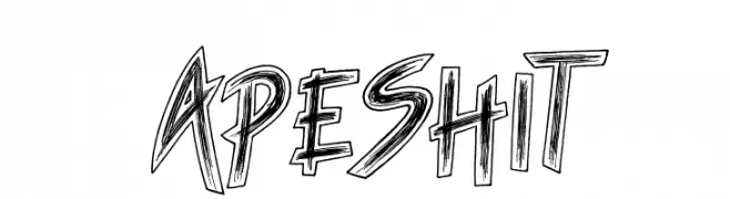
( Fonts by JSH creates )
Bold, sketch-style decorative font.
![Ape Shit font caratteri gratis]() Scaricare 203 Downloads@WebFont
Scaricare 203 Downloads@WebFont -
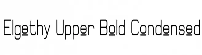
( Fonts by Graham Meade - GemFonts )
A modern, geometric font with a bold, condensed style and clean lines.
![Elgethy Upper Bold Condensed font caratteri gratis]() Scaricare 203 Downloads@WebFont
Scaricare 203 Downloads@WebFont -
( Fonts by Graham Meade - GemFonts )
Eclectic pictogram and symbol dingbat font.
![Odds n Sods font caratteri gratis]() Scaricare 203 Downloads@WebFont
Scaricare 203 Downloads@WebFont -
( 7NTypes - Situjuh Nazara - 7ntypes.com )
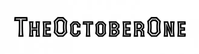
A bold, geometric font with angular shapes and a double-line effect.
![The October One font caratteri gratis]() Scaricare 203 Downloads@WebFont
Scaricare 203 Downloads@WebFont -
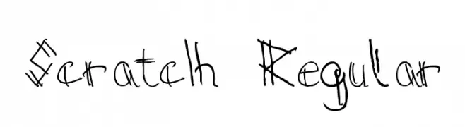
![Scratch Regular font caratteri gratis]() Scaricare 203 Downloads@WebFont
Scaricare 203 Downloads@WebFont -
( Download for Personal Use. For Commercial: http://www.k-type.com )
A modern, italicized font with medium contrast and normal spacing.
![ExciteItalic font caratteri gratis]() Scaricare 203 Downloads@WebFont
Scaricare 203 Downloads@WebFont -
( Fonts by Andi Moz )
A decorative font with floral embellishments and an organic, whimsical style.
![Floris font caratteri gratis]() Scaricare 203 Downloads@WebFont
Scaricare 203 Downloads@WebFont -
( گالری فانت فارسی پژوهش آريانا - only compatible with Farsi and Arabic )
A flowing, cursive-like font with a modern yet traditional aesthetic.
![Destkhat Plain font caratteri gratis]() Scaricare 203 Downloads@WebFont
Scaricare 203 Downloads@WebFont -
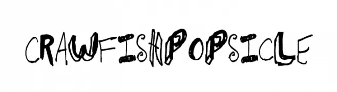
![CrawfishPopsicle font caratteri gratis]() Scaricare 203 Downloads@WebFont
Scaricare 203 Downloads@WebFont -
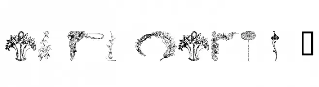
![wmflowers3 font caratteri gratis]() Scaricare 203 Downloads@WebFont
Scaricare 203 Downloads@WebFont -
![Kanji G font caratteri gratis]() Scaricare 203 Downloads@WebFont
Scaricare 203 Downloads@WebFont -
( Fonts by billyargel.blogspot.com - Billy Argel )
A modern, distressed font with a clean yet edgy appearance.
![SAVETHEMINI-TRIAL font caratteri gratis]() Scaricare 203 Downloads@WebFont
Scaricare 203 Downloads@WebFont -
( Fonts by Michael Muranaka - muraknockout.com - Personal-use only. For commercial use please contact owner. )
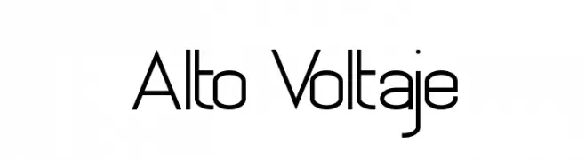
A modern, geometric font with uniform line thickness and rounded edges.
![Alto Voltaje font caratteri gratis]() Scaricare 203 Downloads@WebFont
Scaricare 203 Downloads@WebFont -
( Fonts by Daniel Zadorozny - www.iconian.com )
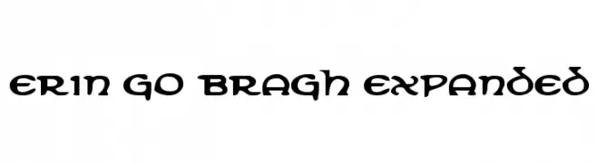
A bold, decorative font with Celtic-inspired letterforms and intricate serifs.
![Erin Go Bragh Expanded font caratteri gratis]() Scaricare 203 Downloads@WebFont
Scaricare 203 Downloads@WebFont -
( Fonts by Galdino Otten Fonts - www.galdinootten.com - Personal-use only. For commercial use please contact owner. )
A bold, geometric font with rounded edges and a modern aesthetic.
![Grapheno font caratteri gratis]() Scaricare 203 Downloads@WebFont
Scaricare 203 Downloads@WebFont -
( Fonts by Letterena Studios - letterena.com - Personal-use only. For commercial use please contact owner. )
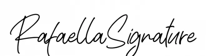
A fluid and elegant handwritten font with a personal touch.
![Rafaella Signature font caratteri gratis]() Scaricare 203 Downloads@WebFont
Scaricare 203 Downloads@WebFont -
( Fonts by Manfred Klein. Free for private and charity use. Free for commercial with donation to organizations )
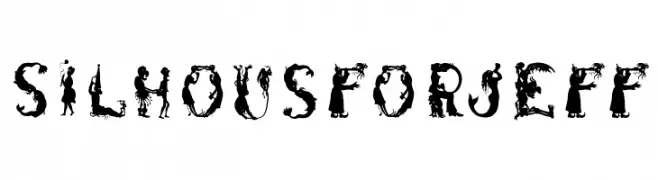
A decorative display font featuring intricate silhouette designs within each character.
![SilhousForJeff font caratteri gratis]() Scaricare 203 Downloads@WebFont
Scaricare 203 Downloads@WebFont -
( Fonts by Weape Studio )
A bold, rounded font with a playful, hand-drawn style.
![Becak font caratteri gratis]() Scaricare 203 Downloads@WebFont
Scaricare 203 Downloads@WebFont -
( https://www.behance.net/poemhaiku )
A decorative, hand-drawn font with a wild, jagged style.
![Words are but wind Demo Version font caratteri gratis]() Scaricare 203 Downloads@WebFont
Scaricare 203 Downloads@WebFont -
( Fonts by Michael Sharanda )
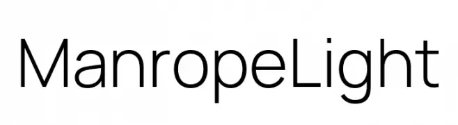
A modern, geometric sans-serif font with clean lines and excellent legibility.
![Manrope Light font caratteri gratis]() Scaricare 203 Downloads@WebFont
Scaricare 203 Downloads@WebFont -
( Fonts by Daniel Zadorozny - www.iconian.com )
A bold, geometric, condensed italic font with a retro-futuristic style.
![Disco Deck Condensed Italic font caratteri gratis]() Scaricare 203 Downloads@WebFont
Scaricare 203 Downloads@WebFont -
( Fonts by Iconian Fonts )
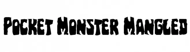
A bold, jagged font with an irregular, monster-themed design.
![Pocket Monster Mangled font caratteri gratis]() Scaricare 203 Downloads@WebFont
Scaricare 203 Downloads@WebFont -
![CheezyPie font caratteri gratis]() Scaricare 203 Downloads@WebFont
Scaricare 203 Downloads@WebFont -
( www.flickr.com/photos/digitalcodi/ )
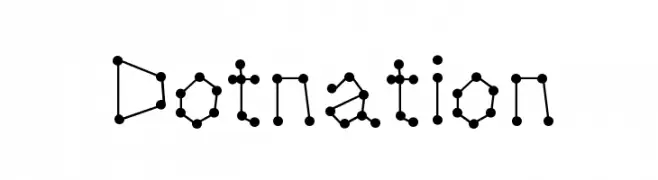
A modern, dot-connected font with a geometric and artistic style.
![Dotnation font caratteri gratis]() Scaricare 203 Downloads@WebFont
Scaricare 203 Downloads@WebFont -
( www.leodsen.com )
A playful, bold font with a unique split design, perfect for creative projects.
![HalfHalf font caratteri gratis]() Scaricare 203 Downloads@WebFont
Scaricare 203 Downloads@WebFont -
( Fonts by Daniel Zadorozny - www.iconian.com )
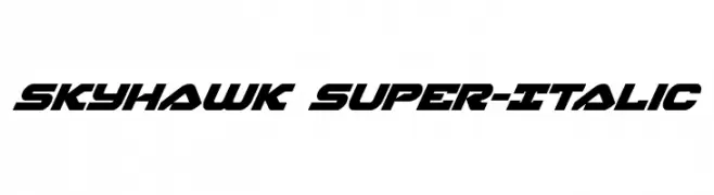
A bold, italic font with sharp angles and a dynamic, modern style.
![Skyhawk Super-Italic font caratteri gratis]() Scaricare 203 Downloads@WebFont
Scaricare 203 Downloads@WebFont -
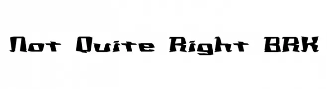
![Not Quite Right BRK font caratteri gratis]() Scaricare 203 Downloads@WebFont
Scaricare 203 Downloads@WebFont -
( imagex - www.imagex-fonts.com )
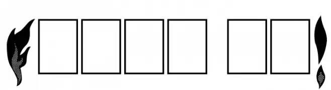
A bold, flame-inspired decorative font with intricate detailing.
![Flame on! font caratteri gratis]() Scaricare 203 Downloads@WebFont
Scaricare 203 Downloads@WebFont -
( Fonts by Iconian Fonts )
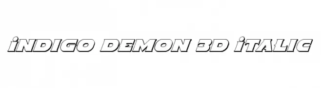
A bold, 3D italic font with a futuristic and dynamic style.
![Indigo Demon 3D Italic font caratteri gratis]() Scaricare 203 Downloads@WebFont
Scaricare 203 Downloads@WebFont -
( Copyright (c) 2016 by Red Hat, Inc. All rights reserved. )
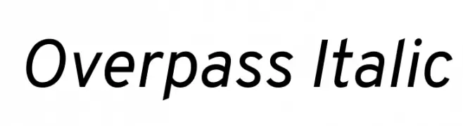
A modern, italic sans-serif font with a sleek and dynamic appearance.
![Overpass Italic font caratteri gratis]() Scaricare 203 Downloads@WebFont
Scaricare 203 Downloads@WebFont -
( Fonts by ARToni - Anthonie Van Hayu - Personal-use only. For commercial use please contact owner. )
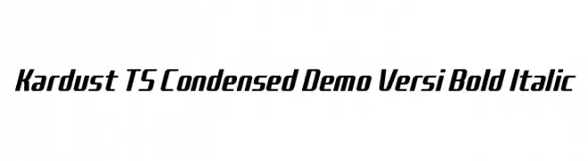
A bold, italic, and condensed font with a modern and dynamic style.
![Kardust TS Condensed Demo Versi Bold Italic font caratteri gratis]() Scaricare 203 Downloads@WebFont
Scaricare 203 Downloads@WebFont -
![Granolae font caratteri gratis]() Scaricare 203 Downloads@WebFont
Scaricare 203 Downloads@WebFont -
( Fonts by Jadatype )
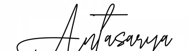
A dynamic, expressive handwritten font with fluid, continuous strokes.
![Antasarya font caratteri gratis]() Scaricare 203 Downloads@WebFont
Scaricare 203 Downloads@WebFont


Quali sono i font più popolari adesso?
Poppins, Roboto, Montserrat, Open Sans e Lato sono molto usati per le forme pulite e l'ampia applicabilità — dall'identità di marca alle landing page e ai poster.
Quali font si usano spesso nei loghi?
Le sans serif geometriche (es. Poppins, famiglie in stile Gotham) sono scelte comuni per un branding pulito e scalabile. Per un tocco personale restano valide script e stili manoscritti. Abbina un display deciso per i titoli a un corpo testo neutro per riconoscibilità ed equilibrio.
Ogni quanto si aggiorna la lista?
Con regolarità, in base ai download e all'attività reale. Torna spesso per scoprire in anticipo le nuove preferite.
💡 Consiglio: aggiungi ai preferiti — le tendenze cambiano in fretta e i font top di oggi possono ispirare il rebranding di domani.