Benvenuto nelle Font Più Popolari — dove popolarità e qualità si incontrano. Qui trovi i font più scaricati e usati dell'anno. Se cerchi scelte sicure per logo, web o social, inizia da qui.
Ogni font top si distingue per equilibrio, leggibilità e versatilità. Troverai sans serif moderne, script eleganti, serif vintage e display minimalisti.
-
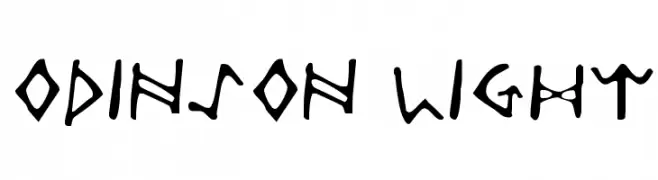
( Fonts by Daniel Zadorozny - www.iconian.com )
A bold, angular font inspired by ancient runic alphabets.
 Scaricare 198 Downloads@WebFont
 -
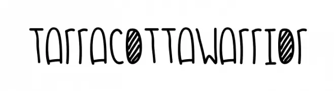
( Fonts by Des Gomez )
A playful, hand-drawn font with tall, narrow characters and a whimsical style.
![TarracottaWarrior font caratteri gratis]() Scaricare 198 Downloads@WebFont
Scaricare 198 Downloads@WebFont -
![Cronus Italic font caratteri gratis]() Scaricare 198 Downloads@WebFont
Scaricare 198 Downloads@WebFont -
( Fonts by Alpaprana Studio )
A bold, playful, and hand-drawn font with a casual, informal style.
![Chill Chirp font caratteri gratis]() Scaricare 198 Downloads@WebFont
Scaricare 198 Downloads@WebFont -
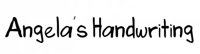
( Fonts by angelalpev - Personal-use only. For commercial use please contact owner. )
Casual handwritten font with a friendly style.
![Angela's Handwriting font caratteri gratis]() Scaricare 198 Downloads@WebFont
Scaricare 198 Downloads@WebFont -
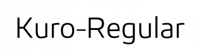
( Fonts by The Northern Block - Jonathan Hill - Personal-use only. For commercial use please contact owner. )
A modern, clean sans-serif font with uniform stroke weight and balanced proportions.
![Kuro-Regular font caratteri gratis]() Scaricare 198 Downloads@WebFont
Scaricare 198 Downloads@WebFont -
![Vintage Decorative Signs 18 font caratteri gratis]() Scaricare 198 Downloads@WebFont
Scaricare 198 Downloads@WebFont -
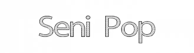
( Fonts by a cenz qobbal - www.facebook.com/cenzqobbalfonts. Personal-use only. For commercial use please contact owner. )
A bold, decorative font with a dotted pattern and modern style.
![Seni Pop font caratteri gratis]() Scaricare 198 Downloads@WebFont
Scaricare 198 Downloads@WebFont -
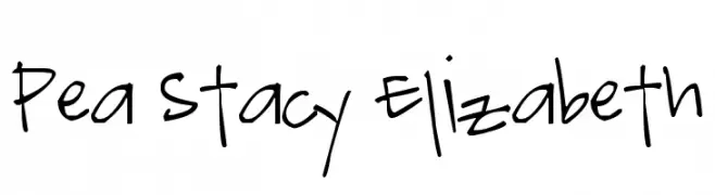
( Free for a personal use. For a commercial use please visit www.kevinandamanda.com )
A playful, handwritten font with a casual and dynamic style.
![Pea Stacy Elizabeth font caratteri gratis]() Scaricare 198 Downloads@WebFont
Scaricare 198 Downloads@WebFont -
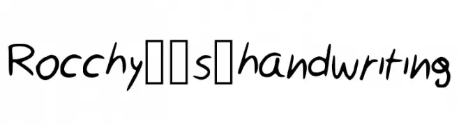
( https://www.facebook.com/pages/RAB-Arts/578670778829024 )
A casual, handwritten-style font with smooth, slightly irregular strokes.
![Rocchy__s_handwriting font caratteri gratis]() Scaricare 198 Downloads@WebFont
Scaricare 198 Downloads@WebFont -
( Fonts by Wino S Kadir - weknow - www.revolge.com/shop/weknow/ - Personal-use only. For commercial use please contact owner. )
A bold, geometric font with a futuristic and energetic style.
![AIRPLANE font caratteri gratis]() Scaricare 198 Downloads@WebFont
Scaricare 198 Downloads@WebFont -
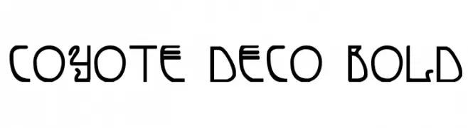
( Fonts by Daniel Zadorozny - www.iconian.com - Free for personal use )
A bold, decorative font with a geometric and futuristic style.
![Coyote Deco Bold font caratteri gratis]() Scaricare 198 Downloads@WebFont
Scaricare 198 Downloads@WebFont -
( Fonts by www.aenigmafonts.com )
A modern, cube-inspired font with bold, geometric characters.
![Qbicle1BRKMKinv font caratteri gratis]() Scaricare 198 Downloads@WebFont
Scaricare 198 Downloads@WebFont -
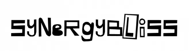
![Synergy Bliss font caratteri gratis]() Scaricare 198 Downloads@WebFont
Scaricare 198 Downloads@WebFont -
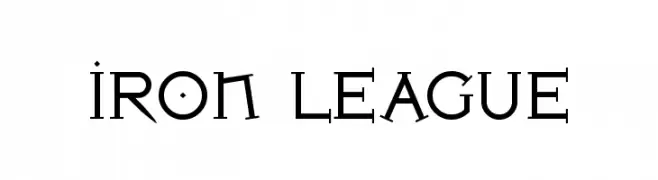
( Fonts by Levi Halmos )
A bold, angular font with a modern, industrial aesthetic.
![Iron League font caratteri gratis]() Scaricare 198 Downloads@WebFont
Scaricare 198 Downloads@WebFont -
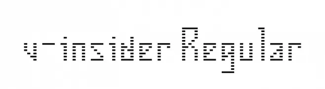
( Fonts by TwoNineFive )
A dot matrix style font with a retro digital aesthetic.
![v-insider Regular font caratteri gratis]() Scaricare 198 Downloads@WebFont
Scaricare 198 Downloads@WebFont -
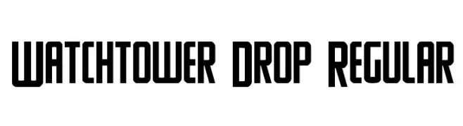
( Fonts by Daniel Zadorozny - www.iconian.com - Free for personal use )
A bold, geometric font with strong, angular lines and a modern aesthetic.
![Watchtower Drop Regular font caratteri gratis]() Scaricare 198 Downloads@WebFont
Scaricare 198 Downloads@WebFont -
( Fonts by Daniel Zadorozny - www.iconian.com - Free for personal use )
A bold, geometric font with strong, angular lines and a modern style.
![Tigershark Regular font caratteri gratis]() Scaricare 198 Downloads@WebFont
Scaricare 198 Downloads@WebFont -
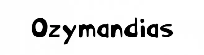
( Fonts by Daniel Zadorozny - www.iconian.com - Free for personal use )
A bold, playful font with a hand-drawn, whimsical style.
![Ozymandias font caratteri gratis]() Scaricare 198 Downloads@WebFont
Scaricare 198 Downloads@WebFont -
( Fonts by weknow )
A bold, geometric font with angular and sharp edges, ideal for modern designs.
![HUMAN ALTER EGO font caratteri gratis]() Scaricare 198 Downloads@WebFont
Scaricare 198 Downloads@WebFont -
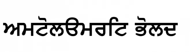
![SamtolAmrit Bold font caratteri gratis]() Scaricare 198 Downloads@WebFont
Scaricare 198 Downloads@WebFont -
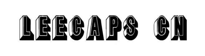
( Fonts by David Rakowski )
A bold, 3D decorative font with a vintage, playful style.
![LeeCaps Cn font caratteri gratis]() Scaricare 198 Downloads@WebFont
Scaricare 198 Downloads@WebFont -
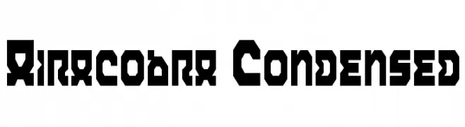
( Fonts by Daniel Zadorozny - www.iconian.com - Free for personal use )
A bold, geometric, and condensed font with a futuristic style.
![Airacobra Condensed font caratteri gratis]() Scaricare 198 Downloads@WebFont
Scaricare 198 Downloads@WebFont -
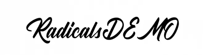
( Fonts by Letterhend Studio - Hendry Juanda - Personal-use only. For commercial use please contact owner. )
A bold, cursive font with a dynamic, handwritten style.
![RadicalsDEMO font caratteri gratis]() Scaricare 198 Downloads@WebFont
Scaricare 198 Downloads@WebFont -
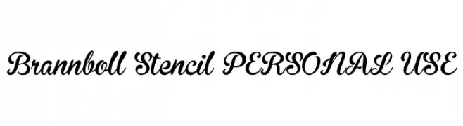
( Fonts by Mans Greback - Personal-use only. For commercial use please contact owner. )
A bold, flowing script font with a unique stencil effect.
![Brannboll Stencil PERSONAL USE font caratteri gratis]() Scaricare 198 Downloads@WebFont
Scaricare 198 Downloads@WebFont -
( Fonts by Forberas Club )
Playful handwritten script font.
![Grey Joy font caratteri gratis]() Scaricare 198 Downloads@WebFont
Scaricare 198 Downloads@WebFont -
( Fonts by Shara Weber )
A playful, dot-accented font with bold, rounded characters.
![GelDotica font caratteri gratis]() Scaricare 198 Downloads@WebFont
Scaricare 198 Downloads@WebFont -
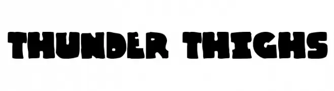
( Fonts by Cumberland Fontworks - http://www222.pair.com/sjohn/fonts.htm - S. John Ross )
A bold, playful font with thick, rounded characters and a cartoonish style.
![Thunder Thighs font caratteri gratis]() Scaricare 198 Downloads@WebFont
Scaricare 198 Downloads@WebFont -
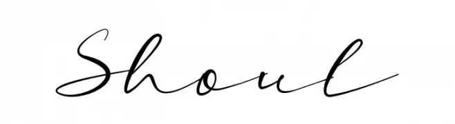
( Fonts by M Ridwan )
Handwritten script font with elegant curves.
![Shoul font caratteri gratis]() Scaricare 198 Downloads@WebFont
Scaricare 198 Downloads@WebFont -
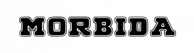
( Fonts by www.woodcutter.es - woodcutter Manero - Personal-use only. For commercial use please contact owner. )
A bold, outlined decorative font with a vintage flair.
![MORBIDA font caratteri gratis]() Scaricare 198 Downloads@WebFont
Scaricare 198 Downloads@WebFont -
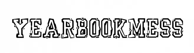
( Fonts by ARRF Designs )
A bold, decorative font with a distressed, grunge-like texture and thick outlines.
![YearBookMess font caratteri gratis]() Scaricare 198 Downloads@WebFont
Scaricare 198 Downloads@WebFont -
( Fonts by ingoFonts. http://www.ingofonts.de )
A bold, Gothic-style font with intricate, angular characters.
![FaberGotic-Textreduced font caratteri gratis]() Scaricare 198 Downloads@WebFont
Scaricare 198 Downloads@WebFont -
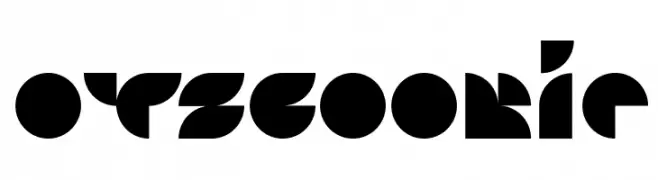
![Otscookie font caratteri gratis]() Scaricare 198 Downloads@WebFont
Scaricare 198 Downloads@WebFont -
( Fonts by Daniel Zadorozny - www.iconian.com - Personal-use only. For commercial use please contact owner. )
A bold, futuristic, and condensed font with a geometric style.
![Astro Armada Condensed font caratteri gratis]() Scaricare 198 Downloads@WebFont
Scaricare 198 Downloads@WebFont -
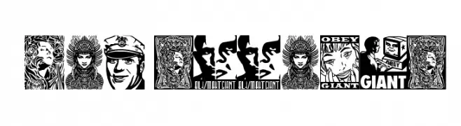
( Fonts by bob istheowl http://luc.devroye.org/bobistheowl.html )
Bold, graphic display font inspired by street art and propaganda.
![ObeyGalleria font caratteri gratis]() Scaricare 198 Downloads@WebFont
Scaricare 198 Downloads@WebFont


Quali sono i font più popolari adesso?
Poppins, Roboto, Montserrat, Open Sans e Lato sono molto usati per le forme pulite e l'ampia applicabilità — dall'identità di marca alle landing page e ai poster.
Quali font si usano spesso nei loghi?
Le sans serif geometriche (es. Poppins, famiglie in stile Gotham) sono scelte comuni per un branding pulito e scalabile. Per un tocco personale restano valide script e stili manoscritti. Abbina un display deciso per i titoli a un corpo testo neutro per riconoscibilità ed equilibrio.
Ogni quanto si aggiorna la lista?
Con regolarità, in base ai download e all'attività reale. Torna spesso per scoprire in anticipo le nuove preferite.
💡 Consiglio: aggiungi ai preferiti — le tendenze cambiano in fretta e i font top di oggi possono ispirare il rebranding di domani.