Benvenuto nelle Font Più Popolari — dove popolarità e qualità si incontrano. Qui trovi i font più scaricati e usati dell'anno. Se cerchi scelte sicure per logo, web o social, inizia da qui.
Ogni font top si distingue per equilibrio, leggibilità e versatilità. Troverai sans serif moderne, script eleganti, serif vintage e display minimalisti.
-
 Scaricare 201 Downloads@WebFont
 -
( Fonts by Amazingmax - Maxim Avdeev )
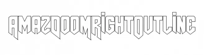
A bold, geometric outline font with a futuristic and dynamic style.
![AmazDooMRightOutline font caratteri gratis]() Scaricare 201 Downloads@WebFont
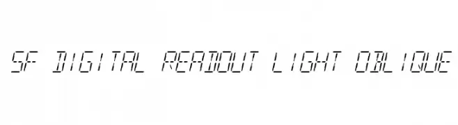
Scaricare 201 Downloads@WebFont -
![SF Digital Readout Light Oblique font caratteri gratis]() Scaricare 201 Downloads@WebFont
Scaricare 201 Downloads@WebFont -
![PigPenCipher font caratteri gratis]() Scaricare 201 Downloads@WebFont
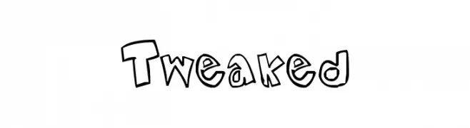
Scaricare 201 Downloads@WebFont -
![Tweaked font caratteri gratis]() Scaricare 201 Downloads@WebFont
Scaricare 201 Downloads@WebFont -
![Dingies font caratteri gratis]() Scaricare 201 Downloads@WebFont
Scaricare 201 Downloads@WebFont -
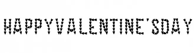
![HAPPY VALENTINE'S DAY font caratteri gratis]() Scaricare 201 Downloads@WebFont
Scaricare 201 Downloads@WebFont -
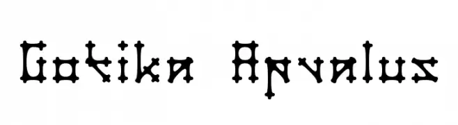
( Fonts by Audrius Skersys - www.extate.lt )
A bold, Gothic-style font with rounded terminals and ornate details.
![Gotika Apvalus font caratteri gratis]() Scaricare 201 Downloads@WebFont
Scaricare 201 Downloads@WebFont -
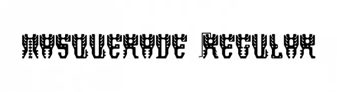
Caratteri di danny91194. For commercial use please contact the owner.
![masquerade Regular font caratteri gratis]() Scaricare 201 Downloads@WebFont
Scaricare 201 Downloads@WebFont -
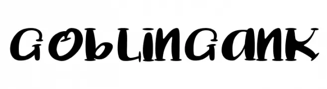
( Fonts by nomlimofont )
A bold, playful font with exaggerated curves and a whimsical style.
![Goblin Gank font caratteri gratis]() Scaricare 201 Downloads@WebFont
Scaricare 201 Downloads@WebFont -
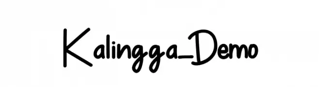
( Fonts by Almaz Studio )
A playful, handwritten-style font with bold, consistent strokes and a casual vibe.
![Kalingga_Demo font caratteri gratis]() Scaricare 201 Downloads@WebFont
Scaricare 201 Downloads@WebFont -
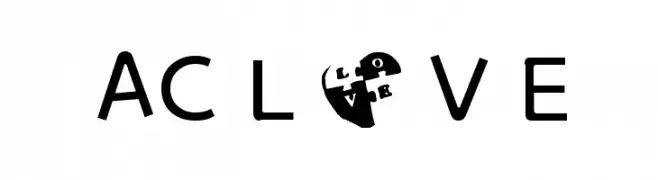
( Fonts by Angeline Clara - Personal-use only. For commercial use please contact owner. )
A playful and whimsical font with heart motifs and rounded characters.
![AC L O V E font caratteri gratis]() Scaricare 201 Downloads@WebFont
Scaricare 201 Downloads@WebFont -
![Make Your Own Pets LT font caratteri gratis]() Scaricare 201 Downloads@WebFont
Scaricare 201 Downloads@WebFont -
( Fonts by Manfred Klein. Free for private and charity use. Free for commercial with donation to organizations )
A bold, spiky decorative font with a playful cactus-inspired design.
![CactusBlossom font caratteri gratis]() Scaricare 201 Downloads@WebFont
Scaricare 201 Downloads@WebFont -
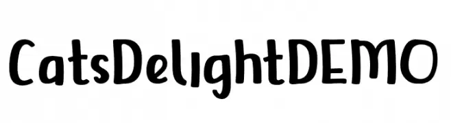
( Fonts by Trim Studio )
A playful, hand-drawn font with bold, rounded characters and a whimsical style.
![CatsDelightDEMO font caratteri gratis]() Scaricare 201 Downloads@WebFont
Scaricare 201 Downloads@WebFont -
( Fonts by Green Adventure Studio )
A bold, playful font with a whimsical, cartoon-like style.
![Jelly Bomb font caratteri gratis]() Scaricare 201 Downloads@WebFont
Scaricare 201 Downloads@WebFont -
( Fonts by Daniel Zadorozny - www.iconian.com )
A bold, distressed font with a rugged, vintage appearance.
![Body Swipers Expanded font caratteri gratis]() Scaricare 201 Downloads@WebFont
Scaricare 201 Downloads@WebFont -
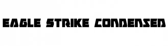
( Fonts by Daniel Zadorozny - www.iconian.com - Free for personal use )
A bold, geometric, and condensed font with sharp angles.
![Eagle Strike Condensed font caratteri gratis]() Scaricare 201 Downloads@WebFont
Scaricare 201 Downloads@WebFont -
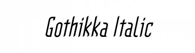
( Fonts by Paul Reid - tracertong.co.uk )
A modern, italicized font with elongated, narrow characters and medium contrast.
![Gothikka Italic font caratteri gratis]() Scaricare 201 Downloads@WebFont
Scaricare 201 Downloads@WebFont -
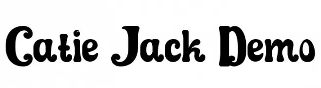
( Fonts by VinType )
A playful, bold font with a whimsical and cartoonish style.
![Catie Jack Demo font caratteri gratis]() Scaricare 201 Downloads@WebFont
Scaricare 201 Downloads@WebFont -
( Fonts by Hanoded )
A bold, geometric font with Art Deco influences, perfect for impactful designs.
![DKBungehuis font caratteri gratis]() Scaricare 201 Downloads@WebFont
Scaricare 201 Downloads@WebFont -
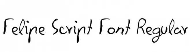
( Fonts by Javier De la Fuente )
A playful, casual handwritten font with smooth curves and a dynamic slant.
![Felipe Script Font Regular font caratteri gratis]() Scaricare 201 Downloads@WebFont
Scaricare 201 Downloads@WebFont -
( Fonts by bob istheowl http://luc.devroye.org/bobistheowl.html )
Photographic silhouette display font with unique images for each character.
![AmyBats3 font caratteri gratis]() Scaricare 201 Downloads@WebFont
Scaricare 201 Downloads@WebFont -
( Fonts by Galdino Otten Fonts )
Retro multi-line decorative font with a 70s disco feel.
![70s Disco Regular font caratteri gratis]() Scaricare 201 Downloads@WebFont
Scaricare 201 Downloads@WebFont -
( Fonts by TarmSaft Font Factory - http://www.aska.nu/tarmsaft/ )
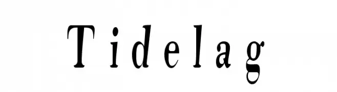
A bold, whimsical serif font with dynamic strokes and elegant curves.
![Tidelag font caratteri gratis]() Scaricare 201 Downloads@WebFont
Scaricare 201 Downloads@WebFont -
( Fonts by www.aenigmafonts.com )
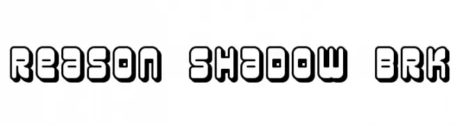
Bold, playful font with a shadow effect for a 3D look.
![Reason Shadow BRK font caratteri gratis]() Scaricare 201 Downloads@WebFont
Scaricare 201 Downloads@WebFont -
( Fonts by imagex )
A bold, futuristic font with a distinct outlined, geometric design.
![Astral Delight font caratteri gratis]() Scaricare 201 Downloads@WebFont
Scaricare 201 Downloads@WebFont -
( Fonts by Apostrophic Lab )
A sleek, modern thin italic font with a dynamic and elegant style.
![Street - Thin Italic font caratteri gratis]() Scaricare 201 Downloads@WebFont
Scaricare 201 Downloads@WebFont -
( jaydegarrow.wix.com/jaydefonts )
A bold, grungy font with a distressed texture, ideal for edgy designs.
![Grungy font caratteri gratis]() Scaricare 201 Downloads@WebFont
Scaricare 201 Downloads@WebFont -
( ingoFonts - Ingo Zimmermann - www.ingofonts.com )
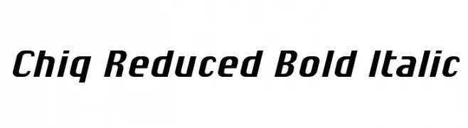
A bold, italicized font with a modern and sleek appearance.
![Chiq Reduced Bold Italic font caratteri gratis]() Scaricare 201 Downloads@WebFont
Scaricare 201 Downloads@WebFont -
![bahana - aksara sunda font caratteri gratis]() Scaricare 201 Downloads@WebFont
Scaricare 201 Downloads@WebFont -
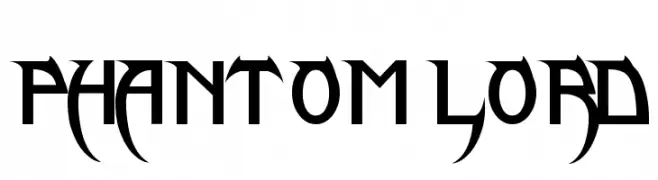
( James Stone - www.behance.net/subversivetype )
A bold, gothic font with sharp, angular edges and pointed serifs.
![Phantom Lord font caratteri gratis]() Scaricare 201 Downloads@WebFont
Scaricare 201 Downloads@WebFont -
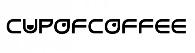
( Fonts by JoannaVu - https://ioannaladopoulou.design - Personal-use only. For commercial use please contact owner. )
A modern, geometric font with a sleek and futuristic style.
![cupofcoffee font caratteri gratis]() Scaricare 201 Downloads@WebFont
Scaricare 201 Downloads@WebFont -
( Fonts by Daniel Zadorozny - www.iconian.com - Free for personal use )
A futuristic, angular italic font with a dynamic and bold style.
![Legion Italic font caratteri gratis]() Scaricare 201 Downloads@WebFont
Scaricare 201 Downloads@WebFont -
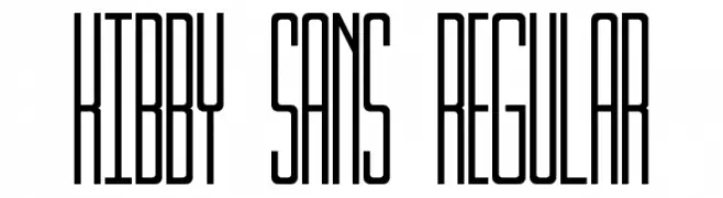
( Fonts by Luedecke Design Font Co. - ldfonts.weebly.com )
A tall, narrow, and modern font with tight character spacing.
![Kibby Sans Regular font caratteri gratis]() Scaricare 201 Downloads@WebFont
Scaricare 201 Downloads@WebFont


Quali sono i font più popolari adesso?
Poppins, Roboto, Montserrat, Open Sans e Lato sono molto usati per le forme pulite e l'ampia applicabilità — dall'identità di marca alle landing page e ai poster.
Quali font si usano spesso nei loghi?
Le sans serif geometriche (es. Poppins, famiglie in stile Gotham) sono scelte comuni per un branding pulito e scalabile. Per un tocco personale restano valide script e stili manoscritti. Abbina un display deciso per i titoli a un corpo testo neutro per riconoscibilità ed equilibrio.
Ogni quanto si aggiorna la lista?
Con regolarità, in base ai download e all'attività reale. Torna spesso per scoprire in anticipo le nuove preferite.
💡 Consiglio: aggiungi ai preferiti — le tendenze cambiano in fretta e i font top di oggi possono ispirare il rebranding di domani.