Benvenuto nelle Font Più Popolari — dove popolarità e qualità si incontrano. Qui trovi i font più scaricati e usati dell'anno. Se cerchi scelte sicure per logo, web o social, inizia da qui.
Ogni font top si distingue per equilibrio, leggibilità e versatilità. Troverai sans serif moderne, script eleganti, serif vintage e display minimalisti.
-
( Fonts by Zetafonts - Personal-use only. For commercial use please contact owner. )
A bold, heavy font with tight spacing and uniform stroke thickness, perfect for impactful designs.
 Scaricare 969 Downloads@WebFont
 -
( Fonts by Mozatype )
A bold, dynamic script font with smooth, flowing strokes and medium contrast.
![Nasi Goreng font caratteri gratis]() Scaricare 969 Downloads@WebFont
Scaricare 969 Downloads@WebFont -
( Fonts by RaffaSyad Studio - www.creativefabrica.com/designer/r-studio/ - Personal-use only. For commercial use please contact owner. )
A bold, expressive script font with flowing, cursive letterforms.
![anthusia font caratteri gratis]() Scaricare 969 Downloads@WebFont
Scaricare 969 Downloads@WebFont -
![DelighterScript font caratteri gratis]() Scaricare 969 Downloads@WebFont
Scaricare 969 Downloads@WebFont -
( Fonts by Peter Wiegel - Personal-use only. For commercial use please contact owner. )
A bold, geometric font with a double-line outline for a modern look.
![AurachTri font caratteri gratis]() Scaricare 969 Downloads@WebFont
Scaricare 969 Downloads@WebFont -
-
( Zetafonts - www.zetafonts.com )
A bold, heavy, italic font with a modern and dynamic style.
![Domotika Trial Heavy Italic font caratteri gratis]() Scaricare 969 Downloads@WebFont
Scaricare 969 Downloads@WebFont -
( Vladimir Nikolic - www.coroflot.com/vladimirnikolic )
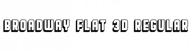
A bold, 3D geometric font with a modern, impactful style.
![Broadway Flat 3D Regular font caratteri gratis]() Scaricare 969 Downloads@WebFont
Scaricare 969 Downloads@WebFont -
( Graphix Line Studio )
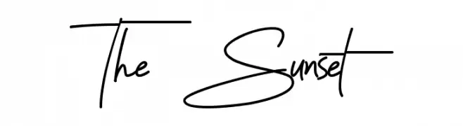
A graceful, handwritten script font with a flowing, elegant style.
![The Sunset font caratteri gratis]() Scaricare 969 Downloads@WebFont
Scaricare 969 Downloads@WebFont -
( Fonts by 7NTypes )
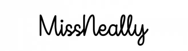
A playful, handwritten script font with smooth, connected letters.
![Miss Neally font caratteri gratis]() Scaricare 969 Downloads@WebFont
Scaricare 969 Downloads@WebFont -
![3ds-CondensedLight font caratteri gratis]() Scaricare 969 Downloads@WebFont
Scaricare 969 Downloads@WebFont

Quali sono i font più popolari adesso?
Poppins, Roboto, Montserrat, Open Sans e Lato sono molto usati per le forme pulite e l'ampia applicabilità — dall'identità di marca alle landing page e ai poster.
Quali font si usano spesso nei loghi?
Le sans serif geometriche (es. Poppins, famiglie in stile Gotham) sono scelte comuni per un branding pulito e scalabile. Per un tocco personale restano valide script e stili manoscritti. Abbina un display deciso per i titoli a un corpo testo neutro per riconoscibilità ed equilibrio.
Ogni quanto si aggiorna la lista?
Con regolarità, in base ai download e all'attività reale. Torna spesso per scoprire in anticipo le nuove preferite.
💡 Consiglio: aggiungi ai preferiti — le tendenze cambiano in fretta e i font top di oggi possono ispirare il rebranding di domani.