Benvenuto nelle Font Più Popolari — dove popolarità e qualità si incontrano. Qui trovi i font più scaricati e usati dell'anno. Se cerchi scelte sicure per logo, web o social, inizia da qui.
Ogni font top si distingue per equilibrio, leggibilità e versatilità. Troverai sans serif moderne, script eleganti, serif vintage e display minimalisti.
-
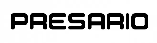
( Fonts by Rajesh Rajput - gumroad.com/rajputrajesh_448 - Personal-use only. For commercial use please contact owner. )
A tall, condensed, and modern font with clean lines and a bold presence.
 Scaricare 2924 Downloads@WebFont
 -
![Presario font caratteri gratis]() Scaricare 2924 Downloads@WebFont
Scaricare 2924 Downloads@WebFont -
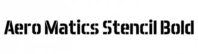
( Font by Jayvee D. Enaguas - grandchaos9000.deviantart.com )
A bold, geometric stencil font with a modern, industrial feel.
![Aero Matics Stencil Bold font caratteri gratis]() Scaricare 2924 Downloads@WebFont
Scaricare 2924 Downloads@WebFont -
![13_Misa font caratteri gratis]() Scaricare 2924 Downloads@WebFont
Scaricare 2924 Downloads@WebFont -
( Font by Ben Nathan - www.hafontia.com )
A bold, modern font with geometric, angular characters and a dynamic slant.
![BN Elements font caratteri gratis]() Scaricare 2924 Downloads@WebFont
Scaricare 2924 Downloads@WebFont -
-
( Fonts by Emerald City Fontwerks )
A playful, handwritten font with a casual and friendly style.
![augie font caratteri gratis]() Scaricare 2924 Downloads@WebFont
Scaricare 2924 Downloads@WebFont -
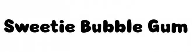
( Fonts by Galdino Otten Fonts )
A playful, bold font with rounded, bubble-like characters.
![Sweetie Bubble Gum font caratteri gratis]() Scaricare 2923 Downloads@WebFont
Scaricare 2923 Downloads@WebFont -
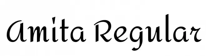
( Copyright (c) 2014, Eduardo Rodriguez Tunni. )
An elegant script font with medium contrast and flowing curves.
![Amita Regular font caratteri gratis]() Scaricare 2923 Downloads@WebFont
Scaricare 2923 Downloads@WebFont -
![Pigiarniq Light font caratteri gratis]() Scaricare 2923 Downloads@WebFont
Scaricare 2923 Downloads@WebFont -
( Fonts by www.selawetype.com - Personal-use only. FOR DONATION https://www.paypal.me/selawe . For commercial use please contact owner. )
A playful, handwritten font with flowing, connected letterforms and artistic flair.
![Tinta font caratteri gratis]() Scaricare 2922 Downloads@WebFont
Scaricare 2922 Downloads@WebFont -
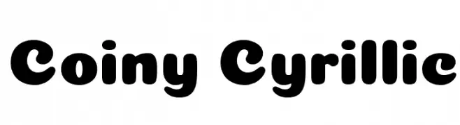
( Denis Ignatov - mutno.me/fonts )
A bold, rounded font with a playful and friendly style.
![Coiny Cyrillic font caratteri gratis]() Scaricare 2922 Downloads@WebFont
Scaricare 2922 Downloads@WebFont -
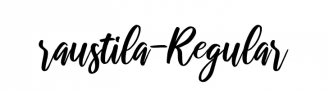
![raustila-Regular font caratteri gratis]() Scaricare 2922 Downloads@WebFont
Scaricare 2922 Downloads@WebFont -
( Fonts by Dan P. Lyons - Personal-use only. For commercial use please contact owner. )
A bold, playful font with rounded edges and a modern, whimsical style.
![New LiteBulb font caratteri gratis]() Scaricare 2921 Downloads@WebFont
Scaricare 2921 Downloads@WebFont -
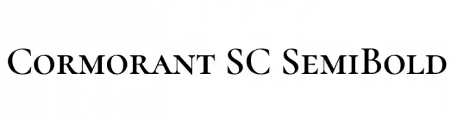
( Copyright (c) 2015, Christian Thalmann and the Cormorant Project Authors (github.com/CatharsisFonts/Cormorant) )
A classic serif font with high contrast and small caps style.
![Cormorant SC SemiBold font caratteri gratis]() Scaricare 2921 Downloads@WebFont
Scaricare 2921 Downloads@WebFont -
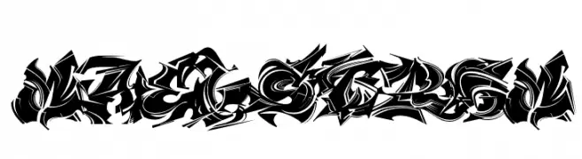
![MAELSTROM font caratteri gratis]() Scaricare 2920 Downloads@WebFont
Scaricare 2920 Downloads@WebFont -
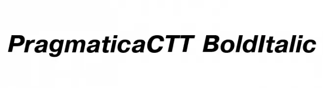
![PragmaticaCTT BoldItalic font caratteri gratis]() Scaricare 2920 Downloads@WebFont
Scaricare 2920 Downloads@WebFont -
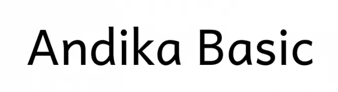
![Andika Basic font caratteri gratis]() Scaricare 2919 Downloads@WebFont
Scaricare 2919 Downloads@WebFont -
![Gyparody font caratteri gratis]() Scaricare 2919 Downloads@WebFont
Scaricare 2919 Downloads@WebFont -
( Fonts by Sungi Creative - Ivan Pranata - Personal-use only. For commercial use please contact owner. )
A playful, hand-drawn font with rounded, bold characters and a whimsical style.
![Chiffon font caratteri gratis]() Scaricare 2917 Downloads@WebFont
Scaricare 2917 Downloads@WebFont -
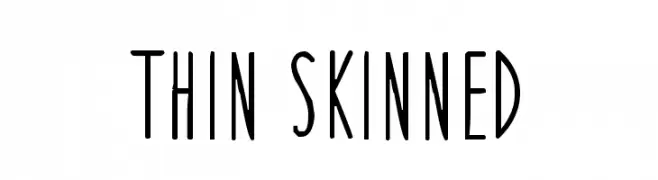
![Thin Skinned font caratteri gratis]() Scaricare 2917 Downloads@WebFont
Scaricare 2917 Downloads@WebFont -
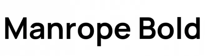
( Copyright 2020 The Manrope Project Authors (https://github.com/sharanda/manrope) )
A modern, clean sans-serif font with excellent readability and geometric design.
![Manrope Bold font caratteri gratis]() Scaricare 2916 Downloads@WebFont
Scaricare 2916 Downloads@WebFont -
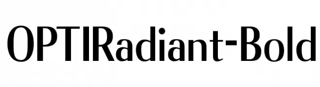
( Fonts by Castcraft Software - OPTI Fonts Archive - opti.netii.net - Personal-use only. For commercial use please contact owner. )
A bold, modern font with clean lines and a professional appearance.
![OPTIRadiant-Bold font caratteri gratis]() Scaricare 2916 Downloads@WebFont
Scaricare 2916 Downloads@WebFont -
( Fonts by www.Fontfabric.com )
A modern, rounded sans-serif font with excellent readability and balanced proportions.
![Signika font caratteri gratis]() Scaricare 2916 Downloads@WebFont
Scaricare 2916 Downloads@WebFont -
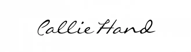
( Fonts by Callie Renee Roberson - www.CallieRenee.com )
A graceful script font with fluid, cursive strokes and a modern calligraphic style.
![CallieHand font caratteri gratis]() Scaricare 2916 Downloads@WebFont
Scaricare 2916 Downloads@WebFont -
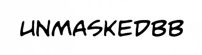
( Fonts by www.blambot.com )
A playful, casual handwritten font with smooth, rounded strokes.
![UnmaskedBB font caratteri gratis]() Scaricare 2916 Downloads@WebFont
Scaricare 2916 Downloads@WebFont -
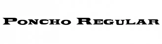
![Poncho Regular font caratteri gratis]() Scaricare 2916 Downloads@WebFont
Scaricare 2916 Downloads@WebFont -
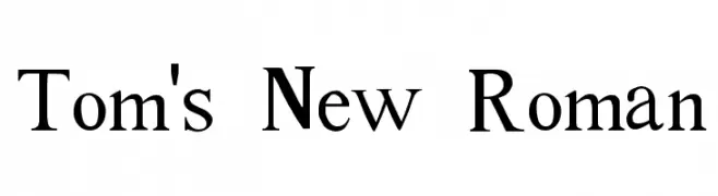
( Fonts by Divide By Zero! - fonts.tom7.com )
A classic serif font with elegant, traditional letterforms and moderate contrast.
![Tom's New Roman font caratteri gratis]() Scaricare 2915 Downloads@WebFont
Scaricare 2915 Downloads@WebFont -
( Google Web Fonts )
A modern yet vintage font with tall, narrow letterforms and rounded edges.
![MedulaOne-Regular font caratteri gratis]() Scaricare 2914 Downloads@WebFont
Scaricare 2914 Downloads@WebFont -
( Fonts by Blue Vinyl - Jess Latham - www.bvfonts.com )
A bold, playful font with rounded, outlined characters and a cartoon-like style.
![Disko font caratteri gratis]() Scaricare 2914 Downloads@WebFont
Scaricare 2914 Downloads@WebFont -
![Dyer font caratteri gratis]() Scaricare 2914 Downloads@WebFont
Scaricare 2914 Downloads@WebFont -
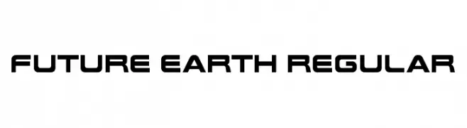
![Future Earth Regular font caratteri gratis]() Scaricare 2912 Downloads@WebFont
Scaricare 2912 Downloads@WebFont -
( Fonts by www.creatingkeepsakes.com )
A playful, casual handwritten font with dynamic strokes and charming flourishes.
![CK Becky font caratteri gratis]() Scaricare 2912 Downloads@WebFont
Scaricare 2912 Downloads@WebFont -
( A font by Jos Buivenga (exljbris) -> www.exljbris.com )
A classic serif font with elegant curves and balanced stroke contrast.
![Tallys font caratteri gratis]() Scaricare 2912 Downloads@WebFont
Scaricare 2912 Downloads@WebFont -
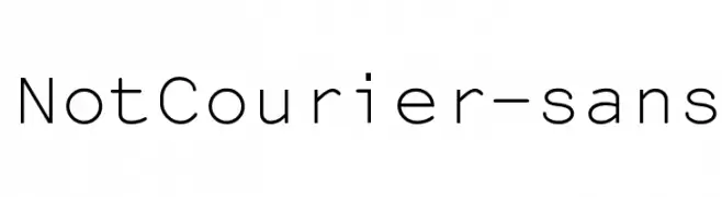
![NotCourier-sans font caratteri gratis]() Scaricare 2912 Downloads@WebFont
Scaricare 2912 Downloads@WebFont -
( Fonts by Roman Gornitsky - Personal-use only. For commercial use please contact owner. )
A modern, bold sans-serif font with clean lines and uniform strokes.
![VremenaGroteskMedium font caratteri gratis]() Scaricare 2911 Downloads@WebFont
Scaricare 2911 Downloads@WebFont


Quali sono i font più popolari adesso?
Poppins, Roboto, Montserrat, Open Sans e Lato sono molto usati per le forme pulite e l'ampia applicabilità — dall'identità di marca alle landing page e ai poster.
Quali font si usano spesso nei loghi?
Le sans serif geometriche (es. Poppins, famiglie in stile Gotham) sono scelte comuni per un branding pulito e scalabile. Per un tocco personale restano valide script e stili manoscritti. Abbina un display deciso per i titoli a un corpo testo neutro per riconoscibilità ed equilibrio.
Ogni quanto si aggiorna la lista?
Con regolarità, in base ai download e all'attività reale. Torna spesso per scoprire in anticipo le nuove preferite.
💡 Consiglio: aggiungi ai preferiti — le tendenze cambiano in fretta e i font top di oggi possono ispirare il rebranding di domani.