Benvenuto nelle Font Più Popolari — dove popolarità e qualità si incontrano. Qui trovi i font più scaricati e usati dell'anno. Se cerchi scelte sicure per logo, web o social, inizia da qui.
Ogni font top si distingue per equilibrio, leggibilità e versatilità. Troverai sans serif moderne, script eleganti, serif vintage e display minimalisti.
-
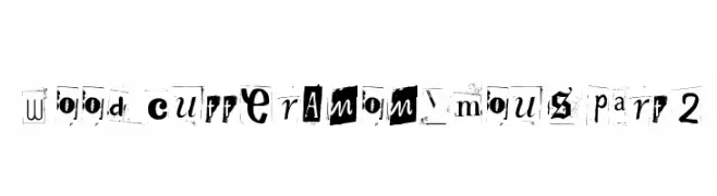
( www.woodcutter.es )
A collage-style font with a mix of eclectic and distressed characters.
 Scaricare 197 Downloads@WebFont
 -
![Grafoman. font caratteri gratis]() Scaricare 197 Downloads
Scaricare 197 Downloads -
( Fonts by Khaidir Fajry - Personal-use only. For commercial use please contact owner. )
A playful, hand-drawn font with a whimsical and informal style.
![Bill & Jack font caratteri gratis]() Scaricare 197 Downloads@WebFont
Scaricare 197 Downloads@WebFont -
( Fonts by Manfred Klein - manfred-klein.ina-mar.com )
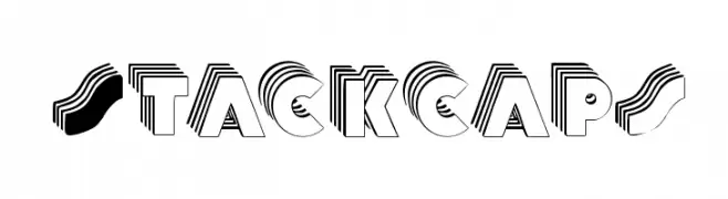
A bold, three-dimensional font with a layered, geometric style.
![Stackcaps font caratteri gratis]() Scaricare 197 Downloads@WebFont
Scaricare 197 Downloads@WebFont -
( Fonts by a Max Infeld - XEROGRAPHER FONTS - xerographer.blogspot.com . Personal-use only. For commercial use please contact owner. )
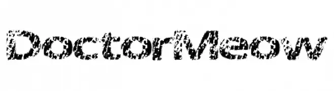
A textured, particle-like font with a dynamic and artistic style.
![DoctorMeow font caratteri gratis]() Scaricare 197 Downloads@WebFont
Scaricare 197 Downloads@WebFont -
![Grey Magus font caratteri gratis]() Scaricare 197 Downloads@WebFont
Scaricare 197 Downloads@WebFont -
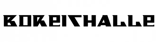
![BDReithalle font caratteri gratis]() Scaricare 197 Downloads@WebFont
Scaricare 197 Downloads@WebFont -
( Fonts by Peax Webdesign - www.peax-webdesign.com. Personal-use only. For commercial use please contact owner. )
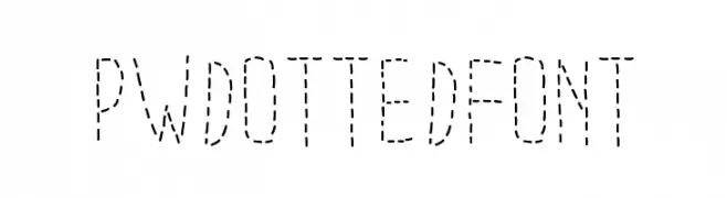
A dotted font with geometric, evenly spaced characters.
![PWDottedFont font caratteri gratis]() Scaricare 197 Downloads@WebFont
Scaricare 197 Downloads@WebFont -
( Qkila - Quentin Aquila - www.creativefabrica.com/designer/qkila/ )
A bold, dynamic script font with calligraphic influences and fluid strokes.
![Mirabelle font caratteri gratis]() Scaricare 197 Downloads@WebFont
Scaricare 197 Downloads@WebFont -
( Fonts by Apostrophic Lab )
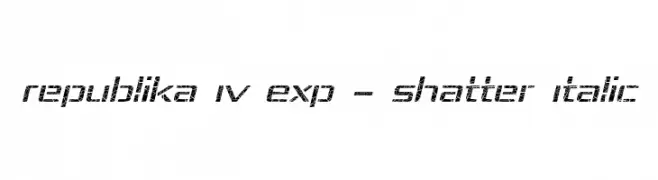
A dynamic, shattered-effect italic font with a modern and edgy style.
![Republika IV Exp - Shatter Italic font caratteri gratis]() Scaricare 197 Downloads@WebFont
Scaricare 197 Downloads@WebFont -
( Fonts by Daniel Zadorozny - www.iconian.com - Free for personal use )
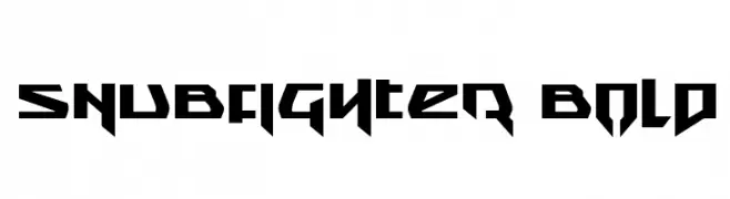
A bold, angular font with a futuristic and dynamic style.
![Snubfighter Bold font caratteri gratis]() Scaricare 197 Downloads@WebFont
Scaricare 197 Downloads@WebFont -
( Fonts by CannotIntoSpaceFonts - KineticPlasma Fonts - Personal-use only. For commercial use please contact owner. )
A bold, mechanical outline font with a modern industrial feel.
![Mechanical Outline font caratteri gratis]() Scaricare 197 Downloads@WebFont
Scaricare 197 Downloads@WebFont -
( Fonts by www.peter-wiegel.de. Personal-use only. For commercial use please contact owner. )
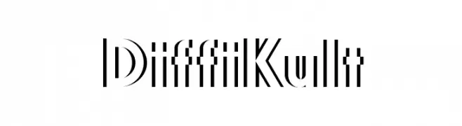
A bold, geometric font with a modern and dynamic style.
![DiffiKult font caratteri gratis]() Scaricare 197 Downloads@WebFont
Scaricare 197 Downloads@WebFont -
( Fonts by Stefie Justprince - https://shoppy.gg/@stefiejustprince- Personal-use only. For commercial use please contact owner. )
A modern, handwritten font with a casual and flowing style.
![Modern Guns font caratteri gratis]() Scaricare 197 Downloads@WebFont
Scaricare 197 Downloads@WebFont -
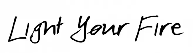
![Light Your Fire font caratteri gratis]() Scaricare 197 Downloads@WebFont
Scaricare 197 Downloads@WebFont -
( Fonts by www.floodfonts.com )
A chaotic, abstract font with irregular shapes and a graffiti-like style.
![BlendfontsIncpot font caratteri gratis]() Scaricare 197 Downloads@WebFont
Scaricare 197 Downloads@WebFont -
( Fonts by Apostrophic Lab )
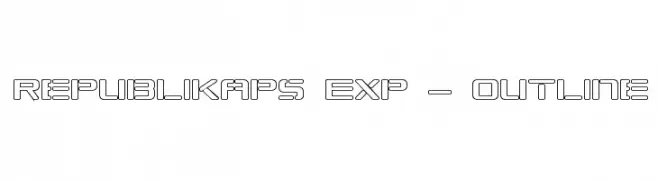
A modern, geometric outline font with a futuristic aesthetic.
![Republikaps Exp - Outline font caratteri gratis]() Scaricare 197 Downloads@WebFont
Scaricare 197 Downloads@WebFont -
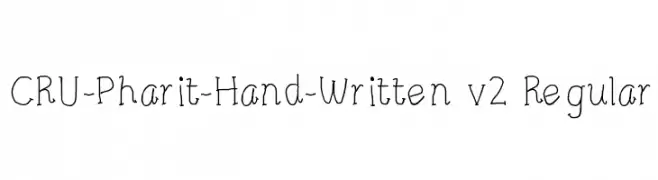
![CRU-Pharit-Hand-Written v2 Regular font caratteri gratis]() Scaricare 197 Downloads@WebFont
Scaricare 197 Downloads@WebFont -
( Fonts by Manfred Klein. Free for private and charity use. Free for commercial with donation to organizations )
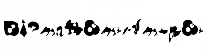
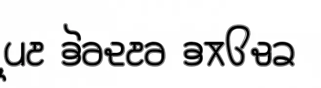
The image displays abstract circular designs, not a font.
![SchiessScheibeUndAuge font caratteri gratis]() Scaricare 197 Downloads@WebFont
Scaricare 197 Downloads@WebFont -
![ND_Urban II font caratteri gratis]() Scaricare 197 Downloads@WebFont
Scaricare 197 Downloads@WebFont -
Caratteri di JamboFonts. For commercial use please contact the owner.
![UptownElegance-Bold font caratteri gratis]() Scaricare 197 Downloads@WebFont
Scaricare 197 Downloads@WebFont -
( NimaVisual - Nima Visual - nimavisual.tumblr.com/ )
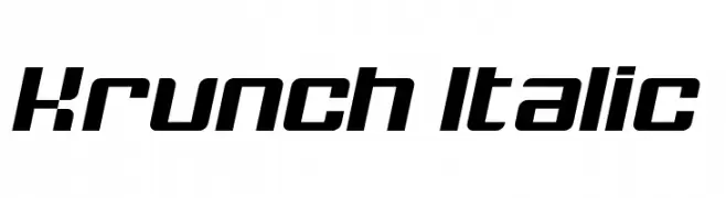
A bold, italic font with sharp angles and a modern, dynamic style.
![Krunch Italic font caratteri gratis]() Scaricare 197 Downloads@WebFont
Scaricare 197 Downloads@WebFont -
( Please check the owner website: http://www.billie.grosse.is-a-geek.com )
A bold, decorative font with a double-line effect and rounded, playful characters.
![Rupe Border Black font caratteri gratis]() Scaricare 197 Downloads@WebFont
Scaricare 197 Downloads@WebFont -
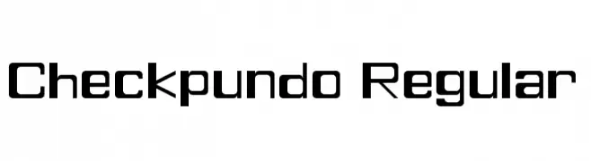
Caratteri di Piotrkovynia. For commercial use please contact the owner.
![Checkpundo Regular font caratteri gratis]() Scaricare 197 Downloads@WebFont
Scaricare 197 Downloads@WebFont -
( Fonts by Letterafa Studio - Ahmad Afandi - Personal-use only. For commercial use please contact owner. )
A playful, bold, and hand-drawn font with rounded edges and a friendly feel.
![We Love Mom - Personal Use Only font caratteri gratis]() Scaricare 197 Downloads@WebFont
Scaricare 197 Downloads@WebFont -
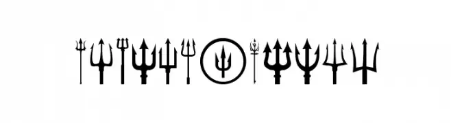
( Woodcutter - woodcutter Manero - www.woodcutter.es )
A display font composed entirely of diverse trident symbols.
![Black Trident font caratteri gratis]() Scaricare 197 Downloads@WebFont
Scaricare 197 Downloads@WebFont -
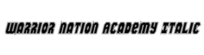
( Fonts by Daniel Zadorozny - www.iconian.com - Free for personal use )
A bold, angular, italic font with a dynamic, three-dimensional style.
![Warrior Nation Academy Italic font caratteri gratis]() Scaricare 197 Downloads@WebFont
Scaricare 197 Downloads@WebFont -
( Fonts by Vladimir Nikolic - www.creativefabrica.com/designer/vladimirnikolic/ - Personal-use only. For commercial use please contact owner. )
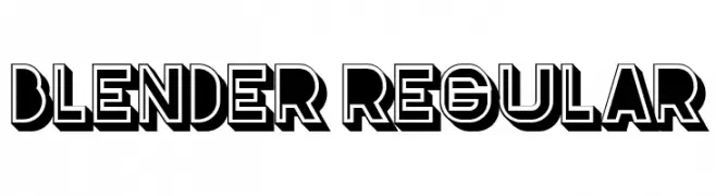
A bold, geometric font with a 3D effect and strong contrast, ideal for headlines.
![Blender Regular font caratteri gratis]() Scaricare 197 Downloads@WebFont
Scaricare 197 Downloads@WebFont -
( Fonts by Apostrophic Lab )
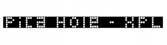
A pixelated, retro-style font with a blocky, geometric design.
![Pica Hole - XPL font caratteri gratis]() Scaricare 197 Downloads@WebFont
Scaricare 197 Downloads@WebFont -
( Fonts by Douglas Vitkauskas - www.vtksdesign.com. Personal-use only. For commercial use please contact owner. )
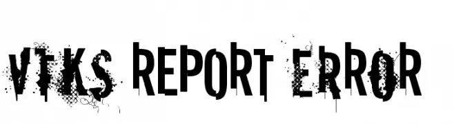
A bold, distressed font with a grunge aesthetic and splatter effects.
![vtks REPORT erRoR font caratteri gratis]() Scaricare 197 Downloads@WebFont
Scaricare 197 Downloads@WebFont -
( Fonts by Kreative Korporation - www.kreativekorp.com )
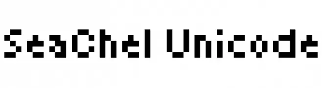
A pixelated, retro-style font with a blocky, digital appearance.
![SeaChel Unicode font caratteri gratis]() Scaricare 197 Downloads@WebFont
Scaricare 197 Downloads@WebFont -
![GiantTigers font caratteri gratis]() Scaricare 197 Downloads@WebFont
Scaricare 197 Downloads@WebFont -
( Fonts by DrawPerfect )
A playful, handwritten font with smooth, rounded edges and a casual style.
![FN Blocknote Hand font caratteri gratis]() Scaricare 197 Downloads@WebFont
Scaricare 197 Downloads@WebFont -
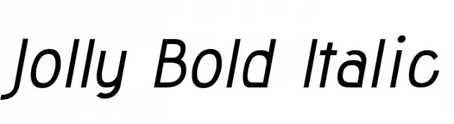
( Fonts by Lauren Thompson - www.nymfont.com )
Bold, italicized sans-serif font with a modern and dynamic style.
![Jolly Bold Italic font caratteri gratis]() Scaricare 197 Downloads@WebFont
Scaricare 197 Downloads@WebFont -
![Kelissa font caratteri gratis]() Scaricare 197 Downloads@WebFont
Scaricare 197 Downloads@WebFont


Quali sono i font più popolari adesso?
Poppins, Roboto, Montserrat, Open Sans e Lato sono molto usati per le forme pulite e l'ampia applicabilità — dall'identità di marca alle landing page e ai poster.
Quali font si usano spesso nei loghi?
Le sans serif geometriche (es. Poppins, famiglie in stile Gotham) sono scelte comuni per un branding pulito e scalabile. Per un tocco personale restano valide script e stili manoscritti. Abbina un display deciso per i titoli a un corpo testo neutro per riconoscibilità ed equilibrio.
Ogni quanto si aggiorna la lista?
Con regolarità, in base ai download e all'attività reale. Torna spesso per scoprire in anticipo le nuove preferite.
💡 Consiglio: aggiungi ai preferiti — le tendenze cambiano in fretta e i font top di oggi possono ispirare il rebranding di domani.