Benvenuto nelle Font Più Popolari — dove popolarità e qualità si incontrano. Qui trovi i font più scaricati e usati dell'anno. Se cerchi scelte sicure per logo, web o social, inizia da qui.
Ogni font top si distingue per equilibrio, leggibilità e versatilità. Troverai sans serif moderne, script eleganti, serif vintage e display minimalisti.
-
( Personal-use only. For commercial use please contact owner. )
A bold, geometric font with a modern and impactful design.
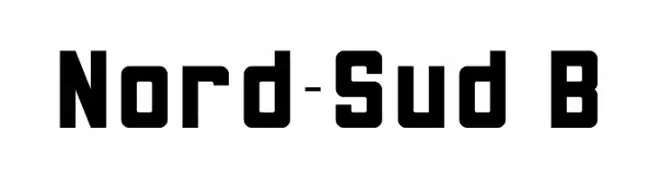 Scaricare 950 Downloads@WebFont
 -
( Fonts by Abdullah Arif - Personal-use only. For commercial use please contact owner. )
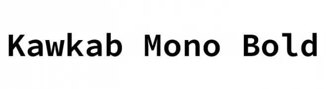
A bold, monospaced font with uniform character width and consistent stroke thickness.
![Kawkab Mono Bold font caratteri gratis]() Scaricare 950 Downloads@WebFont
Scaricare 950 Downloads@WebFont -
( Fonts by Woodcutter Manero - www.woodcutter.es - Personal-use only. For commercial use please contact owner. )
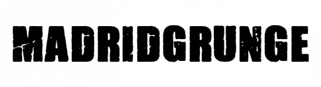
A bold, distressed font with a grunge aesthetic and textured, worn appearance.
![Madrid Grunge font caratteri gratis]() Scaricare 950 Downloads@WebFont
Scaricare 950 Downloads@WebFont -
( Fonts by Vít Čondák )
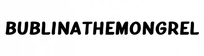
A playful, bold font with rounded, smooth letterforms.
![Bublina the Mongrel font caratteri gratis]() Scaricare 950 Downloads@WebFont
Scaricare 950 Downloads@WebFont -
( Fonts by Hanken Design Co. - Personal-use only. For commercial use please contact owner. )
A modern, geometric sans-serif font with clean lines and balanced spacing.
![NowAlt-Light font caratteri gratis]() Scaricare 950 Downloads@WebFont
Scaricare 950 Downloads@WebFont -
-
( Darrell Flood )
A bold, italic font with a dynamic and energetic style.
![Megabomb Italic font caratteri gratis]() Scaricare 950 Downloads@WebFont
Scaricare 950 Downloads@WebFont -
![TODA DEMO font caratteri gratis]() Scaricare 950 Downloads@WebFont
Scaricare 950 Downloads@WebFont -
( Fonts by CannotIntoSpaceFonts - KineticPlasma Fonts - Personal-use only. For commercial use please contact owner. )
A bold, oblique font with tight spacing and strong visual impact.
![Warsaw Gothic Oblique font caratteri gratis]() Scaricare 950 Downloads@WebFont
Scaricare 950 Downloads@WebFont -
( Fonts by www.legacyofdefeat.com )
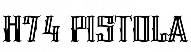
A bold, angular font with high contrast and dramatic style.
![H74 Pistola font caratteri gratis]() Scaricare 950 Downloads@WebFont
Scaricare 950 Downloads@WebFont -
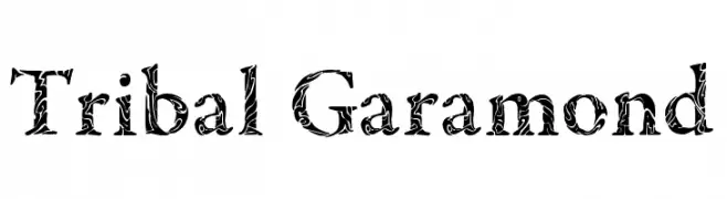
![Tribal Garamond font caratteri gratis]() Scaricare 950 Downloads@WebFont
Scaricare 950 Downloads@WebFont
Quali sono i font più popolari adesso?
Poppins, Roboto, Montserrat, Open Sans e Lato sono molto usati per le forme pulite e l'ampia applicabilità — dall'identità di marca alle landing page e ai poster.
Quali font si usano spesso nei loghi?
Le sans serif geometriche (es. Poppins, famiglie in stile Gotham) sono scelte comuni per un branding pulito e scalabile. Per un tocco personale restano valide script e stili manoscritti. Abbina un display deciso per i titoli a un corpo testo neutro per riconoscibilità ed equilibrio.
Ogni quanto si aggiorna la lista?
Con regolarità, in base ai download e all'attività reale. Torna spesso per scoprire in anticipo le nuove preferite.
💡 Consiglio: aggiungi ai preferiti — le tendenze cambiano in fretta e i font top di oggi possono ispirare il rebranding di domani.