Benvenuto nelle Font Più Popolari — dove popolarità e qualità si incontrano. Qui trovi i font più scaricati e usati dell'anno. Se cerchi scelte sicure per logo, web o social, inizia da qui.
Ogni font top si distingue per equilibrio, leggibilità e versatilità. Troverai sans serif moderne, script eleganti, serif vintage e display minimalisti.
-
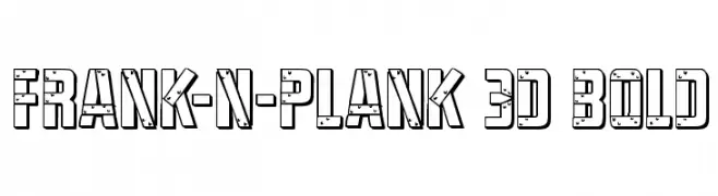
( Fonts by Daniel Zadorozny - www.iconian.com )
A bold, 3D decorative font with geometric shapes and textured details.
 Scaricare 192 Downloads@WebFont
 -
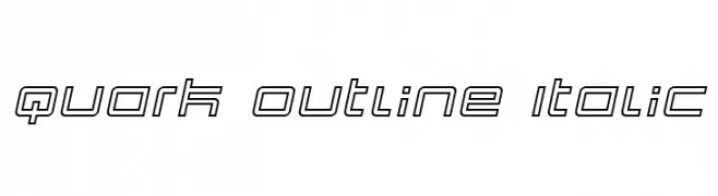
( Fonts by dustBUST - Andreas Nylin )
A modern, geometric outline font with an italic slant, ideal for futuristic designs.
![Quark Outline Italic font caratteri gratis]() Scaricare 192 Downloads@WebFont
Scaricare 192 Downloads@WebFont -
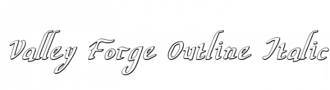
( Fonts by Daniel Zadorozny - www.iconian.com - Free for personal use )
An outlined, italic font with a cursive-like, elegant style.
![Valley Forge Outline Italic font caratteri gratis]() Scaricare 192 Downloads@WebFont
Scaricare 192 Downloads@WebFont -
![CRU-pantagarn font caratteri gratis]() Scaricare 192 Downloads@WebFont
Scaricare 192 Downloads@WebFont -
![ScooBats font caratteri gratis]() Scaricare 192 Downloads@WebFont
Scaricare 192 Downloads@WebFont -
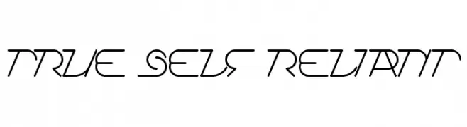
![True Self Reliant font caratteri gratis]() Scaricare 192 Downloads@WebFont
Scaricare 192 Downloads@WebFont -
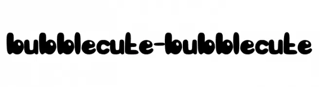
( Fonts by Andrean Prabowo )
A bold, rounded, and playful font with a whimsical style.
![bubblecute-bubblecute font caratteri gratis]() Scaricare 192 Downloads@WebFont
Scaricare 192 Downloads@WebFont -
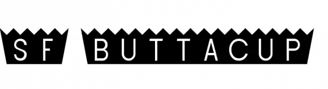
( Fonts by ShyFonts )
A bold, modern font with a unique zigzag pattern and geometric style.
![SF Buttacup font caratteri gratis]() Scaricare 192 Downloads@WebFont
Scaricare 192 Downloads@WebFont -
( Noto is a trademark of Google Inc. Noto fonts are open source. All Noto fonts are published under the SIL Open Font License, Version 1.1 )
A modern, condensed sans-serif font with a clean and balanced design.
![Noto Sans Hebrew Condensed font caratteri gratis]() Scaricare 192 Downloads@WebFont
Scaricare 192 Downloads@WebFont -
( Aulia Rahman - creativemarket.com/ARN )
A bold, dynamic script font with flowing, cursive letterforms.
![NeldaFree font caratteri gratis]() Scaricare 192 Downloads@WebFont
Scaricare 192 Downloads@WebFont -
![WideNoise font caratteri gratis]() Scaricare 192 Downloads@WebFont
Scaricare 192 Downloads@WebFont -
![CarrAstroDings font caratteri gratis]() Scaricare 192 Downloads
Scaricare 192 Downloads -
![Moronic Misfire BRK font caratteri gratis]() Scaricare 192 Downloads@WebFont
Scaricare 192 Downloads@WebFont -
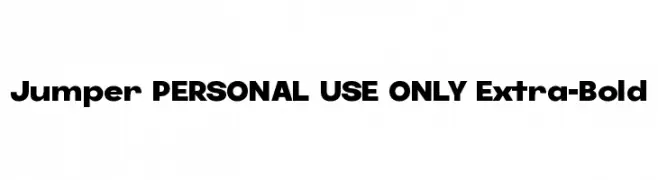
( Fonts by Mans Greback - Personal-use only. For commercial use please contact owner. )
A bold, modern font with thick, uniform strokes and geometric shapes.
![Jumper PERSONAL USE ONLY Extra-Bold font caratteri gratis]() Scaricare 192 Downloads@WebFont
Scaricare 192 Downloads@WebFont -
![Wesmo font caratteri gratis]() Scaricare 192 Downloads@WebFont
Scaricare 192 Downloads@WebFont -
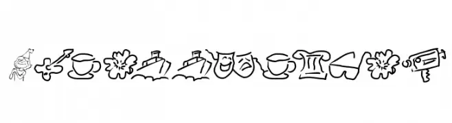
( Fonts by Manfred Klein. Free for private and charity use. Free for commercial with donation to organizations )
Hand-drawn pictogram font with playful, sketchy icons.
![Wacollection font caratteri gratis]() Scaricare 192 Downloads@WebFont
Scaricare 192 Downloads@WebFont -
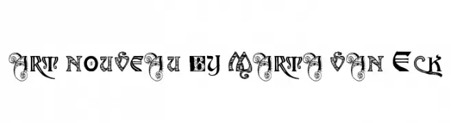
![art nouveau by Marta van Eck font caratteri gratis]() Scaricare 192 Downloads@WebFont
Scaricare 192 Downloads@WebFont -
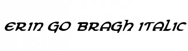
( Fonts by Daniel Zadorozny - www.iconian.com )
A bold, italic font with a calligraphic style and medium contrast.
![Erin Go Bragh Italic font caratteri gratis]() Scaricare 192 Downloads@WebFont
Scaricare 192 Downloads@WebFont -
Caratteri di Naharstd. For commercial use please contact the owner.
( NOTE: This demo font is for PERSONAL USE ONLY! But any donation are very appreciated. Please contact me before any commercial use. My fonts for free use allowed only in personal project , non-profit and charity use. If you make money from using my fonts )
A bold, modern script font with dynamic curves and elegant flourishes.
![Trackers font caratteri gratis]() Scaricare 192 Downloads@WebFont
Scaricare 192 Downloads@WebFont -
( Noto is a trademark of Google Inc. Noto fonts are open source. All Noto fonts are published under the SIL Open Font License, Version 1.1 )
The image shows missing glyphs or unsupported characters.
![Noto Serif Georgian Condensed font caratteri gratis]() Scaricare 192 Downloads@WebFont
Scaricare 192 Downloads@WebFont -
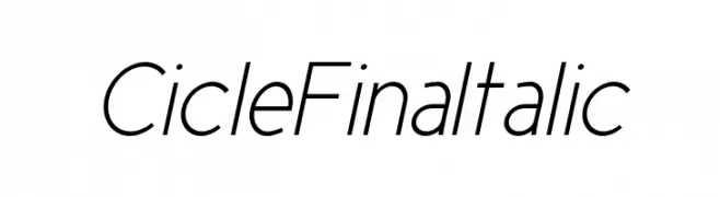
( Fonts by La Tipomatika )
A sleek, modern italic font with clean lines and subtle curves.
![CicleFinaItalic font caratteri gratis]() Scaricare 192 Downloads@WebFont
Scaricare 192 Downloads@WebFont -
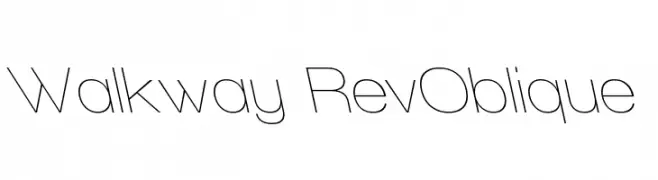
( Fonts by Graham Meade - GemFonts )
A sleek, modern oblique font with thin, elongated characters and a dynamic appearance.
![Walkway RevOblique font caratteri gratis]() Scaricare 192 Downloads@WebFont
Scaricare 192 Downloads@WebFont -
![Marnoc font caratteri gratis]() Scaricare 192 Downloads@WebFont
Scaricare 192 Downloads@WebFont -
![Blokada font caratteri gratis]() Scaricare 192 Downloads@WebFont
Scaricare 192 Downloads@WebFont -
![Minbus font caratteri gratis]() Scaricare 192 Downloads@WebFont
Scaricare 192 Downloads@WebFont -
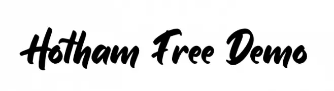
( Fonts by Ardyanatypes - Personal-use only. For commercial use please contact owner. )
A bold, dynamic script font with a handwritten, energetic style.
![Hotham Free Demo font caratteri gratis]() Scaricare 192 Downloads@WebFont
Scaricare 192 Downloads@WebFont -
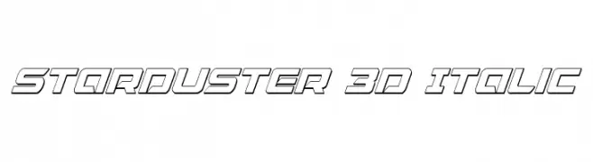
( Fonts by Daniel Zadorozny - www.iconian.com - Free for personal use )
A bold, 3D italic font with a futuristic and dynamic style.
![Starduster 3D Italic font caratteri gratis]() Scaricare 192 Downloads@WebFont
Scaricare 192 Downloads@WebFont -
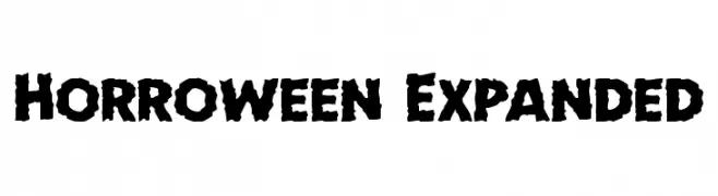
( Fonts by Daniel Zadorozny - www.iconian.com - Free for personal use )
A bold, jagged font with a horror-themed, distressed appearance.
![Horroween Expanded font caratteri gratis]() Scaricare 192 Downloads@WebFont
Scaricare 192 Downloads@WebFont -
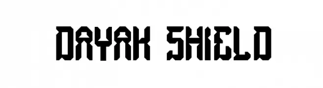
( Fonts by Wino S Kadir - weknow - www.revolge.com/shop/weknow/ - Personal-use only. For commercial use please contact owner. )
A bold, angular font with a geometric and tribal-inspired design.
![dayak shield font caratteri gratis]() Scaricare 192 Downloads@WebFont
Scaricare 192 Downloads@WebFont -
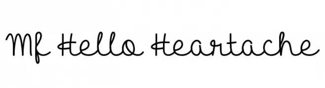
( Fonts by Misti`s Fonts - mistifonts.com - Personal-use only. For commercial use please contact owner. )
A playful, handwritten font with smooth, flowing lines and rounded edges.
![Mf Hello Heartache font caratteri gratis]() Scaricare 192 Downloads@WebFont
Scaricare 192 Downloads@WebFont -
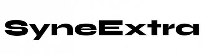
( Fonts by Bonjour Monde )
A bold, modern font with geometric shapes and strong visual impact.
![Syne Extra font caratteri gratis]() Scaricare 192 Downloads@WebFont
Scaricare 192 Downloads@WebFont -
( Fonts by Edric Studio www.creativefabrica.com/designer/edricstudio/ - Personal-use only. For commercial use please contact owner. )
A playful, balloon-inspired font with a three-dimensional, puffy appearance.
![BigBOBY Balloons font caratteri gratis]() Scaricare 192 Downloads@WebFont
Scaricare 192 Downloads@WebFont -
( Fonts by Edric Studio www.creativefabrica.com/designer/edricstudio/ - Personal-use only. For commercial use please contact owner. )
A bold, rounded font with smooth curves and a playful style.
![BigBOBY Rounded font caratteri gratis]() Scaricare 192 Downloads@WebFont
Scaricare 192 Downloads@WebFont -
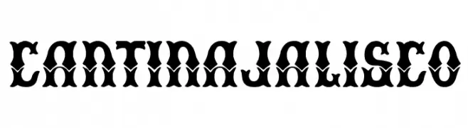
( Fonts by Woodcutter )
A bold, decorative font with intricate details and high contrast, perfect for dramatic visual impact.
![Cantina Jalisco font caratteri gratis]() Scaricare 192 Downloads@WebFont
Scaricare 192 Downloads@WebFont -
( Fonts by CannotIntoSpaceFonts - KineticPlasma Fonts - Personal-use only. For commercial use please contact owner. )
A bold, abstract font with fluid, camouflage-like shapes.
![Camo3 font caratteri gratis]() Scaricare 192 Downloads@WebFont
Scaricare 192 Downloads@WebFont


Quali sono i font più popolari adesso?
Poppins, Roboto, Montserrat, Open Sans e Lato sono molto usati per le forme pulite e l'ampia applicabilità — dall'identità di marca alle landing page e ai poster.
Quali font si usano spesso nei loghi?
Le sans serif geometriche (es. Poppins, famiglie in stile Gotham) sono scelte comuni per un branding pulito e scalabile. Per un tocco personale restano valide script e stili manoscritti. Abbina un display deciso per i titoli a un corpo testo neutro per riconoscibilità ed equilibrio.
Ogni quanto si aggiorna la lista?
Con regolarità, in base ai download e all'attività reale. Torna spesso per scoprire in anticipo le nuove preferite.
💡 Consiglio: aggiungi ai preferiti — le tendenze cambiano in fretta e i font top di oggi possono ispirare il rebranding di domani.