Benvenuto nelle Font Più Popolari — dove popolarità e qualità si incontrano. Qui trovi i font più scaricati e usati dell'anno. Se cerchi scelte sicure per logo, web o social, inizia da qui.
Ogni font top si distingue per equilibrio, leggibilità e versatilità. Troverai sans serif moderne, script eleganti, serif vintage e display minimalisti.
-
( گالری فانت فارسی پژوهش آريانا - only compatible with Farsi and Arabic )
A modern, geometric font with uniform stroke width and clear legibility.
 Scaricare 18103 Downloads@WebFont
 -
( Copyright 2010, 2012, 2014 Adobe Systems Incorporated (http://www.adobe.com/), with Reserved Font Name ‘Source’. )
A bold, modern sans-serif typeface with clean, uniform strokes.
![Source Sans Pro Black font caratteri gratis]() Scaricare 18084 Downloads@WebFont
Scaricare 18084 Downloads@WebFont -
![Pacifico font caratteri gratis]() Scaricare 18080 Downloads@WebFont
Scaricare 18080 Downloads@WebFont -
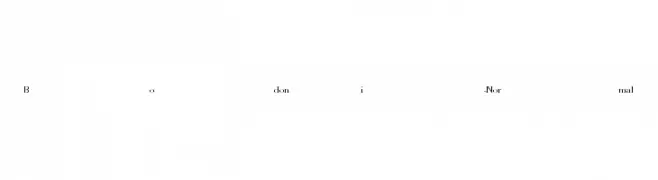
![Bodoni-Normal font caratteri gratis]() Scaricare 18063 Downloads
Scaricare 18063 Downloads -
![Poland Can Into Big Writings font caratteri gratis]() Scaricare 18044 Downloads@WebFont
Scaricare 18044 Downloads@WebFont -
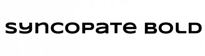
( Fonts by Astigmatic One Eye Typographic Institute - Brian J. Bonislawsky - astigmatic.com )
A bold, modern sans-serif font with clean lines and strong presence.
![Syncopate Bold font caratteri gratis]() Scaricare 18042 Downloads@WebFont
Scaricare 18042 Downloads@WebFont -
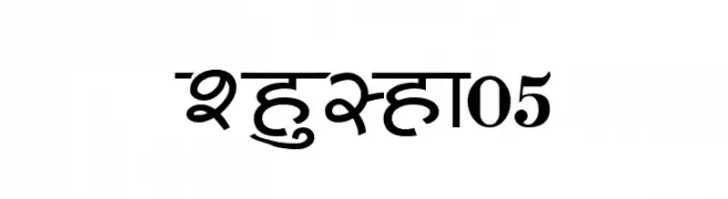
![Shusha05 font caratteri gratis]() Scaricare 18033 Downloads@WebFont
Scaricare 18033 Downloads@WebFont -
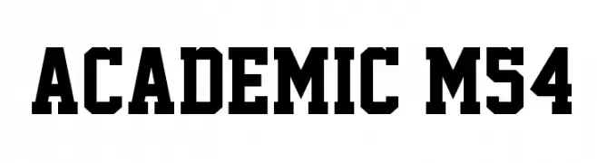
( Fonts by Mohammed Rahman )
A bold, geometric font with a strong, authoritative presence.
![Academic M54 font caratteri gratis]() Scaricare 18028 Downloads@WebFont
Scaricare 18028 Downloads@WebFont -
![Interstate font caratteri gratis]() Scaricare 17985 Downloads@WebFont
Scaricare 17985 Downloads@WebFont -
( Fonts by Levi Halmos )
A bold, geometric font with a modern, futuristic style.
![Bitsumishi font caratteri gratis]() Scaricare 17980 Downloads@WebFont
Scaricare 17980 Downloads@WebFont -
![!!! Handwritingg 3 font caratteri gratis]() Scaricare 17963 Downloads@WebFont
Scaricare 17963 Downloads@WebFont -
![DV-TTYogeshEN Bold font caratteri gratis]() Scaricare 17954 Downloads@WebFont
Scaricare 17954 Downloads@WebFont -
( گالری فانت فارسی پژوهش آريانا - only compatible with Farsi and Arabic )
A classic serif font with elegant curves and pronounced serifs.
![Baanoo font caratteri gratis]() Scaricare 17945 Downloads@WebFont
Scaricare 17945 Downloads@WebFont -
( Fonts by www.typodermicfonts.com - Ray Larabie )
A bold, condensed sans-serif font with a modern and sleek design.
![SteelfishRg-Bold font caratteri gratis]() Scaricare 17927 Downloads@WebFont
Scaricare 17927 Downloads@WebFont -
![360 font caratteri gratis]() Scaricare 17913 Downloads@WebFont
Scaricare 17913 Downloads@WebFont -
( Fonts by developer.android.com )
A bold, modern sans-serif typeface with strong geometric shapes and high legibility.
![Roboto Black font caratteri gratis]() Scaricare 17906 Downloads@WebFont
Scaricare 17906 Downloads@WebFont -
( Copyright (c) 2012 by Brian J. Bonislawsky and Jim Lyles DBA Astigmatic )
A charming and elegant script font with smooth, flowing lines.
![GrandHotel-Regular font caratteri gratis]() Scaricare 17885 Downloads@WebFont
Scaricare 17885 Downloads@WebFont -
![Canterbury font caratteri gratis]() Scaricare 17876 Downloads
Scaricare 17876 Downloads -
( Fonts by a www.fontfabric.com. Personal-use only. For commercial use please contact owner. )
A bold, shadowed font ideal for striking headlines and decorative uses.
![BERNIERShade-Regular font caratteri gratis]() Scaricare 17869 Downloads@WebFont
Scaricare 17869 Downloads@WebFont -
( Fonts by Castcraft Software - opti.netii.net - check the website before use )
A cursive, brush-style font with a flowing, handwritten appearance.
![BrushScriptOpti-Regular font caratteri gratis]() Scaricare 17869 Downloads@WebFont
Scaricare 17869 Downloads@WebFont -
( Copyright 2014-2017 Indian Type Foundry (info@indiantypefoundry.com) )
A bold, modern sans-serif font with an italic style and strong visual impact.
![Poppins Black Italic font caratteri gratis]() Scaricare 17861 Downloads@WebFont
Scaricare 17861 Downloads@WebFont -
( Fonts by Jovanny Lemonad - typetype.ru - Personal-use only. For commercial use please contact owner. )
A flowing, cursive script font with smooth, rounded edges and connected characters.
![Magnolia-Script font caratteri gratis]() Scaricare 17850 Downloads@WebFont
Scaricare 17850 Downloads@WebFont -
( Copyright (c) 2010, Matt McInerney (matt@pixelspread.com) )
A bold, modern sans-serif font with a geometric design and excellent readability.
![Raleway ExtraBold font caratteri gratis]() Scaricare 17822 Downloads@WebFont
Scaricare 17822 Downloads@WebFont -
( Fonts by Marian Steinbach http://www.sendung.de/dinschablonierschrift/ )
A bold, geometric stencil font with industrial appeal.
![DIN Schablonierschrift font caratteri gratis]() Scaricare 17818 Downloads@WebFont
Scaricare 17818 Downloads@WebFont -
( Fonts by www.stereo-type.net )
A modern, geometric sans-serif font with clean lines and uniform stroke width.
![Arrière Garde font caratteri gratis]() Scaricare 17813 Downloads@WebFont
Scaricare 17813 Downloads@WebFont -
( Fonts by JW )
A bold, brush-style font with dynamic and expressive strokes.
![aaaiight! font caratteri gratis]() Scaricare 17791 Downloads@WebFont
Scaricare 17791 Downloads@WebFont -
![Atlantic Inline-Normal font caratteri gratis]() Scaricare 17788 Downloads@WebFont
Scaricare 17788 Downloads@WebFont -
![MLB Blue Jays Vintage font caratteri gratis]() Scaricare 17735 Downloads@WebFont
Scaricare 17735 Downloads@WebFont -
Caratteri di HammerBro101. For commercial use please contact the owner.
![HelveticaNowText-ExtraBold font caratteri gratis]() Scaricare 17720 Downloads@WebFont
Scaricare 17720 Downloads@WebFont -
![kitty sweety font caratteri gratis]() Scaricare 17715 Downloads@WebFont
Scaricare 17715 Downloads@WebFont -
![Khmer OS Siemreap font caratteri gratis]() Scaricare 17696 Downloads@WebFont
Scaricare 17696 Downloads@WebFont -
![Orion Esperanto Dika font caratteri gratis]() Scaricare 17689 Downloads
Scaricare 17689 Downloads -
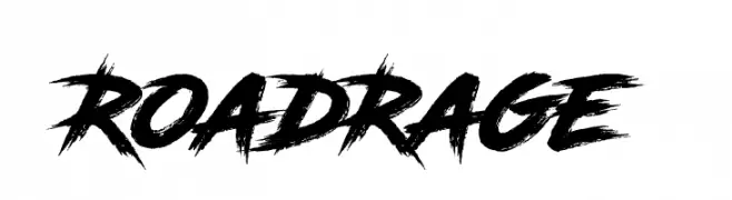
![RoadRage font caratteri gratis]() Scaricare 17663 Downloads@WebFont
Scaricare 17663 Downloads@WebFont -
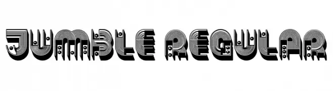
( Fonts by Vladimir Nikolic )
A bold, decorative font with geometric shapes and intricate patterns.
![Jumble Regular font caratteri gratis]() Scaricare 17657 Downloads@WebFont
Scaricare 17657 Downloads@WebFont -
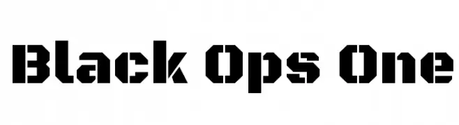
( Copyright (c) 2011 by Sorkin Type Co (www.sorkintype.com) )
A bold, geometric font with a military-inspired design.
![Black Ops One font caratteri gratis]() Scaricare 17642 Downloads@WebFont
Scaricare 17642 Downloads@WebFont


Quali sono i font più popolari adesso?
Poppins, Roboto, Montserrat, Open Sans e Lato sono molto usati per le forme pulite e l'ampia applicabilità — dall'identità di marca alle landing page e ai poster.
Quali font si usano spesso nei loghi?
Le sans serif geometriche (es. Poppins, famiglie in stile Gotham) sono scelte comuni per un branding pulito e scalabile. Per un tocco personale restano valide script e stili manoscritti. Abbina un display deciso per i titoli a un corpo testo neutro per riconoscibilità ed equilibrio.
Ogni quanto si aggiorna la lista?
Con regolarità, in base ai download e all'attività reale. Torna spesso per scoprire in anticipo le nuove preferite.
💡 Consiglio: aggiungi ai preferiti — le tendenze cambiano in fretta e i font top di oggi possono ispirare il rebranding di domani.