Benvenuto nelle Font Più Popolari — dove popolarità e qualità si incontrano. Qui trovi i font più scaricati e usati dell'anno. Se cerchi scelte sicure per logo, web o social, inizia da qui.
Ogni font top si distingue per equilibrio, leggibilità e versatilità. Troverai sans serif moderne, script eleganti, serif vintage e display minimalisti.
-
( Fonts by www.animuk.cz/adam )
A bold, geometric font with a modern and futuristic style.
 Scaricare 907 Downloads@WebFont
 -
( Fonts by Apostrophic Lab )
A bold, condensed sans-serif font with a modern and clean design.
![Florencesans Cond Bold font caratteri gratis]() Scaricare 907 Downloads@WebFont
Scaricare 907 Downloads@WebFont -
![Balcony Angels font caratteri gratis]() Scaricare 907 Downloads@WebFont
Scaricare 907 Downloads@WebFont -
( Fonts by www.DigitalDreamDesign.net )
A bold, geometric 3D font with a modern, industrial aesthetic.
![D3 Concretism typeB font caratteri gratis]() Scaricare 907 Downloads@WebFont
Scaricare 907 Downloads@WebFont -
( Fonts by Google - Personal-use only. For commercial use please contact owner. )
A bold, modern sans-serif font with clean lines and strong presence.
![Roberto Sans Bold font caratteri gratis]() Scaricare 906 Downloads@WebFont
Scaricare 906 Downloads@WebFont -
-
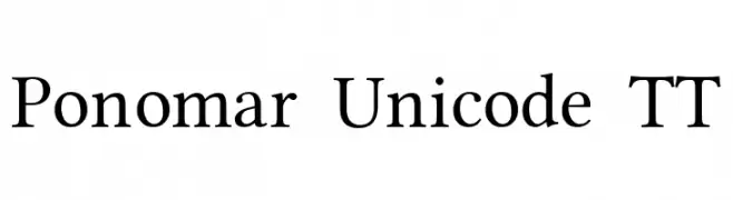
( Fonts by Vladislav V. Dorosh, Yuri A.W. Shardt, Nikita Simmons, Aleksandr Andreev - Personal-use only. For commercial use please contact owner. )
A classic serif font with elegant strokes and medium contrast, suitable for versatile applications.
![Ponomar Unicode TT font caratteri gratis]() Scaricare 906 Downloads@WebFont
Scaricare 906 Downloads@WebFont -
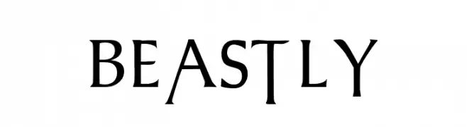
![BEASTLY font caratteri gratis]() Scaricare 906 Downloads@WebFont
Scaricare 906 Downloads@WebFont -
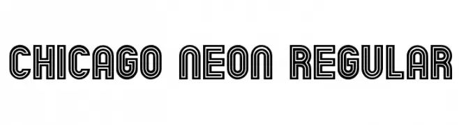
( Vladimir Nikolic - www.coroflot.com/vladimirnikolic )
A bold, geometric font with a neon-like outline, perfect for retro and modern designs.
![Chicago Neon Regular font caratteri gratis]() Scaricare 906 Downloads@WebFont
Scaricare 906 Downloads@WebFont -
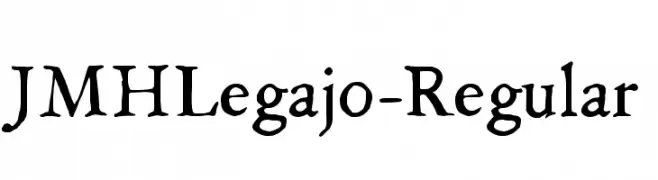
![JMHLegajo-Regular font caratteri gratis]() Scaricare 906 Downloads@WebFont
Scaricare 906 Downloads@WebFont -
( Fonts by Castcraft Software - OPTI Fonts Archive - opti.netii.net - Personal-use only. For commercial use please contact owner. )
An elegant, italic serif font with moderate contrast and a dynamic style.
![OPTINonoy-MediumItalic font caratteri gratis]() Scaricare 906 Downloads@WebFont
Scaricare 906 Downloads@WebFont


Quali sono i font più popolari adesso?
Poppins, Roboto, Montserrat, Open Sans e Lato sono molto usati per le forme pulite e l'ampia applicabilità — dall'identità di marca alle landing page e ai poster.
Quali font si usano spesso nei loghi?
Le sans serif geometriche (es. Poppins, famiglie in stile Gotham) sono scelte comuni per un branding pulito e scalabile. Per un tocco personale restano valide script e stili manoscritti. Abbina un display deciso per i titoli a un corpo testo neutro per riconoscibilità ed equilibrio.
Ogni quanto si aggiorna la lista?
Con regolarità, in base ai download e all'attività reale. Torna spesso per scoprire in anticipo le nuove preferite.
💡 Consiglio: aggiungi ai preferiti — le tendenze cambiano in fretta e i font top di oggi possono ispirare il rebranding di domani.