Benvenuto nelle Font Più Popolari — dove popolarità e qualità si incontrano. Qui trovi i font più scaricati e usati dell'anno. Se cerchi scelte sicure per logo, web o social, inizia da qui.
Ogni font top si distingue per equilibrio, leggibilità e versatilità. Troverai sans serif moderne, script eleganti, serif vintage e display minimalisti.
-
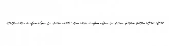
( Fonts by Graham Meade - GemFonts )
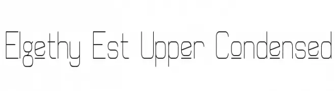
A modern, geometric font with a condensed and minimalist design.
 Scaricare 182 Downloads@WebFont
 -
( Fonts by Iconian Fonts )
A bold, 3D italic font with a dynamic and futuristic style.
![Funk Machine 3D Italic font caratteri gratis]() Scaricare 182 Downloads@WebFont
Scaricare 182 Downloads@WebFont -
( Fonts by Graham Meade - GemFonts )
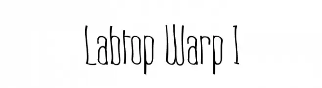
A tall, narrow, and quirky font with a hand-drawn feel.
![Labtop Warp 1 font caratteri gratis]() Scaricare 182 Downloads@WebFont
Scaricare 182 Downloads@WebFont -
( Fonts by Manfred Klein. Free for private and charity use. Free for commercial with donation to organizations )
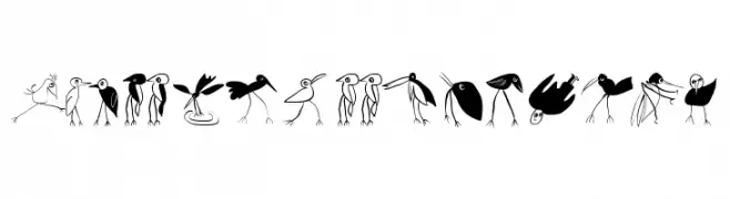
A collection of whimsical bird illustrations in various playful styles.
![Birds-Relaunch font caratteri gratis]() Scaricare 182 Downloads@WebFont
Scaricare 182 Downloads@WebFont -
( Fonts by MJType - Personal-use only. For commercial use please contact owner. )
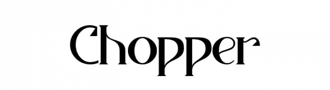
A modern serif font with sharp serifs and elegant curves, perfect for sophisticated designs.
![Chopper font caratteri gratis]() Scaricare 182 Downloads@WebFont
Scaricare 182 Downloads@WebFont -
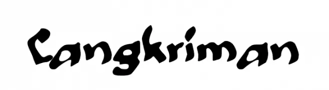
( Fonts by wep )
A bold, hand-drawn font with a playful and energetic style.
![Cangkriman font caratteri gratis]() Scaricare 182 Downloads@WebFont
Scaricare 182 Downloads@WebFont -
( Fonts by Daniel Zadorozny - www.iconian.com - Free for personal use )
A futuristic, angular font with sharp edges and geometric shapes.
![Spylord font caratteri gratis]() Scaricare 182 Downloads@WebFont
Scaricare 182 Downloads@WebFont -
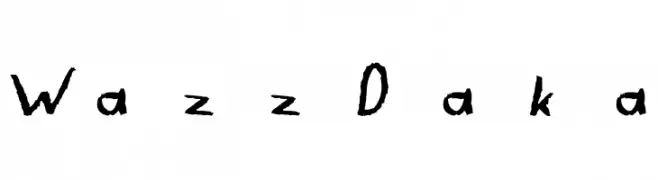
![WazzDaka font caratteri gratis]() Scaricare 182 Downloads@WebFont
Scaricare 182 Downloads@WebFont -
Caratteri di danny91194. For commercial use please contact the owner.
( tricky )
A playful and whimsical collection of hand-drawn doodles.
![CreateDoodles font caratteri gratis]() Scaricare 182 Downloads@WebFont
Scaricare 182 Downloads@WebFont -
( Fonts by Letterena Studios )
A lively and expressive script font with fluid, dynamic strokes.
![Beauty Amalia font caratteri gratis]() Scaricare 182 Downloads@WebFont
Scaricare 182 Downloads@WebFont -
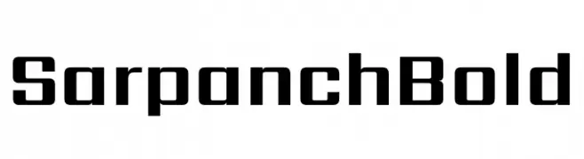
( Fonts by Indian Type Foundry )
A bold, geometric font with a modern and structured design.
![Sarpanch Bold font caratteri gratis]() Scaricare 182 Downloads@WebFont
Scaricare 182 Downloads@WebFont -
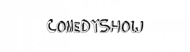
( Fonts by Xerographer Fonts )
A playful, hand-drawn font with bold, irregular outlines.
![ComedyShow font caratteri gratis]() Scaricare 182 Downloads@WebFont
Scaricare 182 Downloads@WebFont -
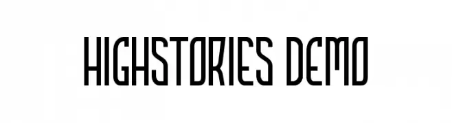
( mlkwsn - Malik Wisnu )
A tall, narrow, and geometric font with a modern aesthetic.
![HIGHSTORIES Demo font caratteri gratis]() Scaricare 182 Downloads@WebFont
Scaricare 182 Downloads@WebFont -
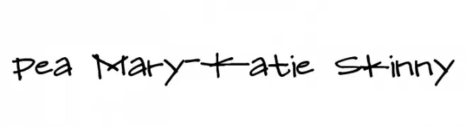
( Free for a personal use. For a commercial use please visit www.kevinandamanda.com )
A playful, handwritten font with a casual and informal style.
![Pea Mary-Katie Skinny font caratteri gratis]() Scaricare 182 Downloads@WebFont
Scaricare 182 Downloads@WebFont -
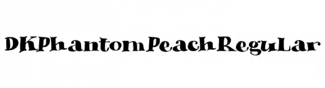
( Fonts by Hanoded )
A playful, spooky font with bold, irregular letterforms and thematic elements.
![DK Phantom Peach Regular font caratteri gratis]() Scaricare 182 Downloads@WebFont
Scaricare 182 Downloads@WebFont -
( Fonts by Kong Font )
A playful, rounded font with a hand-drawn feel and bold strokes.
![Pop Sunshine PERSONAL USE ONLY! font caratteri gratis]() Scaricare 182 Downloads@WebFont
Scaricare 182 Downloads@WebFont -
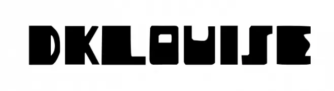
( Fonts by David Kerkhoff - www.hanodedphotography.com )
A bold, geometric font with sharp, angular characters.
![DKLouise font caratteri gratis]() Scaricare 182 Downloads@WebFont
Scaricare 182 Downloads@WebFont -
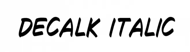
( Fonts by William Jeovah de Medeiros )
A bold, italicized handwritten font with a dynamic and casual style.
![Decalk Italic font caratteri gratis]() Scaricare 182 Downloads@WebFont
Scaricare 182 Downloads@WebFont -
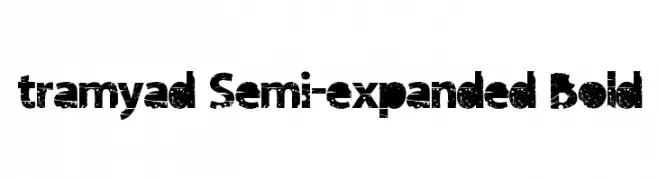
( www.loosydesign.com )
A bold, semi-expanded font with a distressed, grunge texture.
![tramyad Semi-expanded Bold font caratteri gratis]() Scaricare 182 Downloads@WebFont
Scaricare 182 Downloads@WebFont -
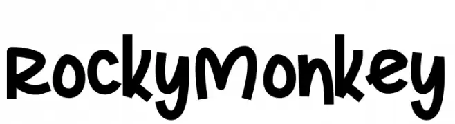
( Fonts by Letterena Studios )
A bold, playful font with rounded characters and a whimsical style.
![Rocky Monkey font caratteri gratis]() Scaricare 182 Downloads@WebFont
Scaricare 182 Downloads@WebFont -
( Fonts by www.omniglot.com )
A dynamic, abstract handwritten script with sharp angles and fluid curves.
![Avern font caratteri gratis]() Scaricare 182 Downloads@WebFont
Scaricare 182 Downloads@WebFont -
( گالری فانت فارسی پژوهش آريانا - only compatible with Farsi and Arabic )
A playful, dotted-line font perfect for creative projects.
![Tefl font caratteri gratis]() Scaricare 182 Downloads@WebFont
Scaricare 182 Downloads@WebFont -
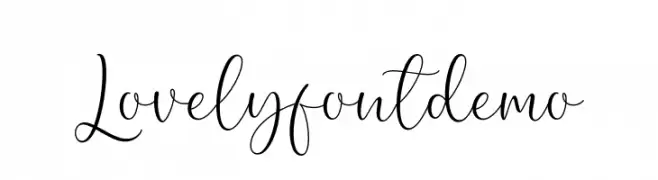
( Fonts by AV Type - Aldo Vesely - Personal-use only. For commercial use please contact owner. )
An elegant, flowing script font with graceful loops and a handwritten feel.
![Lovely font demo font caratteri gratis]() Scaricare 182 Downloads@WebFont
Scaricare 182 Downloads@WebFont -
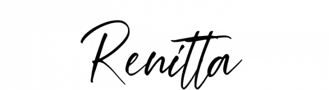
( Fonts by Hanzel Space - Personal-use only. For commercial use please contact owner. )
A fluid, cursive script font with a natural handwritten style.
![Renitta font caratteri gratis]() Scaricare 182 Downloads@WebFont
Scaricare 182 Downloads@WebFont -
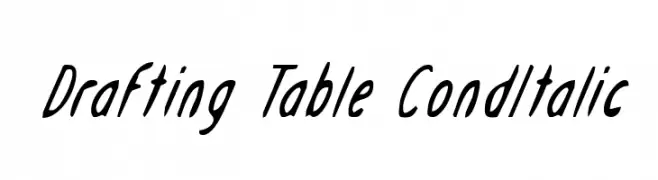
( Fonts by Daniel Zadorozny - www.iconian.com )
A modern, condensed italic font with medium contrast and sleek design.
![Drafting Table CondItalic font caratteri gratis]() Scaricare 182 Downloads@WebFont
Scaricare 182 Downloads@WebFont -
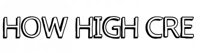
( Fonts by Fred Cre )
A bold, outlined font with a playful and dynamic style.
![how high cre font caratteri gratis]() Scaricare 182 Downloads@WebFont
Scaricare 182 Downloads@WebFont -
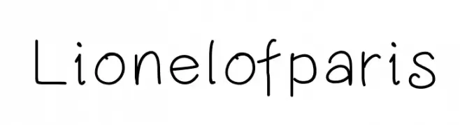
( Lionel Pailloncy - about.me/lionel.pailloncy )
A playful handwritten font with rounded, casual letterforms.
![Lionelofparis font caratteri gratis]() Scaricare 182 Downloads@WebFont
Scaricare 182 Downloads@WebFont -
![Ticky font font caratteri gratis]() Scaricare 182 Downloads@WebFont
Scaricare 182 Downloads@WebFont -
( Fonts by madeDeduk - Personal-use only. For commercial use please contact owner. )
A modern, elegant font with tall, slender letterforms and subtle curves.
![Hacky Light Demo Light font caratteri gratis]() Scaricare 182 Downloads@WebFont
Scaricare 182 Downloads@WebFont -
![UWJack8 font caratteri gratis]() Scaricare 182 Downloads@WebFont
Scaricare 182 Downloads@WebFont -
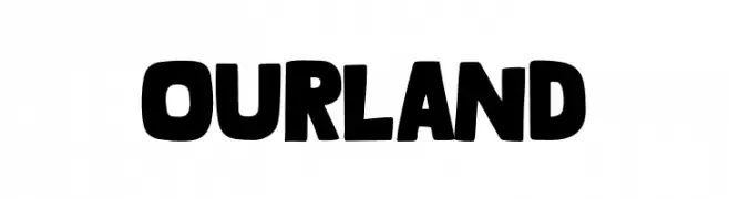
( Fonts by Khurasan )
A bold, rounded font with a playful and friendly style.
![Ourland font caratteri gratis]() Scaricare 182 Downloads@WebFont
Scaricare 182 Downloads@WebFont -
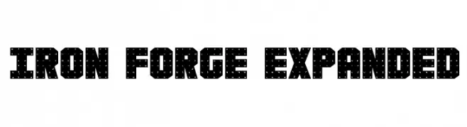
( Fonts by Daniel Zadorozny - www.iconian.com )
A bold, industrial font with a rugged, dotted texture and expanded width.
![Iron Forge Expanded font caratteri gratis]() Scaricare 182 Downloads@WebFont
Scaricare 182 Downloads@WebFont -
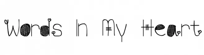
![Words In My Heart font caratteri gratis]() Scaricare 182 Downloads@WebFont
Scaricare 182 Downloads@WebFont -
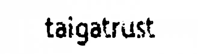
( bulgrin.de )
A rugged, distressed font with a hand-crafted, organic feel.
![Taigatrust font caratteri gratis]() Scaricare 182 Downloads@WebFont
Scaricare 182 Downloads@WebFont -
( Fonts by www.blambot.com )
A flowing, cursive font with an elegant, handwritten style.
![MumbleGrumbleIIBB font caratteri gratis]() Scaricare 182 Downloads@WebFont
Scaricare 182 Downloads@WebFont


Quali sono i font più popolari adesso?
Poppins, Roboto, Montserrat, Open Sans e Lato sono molto usati per le forme pulite e l'ampia applicabilità — dall'identità di marca alle landing page e ai poster.
Quali font si usano spesso nei loghi?
Le sans serif geometriche (es. Poppins, famiglie in stile Gotham) sono scelte comuni per un branding pulito e scalabile. Per un tocco personale restano valide script e stili manoscritti. Abbina un display deciso per i titoli a un corpo testo neutro per riconoscibilità ed equilibrio.
Ogni quanto si aggiorna la lista?
Con regolarità, in base ai download e all'attività reale. Torna spesso per scoprire in anticipo le nuove preferite.
💡 Consiglio: aggiungi ai preferiti — le tendenze cambiano in fretta e i font top di oggi possono ispirare il rebranding di domani.