Benvenuto nelle Font Più Popolari — dove popolarità e qualità si incontrano. Qui trovi i font più scaricati e usati dell'anno. Se cerchi scelte sicure per logo, web o social, inizia da qui.
Ogni font top si distingue per equilibrio, leggibilità e versatilità. Troverai sans serif moderne, script eleganti, serif vintage e display minimalisti.
-
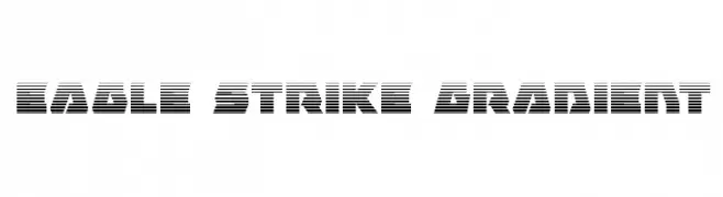
( Fonts by Daniel Zadorozny - www.iconian.com - Free for personal use )
A bold, futuristic font with a distinctive horizontal line pattern.
 Scaricare 180 Downloads@WebFont
 -
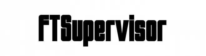
( Fonts by Fenotype - Emil Bertell - Personal-use only. For commercial use please contact owner. )
A bold, geometric font with thick strokes and tight spacing, perfect for impactful designs.
![FTSupervisor font caratteri gratis]() Scaricare 180 Downloads@WebFont
Scaricare 180 Downloads@WebFont -
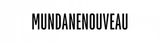
( Fonts by HENRIavecunK - Henrik - Personal-use only. For commercial use please contact owner. )
A tall, narrow, and modern font with clean lines and a cohesive style.
![Mundane Nouveau font caratteri gratis]() Scaricare 180 Downloads@WebFont
Scaricare 180 Downloads@WebFont -
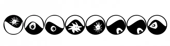
( Fonts by Manfred Klein. Free for private and charity use. Free for commercial with donation to organizations )
Decorative font with abstract eyeball motifs in circular forms.
![Eyeballs font caratteri gratis]() Scaricare 180 Downloads@WebFont
Scaricare 180 Downloads@WebFont -
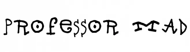
( SDFonts. http://www.angelfire.com/scifi2/sdfonts/index.html )
A whimsical and playful font with irregular, hand-drawn letterforms.
![Professor Mad font caratteri gratis]() Scaricare 180 Downloads@WebFont
Scaricare 180 Downloads@WebFont -
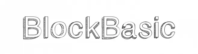
( GroovyJournal - www.groovyjournal.com )
A bold, outlined font with diagonal hatching for a playful yet structured look.
![BlockBasic font caratteri gratis]() Scaricare 180 Downloads@WebFont
Scaricare 180 Downloads@WebFont -
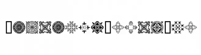
( Fonts by www.houseoflime.com )
Ornamental font with medieval motif designs.
![MedievalMotifTwo font caratteri gratis]() Scaricare 180 Downloads@WebFont
Scaricare 180 Downloads@WebFont -
( Fonts by dot colon )
A sleek, modern italic font with clean lines and excellent legibility.
![Aileron Italic font caratteri gratis]() Scaricare 180 Downloads@WebFont
Scaricare 180 Downloads@WebFont -
![iluvwritingsmall font caratteri gratis]() Scaricare 180 Downloads@WebFont
Scaricare 180 Downloads@WebFont -
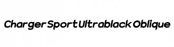
![Charger Sport Ultrablack Oblique font caratteri gratis]() Scaricare 180 Downloads@WebFont
Scaricare 180 Downloads@WebFont -
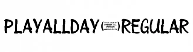
![Playallday-Regular font caratteri gratis]() Scaricare 180 Downloads@WebFont
Scaricare 180 Downloads@WebFont -
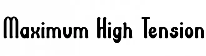
( Fonts by Wino S Kadir - weknow - www.revolge.com/shop/weknow/ - Personal-use only. For commercial use please contact owner. )
A bold, playful font with rounded edges and a modern, whimsical style.
![Maximum High Tension font caratteri gratis]() Scaricare 180 Downloads@WebFont
Scaricare 180 Downloads@WebFont -
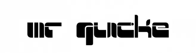
( Fonts by www.fenotype.com )
A bold, geometric font with a futuristic and digital aesthetic.
![Mr Quicke font caratteri gratis]() Scaricare 180 Downloads@WebFont
Scaricare 180 Downloads@WebFont -
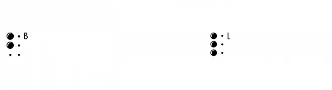
( Fonts by Manfred Klein - manfred-klein.ina-mar.com )
Braille is a tactile writing system for the visually impaired, using raised dots for characters.
![BrailleLatin font caratteri gratis]() Scaricare 180 Downloads@WebFont
Scaricare 180 Downloads@WebFont -
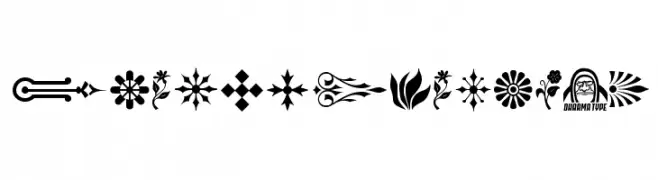
( This font are Copyrighted by Ryoichi Tsunekawa. www.dharmatype.com )
Ornamental gothic dingbat and border set with high detail.
![GothicExtras-B font caratteri gratis]() Scaricare 180 Downloads@WebFont
Scaricare 180 Downloads@WebFont -
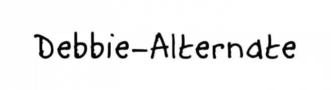
( Fonts by 123Print UK----www.123print.co.uk. Personal-use only. For commercial use please contact owner. )
A playful, handwritten font with irregular, organic strokes and a casual vibe.
![Debbie-Alternate font caratteri gratis]() Scaricare 180 Downloads@WebFont
Scaricare 180 Downloads@WebFont -
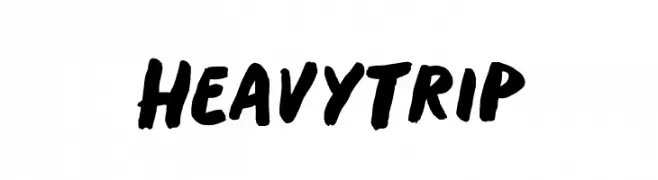
( Fonts by BLKBK - https://blkbk.ink - Personal-use only. For commercial use please contact owner. Commerciali Caratteri )
A bold, brush-style font with dynamic, handcrafted strokes.
![Heavy Trip font caratteri gratis]() Scaricare 180 Downloads
Scaricare 180 Downloads -
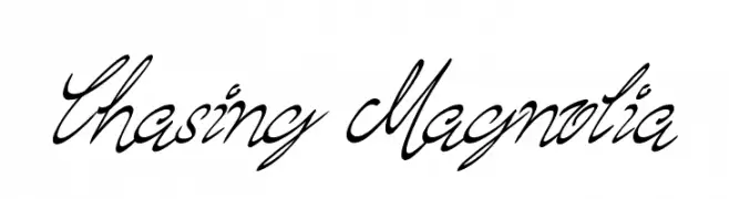
![Chasing Magnolia font caratteri gratis]() Scaricare 180 Downloads@WebFont
Scaricare 180 Downloads@WebFont -
( Fonts by CannotIntoSpaceFonts - KineticPlasma Fonts - Personal-use only. For commercial use please contact owner. )
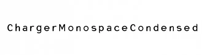
A modern, monospaced, and condensed font with a clean and uniform appearance.
![Charger Monospace Condensed font caratteri gratis]() Scaricare 180 Downloads@WebFont
Scaricare 180 Downloads@WebFont -
( Noto is a trademark of Google Inc. Noto fonts are open source. All Noto fonts are published under the SIL Open Font License, Version 1.1 )
The image shows placeholder symbols instead of a valid font.
![Noto Sans Thai Black font caratteri gratis]() Scaricare 180 Downloads@WebFont
Scaricare 180 Downloads@WebFont -
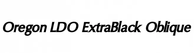
( Fonts by Luke Owens - Personal-use only. For commercial use please contact owner. )
A bold, oblique font with a dynamic and energetic style.
![Oregon LDO ExtraBlack Oblique font caratteri gratis]() Scaricare 180 Downloads@WebFont
Scaricare 180 Downloads@WebFont -
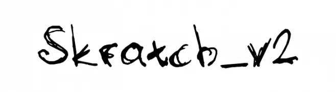
![Skratch_v2 font caratteri gratis]() Scaricare 180 Downloads@WebFont
Scaricare 180 Downloads@WebFont -
( Craft Supply Co. - creativemarket.com/craftsupplyco )
A modern, playful outline font with bold uppercase letters.
![DutchyFree-Outline font caratteri gratis]() Scaricare 180 Downloads@WebFont
Scaricare 180 Downloads@WebFont -
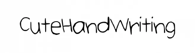
![CuteHandWriting font caratteri gratis]() Scaricare 180 Downloads@WebFont
Scaricare 180 Downloads@WebFont -
( Fonts by bob istheowl http://luc.devroye.org/bobistheowl.html )
Portrait-based decorative dingbat font with high-contrast illustrations.
![HaydenPanettiereBats demov1.5 font caratteri gratis]() Scaricare 180 Downloads@WebFont
Scaricare 180 Downloads@WebFont -
( Fonts by Rodrigo German - RASDESIGN )
Playful, illustrated character-based font with a quirky, hand-drawn style.
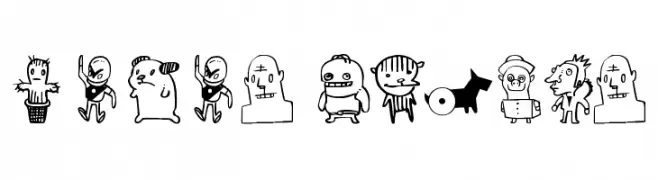
![monos frekis font caratteri gratis]() Scaricare 180 Downloads@WebFont
Scaricare 180 Downloads@WebFont -
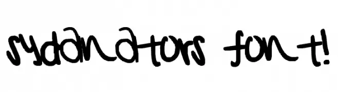
![sydanators font! font caratteri gratis]() Scaricare 180 Downloads@WebFont
Scaricare 180 Downloads@WebFont -
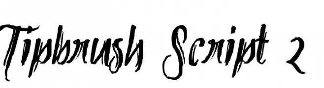
( Fonts by Mans Greback - www.mawns.com )
A bold, expressive brush script font with dynamic strokes and artistic flair.
![Tipbrush Script 2 font caratteri gratis]() Scaricare 180 Downloads@WebFont
Scaricare 180 Downloads@WebFont -
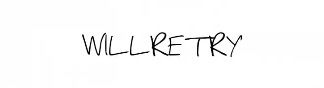
![WILLRETRY font caratteri gratis]() Scaricare 180 Downloads@WebFont
Scaricare 180 Downloads@WebFont -
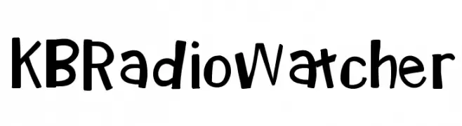
( www.teacherspayteachers.com/Store/Khrys-Bosland )
A playful, hand-drawn font with a whimsical and informal style.
![KBRadioWatcher font caratteri gratis]() Scaricare 180 Downloads@WebFont
Scaricare 180 Downloads@WebFont -
( Fonts by JoannaVu - https://ioannaladopoulou.design - Personal-use only. For commercial use please contact owner. )
A futuristic, angular font with a geometric and minimalistic style.
![Andromedaeclipsis font caratteri gratis]() Scaricare 180 Downloads@WebFont
Scaricare 180 Downloads@WebFont -
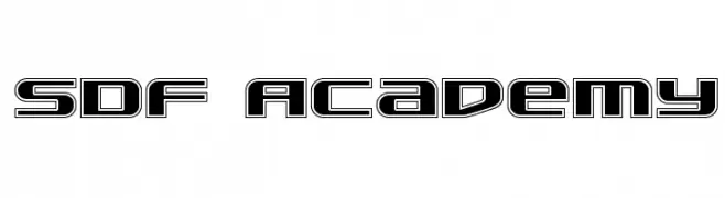
( Fonts by Daniel Zadorozny - www.iconian.com )
A bold, futuristic font with geometric outlines and sharp angles.
![SDF Academy font caratteri gratis]() Scaricare 180 Downloads@WebFont
Scaricare 180 Downloads@WebFont -
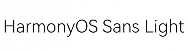
( Fonts by huawei.com - Personal-use only. For commercial use please contact owner. )
A modern, light, and clean sans-serif font with excellent readability.
![HarmonyOS Sans Light font caratteri gratis]() Scaricare 180 Downloads@WebFont
Scaricare 180 Downloads@WebFont -
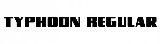
( Fonts by Daniel Zadorozny - www.iconian.com - Free for personal use )
A bold, geometric font with thick strokes and a modern, impactful design.
![Typhoon Regular font caratteri gratis]() Scaricare 180 Downloads@WebFont
Scaricare 180 Downloads@WebFont -
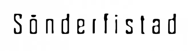
( Fonts by TarmSaft Font Factory - http://www.aska.nu/tarmsaft/ )
A handcrafted, artistic font with irregular shapes and bold contrasts.
![Sönderfistad font caratteri gratis]() Scaricare 180 Downloads@WebFont
Scaricare 180 Downloads@WebFont


Quali sono i font più popolari adesso?
Poppins, Roboto, Montserrat, Open Sans e Lato sono molto usati per le forme pulite e l'ampia applicabilità — dall'identità di marca alle landing page e ai poster.
Quali font si usano spesso nei loghi?
Le sans serif geometriche (es. Poppins, famiglie in stile Gotham) sono scelte comuni per un branding pulito e scalabile. Per un tocco personale restano valide script e stili manoscritti. Abbina un display deciso per i titoli a un corpo testo neutro per riconoscibilità ed equilibrio.
Ogni quanto si aggiorna la lista?
Con regolarità, in base ai download e all'attività reale. Torna spesso per scoprire in anticipo le nuove preferite.
💡 Consiglio: aggiungi ai preferiti — le tendenze cambiano in fretta e i font top di oggi possono ispirare il rebranding di domani.