Benvenuto nelle Font Più Popolari — dove popolarità e qualità si incontrano. Qui trovi i font più scaricati e usati dell'anno. Se cerchi scelte sicure per logo, web o social, inizia da qui.
Ogni font top si distingue per equilibrio, leggibilità e versatilità. Troverai sans serif moderne, script eleganti, serif vintage e display minimalisti.
-
 Scaricare 17628 Downloads@WebFont
 -
![Tecate font caratteri gratis]() Scaricare 17621 Downloads@WebFont
Scaricare 17621 Downloads@WebFont -
![101! BoXY 'Bet font caratteri gratis]() Scaricare 17616 Downloads@WebFont
Scaricare 17616 Downloads@WebFont -
![NBA Rockets font caratteri gratis]() Scaricare 17609 Downloads@WebFont
Scaricare 17609 Downloads@WebFont -
( Please check the owner website: http://www.billie.grosse.is-a-geek.com )
A fluid, handwritten script font with elegant curves and varying stroke thickness.
![GHW Dukandar font caratteri gratis]() Scaricare 17605 Downloads@WebFont
Scaricare 17605 Downloads@WebFont -
![Tanuki Permanent Marker font caratteri gratis]() Scaricare 17600 Downloads@WebFont
Scaricare 17600 Downloads@WebFont -
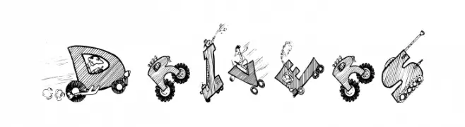
( Fonts by Manfred Klein - manfred-klein.ina-mar.com )
A whimsical, vehicle-themed decorative font with dynamic illustrations.
![Drivers font caratteri gratis]() Scaricare 17563 Downloads@WebFont
Scaricare 17563 Downloads@WebFont -
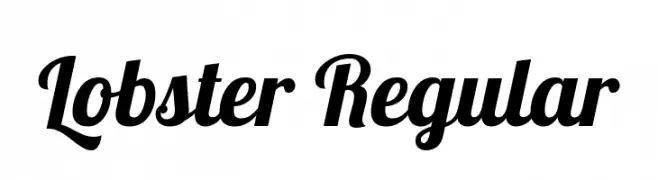
( Copyright 2010 The Lobster Project Authors (https://github.com/impallari/The-Lobster-Font), with Reserved Font Name "Lobster". )
A bold, flowing script font with modern elegance and playful sophistication.
![Lobster Regular font caratteri gratis]() Scaricare 17545 Downloads@WebFont
Scaricare 17545 Downloads@WebFont -
( Fonts by Roger White - www.rogersfonts.org.uk )
A modern, dotted font with a playful and geometric design.
![National First Font Dotted font caratteri gratis]() Scaricare 17533 Downloads@WebFont
Scaricare 17533 Downloads@WebFont -
![Manuscript font caratteri gratis]() Scaricare 17519 Downloads@WebFont
Scaricare 17519 Downloads@WebFont -
![GoldRush font caratteri gratis]() Scaricare 17517 Downloads@WebFont
Scaricare 17517 Downloads@WebFont -
( Paul Lloyd Fonts )
A bold, condensed font with high contrast and tight spacing, ideal for impactful designs.
![Shrewsbury-Condensed Bold font caratteri gratis]() Scaricare 17514 Downloads@WebFont
Scaricare 17514 Downloads@WebFont -
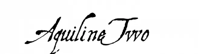
( Fonts by Manfred Klein - manfred-klein.ina-mar.com )
A flowing, cursive script font with elegant, calligraphic strokes.
![AquilineTwo font caratteri gratis]() Scaricare 17508 Downloads@WebFont
Scaricare 17508 Downloads@WebFont -
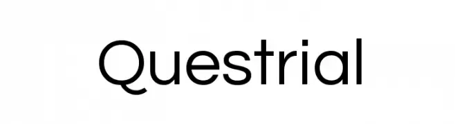
( Copyright (c) 2011, Admix Designs (http://www.admixdesigns.com/) with Reserved Font Name Questrial. )
A clean, modern sans-serif font with uniform stroke width and excellent readability.
![Questrial font caratteri gratis]() Scaricare 17484 Downloads@WebFont
Scaricare 17484 Downloads@WebFont -
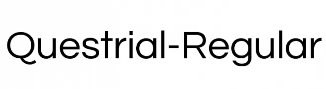
( Copyright (c) 2011, Admix Designs (http://www.admixdesigns.com/) with Reserved Font Name Questrial. )
A modern, clean sans-serif font with uniform stroke width and excellent readability.
![Questrial-Regular font caratteri gratis]() Scaricare 17481 Downloads@WebFont
Scaricare 17481 Downloads@WebFont -
Caratteri di LOMBAXRATCHET. For commercial use please contact the owner.
![Engschrift Caps font caratteri gratis]() Scaricare 17475 Downloads@WebFont
Scaricare 17475 Downloads@WebFont -
( Copyright 2010 The Bangers Project Authors (contact@sansoxygen.com) )
A bold, dynamic font with a playful, comic-like style.
![Bangers Regular font caratteri gratis]() Scaricare 17465 Downloads@WebFont
Scaricare 17465 Downloads@WebFont -
![VI Quan Tu font caratteri gratis]() Scaricare 17450 Downloads@WebFont
Scaricare 17450 Downloads@WebFont -
( Copyright 2014-2017 Indian Type Foundry (info@indiantypefoundry.com) )
A modern, italic sans-serif font with clean lines and geometric shapes.
![Poppins Italic font caratteri gratis]() Scaricare 17446 Downloads@WebFont
Scaricare 17446 Downloads@WebFont -
![Decker font caratteri gratis]() Scaricare 17444 Downloads@WebFont
Scaricare 17444 Downloads@WebFont -
( Fonts by Castcraft Software - opti.netii.net - check the website before use )
A modern, geometric font with bold, angular characters and a sleek appearance.
![OPTIBankGothic-Medium font caratteri gratis]() Scaricare 17440 Downloads@WebFont
Scaricare 17440 Downloads@WebFont -
![PallMallBold font caratteri gratis]() Scaricare 17423 Downloads@WebFont
Scaricare 17423 Downloads@WebFont -
( Copyright (c) 2011, TypeTogether (www.type-together.com) )
A bold, high-contrast serif font with elegant and dramatic strokes.
![AbrilFatface-Regular font caratteri gratis]() Scaricare 17419 Downloads@WebFont
Scaricare 17419 Downloads@WebFont -
![Subtitle font caratteri gratis]() Scaricare 17415 Downloads@WebFont
Scaricare 17415 Downloads@WebFont -
![Creepy Regular font caratteri gratis]() Scaricare 17413 Downloads@WebFont
Scaricare 17413 Downloads@WebFont -
![Slicker font caratteri gratis]() Scaricare 17406 Downloads
Scaricare 17406 Downloads -
![Wrexham Script font caratteri gratis]() Scaricare 17391 Downloads@WebFont
Scaricare 17391 Downloads@WebFont -
![Zelda font caratteri gratis]() Scaricare 17384 Downloads@WebFont
Scaricare 17384 Downloads@WebFont -
![RTL font caratteri gratis]() Scaricare 17371 Downloads@WebFont
Scaricare 17371 Downloads@WebFont -
![College Block font caratteri gratis]() Scaricare 17360 Downloads@WebFont
Scaricare 17360 Downloads@WebFont -
![Futurama Bold Font font caratteri gratis]() Scaricare 17355 Downloads@WebFont
Scaricare 17355 Downloads@WebFont -
![Anja Eliane font caratteri gratis]() Scaricare 17285 Downloads@WebFont
Scaricare 17285 Downloads@WebFont -
![Famous Label font caratteri gratis]() Scaricare 17274 Downloads@WebFont
Scaricare 17274 Downloads@WebFont -
( Fonts by Jacob Fisher - www.pizzadude.dk )
A sleek, modern font with geometric and minimalist design.
![7 days font caratteri gratis]() Scaricare 17260 Downloads@WebFont
Scaricare 17260 Downloads@WebFont -
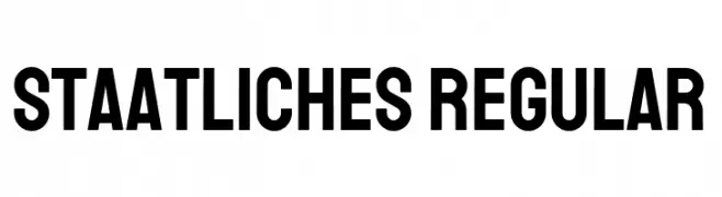
( Copyright 2018 The Staatliches Authors (https://github.com/googlefonts/staatliches) )
A bold, geometric sans-serif font with a modern and clean design.
![Staatliches Regular font caratteri gratis]() Scaricare 17251 Downloads@WebFont
Scaricare 17251 Downloads@WebFont


Quali sono i font più popolari adesso?
Poppins, Roboto, Montserrat, Open Sans e Lato sono molto usati per le forme pulite e l'ampia applicabilità — dall'identità di marca alle landing page e ai poster.
Quali font si usano spesso nei loghi?
Le sans serif geometriche (es. Poppins, famiglie in stile Gotham) sono scelte comuni per un branding pulito e scalabile. Per un tocco personale restano valide script e stili manoscritti. Abbina un display deciso per i titoli a un corpo testo neutro per riconoscibilità ed equilibrio.
Ogni quanto si aggiorna la lista?
Con regolarità, in base ai download e all'attività reale. Torna spesso per scoprire in anticipo le nuove preferite.
💡 Consiglio: aggiungi ai preferiti — le tendenze cambiano in fretta e i font top di oggi possono ispirare il rebranding di domani.