Benvenuto nelle Font Più Popolari — dove popolarità e qualità si incontrano. Qui trovi i font più scaricati e usati dell'anno. Se cerchi scelte sicure per logo, web o social, inizia da qui.
Ogni font top si distingue per equilibrio, leggibilità e versatilità. Troverai sans serif moderne, script eleganti, serif vintage e display minimalisti.
-
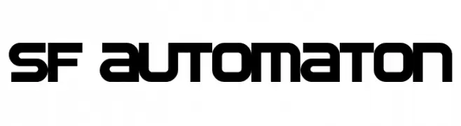
( Fonts by ShyFonts )
A futuristic, geometric font with bold, blocky letterforms and consistent stroke width.
 Scaricare 2760 Downloads@WebFont
 -
( Fonts by Paul Miller )
A playful, rounded font with a friendly and approachable style.
![Bainsley font caratteri gratis]() Scaricare 2759 Downloads@WebFont
Scaricare 2759 Downloads@WebFont -
![EA Logo Regular font caratteri gratis]() Scaricare 2759 Downloads@WebFont
Scaricare 2759 Downloads@WebFont -
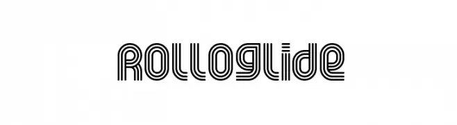
( Fonts by www.fontalicious.com )
A decorative, geometric font with parallel lines creating a modern, rhythmic look.
![Rolloglide font caratteri gratis]() Scaricare 2759 Downloads@WebFont
Scaricare 2759 Downloads@WebFont -
![N.O.- World [ChaneyBoldItalic] font caratteri gratis]() Scaricare 2759 Downloads@WebFont
Scaricare 2759 Downloads@WebFont -
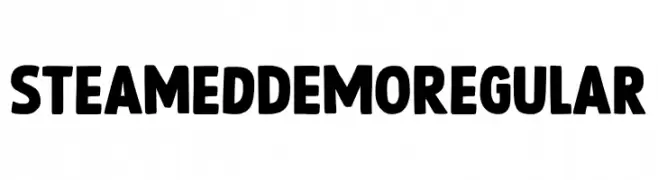
( Fonts by Hanoded )
A bold, playful font with thick, rounded characters and quirky symbols.
![Steamed DEMO Regular font caratteri gratis]() Scaricare 2758 Downloads@WebFont
Scaricare 2758 Downloads@WebFont -
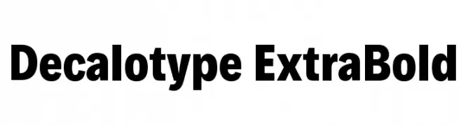
( Fonts by Hanken Design Co. - Personal-use only. For commercial use please contact owner. )
A bold, modern font with strong geometric forms and consistent weight.
![Decalotype ExtraBold font caratteri gratis]() Scaricare 2758 Downloads@WebFont
Scaricare 2758 Downloads@WebFont -
![ArTarumianAnpuit font caratteri gratis]() Scaricare 2758 Downloads@WebFont
Scaricare 2758 Downloads@WebFont -
![University Ex font caratteri gratis]() Scaricare 2758 Downloads@WebFont
Scaricare 2758 Downloads@WebFont -
( Fonts by dartcanada.tripod.com - Darren Rigby )
A modern, geometric sans-serif font with clean lines and uniform structure.
![Enigmatic Unicode Regular font caratteri gratis]() Scaricare 2757 Downloads
Scaricare 2757 Downloads -
( Fonts by yusukekamiyamane.com )
A bold, pixelated font with a retro digital aesthetic.
![PF Tempesta Five Compressed font caratteri gratis]() Scaricare 2757 Downloads@WebFont
Scaricare 2757 Downloads@WebFont -
( Copyright 2014 The Comic Neue Project Authors (https://github.com/crozynski/comicneue) )
A playful, bold, and italic typeface with a modern, friendly appearance.
![Comic Neue Bold Italic font caratteri gratis]() Scaricare 2756 Downloads@WebFont
Scaricare 2756 Downloads@WebFont -
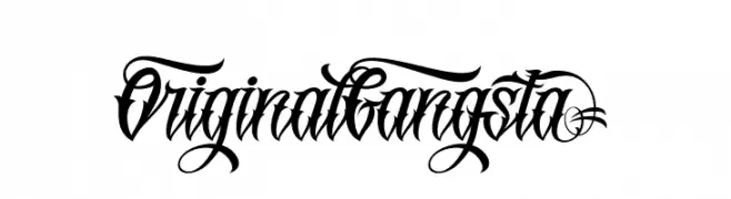
![OriginalGangstA font caratteri gratis]() Scaricare 2756 Downloads@WebFont
Scaricare 2756 Downloads@WebFont -
( Fonts by www.carrois.com )
A modern, clean typeface with balanced structure and smooth curves.
![Colaborate-Medium font caratteri gratis]() Scaricare 2756 Downloads@WebFont
Scaricare 2756 Downloads@WebFont -
( deFharo - Fernando Haro - defharo.com )
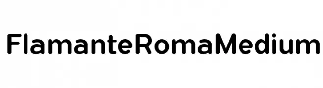
A modern sans-serif font with smooth curves and a balanced structure.
![FlamanteRomaMedium font caratteri gratis]() Scaricare 2755 Downloads@WebFont
Scaricare 2755 Downloads@WebFont -
( Fonts by prescottdesignshop.com - Personal-use only. For commercial use please contact owner. )
A sleek, modern font with clean lines and a geometric structure.
![PassionSansPDbe-BookSmallCaps font caratteri gratis]() Scaricare 2755 Downloads@WebFont
Scaricare 2755 Downloads@WebFont -
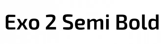
( Copyright (c) 2013, Natanael Gama (www.ndiscovered.com . info(at)ndiscovered.com), with Reserved Font Name 'Exo )
A modern, geometric sans-serif font with a clean and structured design.
![Exo 2 Semi Bold font caratteri gratis]() Scaricare 2755 Downloads@WebFont
Scaricare 2755 Downloads@WebFont -
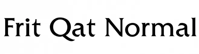
![Frit Qat Normal font caratteri gratis]() Scaricare 2755 Downloads
Scaricare 2755 Downloads -
![BLAST font caratteri gratis]() Scaricare 2755 Downloads@WebFont
Scaricare 2755 Downloads@WebFont -
![Cooper Black Italic BT font caratteri gratis]() Scaricare 2754 Downloads
Scaricare 2754 Downloads -
( Fonts by a AlterDeco Type Foundry - Adit Saputra. Personal-use only. For commercial use please contact owner. )
A bold, geometric font with Art Deco influences, perfect for striking headlines and logos.
![Dialog font caratteri gratis]() Scaricare 2753 Downloads@WebFont
Scaricare 2753 Downloads@WebFont -
( Fonts by backpacker.gr )
A modern, dotted font with a playful and minimalist design.
![BPdots-Light font caratteri gratis]() Scaricare 2753 Downloads@WebFont
Scaricare 2753 Downloads@WebFont -
![BrookmanSwash Bold font caratteri gratis]() Scaricare 2753 Downloads
Scaricare 2753 Downloads -
![Acryle Script Personal Use font caratteri gratis]() Scaricare 2752 Downloads@WebFont
Scaricare 2752 Downloads@WebFont -
![RMFlwrHt font caratteri gratis]() Scaricare 2752 Downloads@WebFont
Scaricare 2752 Downloads@WebFont -
![Rechtman-Script Medium font caratteri gratis]() Scaricare 2752 Downloads
Scaricare 2752 Downloads -
( FULL MOON Design House™ - Penta Gram - en.fmdh.rs )
An artistic, angular font with a gothic flair, perfect for dramatic designs.
![PentaGram s Salemica font caratteri gratis]() Scaricare 2751 Downloads@WebFont
Scaricare 2751 Downloads@WebFont -
![Dinova Black font caratteri gratis]() Scaricare 2751 Downloads@WebFont
Scaricare 2751 Downloads@WebFont -
( Cochocib Std - bit.ly/saffatinmyfonts )
A flowing, cursive script with elegant, sweeping strokes and a handwritten appearance.
![BarbequeFreeFont font caratteri gratis]() Scaricare 2750 Downloads@WebFont
Scaricare 2750 Downloads@WebFont -
![Radeon Regular font caratteri gratis]() Scaricare 2750 Downloads@WebFont
Scaricare 2750 Downloads@WebFont -
( Fonts by a www.fontfabric.com. Personal-use only. For commercial use please contact owner. )
A modern, geometric sans-serif font with uniform strokes and excellent readability.
![Track font caratteri gratis]() Scaricare 2750 Downloads@WebFont
Scaricare 2750 Downloads@WebFont -
![Dubiel font caratteri gratis]() Scaricare 2749 Downloads@WebFont
Scaricare 2749 Downloads@WebFont -
( Fonts by Castcraft Software - OPTI Fonts Archive - opti.netii.net - Personal-use only. For commercial use please contact owner. )
A classic serif font with elegant strokes and sharp serifs.
![OPTIRomanaRoman-Normal font caratteri gratis]() Scaricare 2748 Downloads@WebFont
Scaricare 2748 Downloads@WebFont -
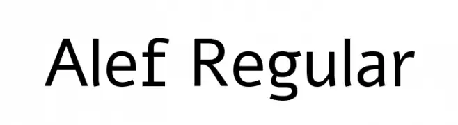
( Copyright (c) 2012, HaGilda & Mushon Zer-Aviv (
A clean, modern sans-serif typeface with balanced spacing and consistent stroke width.
![Alef Regular font caratteri gratis]() Scaricare 2748 Downloads@WebFont
Scaricare 2748 Downloads@WebFont -
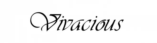
![Vivacious font caratteri gratis]() Scaricare 2748 Downloads
Scaricare 2748 Downloads

![N.O.- World [ChaneyBoldItalic] font caratteri gratis](https://d144mzi0q5mijx.cloudfront.net/img/N/0/NO-World-ChaneyBoldItalic.webp)


Quali sono i font più popolari adesso?
Poppins, Roboto, Montserrat, Open Sans e Lato sono molto usati per le forme pulite e l'ampia applicabilità — dall'identità di marca alle landing page e ai poster.
Quali font si usano spesso nei loghi?
Le sans serif geometriche (es. Poppins, famiglie in stile Gotham) sono scelte comuni per un branding pulito e scalabile. Per un tocco personale restano valide script e stili manoscritti. Abbina un display deciso per i titoli a un corpo testo neutro per riconoscibilità ed equilibrio.
Ogni quanto si aggiorna la lista?
Con regolarità, in base ai download e all'attività reale. Torna spesso per scoprire in anticipo le nuove preferite.
💡 Consiglio: aggiungi ai preferiti — le tendenze cambiano in fretta e i font top di oggi possono ispirare il rebranding di domani.