Benvenuto nelle Font Più Popolari — dove popolarità e qualità si incontrano. Qui trovi i font più scaricati e usati dell'anno. Se cerchi scelte sicure per logo, web o social, inizia da qui.
Ogni font top si distingue per equilibrio, leggibilità e versatilità. Troverai sans serif moderne, script eleganti, serif vintage e display minimalisti.
-
( Fonts by www.omniglot.com )
An ornate and decorative font with intricate curves and flourishes.
 Scaricare 888 Downloads@WebFont
 -
( Free for personal use )
A bold, geometric font with sharp angles and a modern look.
![journey Regular font caratteri gratis]() Scaricare 888 Downloads@WebFont
Scaricare 888 Downloads@WebFont -
( Copyright (c) 2011 by Brian J. Bonislawsky DBA Astigmatic (AOETI) )
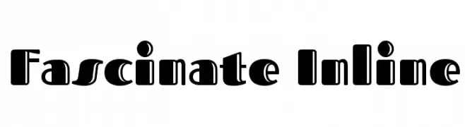
A bold, decorative font with unique inline details and a modern-retro style.
![Fascinate Inline font caratteri gratis]() Scaricare 888 Downloads@WebFont
Scaricare 888 Downloads@WebFont -
( Free for non-commercial use. For commercial use please buy a license. http://www.cape-arcona.com )
A bold, italicized font with a strong, modern presence.
![CAKissKissBangBang font caratteri gratis]() Scaricare 888 Downloads@WebFont
Scaricare 888 Downloads@WebFont -
![M+ 2m medium font caratteri gratis]() Scaricare 888 Downloads@WebFont
Scaricare 888 Downloads@WebFont -
-
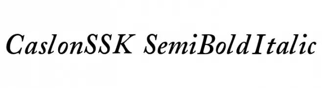
![CaslonSSK SemiBoldItalic font caratteri gratis]() Scaricare 888 Downloads@WebFont
Scaricare 888 Downloads@WebFont -
( Fonts by Christopher Hansen )
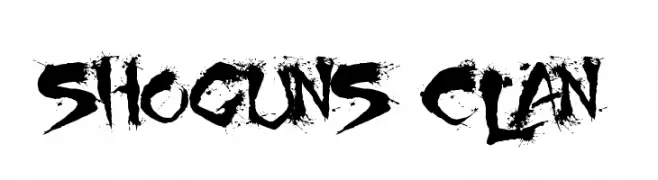
A bold, calligraphy-inspired font with sharp, angular strokes and ink splatter effects.
![Shoguns Clan font caratteri gratis]() Scaricare 888 Downloads@WebFont
Scaricare 888 Downloads@WebFont -
( Fonts by www.houseoflime.com )
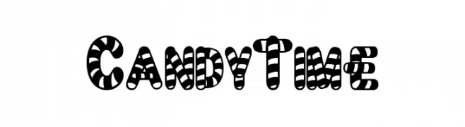
A bold, candy-striped font with a playful and festive style.
![CandyTime font caratteri gratis]() Scaricare 888 Downloads@WebFont
Scaricare 888 Downloads@WebFont -
( Fonts by Cooper Hewitt Smithsonian Design Museum )
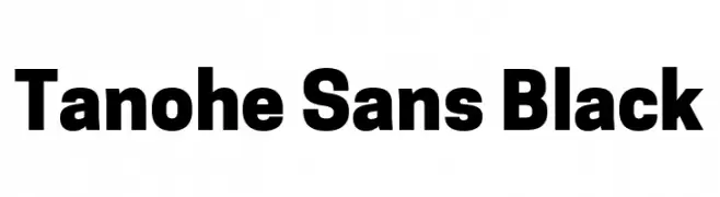
A bold, modern sans-serif font with strong, uniform strokes.
![Tanohe Sans Black font caratteri gratis]() Scaricare 887 Downloads@WebFont
Scaricare 887 Downloads@WebFont -
( Fonts by Graptail Type Studio - Personal-use only. For commercial use please contact owner. )
A bold, elegant serif font with high contrast and sharp serifs.
![Arastin Std FREE DEMO Regular font caratteri gratis]() Scaricare 887 Downloads@WebFont
Scaricare 887 Downloads@WebFont


Quali sono i font più popolari adesso?
Poppins, Roboto, Montserrat, Open Sans e Lato sono molto usati per le forme pulite e l'ampia applicabilità — dall'identità di marca alle landing page e ai poster.
Quali font si usano spesso nei loghi?
Le sans serif geometriche (es. Poppins, famiglie in stile Gotham) sono scelte comuni per un branding pulito e scalabile. Per un tocco personale restano valide script e stili manoscritti. Abbina un display deciso per i titoli a un corpo testo neutro per riconoscibilità ed equilibrio.
Ogni quanto si aggiorna la lista?
Con regolarità, in base ai download e all'attività reale. Torna spesso per scoprire in anticipo le nuove preferite.
💡 Consiglio: aggiungi ai preferiti — le tendenze cambiano in fretta e i font top di oggi possono ispirare il rebranding di domani.