Benvenuto nelle Font Più Popolari — dove popolarità e qualità si incontrano. Qui trovi i font più scaricati e usati dell'anno. Se cerchi scelte sicure per logo, web o social, inizia da qui.
Ogni font top si distingue per equilibrio, leggibilità e versatilità. Troverai sans serif moderne, script eleganti, serif vintage e display minimalisti.
-
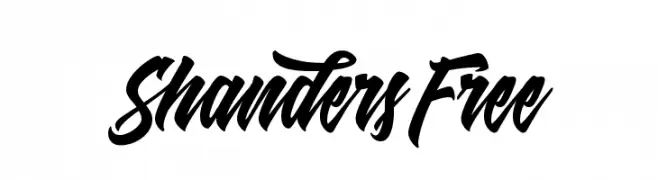
( Dirtyline Studio - Hendra Maulia - creativemarket.com/h_m )
A bold, cursive font with dynamic, flowing strokes and elegant flourishes.
 Scaricare 883 Downloads@WebFont
 -
( Fonts by John Webber - Personal-use only. For commercial use please contact owner. )
A bold, geometric font with a modern and clean aesthetic.
![Beer font caratteri gratis]() Scaricare 883 Downloads@WebFont
Scaricare 883 Downloads@WebFont -
( Copyright 2015 The Lemonada Project Authors (gaber@gaberism.net) )
A playful and modern script font with smooth, rounded strokes.
![Lemonada Regular font caratteri gratis]() Scaricare 883 Downloads@WebFont
Scaricare 883 Downloads@WebFont -
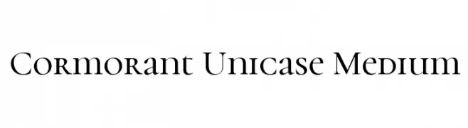
( Copyright (c) 2015, Christian Thalmann and the Cormorant Project Authors (github.com/CatharsisFonts/Cormorant) )
A sophisticated serif font with a unique unicase style and elegant design.
![Cormorant Unicase Medium font caratteri gratis]() Scaricare 883 Downloads@WebFont
Scaricare 883 Downloads@WebFont -
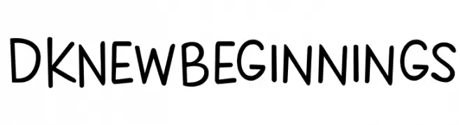
![DKNewBeginnings font caratteri gratis]() Scaricare 883 Downloads@WebFont
Scaricare 883 Downloads@WebFont -
-
( Fonts by Castcraft Software - opti.netii.net - check the website before use )
A light, modern serif font with elegant and refined characteristics.
![OPTIGleam-Light font caratteri gratis]() Scaricare 883 Downloads@WebFont
Scaricare 883 Downloads@WebFont -
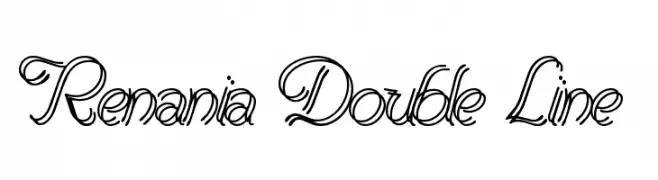
![Renania Double Line font caratteri gratis]() Scaricare 883 Downloads@WebFont
Scaricare 883 Downloads@WebFont -
( Fonts by www.tipometar.org )
A bold, classic serif font with strong strokes and elegant serifs.
![Resavska BG-Bold font caratteri gratis]() Scaricare 883 Downloads@WebFont
Scaricare 883 Downloads@WebFont -
( Copyright (c) 2011, Constanza Artigas Preller (artigasconstanza@gmail.com) )
A bold serif font with strong, thick strokes and a classic appearance.
![Inika Bold font caratteri gratis]() Scaricare 883 Downloads@WebFont
Scaricare 883 Downloads@WebFont -
( THESE ARE SHAREWARE FONTS ! NOT FREEWARE ! PLEASE VISIT www.fuelfonts.com )
A playful, bold font with rounded, bubble-like characters.
![Gummy font caratteri gratis]() Scaricare 883 Downloads@WebFont
Scaricare 883 Downloads@WebFont


Quali sono i font più popolari adesso?
Poppins, Roboto, Montserrat, Open Sans e Lato sono molto usati per le forme pulite e l'ampia applicabilità — dall'identità di marca alle landing page e ai poster.
Quali font si usano spesso nei loghi?
Le sans serif geometriche (es. Poppins, famiglie in stile Gotham) sono scelte comuni per un branding pulito e scalabile. Per un tocco personale restano valide script e stili manoscritti. Abbina un display deciso per i titoli a un corpo testo neutro per riconoscibilità ed equilibrio.
Ogni quanto si aggiorna la lista?
Con regolarità, in base ai download e all'attività reale. Torna spesso per scoprire in anticipo le nuove preferite.
💡 Consiglio: aggiungi ai preferiti — le tendenze cambiano in fretta e i font top di oggi possono ispirare il rebranding di domani.