Benvenuto nelle Font Più Popolari — dove popolarità e qualità si incontrano. Qui trovi i font più scaricati e usati dell'anno. Se cerchi scelte sicure per logo, web o social, inizia da qui.
Ogni font top si distingue per equilibrio, leggibilità e versatilità. Troverai sans serif moderne, script eleganti, serif vintage e display minimalisti.
-
( Fonts by Anton Chernogorov - Personal-use only. For commercial use please contact owner. )
A bold, condensed font with strong vertical emphasis and uniform width.
 Scaricare 874 Downloads@WebFont
 -
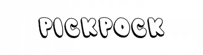
( Fonts by The Docallisme )
A playful, bold font with scalloped edges and a bubbly appearance.
![PICK POCK font caratteri gratis]() Scaricare 874 Downloads@WebFont
Scaricare 874 Downloads@WebFont -
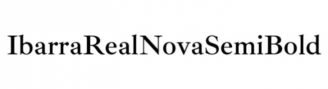
( Copyright 2007 The Ibarra Real Nova Project Authors (https://github.com/googlefonts/ibarrareal) )
A classic serif font with a semi-bold weight, offering elegance and readability.
![Ibarra Real Nova SemiBold font caratteri gratis]() Scaricare 874 Downloads@WebFont
Scaricare 874 Downloads@WebFont -
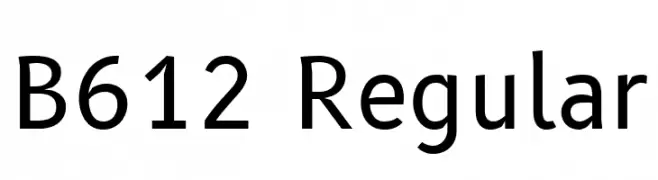
( Copyright 2012 The B612 Project Authors (https://github.com/polarsys/b612) )
A clean, modern sans-serif font with excellent readability and versatility.
![B612 Regular font caratteri gratis]() Scaricare 874 Downloads@WebFont
Scaricare 874 Downloads@WebFont -
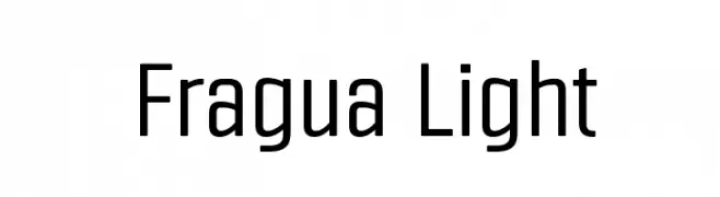
![Fragua Light font caratteri gratis]() Scaricare 874 Downloads@WebFont
Scaricare 874 Downloads@WebFont -
-
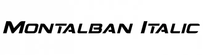
( Fonts by a Neale Davidson - www.pixelsagas.com. Personal-use only. For commercial use please contact owner. )
A modern, italicized font with bold strokes and a dynamic appearance.
![Montalban Italic font caratteri gratis]() Scaricare 874 Downloads@WebFont
Scaricare 874 Downloads@WebFont -
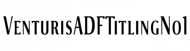
( Fonts by Arkandis Digital Foundry )
A classic serif font with elegant, refined letterforms and sharp serifs.
![VenturisADFTitlingNo1 font caratteri gratis]() Scaricare 874 Downloads@WebFont
Scaricare 874 Downloads@WebFont -
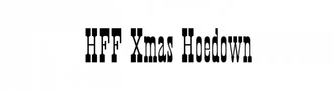
( Fonts by Have Fun with Fonts )
A bold, decorative font with a Western flair, ideal for headlines and themed designs.
![HFF Xmas Hoedown font caratteri gratis]() Scaricare 874 Downloads@WebFont
Scaricare 874 Downloads@WebFont -
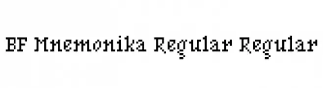
![BF Mnemonika Regular Regular font caratteri gratis]() Scaricare 874 Downloads@WebFont
Scaricare 874 Downloads@WebFont -
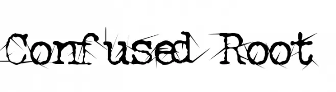
( Fonts by Abstract Type Design - Patrick Durr )
A chaotic, thorn-like decorative font with sharp, jagged embellishments.
![Confused Root font caratteri gratis]() Scaricare 874 Downloads@WebFont
Scaricare 874 Downloads@WebFont
Quali sono i font più popolari adesso?
Poppins, Roboto, Montserrat, Open Sans e Lato sono molto usati per le forme pulite e l'ampia applicabilità — dall'identità di marca alle landing page e ai poster.
Quali font si usano spesso nei loghi?
Le sans serif geometriche (es. Poppins, famiglie in stile Gotham) sono scelte comuni per un branding pulito e scalabile. Per un tocco personale restano valide script e stili manoscritti. Abbina un display deciso per i titoli a un corpo testo neutro per riconoscibilità ed equilibrio.
Ogni quanto si aggiorna la lista?
Con regolarità, in base ai download e all'attività reale. Torna spesso per scoprire in anticipo le nuove preferite.
💡 Consiglio: aggiungi ai preferiti — le tendenze cambiano in fretta e i font top di oggi possono ispirare il rebranding di domani.