Benvenuto nelle Font Più Popolari — dove popolarità e qualità si incontrano. Qui trovi i font più scaricati e usati dell'anno. Se cerchi scelte sicure per logo, web o social, inizia da qui.
Ogni font top si distingue per equilibrio, leggibilità e versatilità. Troverai sans serif moderne, script eleganti, serif vintage e display minimalisti.
-
( www.joseba.co.uk )
A bold, brush-style font with dynamic and expressive strokes.
 Scaricare 174 Downloads@WebFont
 -
( Roland Huse Design - Roland Huse - rolandhuse.com )
A fluid, elegant handwritten style with dynamic, connected characters.
![Jaspers Handwriting Regular font caratteri gratis]() Scaricare 174 Downloads@WebFont
Scaricare 174 Downloads@WebFont -
( Fonts by zep1903 )
A playful, handwritten font with rounded, consistent strokes and a casual aesthetic.
![Ruhma Font Regular font caratteri gratis]() Scaricare 174 Downloads@WebFont
Scaricare 174 Downloads@WebFont -
( Fonts by Daniel Zadorozny - www.iconian.com - Free for personal use )
A bold, 3D italic font with a modern, geometric design.
![Crixus 3D Italic font caratteri gratis]() Scaricare 174 Downloads@WebFont
Scaricare 174 Downloads@WebFont -
( Fonts by Tigadestd - Doli Harahap - Personal-use only. For commercial use please contact owner. )
A graceful and flowing script font with elegant, fluid letterforms.
![Jameela font caratteri gratis]() Scaricare 174 Downloads@WebFont
Scaricare 174 Downloads@WebFont -
( Typodermic Fonts - Ray Larabie - www.typodermicfonts.com/ )
A bold, italicized font with a modern, dynamic style.
![AthabascaExRg-BoldItalic font caratteri gratis]() Scaricare 174 Downloads@WebFont
Scaricare 174 Downloads@WebFont -
( Free for a personal use. For a commercial use please visit www.kevinandamanda.com )
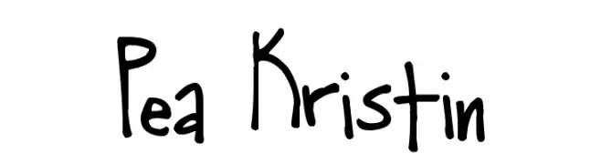
A playful, casual handwritten font with bold, irregular strokes.
![Pea Kristin font caratteri gratis]() Scaricare 174 Downloads@WebFont
Scaricare 174 Downloads@WebFont -
( Fonts by Manfred Klein - manfred-klein.ina-mar.com )
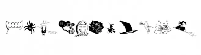
Halloween-themed dingbat font with whimsical illustrations.
![SpidersClub font caratteri gratis]() Scaricare 174 Downloads@WebFont
Scaricare 174 Downloads@WebFont -
( Fonts by Febri_Creative - Febrianto Yuwono - Personal-use only. For commercial use please contact owner. )
A fluid, cursive font with elegant, sweeping strokes and a handwritten feel.
![Windha font caratteri gratis]() Scaricare 174 Downloads@WebFont
Scaricare 174 Downloads@WebFont -
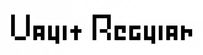
![Vault Regular font caratteri gratis]() Scaricare 174 Downloads@WebFont
Scaricare 174 Downloads@WebFont -
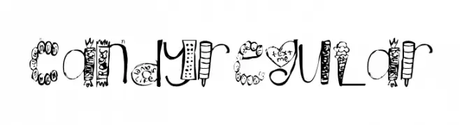
![CandyRegular font caratteri gratis]() Scaricare 174 Downloads@WebFont
Scaricare 174 Downloads@WebFont -
( Fonts by Des Gomez )
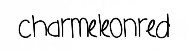
A playful, handwritten font with rounded edges and a casual style.
![CharmeleonRed font caratteri gratis]() Scaricare 174 Downloads@WebFont
Scaricare 174 Downloads@WebFont -
( Måns Grebäck - www.mansgreback.com )
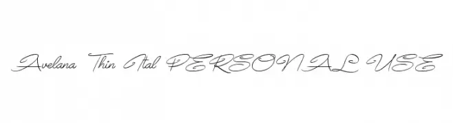
A thin, elegant script font with flowing, graceful curves.
![Avelana Thin Ital PERSONAL USE font caratteri gratis]() Scaricare 174 Downloads@WebFont
Scaricare 174 Downloads@WebFont -
![wmarrows1 font caratteri gratis]() Scaricare 174 Downloads@WebFont
Scaricare 174 Downloads@WebFont -
( Fonts by Graham Meade - GemFonts )
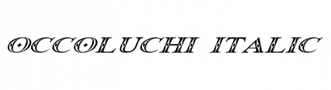
A decorative italic font with intricate patterns and high contrast.
![Occoluchi Italic font caratteri gratis]() Scaricare 174 Downloads@WebFont
Scaricare 174 Downloads@WebFont -
( Fonts by Alde Saputro - aldedesign - https://www.creativefabrica.com/product/the-crafty-holiday-font-bundle/ref/125925/ - Personal-use only. For commercial use please contact owner. )
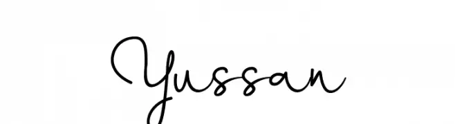
A playful, handwritten script font with a casual and friendly style.
![Yussan font caratteri gratis]() Scaricare 174 Downloads@WebFont
Scaricare 174 Downloads@WebFont -
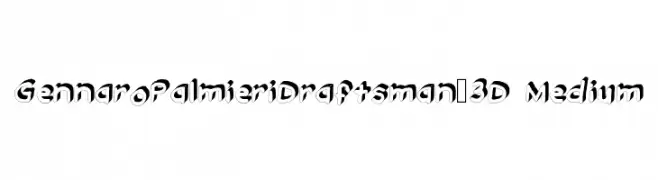
![GennaroPalmieriDraftsman_3D Medium font caratteri gratis]() Scaricare 174 Downloads@WebFont
Scaricare 174 Downloads@WebFont -
( Fonts by www.aenigmafonts.com )
A bold, wavy font with a dynamic, three-dimensional effect.
![waver [BRK] font caratteri gratis]() Scaricare 174 Downloads@WebFont
Scaricare 174 Downloads@WebFont -
( Iconian Fonts - Daniel Zadorozny - www.iconian.com )
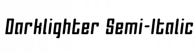
A modern, semi-italic font with bold, condensed characters and a sleek, dynamic style.
![Darklighter Semi-Italic font caratteri gratis]() Scaricare 174 Downloads@WebFont
Scaricare 174 Downloads@WebFont -
( Renny Murray - www.rennysniche.com )
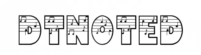
A bold, decorative font with musical notes integrated into each letter.
![DTNoted font caratteri gratis]() Scaricare 174 Downloads@WebFont
Scaricare 174 Downloads@WebFont -
( Fonts by Georg Duffner - Personal-use only. For commercial use please contact owner. )
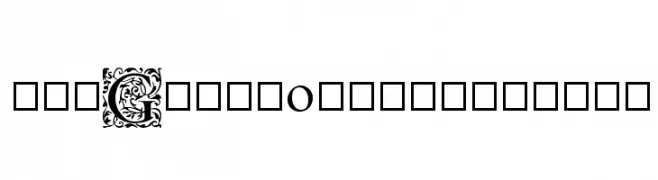
Ornate initials with intricate decorative patterns, exuding elegance and sophistication.
![EB Garamond Initials font caratteri gratis]() Scaricare 174 Downloads@WebFont
Scaricare 174 Downloads@WebFont -
( www.junkohanhero.com )
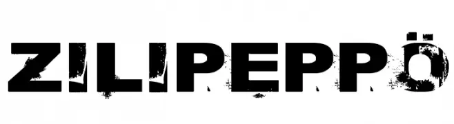
A bold, distressed font with a grunge texture and rugged appearance.
![Zilipeppö font caratteri gratis]() Scaricare 174 Downloads@WebFont
Scaricare 174 Downloads@WebFont -
( Fonts by FallenGraphic Studio - Vava Aryanto - Personal-use only. For commercial use please contact owner. )
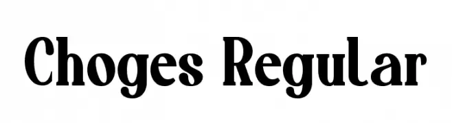
A bold, high-contrast serif font with pronounced serifs and a classic style.
![Choges Regular font caratteri gratis]() Scaricare 174 Downloads@WebFont
Scaricare 174 Downloads@WebFont -
( Fonts by Andi Moz )
Decorative font with a mix of tall uppercase and cursive lowercase letters.
![Batch font caratteri gratis]() Scaricare 174 Downloads@WebFont
Scaricare 174 Downloads@WebFont -
![yoicks font caratteri gratis]() Scaricare 174 Downloads
Scaricare 174 Downloads -
( Fonts by Apostrophic Lab )
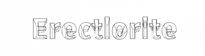
A bold, three-dimensional outline font with a modern, geometric style.
![Erectlorite font caratteri gratis]() Scaricare 174 Downloads@WebFont
Scaricare 174 Downloads@WebFont -
( Fonts by Manfred Klein. Free for private and charity use. Free for commercial with donation to organizations )
Abstract, illustrative font with playful, hand-drawn and geometric glyphs.
![AbstractToConcrete font caratteri gratis]() Scaricare 174 Downloads@WebFont
Scaricare 174 Downloads@WebFont -
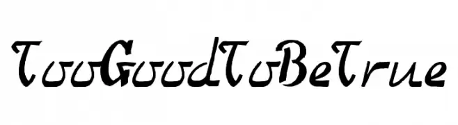
![TooGoodToBeTrue font caratteri gratis]() Scaricare 174 Downloads@WebFont
Scaricare 174 Downloads@WebFont -
( Fonts by Daniel Zadorozny - www.iconian.com - Free for personal use )
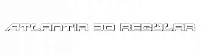
A bold, futuristic font with a 3D outlined design.
![Atlantia 3D Regular font caratteri gratis]() Scaricare 174 Downloads@WebFont
Scaricare 174 Downloads@WebFont -
( Fonts by Noah Type - noahtype.com - Personal-use only. For commercial use please contact owner. )
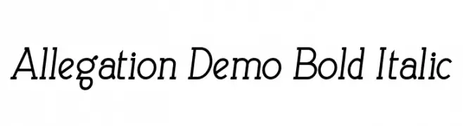
A bold, italicized font with a modern yet classic style.
![Allegation Demo Bold Italic font caratteri gratis]() Scaricare 174 Downloads@WebFont
Scaricare 174 Downloads@WebFont -
( Fonts by Scratchones )
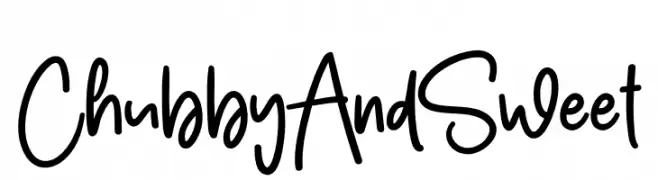
Playful handwritten font with rounded edges.
![Chubby And Sweet font caratteri gratis]() Scaricare 174 Downloads@WebFont
Scaricare 174 Downloads@WebFont -
( Fonts by Fei Tian - Personal-use only. For commercial use please contact owner. )
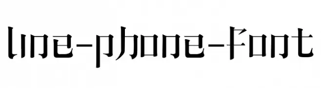
A modern gothic font with sharp, angular lines and geometric shapes.
![line-phone-font font caratteri gratis]() Scaricare 174 Downloads@WebFont
Scaricare 174 Downloads@WebFont -
( Fonts by Douglas Vitkauskas - www.vtksdesign.com. Personal-use only. For commercial use please contact owner. )
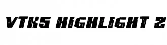
A bold, distressed font with a rugged, textured appearance.
![VTKS HIGHLIGHT 2 font caratteri gratis]() Scaricare 174 Downloads@WebFont
Scaricare 174 Downloads@WebFont -
( Fonts by Miffies - mfs.jp.org - Personal-use only. For commercial use please contact owner. )
A bold, geometric font with a strong, monospaced appearance.
![M29_DUCK HOUND font caratteri gratis]() Scaricare 174 Downloads@WebFont
Scaricare 174 Downloads@WebFont -
( Noto is a trademark of Google Inc. Noto fonts are open source. All Noto fonts are published under the SIL Open Font License, Version 1.1 )
Elegant serif font with thin, italicized strokes for a classic and refined look.
![Noto Serif Display Thin Italic font caratteri gratis]() Scaricare 174 Downloads@WebFont
Scaricare 174 Downloads@WebFont


![waver [BRK] font caratteri gratis](https://d144mzi0q5mijx.cloudfront.net/img/W/A/waver-BRK.webp)


Quali sono i font più popolari adesso?
Poppins, Roboto, Montserrat, Open Sans e Lato sono molto usati per le forme pulite e l'ampia applicabilità — dall'identità di marca alle landing page e ai poster.
Quali font si usano spesso nei loghi?
Le sans serif geometriche (es. Poppins, famiglie in stile Gotham) sono scelte comuni per un branding pulito e scalabile. Per un tocco personale restano valide script e stili manoscritti. Abbina un display deciso per i titoli a un corpo testo neutro per riconoscibilità ed equilibrio.
Ogni quanto si aggiorna la lista?
Con regolarità, in base ai download e all'attività reale. Torna spesso per scoprire in anticipo le nuove preferite.
💡 Consiglio: aggiungi ai preferiti — le tendenze cambiano in fretta e i font top di oggi possono ispirare il rebranding di domani.