Benvenuto nelle Font Più Popolari — dove popolarità e qualità si incontrano. Qui trovi i font più scaricati e usati dell'anno. Se cerchi scelte sicure per logo, web o social, inizia da qui.
Ogni font top si distingue per equilibrio, leggibilità e versatilità. Troverai sans serif moderne, script eleganti, serif vintage e display minimalisti.
-
( Fonts by Zetafonts - Personal-use only. For commercial use please contact owner. )
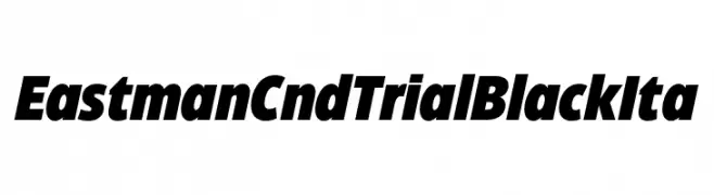
A bold, condensed, and italic font with high contrast and a modern style.
 Scaricare 173 Downloads@WebFont
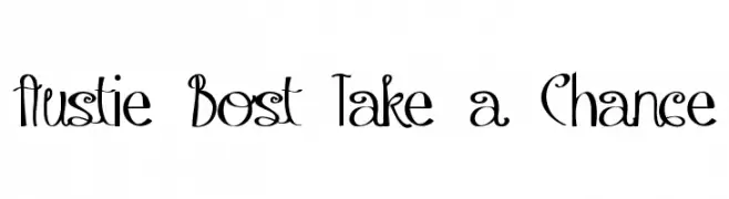
 -
![Austie Bost Take a Chance font caratteri gratis]() Scaricare 173 Downloads@WebFont
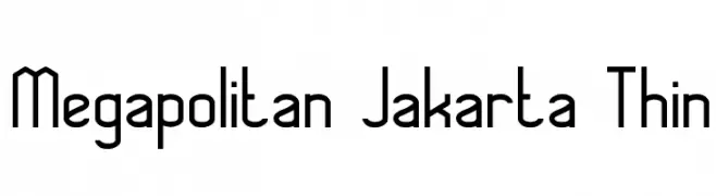
Scaricare 173 Downloads@WebFont -
![Megapolitan Jakarta Thin font caratteri gratis]() Scaricare 173 Downloads@WebFont
Scaricare 173 Downloads@WebFont -
( Fonts by Vladimir Nikolic - www.creativefabrica.com/designer/vladimirnikolic/ - Personal-use only. For commercial use please contact owner. )
A bold, geometric font with sharp angles and a modern aesthetic.
![Explosion Book font caratteri gratis]() Scaricare 173 Downloads@WebFont
Scaricare 173 Downloads@WebFont -
![POE Sans New Italic font caratteri gratis]() Scaricare 173 Downloads@WebFont
Scaricare 173 Downloads@WebFont -
( Fonts by www.chequered.ink - Chequered Ink - Personal-use only. For commercial use please contact owner. )
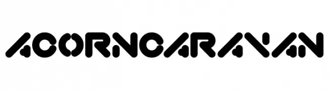
A bold, geometric font with rounded edges and a futuristic style.
![Acorn Caravan font caratteri gratis]() Scaricare 173 Downloads@WebFont
Scaricare 173 Downloads@WebFont -
( Fonts by Vunira Design )
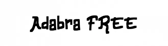
A playful, hand-drawn font with bold, irregular strokes and a whimsical style.
![Adabra FREE font caratteri gratis]() Scaricare 173 Downloads@WebFont
Scaricare 173 Downloads@WebFont -
![IFoundMyValentineHearted font caratteri gratis]() Scaricare 173 Downloads@WebFont
Scaricare 173 Downloads@WebFont -
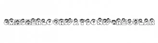
![JMHSherlockWatsonW-Regular font caratteri gratis]() Scaricare 173 Downloads@WebFont
Scaricare 173 Downloads@WebFont -
![FreeFont font caratteri gratis]() Scaricare 173 Downloads@WebFont
Scaricare 173 Downloads@WebFont -
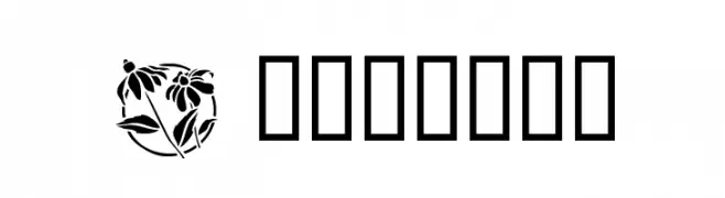
![Flowers3 font caratteri gratis]() Scaricare 173 Downloads@WebFont
Scaricare 173 Downloads@WebFont -
( Fonts by a Neale Davidson - www.pixelsagas.com. Personal-use only. For commercial use please contact owner. )
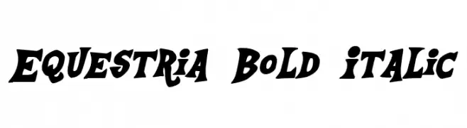
A bold, italic font with dynamic, playful curves and sharp edges.
![Equestria Bold Italic font caratteri gratis]() Scaricare 173 Downloads@WebFont
Scaricare 173 Downloads@WebFont -
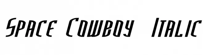
( Fonts by Marty Bee - www.martybee.com )
A dynamic, italicized font with angular, futuristic design elements.
![Space Cowboy Italic font caratteri gratis]() Scaricare 173 Downloads@WebFont
Scaricare 173 Downloads@WebFont -
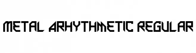
( Fonts by Andrew McCluskey - nalgames.com )
A bold, geometric font with a futuristic and industrial design.
![Metal Arhythmetic Regular font caratteri gratis]() Scaricare 173 Downloads@WebFont
Scaricare 173 Downloads@WebFont -
( Copyright 2018 The Grenze Project Authors (https://github.com/Omnibus-Type/Grenze), with Reserved Font Name "Grenze". )
A medium weight, italic serif font with a modern yet classic style.
![Grenze Medium Italic font caratteri gratis]() Scaricare 173 Downloads@WebFont
Scaricare 173 Downloads@WebFont -
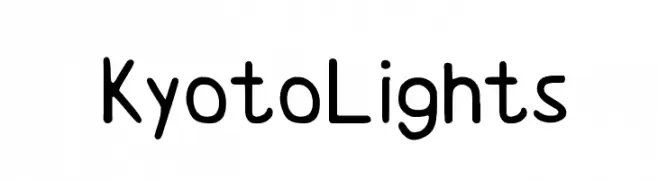
( Fonts by Walter Gray )
A playful, rounded font with smooth curves and a friendly appearance.
![KyotoLights font caratteri gratis]() Scaricare 173 Downloads@WebFont
Scaricare 173 Downloads@WebFont -
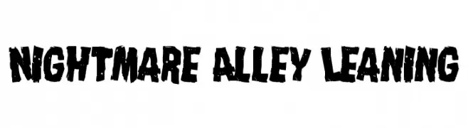
( Fonts by Iconian Fonts )
A bold, distressed font with a rugged, hand-drawn appearance.
![Nightmare Alley Leaning font caratteri gratis]() Scaricare 173 Downloads@WebFont
Scaricare 173 Downloads@WebFont -
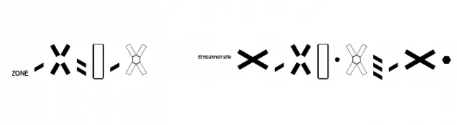
( Fonts by www.peter-wiegel.de. Personal-use only. For commercial use please contact owner. )
Geometric sans-serif with integrated transport and signage icons.
![Zeichen Dreihundert font caratteri gratis]() Scaricare 173 Downloads@WebFont
Scaricare 173 Downloads@WebFont -
( گالری فانت فارسی پژوهش آريانا - only compatible with Farsi and Arabic )
A calligraphic script font with elegant curves and artistic flair.
![Wahid I font caratteri gratis]() Scaricare 173 Downloads@WebFont
Scaricare 173 Downloads@WebFont -
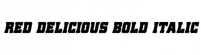
( Fonts by Daniel Zadorozny - www.iconian.com - Personal-use only. For commercial use please contact owner. )
A bold, italicized font with a strong, impactful presence and modern style.
![Red Delicious Bold Italic font caratteri gratis]() Scaricare 173 Downloads@WebFont
Scaricare 173 Downloads@WebFont -
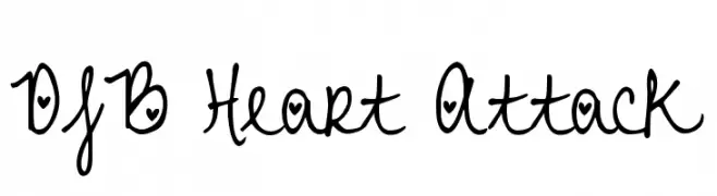
( Fonts by Darcy Baldwin - darcybaldwin.com. Free for personal use only )
A playful handwritten font with heart-themed decorations on each character.
![DJB Heart Attack font caratteri gratis]() Scaricare 173 Downloads@WebFont
Scaricare 173 Downloads@WebFont -
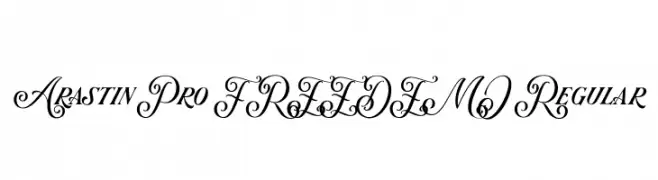
( Fonts by Graptail Type Studio - Personal-use only. For commercial use please contact owner. )
A versatile font combining elegant script with bold serif styles.
![Arastin Pro FREE DEMO Regular font caratteri gratis]() Scaricare 173 Downloads@WebFont
Scaricare 173 Downloads@WebFont -
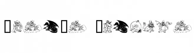
( Fonts by www.houseoflime.com )
Whimsical dragon-themed decorative font with illustrated glyphs.
![Lisa's Dragons font caratteri gratis]() Scaricare 173 Downloads@WebFont
Scaricare 173 Downloads@WebFont -
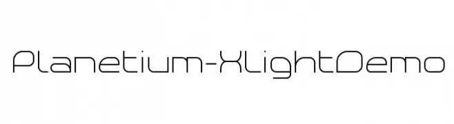
( Fonts by www.studiotypo.com - Personal-use only. For commercial use please contact owner. )
A modern, geometric font with a sleek and minimalistic design.
![Planetium-X Light Demo font caratteri gratis]() Scaricare 173 Downloads@WebFont
Scaricare 173 Downloads@WebFont -
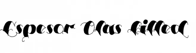
( Fonts by Mans Greback - www.mawns.com )
A bold, expressive script font with dramatic flourishes and interconnected characters.
![Espesor Olas Filled font caratteri gratis]() Scaricare 173 Downloads@WebFont
Scaricare 173 Downloads@WebFont -
( Fonts by a Max Infeld - XEROGRAPHER FONTS - xerographer.blogspot.com . Personal-use only. For commercial use please contact owner. )
A bold, handwritten font with a dynamic, brush-like style.
![SmokingParadise font caratteri gratis]() Scaricare 173 Downloads@WebFont
Scaricare 173 Downloads@WebFont -
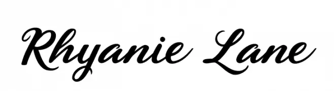
( Fonts by Tan Cundrawan - cove703 - creativemarket.com/cove703 - Personal-use only. For commercial use please contact owner. )
An elegant script font with flowing, connected letters and a classic, sophisticated style.
![Rhyanie Lane font caratteri gratis]() Scaricare 173 Downloads@WebFont
Scaricare 173 Downloads@WebFont -
![AngryOrange font caratteri gratis]() Scaricare 173 Downloads@WebFont
Scaricare 173 Downloads@WebFont -
( Fonts by Tokopress )
A bold, cursive font with dynamic and flowing strokes.
![Gold-Jack font caratteri gratis]() Scaricare 173 Downloads@WebFont
Scaricare 173 Downloads@WebFont -
( Fonts by Maelle.K - Thomas Boucherie )
A playful, handwritten font with a casual and informal style.
![In Secret i Love You Medium font caratteri gratis]() Scaricare 173 Downloads@WebFont
Scaricare 173 Downloads@WebFont -
( Fonts by Billy Argel - www.billyargel.com - Personal-use only. For commercial use please contact owner. )
A bold, shadowed font with a comic book style and dynamic presence.
![PROPAGANDA SIGHT SHADOW PERSONA font caratteri gratis]() Scaricare 173 Downloads@WebFont
Scaricare 173 Downloads@WebFont -
( Fonts by HansCo - Burhan Afif - Personal-use only. For commercial use please contact owner. )
A bold, retro font with playful, whimsical letterforms and decorative flourishes.
![Magic Retro font caratteri gratis]() Scaricare 173 Downloads@WebFont
Scaricare 173 Downloads@WebFont -
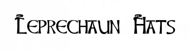
( ArtsyLady - artsylady.8m.com/fonts/fontpage.htm )
A whimsical, decorative font featuring leprechaun hats on each character, perfect for festive projects.
![Leprechaun Hats font caratteri gratis]() Scaricare 173 Downloads@WebFont
Scaricare 173 Downloads@WebFont -
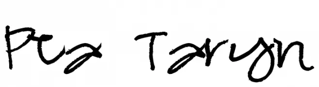
( Free for a personal use. For a commercial use please visit www.kevinandamanda.com )
A playful, handwritten font with a casual and dynamic style.
![Pea Taryn font caratteri gratis]() Scaricare 173 Downloads@WebFont
Scaricare 173 Downloads@WebFont -
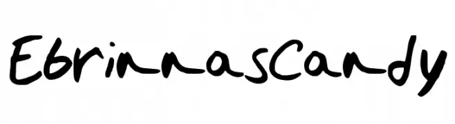
( a-night-to-remember.weebly.com/ )
A playful, bold handwritten font with a casual and lively style.
![EbrinnasCandy font caratteri gratis]() Scaricare 173 Downloads@WebFont
Scaricare 173 Downloads@WebFont


Quali sono i font più popolari adesso?
Poppins, Roboto, Montserrat, Open Sans e Lato sono molto usati per le forme pulite e l'ampia applicabilità — dall'identità di marca alle landing page e ai poster.
Quali font si usano spesso nei loghi?
Le sans serif geometriche (es. Poppins, famiglie in stile Gotham) sono scelte comuni per un branding pulito e scalabile. Per un tocco personale restano valide script e stili manoscritti. Abbina un display deciso per i titoli a un corpo testo neutro per riconoscibilità ed equilibrio.
Ogni quanto si aggiorna la lista?
Con regolarità, in base ai download e all'attività reale. Torna spesso per scoprire in anticipo le nuove preferite.
💡 Consiglio: aggiungi ai preferiti — le tendenze cambiano in fretta e i font top di oggi possono ispirare il rebranding di domani.