Benvenuto nelle Font Più Popolari — dove popolarità e qualità si incontrano. Qui trovi i font più scaricati e usati dell'anno. Se cerchi scelte sicure per logo, web o social, inizia da qui.
Ogni font top si distingue per equilibrio, leggibilità e versatilità. Troverai sans serif moderne, script eleganti, serif vintage e display minimalisti.
-
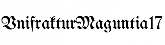
( Fonts by Unifraktur Project )
A traditional blackletter font with ornate, dramatic letterforms.
 Scaricare 172 Downloads@WebFont
 -
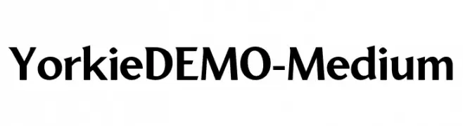
( Fonts by Font People - Personal-use only. For commercial use please contact owner. )
A bold, modern serif font with clean lines and a versatile style.
![YorkieDEMO-Medium font caratteri gratis]() Scaricare 172 Downloads@WebFont
Scaricare 172 Downloads@WebFont -
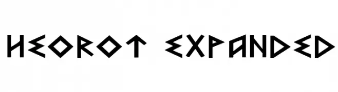
![Heorot Expanded font caratteri gratis]() Scaricare 172 Downloads@WebFont
Scaricare 172 Downloads@WebFont -
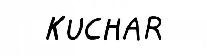
( www.sfai.edu )
A playful, handwritten font with a casual and friendly style.
![KUCHAR font caratteri gratis]() Scaricare 172 Downloads@WebFont
Scaricare 172 Downloads@WebFont -
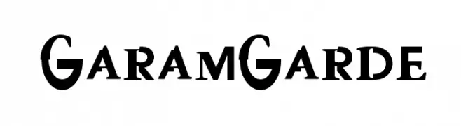
![GaramGarde font caratteri gratis]() Scaricare 172 Downloads@WebFont
Scaricare 172 Downloads@WebFont -
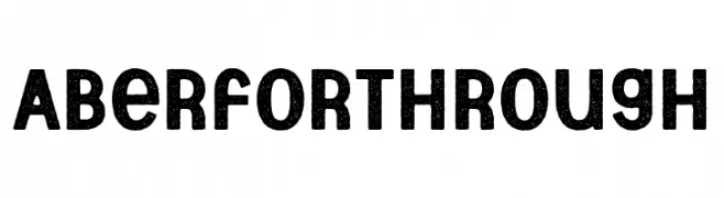
( Fonts by Brittney Murphy Design - Brittney Murphy - Personal-use only. For commercial use please contact owner. )
A bold, textured font with a vintage, handcrafted feel.
![Aberforth Rough font caratteri gratis]() Scaricare 172 Downloads@WebFont
Scaricare 172 Downloads@WebFont -
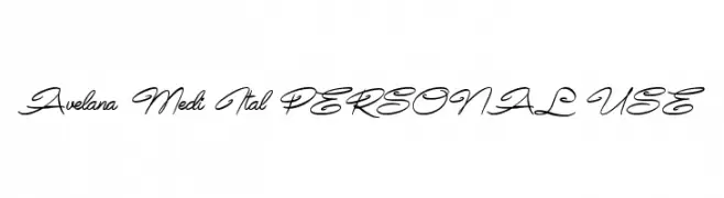
( Måns Grebäck - www.mansgreback.com )
An elegant, flowing script font with smooth, cursive letterforms.
![Avelana Medi Ital PERSONAL USE font caratteri gratis]() Scaricare 172 Downloads@WebFont
Scaricare 172 Downloads@WebFont -
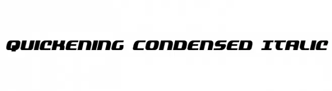
( Fonts by Daniel Zadorozny - www.iconian.com )
A bold, italicized, and condensed font with a modern, dynamic style.
![Quickening Condensed Italic font caratteri gratis]() Scaricare 172 Downloads@WebFont
Scaricare 172 Downloads@WebFont -
( Fonts by Jacob Fisher - www.pizzadude.dk )
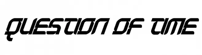
A bold, futuristic font with angular shapes and high contrast.
![Question of time font caratteri gratis]() Scaricare 172 Downloads@WebFont
Scaricare 172 Downloads@WebFont -
![UP Tiny lcd four 8 decoV font caratteri gratis]() Scaricare 172 Downloads@WebFont
Scaricare 172 Downloads@WebFont -
( Fonts by Manfred Klein. Free for private and charity use. Free for commercial with donation to organizations )
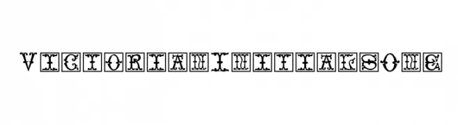
An ornate, Victorian-inspired decorative font with intricate flourishes.
![VictorianInitialsOne font caratteri gratis]() Scaricare 172 Downloads@WebFont
Scaricare 172 Downloads@WebFont -
( Fonts by Arendx Studio - Personal-use only. For commercial use please contact owner. )
A bold, cursive font with interconnected characters and a playful style.
![Himalaya font caratteri gratis]() Scaricare 172 Downloads@WebFont
Scaricare 172 Downloads@WebFont -
( Fonts by a Neale Davidson - www.pixelsagas.com. Personal-use only. For commercial use please contact owner. )
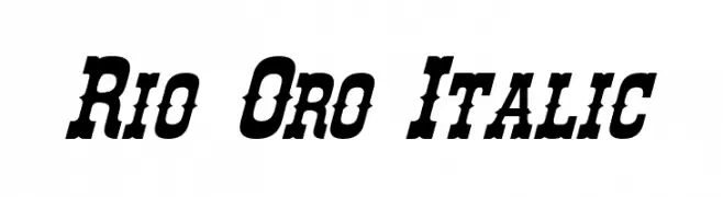
A bold, italicized font with a dynamic and energetic style.
![Rio Oro Italic font caratteri gratis]() Scaricare 172 Downloads@WebFont
Scaricare 172 Downloads@WebFont -
( Fonts by Bumbayo Font Fabrik - bumbayo.blogspot.com )
A bold, distressed font with a vintage, grunge aesthetic.
![Liszthius-Alkimista font caratteri gratis]() Scaricare 172 Downloads@WebFont
Scaricare 172 Downloads@WebFont -
( Fonts by ErgoType )
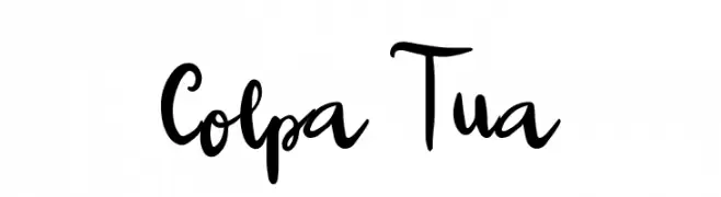
A bold, expressive handwritten font with dynamic strokes and playful flair.
![Colpa Tua font caratteri gratis]() Scaricare 172 Downloads@WebFont
Scaricare 172 Downloads@WebFont -
![Syahertian font caratteri gratis]() Scaricare 172 Downloads@WebFont
Scaricare 172 Downloads@WebFont -
![FE10LilGhosts font caratteri gratis]() Scaricare 172 Downloads@WebFont
Scaricare 172 Downloads@WebFont -
( Fonts by a Max Infeld - XEROGRAPHER FONTS - xerographer.blogspot.com . Personal-use only. For commercial use please contact owner. )
A bold, striped font with a modern and artistic flair.
![FreshMaker font caratteri gratis]() Scaricare 172 Downloads@WebFont
Scaricare 172 Downloads@WebFont -
( imagex - www.imagex-fonts.com )
A bold, textured font with a vintage, distressed style.
![Magnifico font caratteri gratis]() Scaricare 172 Downloads@WebFont
Scaricare 172 Downloads@WebFont -
( Fonts by a Max Infeld - XEROGRAPHER FONTS - xerographer.blogspot.com . Personal-use only. For commercial use please contact owner. )
A dynamic and flowing script font with elegant curves and artistic flair.
![SchoolParty font caratteri gratis]() Scaricare 172 Downloads@WebFont
Scaricare 172 Downloads@WebFont -
( Fonts by Daniel Zadorozny - www.iconian.com - Free for personal use )
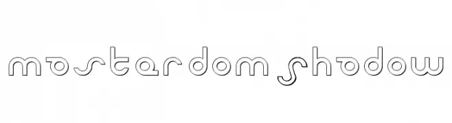
A futuristic, geometric font with clean lines and circular elements.
![Masterdom Shadow font caratteri gratis]() Scaricare 172 Downloads@WebFont
Scaricare 172 Downloads@WebFont -
( Fonts by weknow - Wino S Kadir )
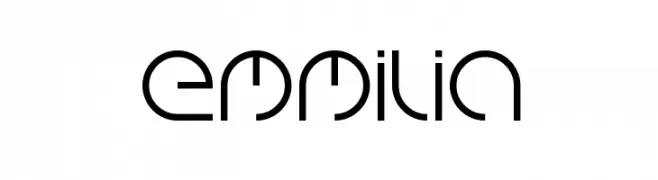
A futuristic and geometric font with abstract letterforms.
![emmilia font caratteri gratis]() Scaricare 172 Downloads@WebFont
Scaricare 172 Downloads@WebFont -
( Fonts by Peter Olexa - www.dealjumbo.com - Personal-use only. For commercial use please contact owner. )
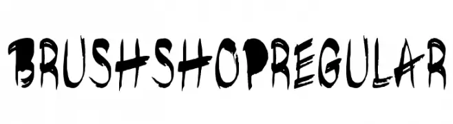
A bold, brush-style font with an expressive, hand-painted look.
![brushshopregular font caratteri gratis]() Scaricare 172 Downloads@WebFont
Scaricare 172 Downloads@WebFont -
( Fonts by zamjump - Ahmad Zamzami - Personal-use only. For commercial use please contact owner. )
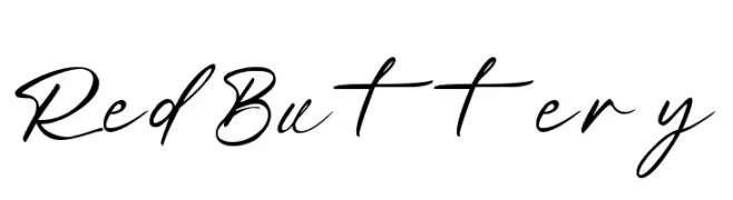
A cursive, handwritten font with elegant, flowing strokes.
![Red Buttery font caratteri gratis]() Scaricare 172 Downloads@WebFont
Scaricare 172 Downloads@WebFont -
( Fonts by Graham Meade - GemFonts )
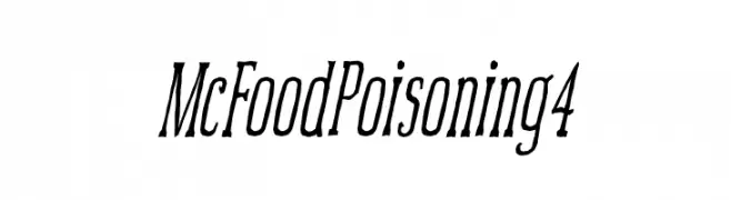
A dynamic, slanted serif font with elongated characters and sharp serifs.
![McFoodPoisoning4 font caratteri gratis]() Scaricare 172 Downloads@WebFont
Scaricare 172 Downloads@WebFont -
( Iconian Fonts - Daniel Zadorozny - www.iconian.com )
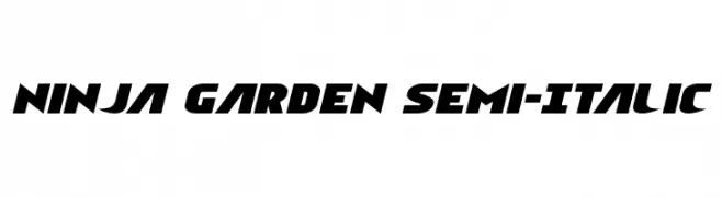
A bold, semi-italic font with a dynamic and modern style.
![Ninja Garden Semi-Italic font caratteri gratis]() Scaricare 172 Downloads@WebFont
Scaricare 172 Downloads@WebFont -
( Fonts by Manfred Klein - manfred-klein.ina-mar.com )
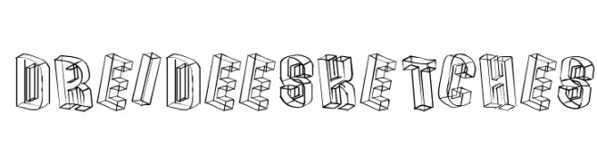
A 3D sketch-style font with a hand-drawn, dimensional appearance.
![DreiDeeSketches font caratteri gratis]() Scaricare 172 Downloads@WebFont
Scaricare 172 Downloads@WebFont -
( Fonts by Dmitry Astakhov - www.behance.net/adonis-abe1e - Personal-use only. For commercial use please contact owner. )
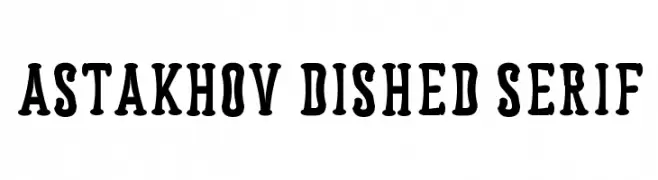
A bold, playful serif font with thick, rounded serifs and strong character presence.
![Astakhov Dished Serif font caratteri gratis]() Scaricare 172 Downloads@WebFont
Scaricare 172 Downloads@WebFont -
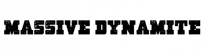
( imagex - www.imagex-fonts.com )
A bold, distressed font with a vintage, rugged style.
![Massive Dynamite font caratteri gratis]() Scaricare 172 Downloads@WebFont
Scaricare 172 Downloads@WebFont -
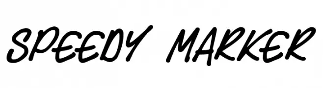
![Speedy Marker font caratteri gratis]() Scaricare 172 Downloads@WebFont
Scaricare 172 Downloads@WebFont -
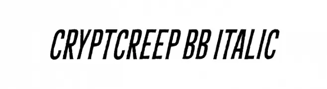
( Fonts by www.blambot.com )
A bold, italicized font with a dynamic and energetic slant.
![CryptCreep BB Italic font caratteri gratis]() Scaricare 172 Downloads@WebFont
Scaricare 172 Downloads@WebFont -
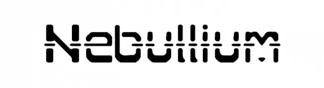
![Nebullium font caratteri gratis]() Scaricare 172 Downloads@WebFont
Scaricare 172 Downloads@WebFont -
( Fonts by Maulana Creative )
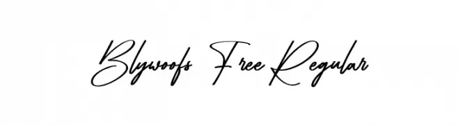
Elegant, casual handwritten script with connected, flowing strokes.
![Blywoofs Free Regular font caratteri gratis]() Scaricare 172 Downloads@WebFont
Scaricare 172 Downloads@WebFont -
![GS Open font caratteri gratis]() Scaricare 172 Downloads@WebFont
Scaricare 172 Downloads@WebFont -
![Wahei font caratteri gratis]() Scaricare 172 Downloads@WebFont
Scaricare 172 Downloads@WebFont


Quali sono i font più popolari adesso?
Poppins, Roboto, Montserrat, Open Sans e Lato sono molto usati per le forme pulite e l'ampia applicabilità — dall'identità di marca alle landing page e ai poster.
Quali font si usano spesso nei loghi?
Le sans serif geometriche (es. Poppins, famiglie in stile Gotham) sono scelte comuni per un branding pulito e scalabile. Per un tocco personale restano valide script e stili manoscritti. Abbina un display deciso per i titoli a un corpo testo neutro per riconoscibilità ed equilibrio.
Ogni quanto si aggiorna la lista?
Con regolarità, in base ai download e all'attività reale. Torna spesso per scoprire in anticipo le nuove preferite.
💡 Consiglio: aggiungi ai preferiti — le tendenze cambiano in fretta e i font top di oggi possono ispirare il rebranding di domani.