Benvenuto nelle Font Più Popolari — dove popolarità e qualità si incontrano. Qui trovi i font più scaricati e usati dell'anno. Se cerchi scelte sicure per logo, web o social, inizia da qui.
Ogni font top si distingue per equilibrio, leggibilità e versatilità. Troverai sans serif moderne, script eleganti, serif vintage e display minimalisti.
-
( Fonts by Attype Studio - Fadli Ramadhan Iskandar - Personal-use only. For commercial use please contact owner. )
A playful, casual handwritten font with smooth curves and a friendly feel.
 Scaricare 172 Downloads@WebFont
 -
![LC Look With Your Heart font caratteri gratis]() Scaricare 172 Downloads@WebFont
Scaricare 172 Downloads@WebFont -
( Haksen Letters - Sarwo Edhi Prayitno )
A rustic, hand-drawn font with a textured, brush-like appearance.
![Muttung - Rustic font caratteri gratis]() Scaricare 172 Downloads@WebFont
Scaricare 172 Downloads@WebFont -
( Fonts by fsuarez913 )
A bold, playful font with rounded edges and a bubbly appearance.
![Super Story font caratteri gratis]() Scaricare 172 Downloads@WebFont
Scaricare 172 Downloads@WebFont -
( Fonts by Syaf Rizal - www.creativefabrica.com/ref/53/ - Personal-use only. For commercial use please contact owner. )
A dynamic and elegant script font with bold, flowing letterforms.
![Alansky font caratteri gratis]() Scaricare 172 Downloads@WebFont
Scaricare 172 Downloads@WebFont -
( Fonts by Kong Font - https://fontkong.com/ - Personal-use only. For commercial use please contact owner. )
A playful, bold, and hand-drawn style font with rounded characters.
![Confused font caratteri gratis]() Scaricare 172 Downloads@WebFont
Scaricare 172 Downloads@WebFont -
( Malre - David Masson Alalire - www.facebook.com/Community-Search-146103155534356/ )
A bold, classic serif font with strong, elegant strokes.
![Absortile-Bold font caratteri gratis]() Scaricare 172 Downloads@WebFont
Scaricare 172 Downloads@WebFont -
![Random Dingbats font caratteri gratis]() Scaricare 172 Downloads@WebFont
Scaricare 172 Downloads@WebFont -
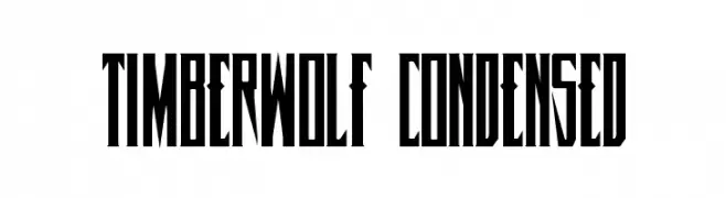
( Fonts by Daniel Zadorozny - www.iconian.com )
A bold, condensed font with angular, geometric shapes for a modern look.
![Timberwolf Condensed font caratteri gratis]() Scaricare 172 Downloads@WebFont
Scaricare 172 Downloads@WebFont -
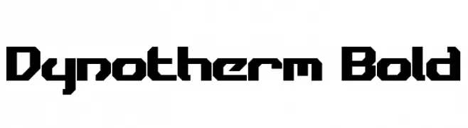
( Fonts by a Neale Davidson - www.pixelsagas.com. Personal-use only. For commercial use please contact owner. )
A bold, geometric font with a futuristic and angular design.
![Dynotherm Bold font caratteri gratis]() Scaricare 172 Downloads@WebFont
Scaricare 172 Downloads@WebFont -
( Fonts by Manjali Studio - Personal-use only. For commercial use please contact owner. )
A graceful script font with elegant swashes and a classic calligraphic style.
![Cherilyn font caratteri gratis]() Scaricare 172 Downloads@WebFont
Scaricare 172 Downloads@WebFont -
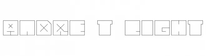
![andre t light font caratteri gratis]() Scaricare 172 Downloads@WebFont
Scaricare 172 Downloads@WebFont -
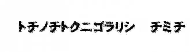
![OsakashiBoldKana font caratteri gratis]() Scaricare 172 Downloads@WebFont
Scaricare 172 Downloads@WebFont -
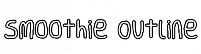
![Smoothie Outline font caratteri gratis]() Scaricare 172 Downloads@WebFont
Scaricare 172 Downloads@WebFont -
( Fonts by Mans Greback - Personal-use only. For commercial use please contact owner. )
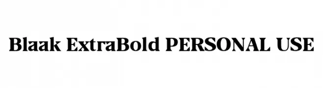
A bold serif font with high contrast and strong, elegant serifs.
![Blaak ExtraBold PERSONAL USE font caratteri gratis]() Scaricare 172 Downloads@WebFont
Scaricare 172 Downloads@WebFont -
Caratteri di JuanCasco. For commercial use please contact the owner.
( Fonts by Juan Casco - www.juancasco.net )
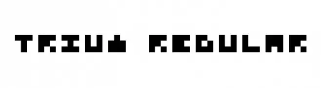
A bold, pixelated font with a retro digital aesthetic.
![Trium Regular font caratteri gratis]() Scaricare 172 Downloads@WebFont
Scaricare 172 Downloads@WebFont -
( Fonts by Daniel Zadorozny - www.iconian.com )
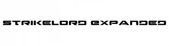
A bold, futuristic font with angular, geometric letterforms and an expanded width.
![Strikelord Expanded font caratteri gratis]() Scaricare 172 Downloads@WebFont
Scaricare 172 Downloads@WebFont -
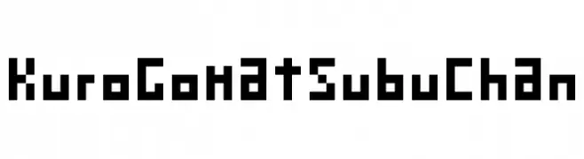
( Fonts by Baka - Kyakirun - bakafonts.kyakirun.com )
A bold, pixelated font with a retro digital aesthetic.
![KuroGomatsubuChan font caratteri gratis]() Scaricare 172 Downloads@WebFont
Scaricare 172 Downloads@WebFont -
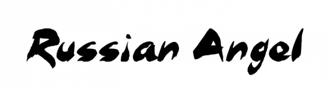
( Fonts by Jonathan S. Harris - Personal-use only. For commercial use please contact owner. )
A bold, brush-style font with dynamic strokes and expressive flair.
![Russian Angel font caratteri gratis]() Scaricare 172 Downloads@WebFont
Scaricare 172 Downloads@WebFont -
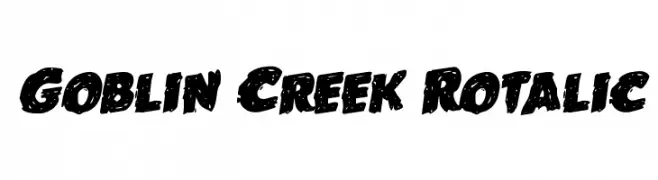
( Fonts by Iconian Fonts )
A bold, textured font with a playful and dynamic style.
![Goblin Creek Rotalic font caratteri gratis]() Scaricare 172 Downloads@WebFont
Scaricare 172 Downloads@WebFont -
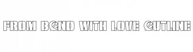
( Fonts by Daniel Zadorozny - www.iconian.com )
A bold, geometric outline font with a modern, futuristic style.
![From BOND With Love Outline font caratteri gratis]() Scaricare 172 Downloads@WebFont
Scaricare 172 Downloads@WebFont -
( Fonts by backpacker.gr )
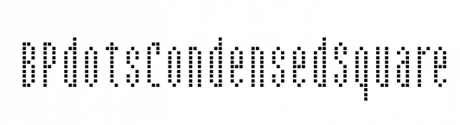
A dotted, pixelated font with a geometric and digital appearance.
![BPdotsCondensedSquare font caratteri gratis]() Scaricare 172 Downloads@WebFont
Scaricare 172 Downloads@WebFont -
Caratteri di HeroglyphsStudio. For commercial use please contact the owner.
( Thank you for downloading this font This font is free for PERSONAL USE ONLY! Commercial license for this font can be purchased at: http://bit.ly/2wjC4vy )
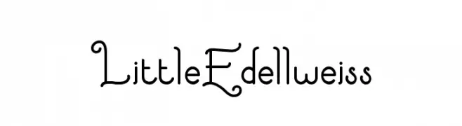
A whimsical and playful font with curly, decorative elements.
![LittleEdellweiss font caratteri gratis]() Scaricare 172 Downloads@WebFont
Scaricare 172 Downloads@WebFont -
( Fonts by Adien Gunarta - fontasticindonesia.blogspot.com )
A clean, geometric sans-serif font with a modern and minimalist style.
![Ikan Besar font caratteri gratis]() Scaricare 172 Downloads@WebFont
Scaricare 172 Downloads@WebFont -
( Fonts by Manfred Klein. Free for private and charity use. Free for commercial with donation to organizations )
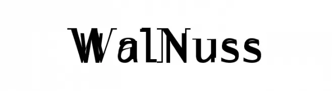
A bold and dynamic font with sharp angles and smooth curves.
![WalNuss font caratteri gratis]() Scaricare 172 Downloads@WebFont
Scaricare 172 Downloads@WebFont -
( Fonts by Daniel Zadorozny - www.iconian.com - Free for personal use )
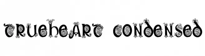
An ornate, decorative font with intricate flourishes and condensed characters.
![Trueheart Condensed font caratteri gratis]() Scaricare 172 Downloads@WebFont
Scaricare 172 Downloads@WebFont -
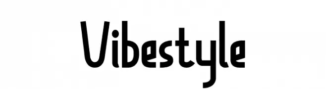
![Vibestyle font caratteri gratis]() Scaricare 172 Downloads@WebFont
Scaricare 172 Downloads@WebFont -
Caratteri di danny91194. For commercial use please contact the owner.
( m )
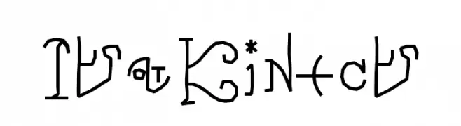
An artistic and decorative font with abstract, symbol-like characters.
![ItzKinect font caratteri gratis]() Scaricare 172 Downloads@WebFont
Scaricare 172 Downloads@WebFont -
![Marthin font caratteri gratis]() Scaricare 172 Downloads@WebFont
Scaricare 172 Downloads@WebFont -
( Fonts by Zetafonts - Personal-use only. For commercial use please contact owner. )
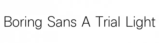
A clean, minimalist sans-serif font with consistent stroke width.
![Boring Sans A Trial Light font caratteri gratis]() Scaricare 172 Downloads@WebFont
Scaricare 172 Downloads@WebFont -
( Fonts by Mozilla Foundation - Personal-use only. For commercial use please contact owner. )
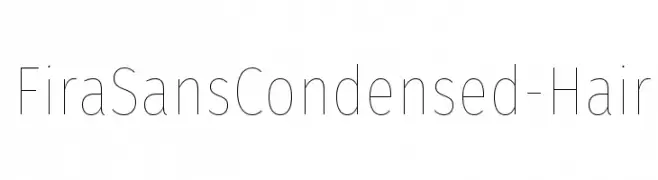
A modern, ultra-light, condensed sans-serif font with a sleek and minimalistic design.
![FiraSansCondensed-Hair font caratteri gratis]() Scaricare 172 Downloads@WebFont
Scaricare 172 Downloads@WebFont -
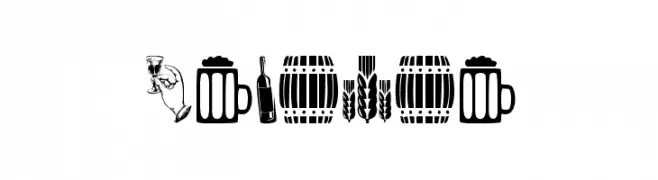
( Fonts by www.woodcutter.es - woodcutter Manero - Personal-use only. For commercial use please contact owner. )
Alcohol-themed pictogram display font with bold, illustrative icons.
![Alcohol font caratteri gratis]() Scaricare 172 Downloads@WebFont
Scaricare 172 Downloads@WebFont -
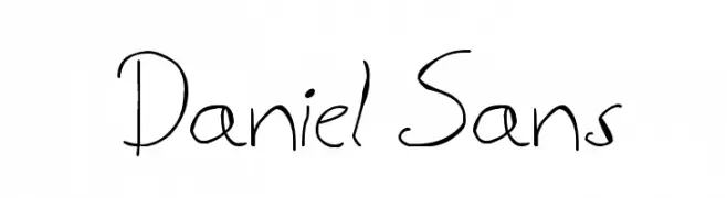
![Daniel Sans font caratteri gratis]() Scaricare 172 Downloads@WebFont
Scaricare 172 Downloads@WebFont -
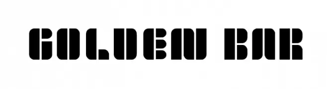
![golden bar font caratteri gratis]() Scaricare 172 Downloads@WebFont
Scaricare 172 Downloads@WebFont -
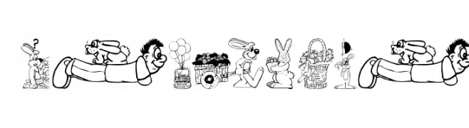
( Fonts by Manfred Klein. Free for private and charity use. Free for commercial with donation to organizations )
Whimsical Easter-themed dingbat font with cartoon illustrations.
![Easteria font caratteri gratis]() Scaricare 172 Downloads@WebFont
Scaricare 172 Downloads@WebFont


Quali sono i font più popolari adesso?
Poppins, Roboto, Montserrat, Open Sans e Lato sono molto usati per le forme pulite e l'ampia applicabilità — dall'identità di marca alle landing page e ai poster.
Quali font si usano spesso nei loghi?
Le sans serif geometriche (es. Poppins, famiglie in stile Gotham) sono scelte comuni per un branding pulito e scalabile. Per un tocco personale restano valide script e stili manoscritti. Abbina un display deciso per i titoli a un corpo testo neutro per riconoscibilità ed equilibrio.
Ogni quanto si aggiorna la lista?
Con regolarità, in base ai download e all'attività reale. Torna spesso per scoprire in anticipo le nuove preferite.
💡 Consiglio: aggiungi ai preferiti — le tendenze cambiano in fretta e i font top di oggi possono ispirare il rebranding di domani.