Benvenuto nelle Font Più Popolari — dove popolarità e qualità si incontrano. Qui trovi i font più scaricati e usati dell'anno. Se cerchi scelte sicure per logo, web o social, inizia da qui.
Ogni font top si distingue per equilibrio, leggibilità e versatilità. Troverai sans serif moderne, script eleganti, serif vintage e display minimalisti.
-
( Character )
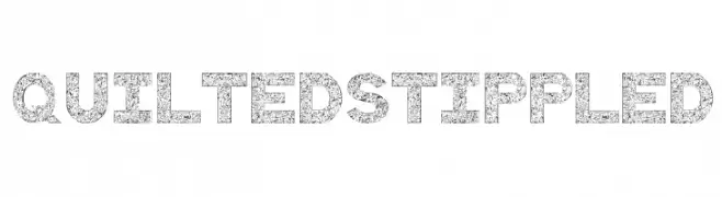
A bold, stippled sans-serif font with a quilted texture.
 Scaricare 170 Downloads@WebFont
 -
( Fonts by Craft Supply Co - Personal-use only. For commercial use please contact owner. )
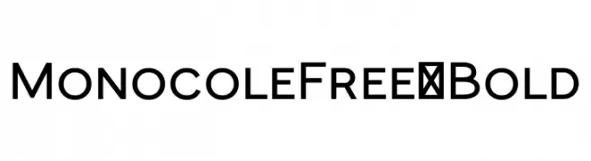
A bold, modern sans-serif font with clean lines and strong legibility.
![MonocoleFree-Bold font caratteri gratis]() Scaricare 170 Downloads@WebFont
Scaricare 170 Downloads@WebFont -
( Fonts by Miffies - mfs.jp.org - Personal-use only. For commercial use please contact owner. )
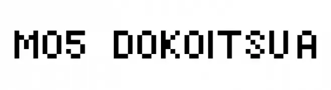
A pixelated, retro-style font with a blocky, digital appearance.
![M05_DOKOITSU A font caratteri gratis]() Scaricare 170 Downloads@WebFont
Scaricare 170 Downloads@WebFont -
( Fonts by Letterena Studios )
A sophisticated and fluid script font with elegant, cursive strokes.
![Faithfull Signature font caratteri gratis]() Scaricare 170 Downloads@WebFont
Scaricare 170 Downloads@WebFont -
( Fonts by Iconian Fonts )
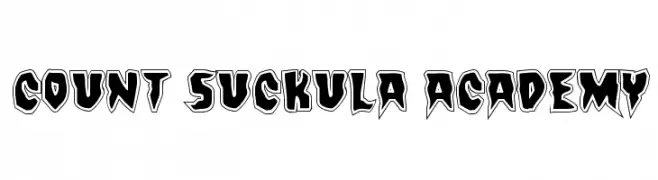
A bold, edgy font with sharp angles and a gothic flair.
![Count Suckula Academy font caratteri gratis]() Scaricare 170 Downloads@WebFont
Scaricare 170 Downloads@WebFont -
( Fonts by Jacob Fisher - www.pizzadude.dk )
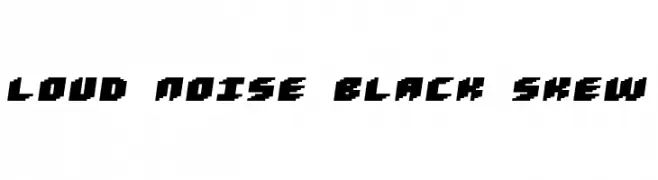
A bold, angular font with a dynamic skew and geometric design.
![Loud noise Black Skew font caratteri gratis]() Scaricare 170 Downloads@WebFont
Scaricare 170 Downloads@WebFont -
( Fonts by Typefactoryco )
A bold, angular font with a modern, energetic style.
![Shocked Up font caratteri gratis]() Scaricare 170 Downloads@WebFont
Scaricare 170 Downloads@WebFont -
( Fonts by www.dcoxy.com )
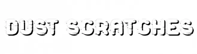
A bold, distressed font with a vintage, industrial feel.
![Dust Scratches font caratteri gratis]() Scaricare 170 Downloads@WebFont
Scaricare 170 Downloads@WebFont -
( Fonts by Jonathan S. Harris - www.tattoowoo.com. Personal-use only. For commercial use please contact owner. )
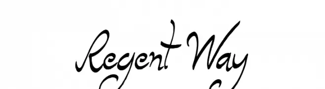
A dynamic, cursive script font with bold, sweeping strokes and elegant flourishes.
![Regent Way font caratteri gratis]() Scaricare 170 Downloads@WebFont
Scaricare 170 Downloads@WebFont -
( Fonts by Adien Gunarta - fontasticindonesia.blogspot.com )
The image does not depict a valid font.
![IW Pixelated Regular font caratteri gratis]() Scaricare 170 Downloads@WebFont
Scaricare 170 Downloads@WebFont -
( Fonts by Billy Argel Fonts - www.billyargel.com - Personal-use only. For commercial use please contact owner. )
A bold, distressed font with a rugged, industrial style.
![DIESELPOWER PERSONAL USE font caratteri gratis]() Scaricare 170 Downloads@WebFont
Scaricare 170 Downloads@WebFont -
( Fonts by Letterrendra - Personal-use only. For commercial use please contact owner. )
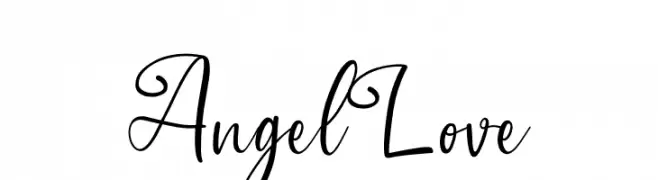
A romantic and elegant script font with flowing, cursive letters.
![Angel Love font caratteri gratis]() Scaricare 170 Downloads@WebFont
Scaricare 170 Downloads@WebFont -
( Xerographer Fonts - Max Infeld - xerographer.blogspot.com )
A dynamic, sketchy font with a hand-drawn, energetic style.
![SketchyBuilder font caratteri gratis]() Scaricare 170 Downloads@WebFont
Scaricare 170 Downloads@WebFont -
( Fonts by Manfred Klein - manfred-klein.ina-mar.com )
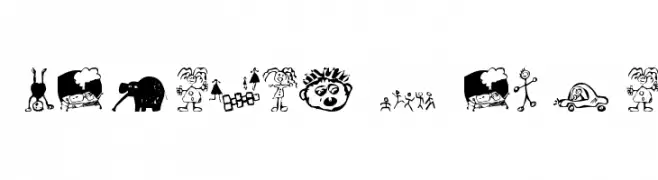
A doodle-style font mimicking children's playful sketches.
![KidsDrawings font caratteri gratis]() Scaricare 170 Downloads@WebFont
Scaricare 170 Downloads@WebFont -
![lpfood font caratteri gratis]() Scaricare 170 Downloads@WebFont
Scaricare 170 Downloads@WebFont -
( Fonts by Apostrophic Lab )
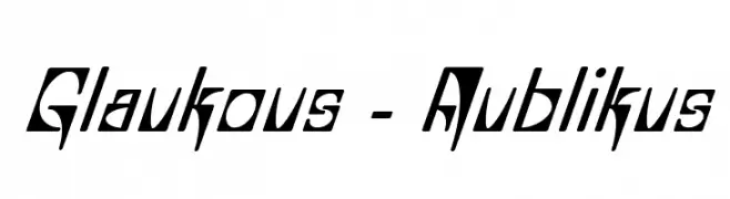
A dynamic, angular font with a futuristic and energetic style.
![Glaukous - Aublikus font caratteri gratis]() Scaricare 170 Downloads@WebFont
Scaricare 170 Downloads@WebFont -
( Fonts by twinletter - Rozikan - Personal-use only. For commercial use please contact owner. )
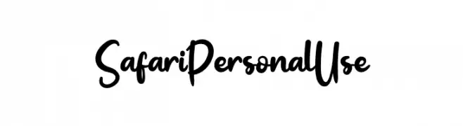
A playful, handwritten font with smooth curves and medium contrast.
![Safari Personal Use font caratteri gratis]() Scaricare 170 Downloads@WebFont
Scaricare 170 Downloads@WebFont -
( Fonts by David Kerkhoff - www.hanodedphotography.com )
A bold, playful font with a chunky, hand-drawn style.
![DKFatKittyKat font caratteri gratis]() Scaricare 170 Downloads@WebFont
Scaricare 170 Downloads@WebFont -
( Fonts by FG Studios )
A classic blackletter font with sharp, angular lines and intricate detailing.
![Salium font caratteri gratis]() Scaricare 170 Downloads@WebFont
Scaricare 170 Downloads@WebFont -
( Fonts by Kreative Korporation - www.kreativekorp.com )
A casual handwritten font with fluid, slightly irregular characters.
![Kawakimi font caratteri gratis]() Scaricare 170 Downloads@WebFont
Scaricare 170 Downloads@WebFont -
( Fonts by Jetsmax Studio )
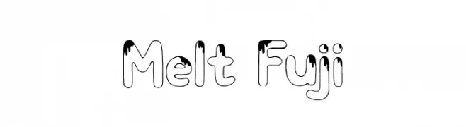
A playful, melting-effect font with bold, rounded characters.
![Melt Fuji font caratteri gratis]() Scaricare 170 Downloads@WebFont
Scaricare 170 Downloads@WebFont -
( Fonts by Daniel Zadorozny - www.iconian.com - Free for personal use )
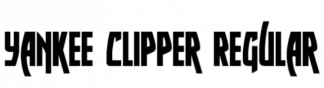
A bold, angular font with a modern and edgy design.
![Yankee Clipper Regular font caratteri gratis]() Scaricare 170 Downloads@WebFont
Scaricare 170 Downloads@WebFont -
![Quickness TT font caratteri gratis]() Scaricare 170 Downloads@WebFont
Scaricare 170 Downloads@WebFont -
( Fonts by Tiny Hand Letter - Nasruni Fajarita - Personal-use only. For commercial use please contact owner. )
A playful, handwritten font with medium contrast and dynamic slant.
![23 - Sekala font caratteri gratis]() Scaricare 170 Downloads@WebFont
Scaricare 170 Downloads@WebFont -
( Fonts by Ianmikraz )
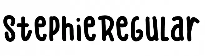
A playful, bold handwritten font with a casual and friendly style.
![Stephie Regular font caratteri gratis]() Scaricare 170 Downloads@WebFont
Scaricare 170 Downloads@WebFont -
( Fonts by Aqeela Studio - Muhammad Nasir - Personal-use only. For commercial use please contact owner. )
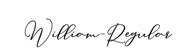
An elegant, cursive font with a handwritten feel and graceful flow.
![William-Regular font caratteri gratis]() Scaricare 170 Downloads@WebFont
Scaricare 170 Downloads@WebFont -
( Fonts by Gab Saiya )
A decorative, angular font with a tribal and mysterious aesthetic.
![azfucl font caratteri gratis]() Scaricare 170 Downloads@WebFont
Scaricare 170 Downloads@WebFont -
( Iconian Fonts - Daniel Zadorozny - www.iconian.com )
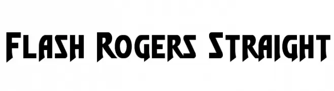
A bold, angular font with a futuristic and dynamic style.
![Flash Rogers Straight font caratteri gratis]() Scaricare 170 Downloads@WebFont
Scaricare 170 Downloads@WebFont -
( Fonts by Typeline Studio - Yadhie Setiawan - Personal-use only. For commercial use please contact owner. )
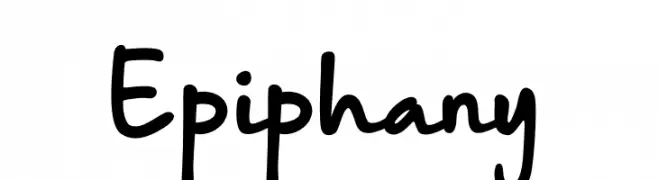
A playful, casual handwritten font with smooth curves and rounded edges.
![Epiphany font caratteri gratis]() Scaricare 170 Downloads@WebFont
Scaricare 170 Downloads@WebFont -
( Fonts by InspiraType )
A bold, playful script font with smooth, rounded edges and a dynamic slant.
![HantariFREE font caratteri gratis]() Scaricare 170 Downloads@WebFont
Scaricare 170 Downloads@WebFont -
( Bogdan Casota - designalot.net/ )
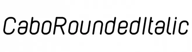
A modern, rounded, and italic font with a friendly and dynamic style.
![Cabo Rounded Italic font caratteri gratis]() Scaricare 170 Downloads@WebFont
Scaricare 170 Downloads@WebFont -
( Fonts by Daniel Zadorozny - www.iconian.com )
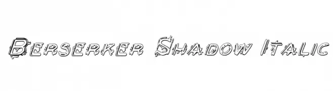
A bold, italicized font with a shadow effect and dynamic, decorative style.
![Berserker Shadow Italic font caratteri gratis]() Scaricare 170 Downloads@WebFont
Scaricare 170 Downloads@WebFont -
![Black Stallion font caratteri gratis]() Scaricare 170 Downloads@WebFont
Scaricare 170 Downloads@WebFont -
![RadiumBold font caratteri gratis]() Scaricare 170 Downloads@WebFont
Scaricare 170 Downloads@WebFont -
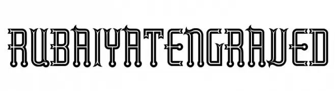
![RubaiyatEngraved font caratteri gratis]() Scaricare 170 Downloads@WebFont
Scaricare 170 Downloads@WebFont


Quali sono i font più popolari adesso?
Poppins, Roboto, Montserrat, Open Sans e Lato sono molto usati per le forme pulite e l'ampia applicabilità — dall'identità di marca alle landing page e ai poster.
Quali font si usano spesso nei loghi?
Le sans serif geometriche (es. Poppins, famiglie in stile Gotham) sono scelte comuni per un branding pulito e scalabile. Per un tocco personale restano valide script e stili manoscritti. Abbina un display deciso per i titoli a un corpo testo neutro per riconoscibilità ed equilibrio.
Ogni quanto si aggiorna la lista?
Con regolarità, in base ai download e all'attività reale. Torna spesso per scoprire in anticipo le nuove preferite.
💡 Consiglio: aggiungi ai preferiti — le tendenze cambiano in fretta e i font top di oggi possono ispirare il rebranding di domani.