Benvenuto nelle Font Più Popolari — dove popolarità e qualità si incontrano. Qui trovi i font più scaricati e usati dell'anno. Se cerchi scelte sicure per logo, web o social, inizia da qui.
Ogni font top si distingue per equilibrio, leggibilità e versatilità. Troverai sans serif moderne, script eleganti, serif vintage e display minimalisti.
-
( Fonts by Douglas Vitkauskas - www.vtksdesign.com. Personal-use only. For commercial use please contact owner. )
A bold, distressed font with a textured, grunge style.
 Scaricare 171 Downloads@WebFont
 -
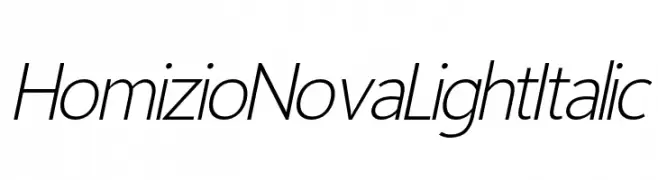
( Fonts by Ãlvaro Thomáz - Personal-use only. For commercial use please contact owner. )
A sleek, modern, light italic sans-serif font with elegant slant and high readability.
![Homizio Nova Light Italic font caratteri gratis]() Scaricare 171 Downloads@WebFont
Scaricare 171 Downloads@WebFont -
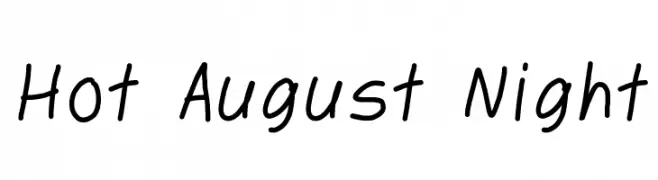
( Fonts by dabnotu - Personal-use only. For commercial use please contact owner. )
A casual, handwritten font with a playful and approachable style.
![Hot August Night font caratteri gratis]() Scaricare 171 Downloads@WebFont
Scaricare 171 Downloads@WebFont -
( www.leodsen.com )
A bold, decorative font with a vintage, distressed style.
![EndOfEra font caratteri gratis]() Scaricare 171 Downloads@WebFont
Scaricare 171 Downloads@WebFont -
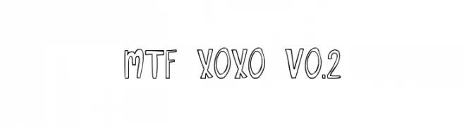
( Fonts by Miss Tiina at www.misstiina.com (please check the website before use) )
A playful, hand-drawn font with a unique outline effect and casual style.
![MTF XOXO Vo.2 font caratteri gratis]() Scaricare 171 Downloads@WebFont
Scaricare 171 Downloads@WebFont -
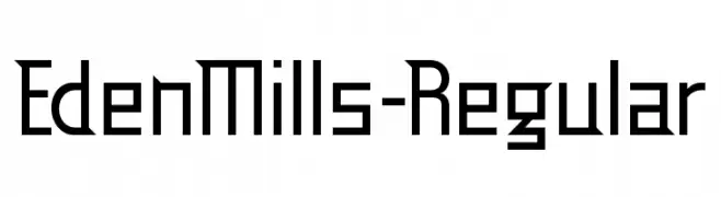
( Fonts by www.typodermicfonts.com - Ray Larabie )
A geometric, modern font with clean lines and sharp angles.
![EdenMills-Regular font caratteri gratis]() Scaricare 171 Downloads@WebFont
Scaricare 171 Downloads@WebFont -
![RootSquare font caratteri gratis]() Scaricare 171 Downloads@WebFont
Scaricare 171 Downloads@WebFont -
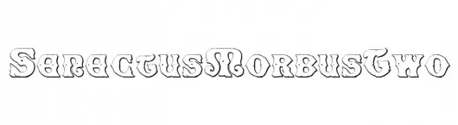
![SenectusMorbusTwo font caratteri gratis]() Scaricare 171 Downloads@WebFont
Scaricare 171 Downloads@WebFont -
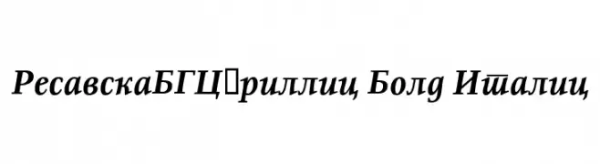
( Fonts by www.tipometar.org )
A bold, italicized serif font with a classic and elegant style.
![ResavskaBGCyrillic Bold Italic font caratteri gratis]() Scaricare 171 Downloads@WebFont
Scaricare 171 Downloads@WebFont -
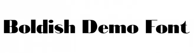
( Fonts by GlitzyGrapix - Lelanie - Personal-use only. For commercial use please contact owner. )
A bold, modern font with high contrast and unique stroke variations.
![Bold-ish Demo Font font caratteri gratis]() Scaricare 171 Downloads@WebFont
Scaricare 171 Downloads@WebFont -
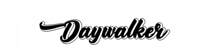
( Fonts by Kotak Kuning Studio - kotakkuning.com - Personal-use only. For commercial use please contact owner. )
A bold, dynamic script font with a flowing, cohesive style and three-dimensional effect.
![Daywalker font caratteri gratis]() Scaricare 171 Downloads@WebFont
Scaricare 171 Downloads@WebFont -
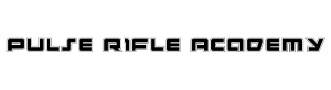
( Fonts by Daniel Zadorozny - www.iconian.com )
A bold, futuristic font with geometric, outlined characters.
![Pulse Rifle Academy font caratteri gratis]() Scaricare 171 Downloads@WebFont
Scaricare 171 Downloads@WebFont -
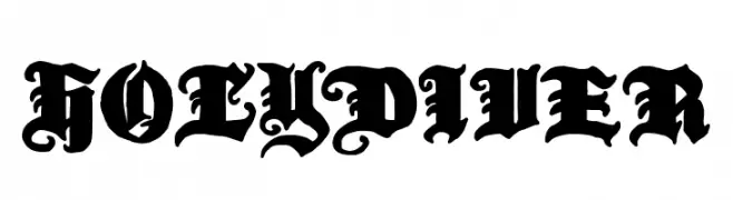
( Fonts by Woodcutter )
A bold, ornate blackletter font with intricate Gothic details.
![Holy Diver font caratteri gratis]() Scaricare 171 Downloads@WebFont
Scaricare 171 Downloads@WebFont -
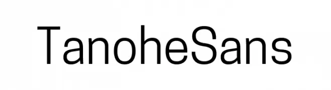
( Fonts by Cooper Hewitt Smithsonian Design Museum )
A clean, modern sans-serif font with consistent stroke width and excellent readability.
![Tanohe Sans font caratteri gratis]() Scaricare 171 Downloads@WebFont
Scaricare 171 Downloads@WebFont -
![GradeSkoolerNBP font caratteri gratis]() Scaricare 171 Downloads@WebFont
Scaricare 171 Downloads@WebFont -
( Fonts by Woodcutter )
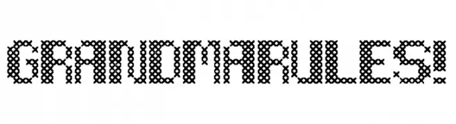
A decorative font with a cross-stitch embroidery style.
![Grandma Rules! font caratteri gratis]() Scaricare 171 Downloads@WebFont
Scaricare 171 Downloads@WebFont -
( Fonts by Pidco Art )
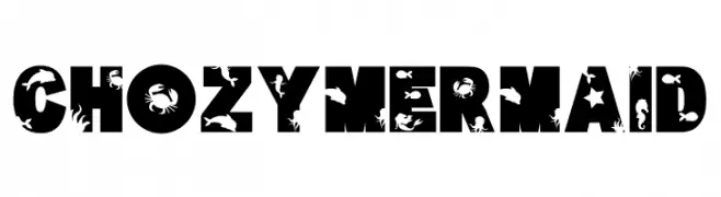
A bold, decorative font with sea-themed cutouts, perfect for creative projects.
![Chozy mermaid font caratteri gratis]() Scaricare 171 Downloads@WebFont
Scaricare 171 Downloads@WebFont -
( Fonts by Daniel Zadorozny - www.iconian.com - Free for personal use )
A futuristic, italicized font with a scanline effect and tight character spacing.
![Federal Escort Scanlines Italic font caratteri gratis]() Scaricare 171 Downloads@WebFont
Scaricare 171 Downloads@WebFont -
( Fonts by a David Fens. Personal-use only. For commercial use please contact owner. )
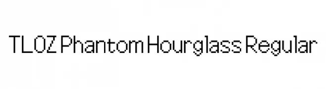
A pixelated, retro-style font inspired by classic video game graphics.
![TLOZ Phantom Hourglass Regular font caratteri gratis]() Scaricare 171 Downloads@WebFont
Scaricare 171 Downloads@WebFont -
( Fonts by Daniel Zadorozny - www.iconian.com )
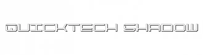
A futuristic, geometric font with sharp angles and outlined characters.
![QuickTech Shadow font caratteri gratis]() Scaricare 171 Downloads@WebFont
Scaricare 171 Downloads@WebFont -
( Fonts by Robin Campistron - Personal-use only. For commercial use please contact owner. )
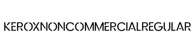
A modern, geometric font with bold, clean lines and a professional appearance.
![KeroxNonCommercialRegular font caratteri gratis]() Scaricare 171 Downloads@WebFont
Scaricare 171 Downloads@WebFont -
( Free for personal use )
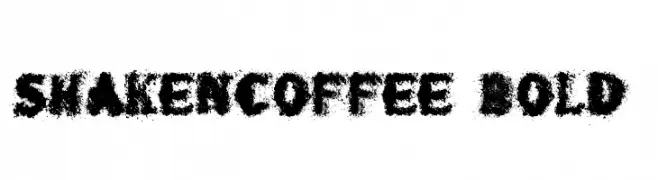
A bold, textured font with distressed uppercase letters and classic serif numbers.
![shaken_coffee Bold font caratteri gratis]() Scaricare 171 Downloads@WebFont
Scaricare 171 Downloads@WebFont -
( Levi Szekeres - www.loremipsum.ro )
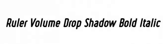
A bold, italicized font with a drop shadow effect and rounded, condensed characters.
![Ruler Volume Drop Shadow Bold Italic font caratteri gratis]() Scaricare 171 Downloads@WebFont
Scaricare 171 Downloads@WebFont -
( Fonts by 38.lineart )
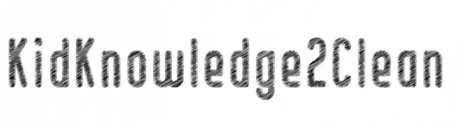
A playful, textured font with a hand-drawn, sketch-like appearance.
![Kid Knowledge 2 Clean font caratteri gratis]() Scaricare 171 Downloads@WebFont
Scaricare 171 Downloads@WebFont -
( Fonts by Manuel Ramos - www.infinitismo.com - Personal-use only. For commercial use please contact owner. )
A geometric, angular font with sharp lines and a futuristic style.
![NewWorld font caratteri gratis]() Scaricare 171 Downloads@WebFont
Scaricare 171 Downloads@WebFont -
( Fonts by www.junkohanhero.com - Personal-use only. For commercial use please contact owner. )
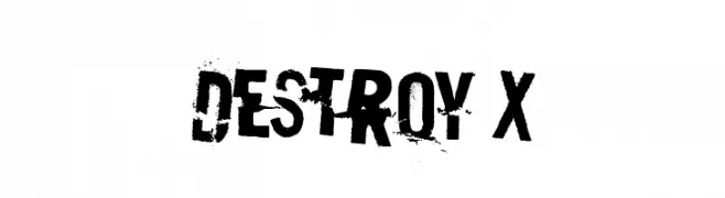
A bold, distressed font with a gritty, urban aesthetic.
![Destroy X font caratteri gratis]() Scaricare 171 Downloads@WebFont
Scaricare 171 Downloads@WebFont -
( Fonts by Manfred Klein. Free for private and charity use. Free for commercial with donation to organizations )
A bold, geometric font with angular shapes and a mysterious, rune-like appearance.
![CalligImprovis-BoldPlus font caratteri gratis]() Scaricare 171 Downloads@WebFont
Scaricare 171 Downloads@WebFont -
( Fonts by Balpirick Studio )
A playful, bold font with rounded, hand-drawn characters.
![BREAKBONE font caratteri gratis]() Scaricare 171 Downloads@WebFont
Scaricare 171 Downloads@WebFont -
( Karavan Studio - www.behance.net/cornelisnathalie )
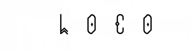
An artistic and abstract font with geometric and decorative elements.
![loco font caratteri gratis]() Scaricare 171 Downloads@WebFont
Scaricare 171 Downloads@WebFont -
![Of Mr Valent font caratteri gratis]() Scaricare 171 Downloads@WebFont
Scaricare 171 Downloads@WebFont -
( Fonts by Iconian Fonts )
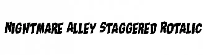
A bold, distressed, staggered italic font with a gritty, energetic style.
![Nightmare Alley Staggered Rotalic font caratteri gratis]() Scaricare 171 Downloads@WebFont
Scaricare 171 Downloads@WebFont -
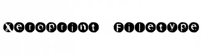
![Xeroprint Filetype font caratteri gratis]() Scaricare 171 Downloads@WebFont
Scaricare 171 Downloads@WebFont -
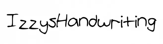
![IzzysHandwriting font caratteri gratis]() Scaricare 171 Downloads@WebFont
Scaricare 171 Downloads@WebFont -
![HF004 font caratteri gratis]() Scaricare 171 Downloads@WebFont
Scaricare 171 Downloads@WebFont -
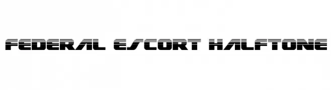
( Fonts by Daniel Zadorozny - www.iconian.com - Free for personal use )
A bold, futuristic font with a halftone effect and geometric shapes.
![Federal Escort Halftone font caratteri gratis]() Scaricare 171 Downloads@WebFont
Scaricare 171 Downloads@WebFont


Quali sono i font più popolari adesso?
Poppins, Roboto, Montserrat, Open Sans e Lato sono molto usati per le forme pulite e l'ampia applicabilità — dall'identità di marca alle landing page e ai poster.
Quali font si usano spesso nei loghi?
Le sans serif geometriche (es. Poppins, famiglie in stile Gotham) sono scelte comuni per un branding pulito e scalabile. Per un tocco personale restano valide script e stili manoscritti. Abbina un display deciso per i titoli a un corpo testo neutro per riconoscibilità ed equilibrio.
Ogni quanto si aggiorna la lista?
Con regolarità, in base ai download e all'attività reale. Torna spesso per scoprire in anticipo le nuove preferite.
💡 Consiglio: aggiungi ai preferiti — le tendenze cambiano in fretta e i font top di oggi possono ispirare il rebranding di domani.