Benvenuto nelle Font Più Popolari — dove popolarità e qualità si incontrano. Qui trovi i font più scaricati e usati dell'anno. Se cerchi scelte sicure per logo, web o social, inizia da qui.
Ogni font top si distingue per equilibrio, leggibilità e versatilità. Troverai sans serif moderne, script eleganti, serif vintage e display minimalisti.
-
( Fonts by Winter Design Studio - winty5.wixsite.com/noahtheawesome/ - Personal-use only. For commercial use please contact owner. )
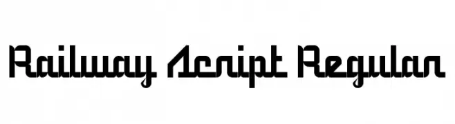
A modern script font with geometric, interconnected characters and a bold presence.
 Scaricare 170 Downloads@WebFont
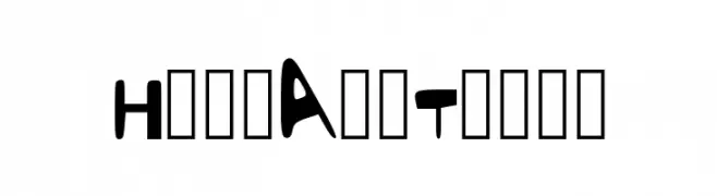
 -
![HereAndThere font caratteri gratis]() Scaricare 170 Downloads@WebFont
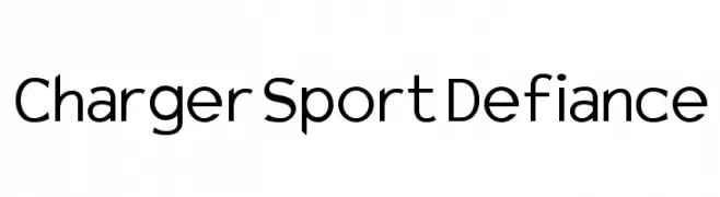
Scaricare 170 Downloads@WebFont -
![Charger Sport Defiance font caratteri gratis]() Scaricare 170 Downloads@WebFont
Scaricare 170 Downloads@WebFont -
( Fonts by www.aenigmafonts.com )
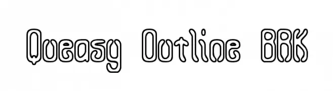
A bold, outline-style font with a playful and modern aesthetic.
![Queasy Outline BRK font caratteri gratis]() Scaricare 170 Downloads@WebFont
Scaricare 170 Downloads@WebFont -
( Here Be Monsters - monsterswithin.com )
A modern, tall, and narrow font with clean lines and minimal curves.
![HBM Serenity Book font caratteri gratis]() Scaricare 170 Downloads@WebFont
Scaricare 170 Downloads@WebFont -
( Fonts by www.dcoxy.com )
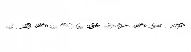
A collection of decorative flourishes and motifs for embellishment.
![Wind of Change font caratteri gratis]() Scaricare 170 Downloads@WebFont
Scaricare 170 Downloads@WebFont -
( Fonts by Vladimir Nikolic )
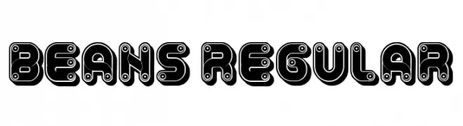
A bold, playful font with a mechanical, gear-like design.
![Beans Regular font caratteri gratis]() Scaricare 170 Downloads@WebFont
Scaricare 170 Downloads@WebFont -
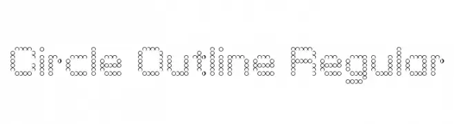
![Circle Outline Regular font caratteri gratis]() Scaricare 170 Downloads@WebFont
Scaricare 170 Downloads@WebFont -
( Fonts by Philipp H. Poll - Personal-use only. For commercial use please contact owner. )
A clean, elegant italic font with a modern and sophisticated style.
![Libertinus Sans Italic font caratteri gratis]() Scaricare 170 Downloads@WebFont
Scaricare 170 Downloads@WebFont -
![Soft Ornaments Fifteen font caratteri gratis]() Scaricare 170 Downloads@WebFont
Scaricare 170 Downloads@WebFont -
( Fonts by ShyFonts )
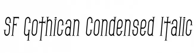
A condensed, italicized font with tall, narrow letterforms and consistent stroke thickness.
![SF Gothican Condensed Italic font caratteri gratis]() Scaricare 170 Downloads@WebFont
Scaricare 170 Downloads@WebFont -
( گالری فانت فارسی پژوهش آريانا - only compatible with Farsi and Arabic )
A bold, modern font with geometric influences and rounded edges.
![Baazi font caratteri gratis]() Scaricare 170 Downloads@WebFont
Scaricare 170 Downloads@WebFont -
( Fonts by Fikry Alif - Fikryal studio - https://www.creativefabrica.com/designer/mfikryalif/ref/222304/ - Personal-use only. For commercial use please contact owner. )
A playful and flowing script font with smooth, rounded edges and elegant curves.
![Winter Creative font caratteri gratis]() Scaricare 170 Downloads@WebFont
Scaricare 170 Downloads@WebFont -
( Fonts by Malley F. )
A playful, hand-drawn font with bold, rounded characters and a whimsical style.
![Skipping_Stones font caratteri gratis]() Scaricare 170 Downloads@WebFont
Scaricare 170 Downloads@WebFont -
( Juan Casco - www.juancasco.net )
A pixelated, monospaced font with a retro digital style.
![Code 8x8 Regular font caratteri gratis]() Scaricare 170 Downloads@WebFont
Scaricare 170 Downloads@WebFont -
![Kaptin Tribble Wound font caratteri gratis]() Scaricare 170 Downloads@WebFont
Scaricare 170 Downloads@WebFont -
( Fonts by Daniel Zadorozny - www.iconian.com - Free for personal use )
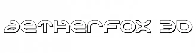
A futuristic, geometric font with outlined, hollow characters.
![Aetherfox 3D font caratteri gratis]() Scaricare 170 Downloads@WebFont
Scaricare 170 Downloads@WebFont -
( Fonts by Moreltype - Hermawan Hermawan - Personal-use only. For commercial use please contact owner. )
A modern serif font with clean lines and balanced forms.
![Leorio font caratteri gratis]() Scaricare 170 Downloads@WebFont
Scaricare 170 Downloads@WebFont -
( Fonts by SDFonts - Ritzy )
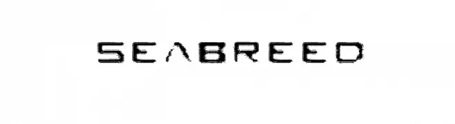
A textured, modern font with a bold, slightly condensed style.
![Seabreed font caratteri gratis]() Scaricare 170 Downloads@WebFont
Scaricare 170 Downloads@WebFont -
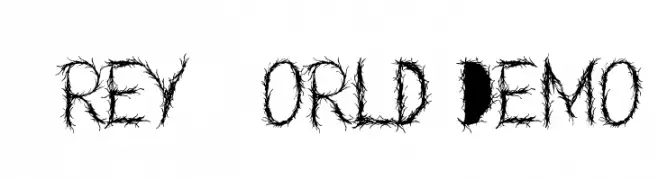
![Grey World Demo font caratteri gratis]() Scaricare 170 Downloads@WebFont
Scaricare 170 Downloads@WebFont -
( Fonts by Gilang Ternadho )
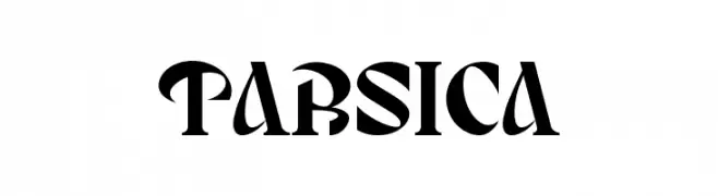
A bold, high-contrast font with sharp, angular edges and exaggerated serifs.
![TARSICA font caratteri gratis]() Scaricare 170 Downloads@WebFont
Scaricare 170 Downloads@WebFont -
( Fonts by Ariq Sya - marsnev.com )
Invalid font image.
![Font-untuk-Ibu font caratteri gratis]() Scaricare 170 Downloads@WebFont
Scaricare 170 Downloads@WebFont -
![Bold Pressing H3 demo font caratteri gratis]() Scaricare 170 Downloads@WebFont
Scaricare 170 Downloads@WebFont -
( Fonts by David Kerkhoff - www.hanodedphotography.com )
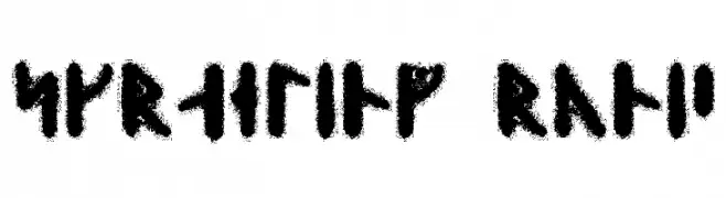
A bold, runic-style font with a rugged, ancient appearance.
![Skraeling Runic font caratteri gratis]() Scaricare 170 Downloads@WebFont
Scaricare 170 Downloads@WebFont -
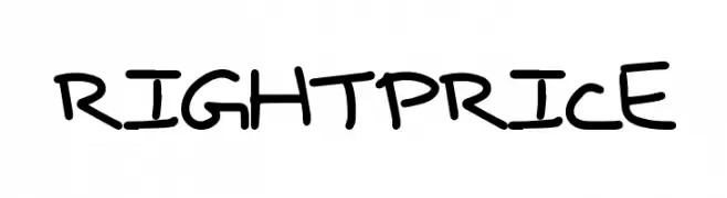
( Fonts by a Max Infeld - XEROGRAPHER FONTS - xerographer.blogspot.com . Personal-use only. For commercial use please contact owner. )
A playful, casual handwritten font with irregular strokes.
![RightPrice font caratteri gratis]() Scaricare 170 Downloads@WebFont
Scaricare 170 Downloads@WebFont -
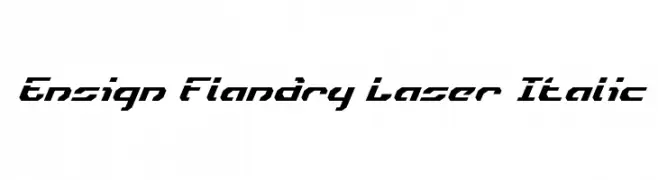
![Ensign Flandry Laser Italic font caratteri gratis]() Scaricare 170 Downloads@WebFont
Scaricare 170 Downloads@WebFont -
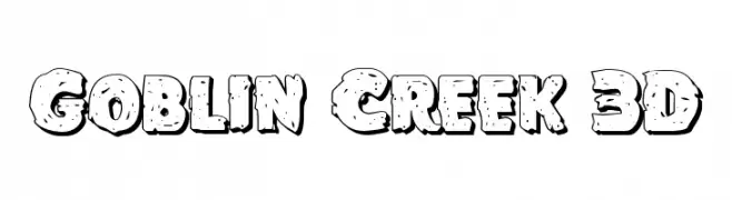
( Fonts by Iconian Fonts )
A bold, playful 3D font with a whimsical, irregular outline and scattered dot details.
![Goblin Creek 3D font caratteri gratis]() Scaricare 170 Downloads@WebFont
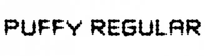
Scaricare 170 Downloads@WebFont -
![Puffy Regular font caratteri gratis]() Scaricare 170 Downloads@WebFont
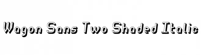
Scaricare 170 Downloads@WebFont -
![Wagon Sans Two Shaded Italic font caratteri gratis]() Scaricare 170 Downloads@WebFont
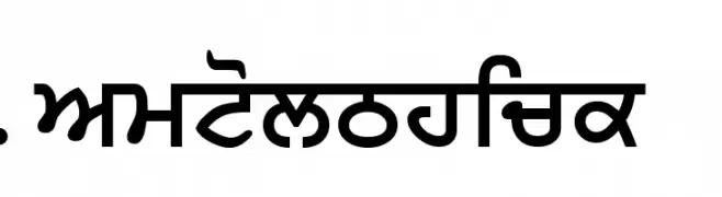
Scaricare 170 Downloads@WebFont -
![SamtolThick font caratteri gratis]() Scaricare 170 Downloads@WebFont
Scaricare 170 Downloads@WebFont -
( Joorgemoron@gmail.com )
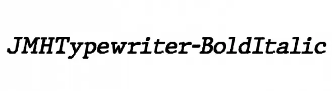
A bold, italicized typewriter-style font with a classic, monospaced design.
![JMHTypewriter-BoldItalic font caratteri gratis]() Scaricare 170 Downloads@WebFont
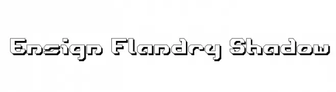
Scaricare 170 Downloads@WebFont -
![Ensign Flandry Shadow font caratteri gratis]() Scaricare 170 Downloads@WebFont
Scaricare 170 Downloads@WebFont -
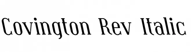
( Fonts by Apostrophic Lab )
A modern serif font with an elegant italic slant and medium contrast.
![Covington Rev Italic font caratteri gratis]() Scaricare 170 Downloads@WebFont
Scaricare 170 Downloads@WebFont -
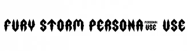
( LJ Design Studios - www.ljdesignstudios.com )
A bold, angular font with a modern, edgy design.
![Fury Storm Personal Use font caratteri gratis]() Scaricare 170 Downloads@WebFont
Scaricare 170 Downloads@WebFont -
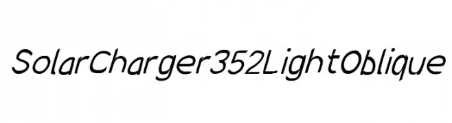
( Fonts by CannotIntoSpaceFonts - KineticPlasma Fonts - Personal-use only. For commercial use please contact owner. )
A modern, oblique font with a light weight and sleek design.
![SolarCharger 352 Light Oblique font caratteri gratis]() Scaricare 170 Downloads@WebFont
Scaricare 170 Downloads@WebFont


Quali sono i font più popolari adesso?
Poppins, Roboto, Montserrat, Open Sans e Lato sono molto usati per le forme pulite e l'ampia applicabilità — dall'identità di marca alle landing page e ai poster.
Quali font si usano spesso nei loghi?
Le sans serif geometriche (es. Poppins, famiglie in stile Gotham) sono scelte comuni per un branding pulito e scalabile. Per un tocco personale restano valide script e stili manoscritti. Abbina un display deciso per i titoli a un corpo testo neutro per riconoscibilità ed equilibrio.
Ogni quanto si aggiorna la lista?
Con regolarità, in base ai download e all'attività reale. Torna spesso per scoprire in anticipo le nuove preferite.
💡 Consiglio: aggiungi ai preferiti — le tendenze cambiano in fretta e i font top di oggi possono ispirare il rebranding di domani.