Benvenuto nelle Font Più Popolari — dove popolarità e qualità si incontrano. Qui trovi i font più scaricati e usati dell'anno. Se cerchi scelte sicure per logo, web o social, inizia da qui.
Ogni font top si distingue per equilibrio, leggibilità e versatilità. Troverai sans serif moderne, script eleganti, serif vintage e display minimalisti.
-
( Fonts by Noah Johnson )
A playful, bold, hand-drawn font with a casual and friendly appearance.
 Scaricare 831 Downloads@WebFont
 -
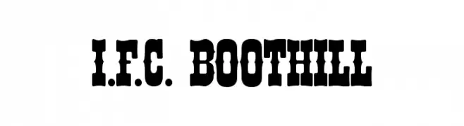
( Fonts by a Anton Krylov . Personal-use only. For commercial use please contact owner. )
A bold, decorative font with a Western vintage style.
![I.F.C. BOOTHILL font caratteri gratis]() Scaricare 831 Downloads@WebFont
Scaricare 831 Downloads@WebFont -
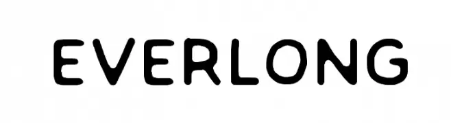
( Fonts by a Zaffar Ansari - Zansari . Personal-use only. For commercial use please contact owner. )
A rounded, playful font with smooth curves and a friendly, modern appearance.
![EVERLONG font caratteri gratis]() Scaricare 831 Downloads@WebFont
Scaricare 831 Downloads@WebFont -
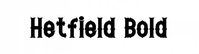
( Fonts by a Neale Davidson - www.pixelsagas.com. Personal-use only. For commercial use please contact owner. )
A bold, Gothic-inspired font with sharp edges and dramatic styling.
![Hetfield Bold font caratteri gratis]() Scaricare 831 Downloads@WebFont
Scaricare 831 Downloads@WebFont -
( Fonts by weknow - Wino S Kadir )
A playful, bubbly font with rounded, cartoonish letterforms.
![smile font caratteri gratis]() Scaricare 831 Downloads@WebFont
Scaricare 831 Downloads@WebFont -
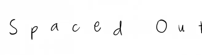
-
![Spaced Out font caratteri gratis]() Scaricare 831 Downloads@WebFont
Scaricare 831 Downloads@WebFont -
( Fonts by Dieter Steffmann )
A bold, ornate Blackletter font with intricate, angular letterforms.
![Missal font caratteri gratis]() Scaricare 831 Downloads@WebFont
Scaricare 831 Downloads@WebFont -
( - www.matiescanalesgonzalez.com )
An organic, tree bark-inspired font with intricate, hand-carved details.
![Gill Tree font caratteri gratis]() Scaricare 831 Downloads@WebFont
Scaricare 831 Downloads@WebFont -
( Fonts by www.gust.org.pl )
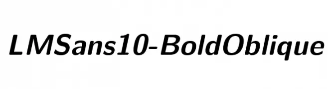
A bold and oblique modern font with smooth, consistent strokes.
![LMSans10-BoldOblique font caratteri gratis]() Scaricare 831 Downloads@WebFont
Scaricare 831 Downloads@WebFont -
![SF Florencesans SC Cond Bold font caratteri gratis]() Scaricare 831 Downloads@WebFont
Scaricare 831 Downloads@WebFont


Quali sono i font più popolari adesso?
Poppins, Roboto, Montserrat, Open Sans e Lato sono molto usati per le forme pulite e l'ampia applicabilità — dall'identità di marca alle landing page e ai poster.
Quali font si usano spesso nei loghi?
Le sans serif geometriche (es. Poppins, famiglie in stile Gotham) sono scelte comuni per un branding pulito e scalabile. Per un tocco personale restano valide script e stili manoscritti. Abbina un display deciso per i titoli a un corpo testo neutro per riconoscibilità ed equilibrio.
Ogni quanto si aggiorna la lista?
Con regolarità, in base ai download e all'attività reale. Torna spesso per scoprire in anticipo le nuove preferite.
💡 Consiglio: aggiungi ai preferiti — le tendenze cambiano in fretta e i font top di oggi possono ispirare il rebranding di domani.