Benvenuto nelle Font Più Popolari — dove popolarità e qualità si incontrano. Qui trovi i font più scaricati e usati dell'anno. Se cerchi scelte sicure per logo, web o social, inizia da qui.
Ogni font top si distingue per equilibrio, leggibilità e versatilità. Troverai sans serif moderne, script eleganti, serif vintage e display minimalisti.
-
( Fonts by Gassstype - Anang Fibriyanto - www.gassstype.com - Personal-use only. For commercial use please contact owner. )
A bold, jagged font with sharp, thorn-like edges for a dramatic and edgy look.
 Scaricare 164 Downloads@WebFont
 -
( Gaël Chrétien )
A bold, modern font with geometric lines and a strong presence.
![Comdie font caratteri gratis]() Scaricare 164 Downloads@WebFont
Scaricare 164 Downloads@WebFont -
( Font by Jonathan Harris - www.tattoowoo.com )
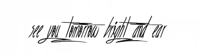
A dynamic and artistic script font with elongated strokes and bold numerals.
![See you tomorrow bright and ear font caratteri gratis]() Scaricare 164 Downloads@WebFont
Scaricare 164 Downloads@WebFont -
( Donationware )
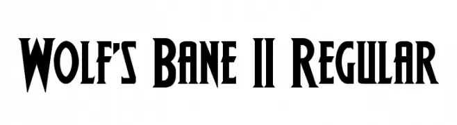
A bold, angular font with high contrast and a dramatic style.
![Wolf's Bane II Regular font caratteri gratis]() Scaricare 164 Downloads@WebFont
Scaricare 164 Downloads@WebFont -
![PrintersOrnamentsTwo font caratteri gratis]() Scaricare 164 Downloads@WebFont
Scaricare 164 Downloads@WebFont -
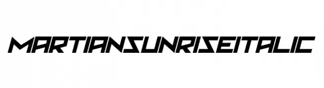
![Martian Sunrise Italic font caratteri gratis]() Scaricare 164 Downloads@WebFont
Scaricare 164 Downloads@WebFont -
( Fonts by deFharo - Personal-use only. For commercial use please contact owner. )
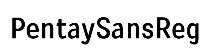
A modern, sans-serif font with clean lines and excellent readability.
![PentaySansReg font caratteri gratis]() Scaricare 164 Downloads@WebFont
Scaricare 164 Downloads@WebFont -
( Fonts by PampaType - Personal-use only. For commercial use please contact owner. )
A modern, italic font with a sleek and elegant style.
![Reforma 2018 Gris Italica font caratteri gratis]() Scaricare 163 Downloads@WebFont
Scaricare 163 Downloads@WebFont -
( Fonts by MadeType - Personal-use only. For commercial use please contact owner. )
A bold, outlined font with a modern and clean design.
![MADETommySoftOutline-ExtraBold font caratteri gratis]() Scaricare 163 Downloads@WebFont
Scaricare 163 Downloads@WebFont -
( www.chiba-design.com )
A sleek, modern font with thin, sharp lines and a minimalist style.
![Thin Normal font caratteri gratis]() Scaricare 163 Downloads@WebFont
Scaricare 163 Downloads@WebFont -
( Fonts by Vladimir Nikolic )
A decorative font with letters integrated into piano key motifs, perfect for musical themes.
![Yamaha Regular font caratteri gratis]() Scaricare 163 Downloads@WebFont
Scaricare 163 Downloads@WebFont -
( Fonts by Daniel Zadorozny - www.iconian.com - Free for personal use )
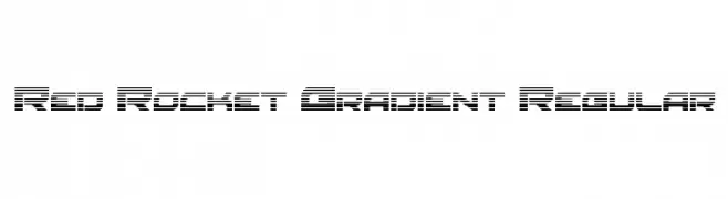
A futuristic, digital-style font with a horizontal line gradient effect.
![Red Rocket Gradient Regular font caratteri gratis]() Scaricare 163 Downloads@WebFont
Scaricare 163 Downloads@WebFont -
![Franck Italic font caratteri gratis]() Scaricare 163 Downloads@WebFont
Scaricare 163 Downloads@WebFont -
( Fonts by Xerographer Fonts )
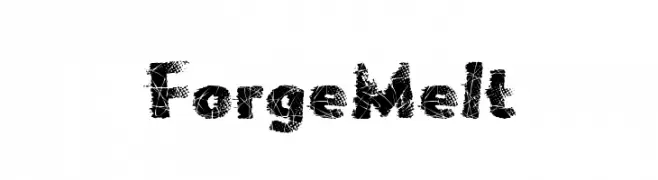
A bold, distressed font with a fragmented, dynamic texture.
![ForgeMelt font caratteri gratis]() Scaricare 163 Downloads@WebFont
Scaricare 163 Downloads@WebFont -
![SudegnakNo3 font caratteri gratis]() Scaricare 163 Downloads@WebFont
Scaricare 163 Downloads@WebFont -
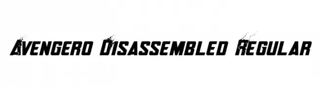
![Avengero Disassembled Regular font caratteri gratis]() Scaricare 163 Downloads@WebFont
Scaricare 163 Downloads@WebFont -
( www.junkohanhero.com )
A bold, distressed font with a vintage, industrial style.
![Rediscovered font caratteri gratis]() Scaricare 163 Downloads@WebFont
Scaricare 163 Downloads@WebFont -
( Fonts by www.fenotype.com )
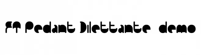
A bold, geometric font with a modern and playful design.
![FT Pedant Dilettante demo font caratteri gratis]() Scaricare 163 Downloads@WebFont
Scaricare 163 Downloads@WebFont -
( Fonts by Iconian Fonts )
A bold, semi-italic font with a modern, angular design.
![Olympic Carrier Semi-Italic font caratteri gratis]() Scaricare 163 Downloads@WebFont
Scaricare 163 Downloads@WebFont -
( Fonts by Arkandis Digital Foundry )
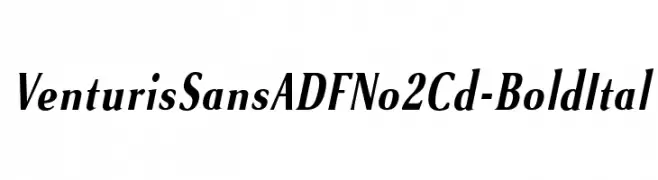
A bold, italicized font with elegant, slightly condensed letterforms.
![VenturisSansADFNo2Cd-BoldItal font caratteri gratis]() Scaricare 163 Downloads@WebFont
Scaricare 163 Downloads@WebFont -
![Praduhhh font caratteri gratis]() Scaricare 163 Downloads@WebFont
Scaricare 163 Downloads@WebFont -
( Fonts by Wino S Kadir - weknow - www.revolge.com/shop/weknow/ - Personal-use only. For commercial use please contact owner. )
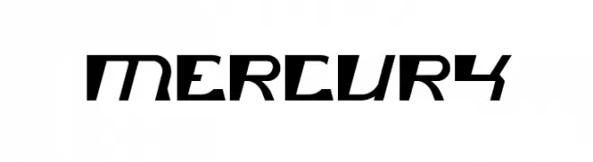
A bold, angular font with a futuristic and dynamic style.
![mercury font caratteri gratis]() Scaricare 163 Downloads@WebFont
Scaricare 163 Downloads@WebFont -
( Fonts by Fernando Carvente - serifdechocolate.wordpress.com )
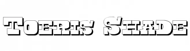
Bold, three-dimensional font with strong shadow effects, ideal for impactful headlines.
![Toeris Shade font caratteri gratis]() Scaricare 163 Downloads@WebFont
Scaricare 163 Downloads@WebFont -
( Fonts by a Max Infeld - XEROGRAPHER FONTS - xerographer.blogspot.com . Personal-use only. For commercial use please contact owner. )
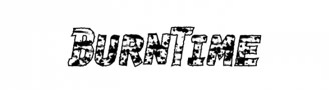
A bold, textured font with a distressed, edgy style.
![BurnTime font caratteri gratis]() Scaricare 163 Downloads@WebFont
Scaricare 163 Downloads@WebFont -
( Fonts by Dmitry Astakhov - www.behance.net/adonis-abe1e - Personal-use only. For commercial use please contact owner. )
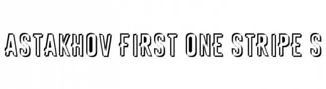
A bold, decorative font with a unique striped pattern and vintage flair.
![Astakhov First One Stripe S font caratteri gratis]() Scaricare 163 Downloads@WebFont
Scaricare 163 Downloads@WebFont -
![Sivernake font caratteri gratis]() Scaricare 163 Downloads@WebFont
Scaricare 163 Downloads@WebFont -
![San Frediano Bold Italic font caratteri gratis]() Scaricare 163 Downloads@WebFont
Scaricare 163 Downloads@WebFont -
( Fonts by bob istheowl http://luc.devroye.org/bobistheowl.html )
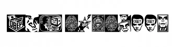
Graphic, illustrative font with each character as a distinct artwork.
![ObeyPotpourri font caratteri gratis]() Scaricare 163 Downloads@WebFont
Scaricare 163 Downloads@WebFont -
( Fonts by www.seansart.net )
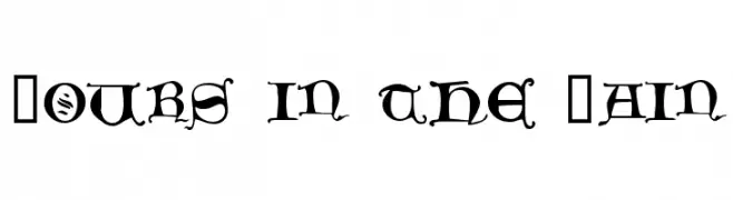
A Gothic-style font with intricate serifs and decorative elements.
![Hours in the Rain font caratteri gratis]() Scaricare 163 Downloads@WebFont
Scaricare 163 Downloads@WebFont -
( Fonts by www.woodcutter.es - woodcutter Manero - Personal-use only. For commercial use please contact owner. )
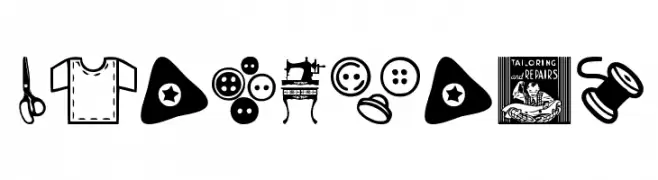
Icon-based font with tailoring and sewing motifs.
![Tailoring font caratteri gratis]() Scaricare 163 Downloads@WebFont
Scaricare 163 Downloads@WebFont -
( Iconian Fonts - Daniel Zadorozny - www.iconian.com )
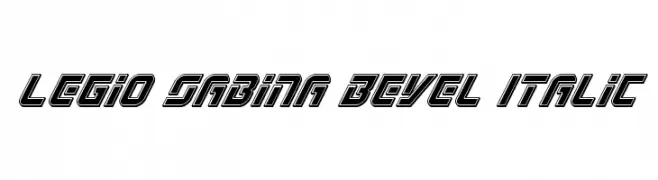
A bold, italicized font with a beveled, three-dimensional style.
![Legio Sabina Bevel Italic font caratteri gratis]() Scaricare 163 Downloads@WebFont
Scaricare 163 Downloads@WebFont -
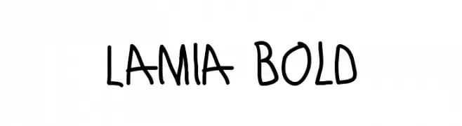
Caratteri di antipixel. For commercial use please contact the owner.
![Lamia Bold font caratteri gratis]() Scaricare 163 Downloads@WebFont
Scaricare 163 Downloads@WebFont -
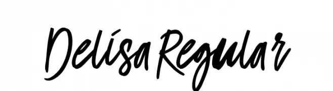
( Fonts by Mr Letters - https://www.creativefabrica.com/designer/mrletters/ - Personal-use only. For commercial use please contact owner. )
A dynamic, expressive handwritten font with fluid, cursive strokes.
![Delisa-Regular font caratteri gratis]() Scaricare 163 Downloads@WebFont
Scaricare 163 Downloads@WebFont -
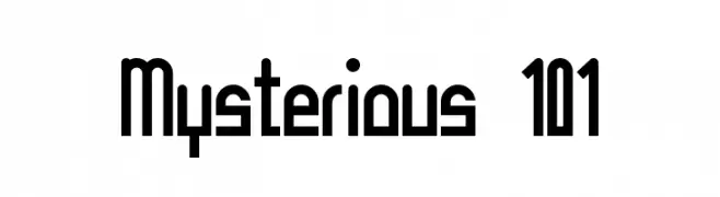
![Mysterious 101 font caratteri gratis]() Scaricare 163 Downloads@WebFont
Scaricare 163 Downloads@WebFont -
( semuthitam - Mokhamad Junaedi - creativemarket.com/junART )
A dynamic and elegant script font with fluid, cursive strokes and high contrast.
![Lavalette font caratteri gratis]() Scaricare 163 Downloads@WebFont
Scaricare 163 Downloads@WebFont


Quali sono i font più popolari adesso?
Poppins, Roboto, Montserrat, Open Sans e Lato sono molto usati per le forme pulite e l'ampia applicabilità — dall'identità di marca alle landing page e ai poster.
Quali font si usano spesso nei loghi?
Le sans serif geometriche (es. Poppins, famiglie in stile Gotham) sono scelte comuni per un branding pulito e scalabile. Per un tocco personale restano valide script e stili manoscritti. Abbina un display deciso per i titoli a un corpo testo neutro per riconoscibilità ed equilibrio.
Ogni quanto si aggiorna la lista?
Con regolarità, in base ai download e all'attività reale. Torna spesso per scoprire in anticipo le nuove preferite.
💡 Consiglio: aggiungi ai preferiti — le tendenze cambiano in fretta e i font top di oggi possono ispirare il rebranding di domani.