Benvenuto nelle Font Più Popolari — dove popolarità e qualità si incontrano. Qui trovi i font più scaricati e usati dell'anno. Se cerchi scelte sicure per logo, web o social, inizia da qui.
Ogni font top si distingue per equilibrio, leggibilità e versatilità. Troverai sans serif moderne, script eleganti, serif vintage e display minimalisti.
-
( Fonts by a Situjuh Nazara - c7n1.wordpress.com. Personal-use only. For commercial use please contact owner. )
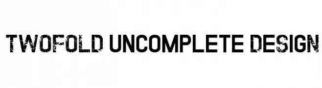
A bold, distressed font with a grunge texture and vintage appeal.
 Scaricare 809 Downloads@WebFont
 -
![BookendsWithAccents font caratteri gratis]() Scaricare 809 Downloads@WebFont
Scaricare 809 Downloads@WebFont -
( Copyright (c) 2011-2012, Martin Sommaruga (martin@estudiotrama.com), with Reserved Font Name 'Rambla' )
A modern sans-serif font with balanced proportions and smooth curves.
![Rambla font caratteri gratis]() Scaricare 809 Downloads@WebFont
Scaricare 809 Downloads@WebFont -
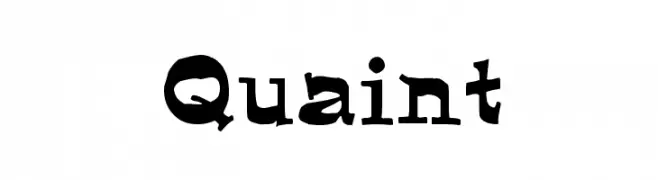
( Fonts by Rick Mueller )
A playful, hand-drawn font with bold, uneven strokes and quirky serifs.
![Quaint font caratteri gratis]() Scaricare 809 Downloads@WebFont
Scaricare 809 Downloads@WebFont -
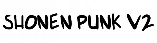
( Fonts by Press Gang Studios - Andeh Pinkard - www.pressgang-studios.com )
A bold, graffiti-inspired font with a playful, hand-drawn style.
![shonen punk v2 font caratteri gratis]() Scaricare 809 Downloads@WebFont
Scaricare 809 Downloads@WebFont -
-
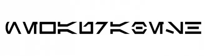
![newAurabesh font caratteri gratis]() Scaricare 809 Downloads@WebFont
Scaricare 809 Downloads@WebFont -
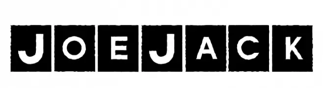
( Fonts by Daniel Gauthier )
Bold, stencil-like font with characters in white on black squares, offering a vintage, industrial feel.
![JoeJack font caratteri gratis]() Scaricare 809 Downloads@WebFont
Scaricare 809 Downloads@WebFont -
( Paul Lloyd Fonts )
A modern, clean font with balanced spacing and clear characters.
![NewStyle font caratteri gratis]() Scaricare 809 Downloads@WebFont
Scaricare 809 Downloads@WebFont -
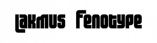
( Fonts by Emil Bertell - www.fenotype.com )
A bold, geometric font with a modern and impactful design.
![Lakmus Fenotype font caratteri gratis]() Scaricare 809 Downloads@WebFont
Scaricare 809 Downloads@WebFont -
![Octoville font caratteri gratis]() Scaricare 809 Downloads@WebFont
Scaricare 809 Downloads@WebFont


Quali sono i font più popolari adesso?
Poppins, Roboto, Montserrat, Open Sans e Lato sono molto usati per le forme pulite e l'ampia applicabilità — dall'identità di marca alle landing page e ai poster.
Quali font si usano spesso nei loghi?
Le sans serif geometriche (es. Poppins, famiglie in stile Gotham) sono scelte comuni per un branding pulito e scalabile. Per un tocco personale restano valide script e stili manoscritti. Abbina un display deciso per i titoli a un corpo testo neutro per riconoscibilità ed equilibrio.
Ogni quanto si aggiorna la lista?
Con regolarità, in base ai download e all'attività reale. Torna spesso per scoprire in anticipo le nuove preferite.
💡 Consiglio: aggiungi ai preferiti — le tendenze cambiano in fretta e i font top di oggi possono ispirare il rebranding di domani.