Benvenuto nelle Font Più Popolari — dove popolarità e qualità si incontrano. Qui trovi i font più scaricati e usati dell'anno. Se cerchi scelte sicure per logo, web o social, inizia da qui.
Ogni font top si distingue per equilibrio, leggibilità e versatilità. Troverai sans serif moderne, script eleganti, serif vintage e display minimalisti.
-
 Scaricare 2555 Downloads@WebFont
 -
![04b_19 font caratteri gratis]() Scaricare 2555 Downloads@WebFont
Scaricare 2555 Downloads@WebFont -
( Free for a personal use. For a commercial use please visit www.kevinandamanda.com )
A playful, handwritten font with a casual and friendly style.
![Auburn font caratteri gratis]() Scaricare 2555 Downloads@WebFont
Scaricare 2555 Downloads@WebFont -
( Fonts by www.typodermicfonts.com - Ray Larabie )
A bold, italic, and condensed font with a dynamic and energetic style.
![KenyanCoffeeRg-Italic font caratteri gratis]() Scaricare 2554 Downloads@WebFont
Scaricare 2554 Downloads@WebFont -
( Free for a personal use. For a commercial use please visit www.kevinandamanda.com )
A playful, handwritten font with dynamic strokes and a lively appearance.
![Charlie font caratteri gratis]() Scaricare 2554 Downloads@WebFont
Scaricare 2554 Downloads@WebFont -
![Umbro Outline font caratteri gratis]() Scaricare 2554 Downloads@WebFont
Scaricare 2554 Downloads@WebFont -
![Block Letters Tryout font caratteri gratis]() Scaricare 2554 Downloads@WebFont
Scaricare 2554 Downloads@WebFont -
Caratteri di defharo. For commercial use please contact the owner.
![GlotonaWhite font caratteri gratis]() Scaricare 2553 Downloads@WebFont
Scaricare 2553 Downloads@WebFont -
( Fonts by Szabina Korsos )
A bold, playful handwritten font with thick strokes and a whimsical style.
![Erlan font caratteri gratis]() Scaricare 2553 Downloads@WebFont
Scaricare 2553 Downloads@WebFont -
( Fonts by Dieter Steffmann )
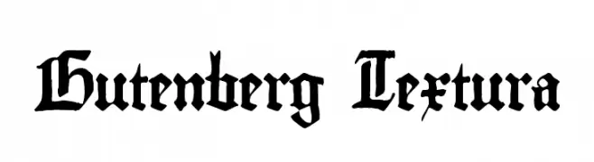
A traditional Blackletter font with sharp, angular lines and a dense appearance.
![Gutenberg Textura font caratteri gratis]() Scaricare 2553 Downloads@WebFont
Scaricare 2553 Downloads@WebFont -
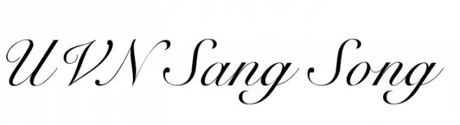
![UVN Sang Song font caratteri gratis]() Scaricare 2552 Downloads@WebFont
Scaricare 2552 Downloads@WebFont -
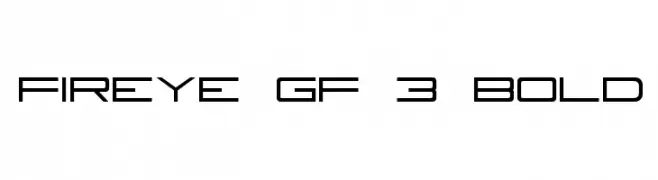
![Fireye GF 3 Bold font caratteri gratis]() Scaricare 2552 Downloads@WebFont
Scaricare 2552 Downloads@WebFont -
Caratteri di joorgemoron. For commercial use please contact the owner.
( Free for personal use )
A classic blackletter font with ornate and intricate design elements.
![JMHSantaMaria-Regular font caratteri gratis]() Scaricare 2551 Downloads@WebFont
Scaricare 2551 Downloads@WebFont -
( Fonts by Darrell Flood - Personal-use only. For commercial use please contact owner. )
A bold, handwritten font with a playful and energetic style.
![Signboard font caratteri gratis]() Scaricare 2551 Downloads@WebFont
Scaricare 2551 Downloads@WebFont -
Caratteri di zombbalala. For commercial use please contact the owner.
![Nito font caratteri gratis]() Scaricare 2551 Downloads@WebFont
Scaricare 2551 Downloads@WebFont -
( Fonts by Casady & Greene )
A bold, elegant font with high contrast and a vintage-modern style.
![CampanileFLF font caratteri gratis]() Scaricare 2551 Downloads@WebFont
Scaricare 2551 Downloads@WebFont -
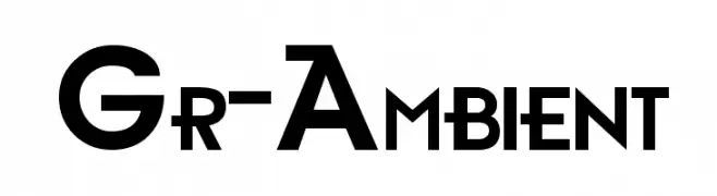
![Gr-Ambient font caratteri gratis]() Scaricare 2551 Downloads@WebFont
Scaricare 2551 Downloads@WebFont -
( 7NTypes - Situjuh Nazara - 7ntypes.com )
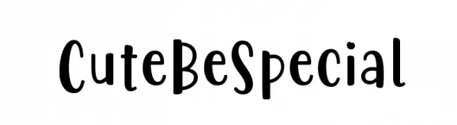
A playful, hand-drawn font with a whimsical and friendly style.
![Cute Be Special font caratteri gratis]() Scaricare 2550 Downloads@WebFont
Scaricare 2550 Downloads@WebFont -
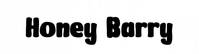
( Fonts by Pinisiart )
A bold, playful font with rounded edges and a bubbly appearance.
![Honey Barry font caratteri gratis]() Scaricare 2549 Downloads@WebFont
Scaricare 2549 Downloads@WebFont -
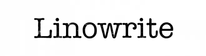
( LennardGlitter )
A vintage typewriter-style font with a textured, distressed appearance.
![Linowrite font caratteri gratis]() Scaricare 2549 Downloads@WebFont
Scaricare 2549 Downloads@WebFont -
( Fonts by Jovanny Lemonad - typetype.ru - Personal-use only. For commercial use please contact owner. )
A bold, geometric font with strong, blocky letterforms and high contrast.
![TT Directors DEMO BL Regular font caratteri gratis]() Scaricare 2549 Downloads@WebFont
Scaricare 2549 Downloads@WebFont -
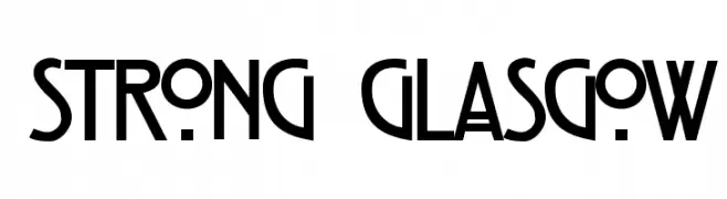
( Fonts by herofonts.com. Personal-use only. For commercial use please contact owner. )
A bold, geometric font with a modern and assertive style.
![Strong Glasgow font caratteri gratis]() Scaricare 2549 Downloads@WebFont
Scaricare 2549 Downloads@WebFont -
( Fonts by Lauren Thompson - www.nymfont.com )
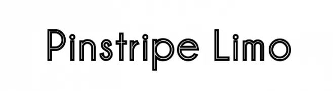
A modern, outlined font with a geometric and clean design.
![Pinstripe Limo font caratteri gratis]() Scaricare 2549 Downloads@WebFont
Scaricare 2549 Downloads@WebFont -
( Purastik Graphics - purastik.net/ames )
A playful, handwritten-style font with rounded, informal letterforms.
![Ames font caratteri gratis]() Scaricare 2548 Downloads@WebFont
Scaricare 2548 Downloads@WebFont -
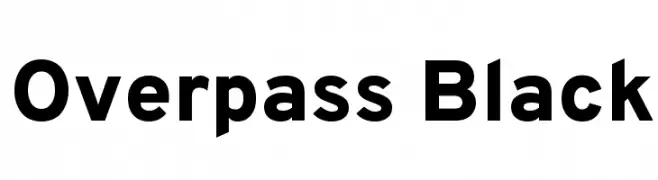
( Copyright (c) 2016 by Red Hat, Inc. All rights reserved. )
A bold, modern sans-serif font with clean lines and strong presence.
![Overpass Black font caratteri gratis]() Scaricare 2548 Downloads@WebFont
Scaricare 2548 Downloads@WebFont -
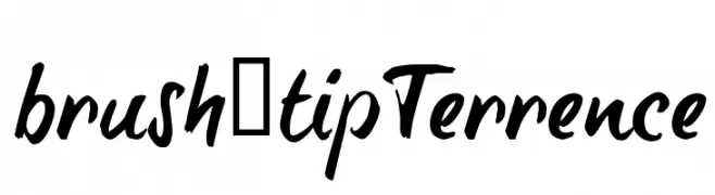
![brush-tipTerrence font caratteri gratis]() Scaricare 2548 Downloads@WebFont
Scaricare 2548 Downloads@WebFont -
( Fonts by Glyphobet Font Foundry - Matt Chisholm - http://glyphobet.net/typography/ )
A bold, angular font with a modern twist on Gothic style, featuring high contrast and sharp edges.
![Shark font caratteri gratis]() Scaricare 2548 Downloads@WebFont
Scaricare 2548 Downloads@WebFont -
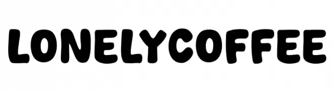
( Fonts by Khurasan )
A bold, rounded font with a playful and whimsical style.
![Lonely Coffee font caratteri gratis]() Scaricare 2547 Downloads@WebFont
Scaricare 2547 Downloads@WebFont -
( Dominique Idiart - dominiqueidiart.myportfolio.com )
A playful, irregular handwritten font with quirky angles and uneven strokes.
![Naive font caratteri gratis]() Scaricare 2547 Downloads@WebFont
Scaricare 2547 Downloads@WebFont -
( Fonts by Daniel Zadorozny - www.iconian.com - Free for personal use )
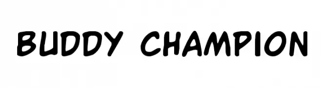
A playful, bold handwritten font with rounded edges and a casual style.
![Buddy Champion font caratteri gratis]() Scaricare 2547 Downloads@WebFont
Scaricare 2547 Downloads@WebFont -
( Fonts by a Max Infeld - XEROGRAPHER FONTS - xerographer.blogspot.com . Personal-use only. For commercial use please contact owner. )
A bold, modern font with a diagonal striped pattern and geometric design.
![MixTape font caratteri gratis]() Scaricare 2547 Downloads@WebFont
Scaricare 2547 Downloads@WebFont -
( Fonts by Universitas Gadjah Mada Yogyakarta - Personal-use only. For commercial use please contact owner. )
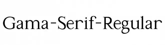
A classic serif typeface with elegant and refined letterforms.
![Gama-Serif-Regular font caratteri gratis]() Scaricare 2546 Downloads@WebFont
Scaricare 2546 Downloads@WebFont -
( Fonts by Burim Loshaj )
A bold, geometric font with a pixelated, digital appearance.
![Cinderblock font caratteri gratis]() Scaricare 2546 Downloads@WebFont
Scaricare 2546 Downloads@WebFont -
![Clb:Valentine font caratteri gratis]() Scaricare 2546 Downloads@WebFont
Scaricare 2546 Downloads@WebFont -
( Fonts by www.kuzumi.net - Dust@fonts )
A bold, geometric font with a modern and futuristic style.
![Electrofied Bold font caratteri gratis]() Scaricare 2546 Downloads@WebFont
Scaricare 2546 Downloads@WebFont


Quali sono i font più popolari adesso?
Poppins, Roboto, Montserrat, Open Sans e Lato sono molto usati per le forme pulite e l'ampia applicabilità — dall'identità di marca alle landing page e ai poster.
Quali font si usano spesso nei loghi?
Le sans serif geometriche (es. Poppins, famiglie in stile Gotham) sono scelte comuni per un branding pulito e scalabile. Per un tocco personale restano valide script e stili manoscritti. Abbina un display deciso per i titoli a un corpo testo neutro per riconoscibilità ed equilibrio.
Ogni quanto si aggiorna la lista?
Con regolarità, in base ai download e all'attività reale. Torna spesso per scoprire in anticipo le nuove preferite.
💡 Consiglio: aggiungi ai preferiti — le tendenze cambiano in fretta e i font top di oggi possono ispirare il rebranding di domani.