Benvenuto nelle Font Più Popolari — dove popolarità e qualità si incontrano. Qui trovi i font più scaricati e usati dell'anno. Se cerchi scelte sicure per logo, web o social, inizia da qui.
Ogni font top si distingue per equilibrio, leggibilità e versatilità. Troverai sans serif moderne, script eleganti, serif vintage e display minimalisti.
-
( Fonts by Des Gomez )
A playful, hand-drawn font with bold, rounded characters and a whimsical style.
 Scaricare 160 Downloads@WebFont
 -
( Fonts by Woodcutter Manero - http://www.woodcutter.es - Personal-use only. For commercial use please contact owner. )
A bold, elongated font with a modern, Nordic-inspired design.
![Nordic Thunder font caratteri gratis]() Scaricare 160 Downloads@WebFont
Scaricare 160 Downloads@WebFont -
( Fonts by Ardian Dwipra - Personal-use only. For commercial use please contact owner. )
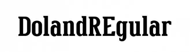
A bold serif font with a classic yet modern style.
![DolandREgular font caratteri gratis]() Scaricare 160 Downloads@WebFont
Scaricare 160 Downloads@WebFont -
( Iconian Fonts - Daniel Zadorozny - www.iconian.com )
A bold, geometric font with a futuristic and industrial aesthetic.
![Banjin Expanded font caratteri gratis]() Scaricare 160 Downloads@WebFont
Scaricare 160 Downloads@WebFont -
( Fonts by Khurasan )
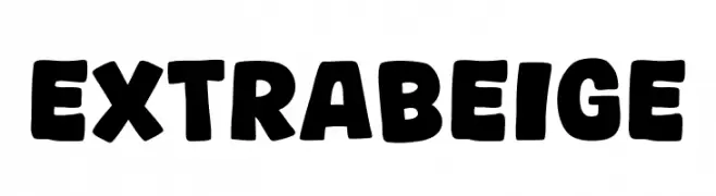
A bold, rounded font with a playful and friendly appearance.
![Extra Beige font caratteri gratis]() Scaricare 160 Downloads@WebFont
Scaricare 160 Downloads@WebFont -
( Fonts by Nur Aisyah Amalia )
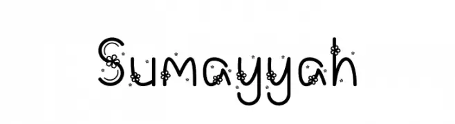
A whimsical decorative font with floral elements integrated into each character.
![Sumayyah font caratteri gratis]() Scaricare 160 Downloads@WebFont
Scaricare 160 Downloads@WebFont -
( Fonts by Kurnia Setyadi )
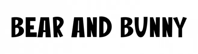
A bold, playful font with a hand-drawn feel and creative special characters.
![Bear And Bunny font caratteri gratis]() Scaricare 160 Downloads@WebFont
Scaricare 160 Downloads@WebFont -
( Fonts by Dondon Nillo )
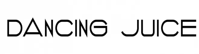
A modern, geometric font with clean lines and a minimalistic style.
![DANCING JUICE font caratteri gratis]() Scaricare 160 Downloads@WebFont
Scaricare 160 Downloads@WebFont -
( Wacaksara Co - www.wacaksara.co )
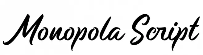
A bold, elegant script font with flowing, interconnected letters and high contrast.
![Monopola Script font caratteri gratis]() Scaricare 160 Downloads@WebFont
Scaricare 160 Downloads@WebFont -
( Fonts by Khurasan™ )
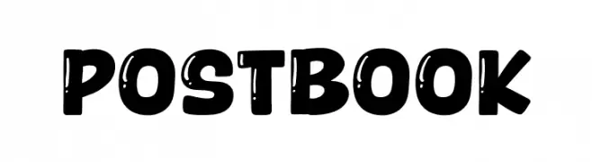
A bold, playful font with a hand-drawn, distressed texture.
![Postbook font caratteri gratis]() Scaricare 160 Downloads@WebFont
Scaricare 160 Downloads@WebFont -
( Fonts by Iconian Fonts )
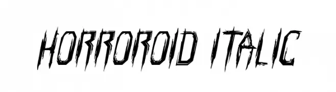
A jagged, horror-themed font with sharp, distressed edges.
![Horroroid Italic font caratteri gratis]() Scaricare 160 Downloads@WebFont
Scaricare 160 Downloads@WebFont -
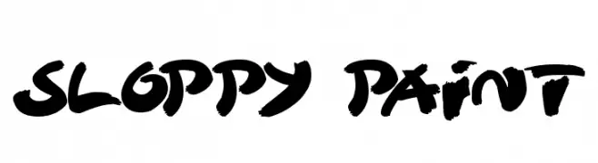
( Fonts by Darrell Flood - Personal-use only. For commercial use please contact owner. )
A bold, brush-style font with dynamic, hand-painted characteristics.
![Sloppy Paint font caratteri gratis]() Scaricare 160 Downloads@WebFont
Scaricare 160 Downloads@WebFont -
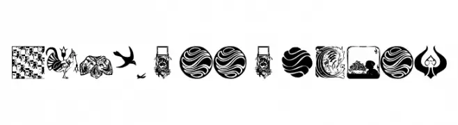
( Fonts by Manfred Klein. Free for private and charity use. Free for commercial with donation to organizations )
Ornate pictogram and dingbat font with diverse, detailed illustrations.
![MiszellenJuly font caratteri gratis]() Scaricare 160 Downloads@WebFont
Scaricare 160 Downloads@WebFont -
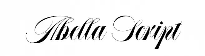
( Fonts by Joel Maker Studio - Zulfikar - Personal-use only. For commercial use please contact owner. )
An elegant script font with high contrast and decorative flourishes.
![Abella Script font caratteri gratis]() Scaricare 160 Downloads@WebFont
Scaricare 160 Downloads@WebFont -
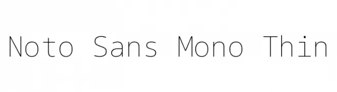
( Noto is a trademark of Google Inc. Noto fonts are open source. All Noto fonts are published under the SIL Open Font License, Version 1.1 )
A clean, monospaced font with thin strokes and a minimalist design.
![Noto Sans Mono Thin font caratteri gratis]() Scaricare 160 Downloads@WebFont
Scaricare 160 Downloads@WebFont -
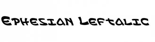
( Fonts by Daniel Zadorozny - www.iconian.com - Free for personal use )
A playful, bold font with a leftward slant and rounded, exaggerated curves.
![Ephesian Leftalic font caratteri gratis]() Scaricare 160 Downloads@WebFont
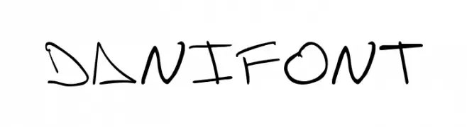
Scaricare 160 Downloads@WebFont -
![danifont font caratteri gratis]() Scaricare 160 Downloads@WebFont
Scaricare 160 Downloads@WebFont -
( Fonts by Manfred Klein. Free for private and charity use. Free for commercial with donation to organizations )
A bold, angular font with geometric shapes and calligraphic influences.
![NipponLatin-Bold font caratteri gratis]() Scaricare 160 Downloads@WebFont
Scaricare 160 Downloads@WebFont -
![Groceries font caratteri gratis]() Scaricare 160 Downloads@WebFont
Scaricare 160 Downloads@WebFont -
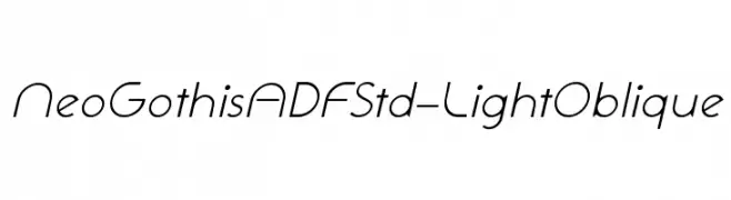
( Fonts by Arkandis Digital Foundry )
A sleek, modern oblique font with smooth curves and clean lines.
![NeoGothisADFStd-LightOblique font caratteri gratis]() Scaricare 160 Downloads@WebFont
Scaricare 160 Downloads@WebFont -
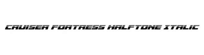
( Fonts by Iconian Fonts )
A bold, italicized font with a halftone effect, offering a dynamic and futuristic style.
![Cruiser Fortress Halftone Italic font caratteri gratis]() Scaricare 160 Downloads@WebFont
Scaricare 160 Downloads@WebFont -
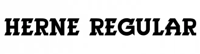
( Vladimir Nikolic - www.coroflot.com/vladimirnikolic )
A bold, serif font with strong, angular serifs and a modern yet classic style.
![Herne Regular font caratteri gratis]() Scaricare 160 Downloads@WebFont
Scaricare 160 Downloads@WebFont -
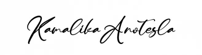
( Fonts by Letterena Studios )
Elegant cursive font with a fluid, handwritten style.
![Kamalika Anotesla font caratteri gratis]() Scaricare 160 Downloads@WebFont
Scaricare 160 Downloads@WebFont -
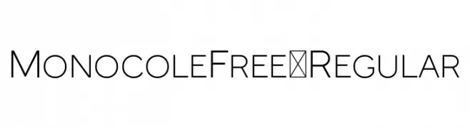
( Fonts by Craft Supply Co - Personal-use only. For commercial use please contact owner. )
A clean, modern sans-serif font with a minimalist design.
![MonocoleFree-Regular font caratteri gratis]() Scaricare 160 Downloads@WebFont
Scaricare 160 Downloads@WebFont -
( Fonts by www.blambot.com )
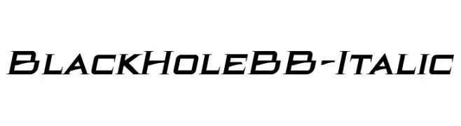
A bold, italic, futuristic font with sharp, angular lines.
![BlackHoleBB-Italic font caratteri gratis]() Scaricare 160 Downloads@WebFont
Scaricare 160 Downloads@WebFont -
( Fonts by Steve Cloutier - www.cloutierfontes.ca )
A bold, decorative font with intricate, hand-drawn patterns and a playful style.
![Emilie Regular font caratteri gratis]() Scaricare 160 Downloads@WebFont
Scaricare 160 Downloads@WebFont -
( Fonts by Wino S Kadir - weknow - www.revolge.com/shop/weknow/ - Personal-use only. For commercial use please contact owner. )
A modern, geometric font with high contrast and a futuristic style.
![WINNER font caratteri gratis]() Scaricare 160 Downloads@WebFont
Scaricare 160 Downloads@WebFont -
( Fonts by Fontfabric - Svetoslav Simov - Personal-use only. For commercial use please contact owner. )
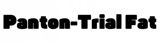
A bold, rounded font with thick, uniform strokes and a strong visual presence.
![Panton-Trial Fat font caratteri gratis]() Scaricare 160 Downloads@WebFont
Scaricare 160 Downloads@WebFont -
( Iconian Fonts - Daniel Zadorozny - www.iconian.com )
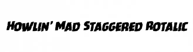
A bold, staggered, and italicized font with a dynamic and edgy style.
![Howlin' Mad Staggered Rotalic font caratteri gratis]() Scaricare 160 Downloads@WebFont
Scaricare 160 Downloads@WebFont -
![Fragua Light Italic font caratteri gratis]() Scaricare 160 Downloads@WebFont
Scaricare 160 Downloads@WebFont -
( Fonts by epiclinez )
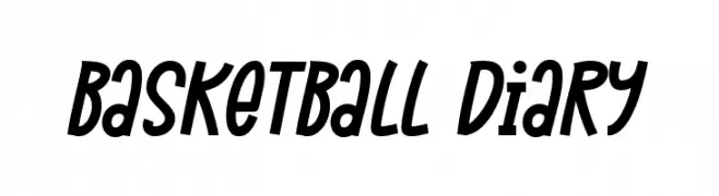
A bold, slanted font with a playful, handwritten style.
![Basketball Diary font caratteri gratis]() Scaricare 160 Downloads@WebFont
Scaricare 160 Downloads@WebFont -
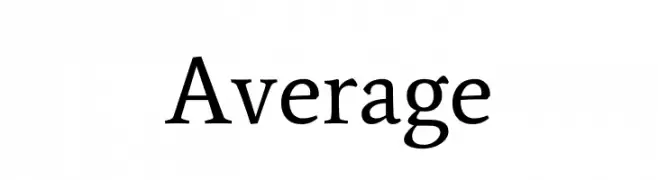
( Fonts by Dharmas Studio - Jamaludin Ahmad - Personal-use only. For commercial use please contact owner. )
A classic serif font with elegant strokes and balanced proportions.
![Average font caratteri gratis]() Scaricare 160 Downloads@WebFont
Scaricare 160 Downloads@WebFont -
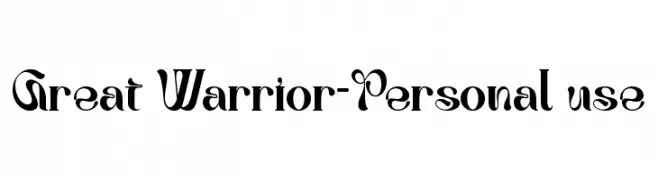
( Fonts by Letterara )
A bold, decorative font with dynamic curves and sharp edges.
![Great Warrior-Personal use font caratteri gratis]() Scaricare 160 Downloads@WebFont
Scaricare 160 Downloads@WebFont -
( Fonts by Kong Font - https://fontkong.com/ - Personal-use only. For commercial use please contact owner. )
A bold, playful font with rounded strokes and high contrast, perfect for dynamic designs.
![Boogie worth font caratteri gratis]() Scaricare 160 Downloads@WebFont
Scaricare 160 Downloads@WebFont -
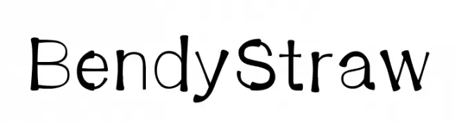
![BendyStraw font caratteri gratis]() Scaricare 160 Downloads@WebFont
Scaricare 160 Downloads@WebFont


Quali sono i font più popolari adesso?
Poppins, Roboto, Montserrat, Open Sans e Lato sono molto usati per le forme pulite e l'ampia applicabilità — dall'identità di marca alle landing page e ai poster.
Quali font si usano spesso nei loghi?
Le sans serif geometriche (es. Poppins, famiglie in stile Gotham) sono scelte comuni per un branding pulito e scalabile. Per un tocco personale restano valide script e stili manoscritti. Abbina un display deciso per i titoli a un corpo testo neutro per riconoscibilità ed equilibrio.
Ogni quanto si aggiorna la lista?
Con regolarità, in base ai download e all'attività reale. Torna spesso per scoprire in anticipo le nuove preferite.
💡 Consiglio: aggiungi ai preferiti — le tendenze cambiano in fretta e i font top di oggi possono ispirare il rebranding di domani.