Benvenuto nelle Font Più Popolari — dove popolarità e qualità si incontrano. Qui trovi i font più scaricati e usati dell'anno. Se cerchi scelte sicure per logo, web o social, inizia da qui.
Ogni font top si distingue per equilibrio, leggibilità e versatilità. Troverai sans serif moderne, script eleganti, serif vintage e display minimalisti.
-
 Scaricare 151 Downloads@WebFont
 -
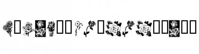
( Fonts by Kat`s Fun Fonts - Personal-use only. For commercial use please contact owner. )
Ornamental font with unique floral illustrations for each character.
![KR Beautiful Flowers font caratteri gratis]() Scaricare 151 Downloads@WebFont
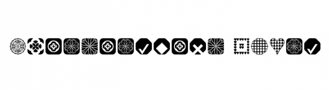
Scaricare 151 Downloads@WebFont -
Caratteri di fontsnthings. For commercial use please contact the owner.
![Fontsnthings 250th font caratteri gratis]() Scaricare 151 Downloads@WebFont
Scaricare 151 Downloads@WebFont -
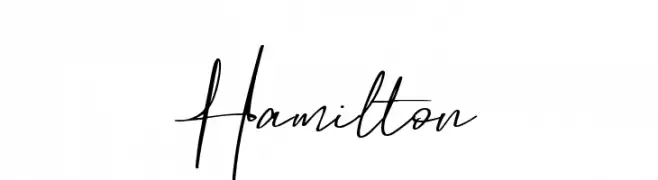
( Fonts by Lettersiro Studio - Muhammad Sirojuddin - Personal-use only. For commercial use please contact owner. )
A lively and expressive handwritten font with fluid, dynamic strokes.
![Hamilton font caratteri gratis]() Scaricare 151 Downloads@WebFont
Scaricare 151 Downloads@WebFont -
( Fonts by DairyProduct )
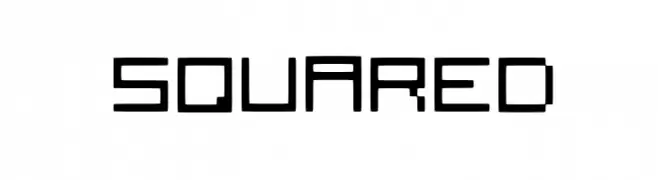
A geometric, squared font with a modern, digital aesthetic.
![Squared font caratteri gratis]() Scaricare 151 Downloads@WebFont
Scaricare 151 Downloads@WebFont -
( Fonts by Alpaprana - Personal-use only. For commercial use please contact owner. )
A dynamic, brush-style handwritten font with expressive strokes.
![Long Path font caratteri gratis]() Scaricare 151 Downloads@WebFont
Scaricare 151 Downloads@WebFont -
( Fonts by Rachel Adams - www.rlaurendesign.com - Personal-use only. For commercial use please contact owner. )
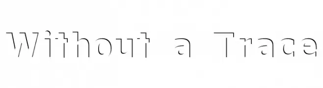
A modern, stencil-like font with geometric lines and strategic cutouts.
![Without a Trace font caratteri gratis]() Scaricare 151 Downloads@WebFont
Scaricare 151 Downloads@WebFont -
( Fonts by Christophe Feray - www.wcfonts.com )
A decorative font made entirely of high-heeled shoe silhouettes.
![WC Fetishist Bta font caratteri gratis]() Scaricare 151 Downloads@WebFont
Scaricare 151 Downloads@WebFont -
( Fonts by Unifraktur Project )
A traditional blackletter font with intricate, ornate letterforms.
![UnifrakturMaguntia20 font caratteri gratis]() Scaricare 151 Downloads@WebFont
Scaricare 151 Downloads@WebFont -
( Font by Jayvee D. Enaguas - grandchaos9000.deviantart.com )
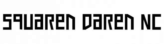
A bold, geometric font with a modern, futuristic style.
![Squaren Daren NC font caratteri gratis]() Scaricare 151 Downloads@WebFont
Scaricare 151 Downloads@WebFont -
( Fonts by MadeType - Personal-use only. For commercial use please contact owner. )
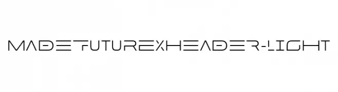
A sleek, futuristic font with geometric elements and a minimalist aesthetic.
![MADEFutureXHEADER-Light font caratteri gratis]() Scaricare 151 Downloads@WebFont
Scaricare 151 Downloads@WebFont -
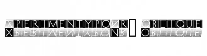
![XperimentypoNr1 Oblique font caratteri gratis]() Scaricare 151 Downloads@WebFont
Scaricare 151 Downloads@WebFont -
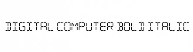
![Digital Computer Bold Italic font caratteri gratis]() Scaricare 151 Downloads@WebFont
Scaricare 151 Downloads@WebFont -
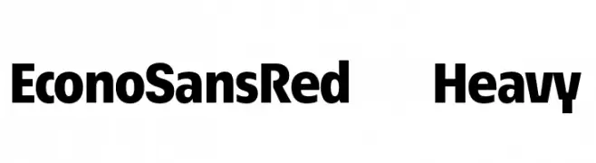
( Fonts by ingoFonts - Ingo Zimmermann - Personal-use only. For commercial use please contact owner. )
A bold, modern sans-serif font with strong geometric shapes and uniform stroke width.
![EconoSansRed-85Heavy font caratteri gratis]() Scaricare 151 Downloads@WebFont
Scaricare 151 Downloads@WebFont -
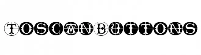
( Fonts by Manfred Klein. Free for private and charity use. Free for commercial with donation to organizations )
A decorative font with characters enclosed in circular outlines, featuring a vintage and artistic style.
![ToscanButtons font caratteri gratis]() Scaricare 151 Downloads@WebFont
Scaricare 151 Downloads@WebFont -
( Fonts by Geronimo )
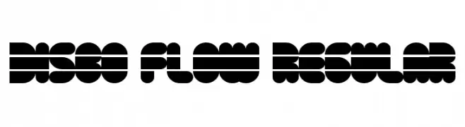
A bold, geometric font with a retro, disco-inspired design.
![Disco Flow Regular font caratteri gratis]() Scaricare 151 Downloads@WebFont
Scaricare 151 Downloads@WebFont -
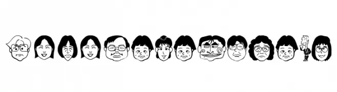
![SakabePeople05 font caratteri gratis]() Scaricare 151 Downloads@WebFont
Scaricare 151 Downloads@WebFont -
( Fonts by a Max Infeld - XEROGRAPHER FONTS - xerographer.blogspot.com . Personal-use only. For commercial use please contact owner. )
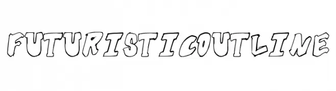
A bold, outlined font with a futuristic and dynamic style.
![FuturisticOutline font caratteri gratis]() Scaricare 151 Downloads@WebFont
Scaricare 151 Downloads@WebFont -
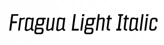
![Fragua Light Italic font caratteri gratis]() Scaricare 151 Downloads@WebFont
Scaricare 151 Downloads@WebFont -
![Boma Normal font caratteri gratis]() Scaricare 151 Downloads@WebFont
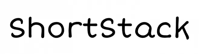
Scaricare 151 Downloads@WebFont -
![Short Stack font caratteri gratis]() Scaricare 151 Downloads@WebFont
Scaricare 151 Downloads@WebFont -
( Fonts by Kreative Korporation - www.kreativekorp.com )
A bold, pixelated font with a retro digital aesthetic.
![KK Px7 font caratteri gratis]() Scaricare 151 Downloads@WebFont
Scaricare 151 Downloads@WebFont -
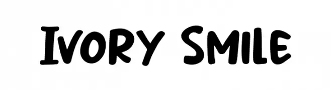
( Fonts by Khurasan )
A playful, bold font with rounded, thick strokes and a hand-drawn feel.
![Ivory Smile font caratteri gratis]() Scaricare 151 Downloads@WebFont
Scaricare 151 Downloads@WebFont -
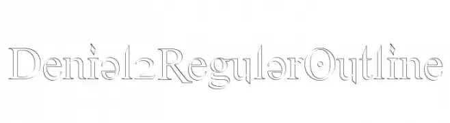
( SDFonts. http://www.angelfire.com/scifi2/sdfonts/index.html )
An elegant outline serif font with precise lines and classic styling.
![Denial2RegularOutline font caratteri gratis]() Scaricare 151 Downloads@WebFont
Scaricare 151 Downloads@WebFont -
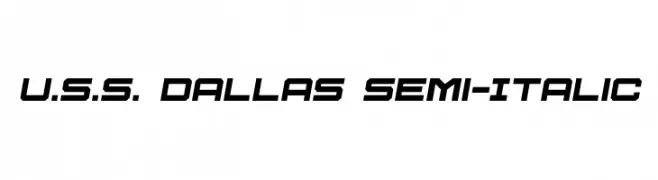
( Iconian Fonts - Daniel Zadorozny - www.iconian.com )
A futuristic, semi-italic font with bold, angular design.
![U.S.S. Dallas Semi-Italic font caratteri gratis]() Scaricare 151 Downloads@WebFont
Scaricare 151 Downloads@WebFont -
( Fonts by Mocha Frappuccino - Personal-use only. For commercial use please contact owner. )
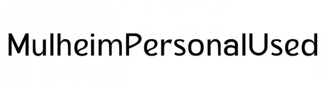
Modern sans-serif font with geometric shapes.
![Mulheim Personal Used font caratteri gratis]() Scaricare 151 Downloads@WebFont
Scaricare 151 Downloads@WebFont -
( Fonts by www.fontalicious.com )
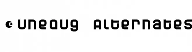
A bold, futuristic font with geometric shapes and circular motifs.
![Dunebug Alternates font caratteri gratis]() Scaricare 151 Downloads@WebFont
Scaricare 151 Downloads@WebFont -
( Fonts by Vladimir Nikolic )
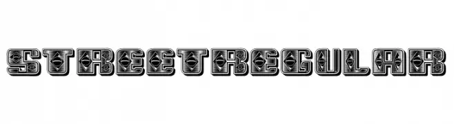
A bold, decorative font with intricate geometric patterns and a street art style.
![Street Regular font caratteri gratis]() Scaricare 151 Downloads@WebFont
Scaricare 151 Downloads@WebFont -
( Fonts by Arkandis Digital Foundry )
A modern italic font with smooth curves and clean lines, perfect for dynamic text.
![IkariusADFNo2Std-Italic font caratteri gratis]() Scaricare 151 Downloads@WebFont
Scaricare 151 Downloads@WebFont -
( Fonts by Wino S Kadir - weknow - www.revolge.com/shop/weknow/ - Personal-use only. For commercial use please contact owner. )
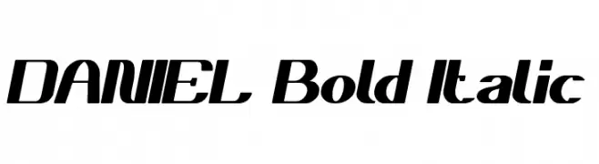
A bold, italicized font with a dynamic and modern style.
![DANIEL Bold Italic font caratteri gratis]() Scaricare 151 Downloads@WebFont
Scaricare 151 Downloads@WebFont -
![Mister Loopy Loops font caratteri gratis]() Scaricare 151 Downloads@WebFont
Scaricare 151 Downloads@WebFont -
( Fonts by Rodrigo German - RASDESIGN )
Casual, hand-drawn font with a playful, skate-inspired style.
![skatelove [ tour 2009] font caratteri gratis]() Scaricare 151 Downloads@WebFont
Scaricare 151 Downloads@WebFont -
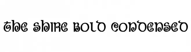
( Fonts by Daniel Zadorozny - www.iconian.com - Free for personal use )
A bold, condensed, and decorative font with whimsical curls and loops.
![The Shire Bold Condensed font caratteri gratis]() Scaricare 151 Downloads@WebFont
Scaricare 151 Downloads@WebFont -
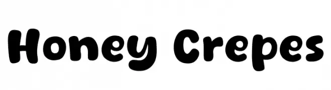
( Fonts by Khurasan )
A playful, bold font with rounded, bubbly characters and a friendly style.
![Honey Crepes font caratteri gratis]() Scaricare 151 Downloads@WebFont
Scaricare 151 Downloads@WebFont -
( Fonts by Font People - Personal-use only. For commercial use please contact owner. )
A modern, light sans-serif font with clean lines and balanced spacing.
![Billie DEMO Light font caratteri gratis]() Scaricare 151 Downloads@WebFont
Scaricare 151 Downloads@WebFont


![skatelove [ tour 2009] font caratteri gratis](https://d144mzi0q5mijx.cloudfront.net/img/S/K/skatelove-tour-2009.webp)

Quali sono i font più popolari adesso?
Poppins, Roboto, Montserrat, Open Sans e Lato sono molto usati per le forme pulite e l'ampia applicabilità — dall'identità di marca alle landing page e ai poster.
Quali font si usano spesso nei loghi?
Le sans serif geometriche (es. Poppins, famiglie in stile Gotham) sono scelte comuni per un branding pulito e scalabile. Per un tocco personale restano valide script e stili manoscritti. Abbina un display deciso per i titoli a un corpo testo neutro per riconoscibilità ed equilibrio.
Ogni quanto si aggiorna la lista?
Con regolarità, in base ai download e all'attività reale. Torna spesso per scoprire in anticipo le nuove preferite.
💡 Consiglio: aggiungi ai preferiti — le tendenze cambiano in fretta e i font top di oggi possono ispirare il rebranding di domani.