Benvenuto nelle Font Più Popolari — dove popolarità e qualità si incontrano. Qui trovi i font più scaricati e usati dell'anno. Se cerchi scelte sicure per logo, web o social, inizia da qui.
Ogni font top si distingue per equilibrio, leggibilità e versatilità. Troverai sans serif moderne, script eleganti, serif vintage e display minimalisti.
-
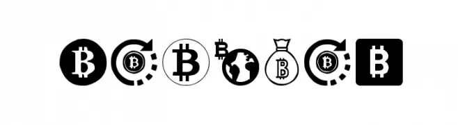
( Woodcutter - woodcutter Manero - www.woodcutter.es )
Bold, iconographic font focused on cryptocurrency and finance symbols.
 Scaricare 773 Downloads@WebFont
 -
( Jef Triforce - Francisco Arellano - www.ixipcalli.com )
A modern, rounded sans-serif font with smooth edges and excellent readability.
![Copilme Light font caratteri gratis]() Scaricare 773 Downloads@WebFont
Scaricare 773 Downloads@WebFont -
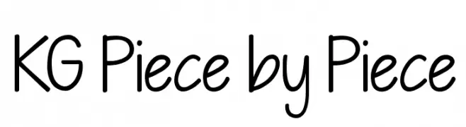
( Fonts by Kimberly Geswein )
A playful, hand-drawn font with a casual and friendly vibe.
![KG Piece by Piece font caratteri gratis]() Scaricare 773 Downloads@WebFont
Scaricare 773 Downloads@WebFont -
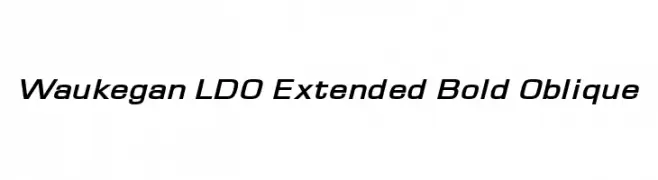
( Fonts by Luke Owens - Personal-use only. For commercial use please contact owner. )
A modern, bold, and oblique font with extended width and high contrast.
![Waukegan LDO Extended Bold Oblique font caratteri gratis]() Scaricare 773 Downloads@WebFont
Scaricare 773 Downloads@WebFont -
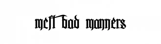
( Fonts by antoniorodriguesjr.com )
A bold, gothic Blackletter font with intricate, angular designs.
![MCF bad manners font caratteri gratis]() Scaricare 773 Downloads@WebFont
Scaricare 773 Downloads@WebFont -
-
( Fonts by Castcraft Software - opti.netii.net - check the website before use )
A modern serif font with clean lines and balanced proportions.
![OPTICounsilMedium font caratteri gratis]() Scaricare 773 Downloads@WebFont
Scaricare 773 Downloads@WebFont -
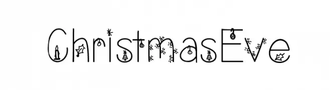
( Fonts by Vanessa Bays - bythebutterfly.com )
A festive, decorative font with Christmas-themed embellishments on each character.
![ChristmasEve font caratteri gratis]() Scaricare 773 Downloads@WebFont
Scaricare 773 Downloads@WebFont -
![T-26 Demo font caratteri gratis]() Scaricare 773 Downloads@WebFont
Scaricare 773 Downloads@WebFont -
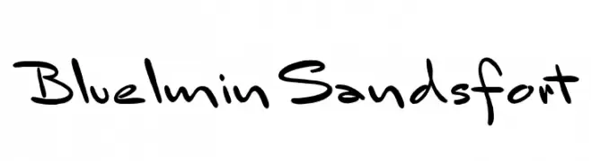
( Free for personal use - new.myfonts.com/foundry/Intellecta_Design/?refby=paulow )
A playful, informal handwritten font with fluid, dynamic strokes.
![BluelminSandsfort font caratteri gratis]() Scaricare 773 Downloads@WebFont
Scaricare 773 Downloads@WebFont -
![Modern Script font caratteri gratis]() Scaricare 773 Downloads@WebFont
Scaricare 773 Downloads@WebFont


Quali sono i font più popolari adesso?
Poppins, Roboto, Montserrat, Open Sans e Lato sono molto usati per le forme pulite e l'ampia applicabilità — dall'identità di marca alle landing page e ai poster.
Quali font si usano spesso nei loghi?
Le sans serif geometriche (es. Poppins, famiglie in stile Gotham) sono scelte comuni per un branding pulito e scalabile. Per un tocco personale restano valide script e stili manoscritti. Abbina un display deciso per i titoli a un corpo testo neutro per riconoscibilità ed equilibrio.
Ogni quanto si aggiorna la lista?
Con regolarità, in base ai download e all'attività reale. Torna spesso per scoprire in anticipo le nuove preferite.
💡 Consiglio: aggiungi ai preferiti — le tendenze cambiano in fretta e i font top di oggi possono ispirare il rebranding di domani.