Benvenuto nelle Font Più Popolari — dove popolarità e qualità si incontrano. Qui trovi i font più scaricati e usati dell'anno. Se cerchi scelte sicure per logo, web o social, inizia da qui.
Ogni font top si distingue per equilibrio, leggibilità e versatilità. Troverai sans serif moderne, script eleganti, serif vintage e display minimalisti.
-
 Scaricare 155 Downloads@WebFont
 -
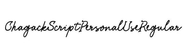
( Fonts by Peter Wiegel - www.peter-wiegel.de - Personal-use only. For commercial use please contact owner. )
An ornate, high-contrast calligraphic font with elaborate flourishes, ideal for vintage and decorative projects.
![18th Century Initials font caratteri gratis]() Scaricare 155 Downloads@WebFont
Scaricare 155 Downloads@WebFont -
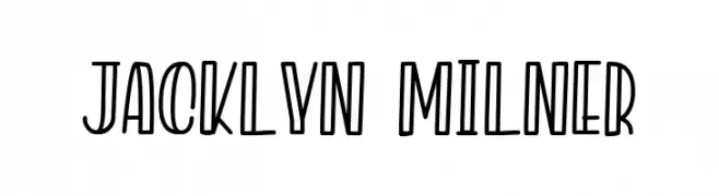
( Fonts by Kotak Kuning Studio - kotakkuning.com - Personal-use only. For commercial use please contact owner. )
A playful, hand-drawn font with tall, narrow characters and a bold outline.
![Jacklyn Milner font caratteri gratis]() Scaricare 155 Downloads@WebFont
Scaricare 155 Downloads@WebFont -
( Fonts by Pizzadude )
A bold, expressive brush-style font with dynamic, hand-painted strokes.
![DispositionDEMO font caratteri gratis]() Scaricare 155 Downloads@WebFont
Scaricare 155 Downloads@WebFont -
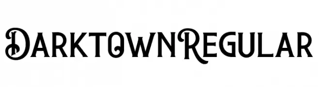
( Fonts by Letterflow Studio - Personal-use only. For commercial use please contact owner. )
A decorative and bold font with ornate uppercase and clear lowercase letters.
![DarktownRegular font caratteri gratis]() Scaricare 155 Downloads@WebFont
Scaricare 155 Downloads@WebFont -
( Fonts by a Max Infeld - XEROGRAPHER FONTS - xerographer.blogspot.com . Personal-use only. For commercial use please contact owner. )
A playful, bold font with rounded, bubbly characters.
![Yummy Nubs font caratteri gratis]() Scaricare 155 Downloads@WebFont
Scaricare 155 Downloads@WebFont -
( Fonts by Vunira Design )
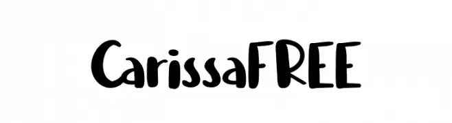
A playful, bold, and handwritten-style font with a friendly appearance.
![CarissaFREE font caratteri gratis]() Scaricare 155 Downloads@WebFont
Scaricare 155 Downloads@WebFont -
( Fonts by dustBUST - Andreas Nylin )
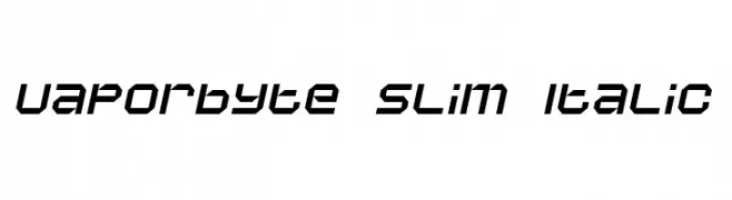
A futuristic, angular, and italicized font with a digital aesthetic.
![Vaporbyte Slim Italic font caratteri gratis]() Scaricare 155 Downloads@WebFont
Scaricare 155 Downloads@WebFont -
( Fonts by Bilqis Studio )
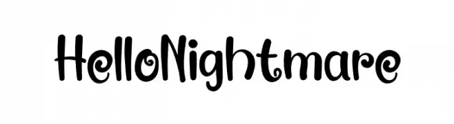
A quirky, decorative hand-drawn font with playful curls and irregular shapes.
![Hello Nightmare font caratteri gratis]() Scaricare 155 Downloads@WebFont
Scaricare 155 Downloads@WebFont -
( Fonts by Vladimir Nikolic )
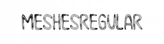
A hand-drawn, textured font with a mesh-like appearance, offering a playful and artistic style.
![Meshes Regular font caratteri gratis]() Scaricare 155 Downloads@WebFont
Scaricare 155 Downloads@WebFont -
( Fonts by Daniel Zadorozny - www.iconian.com )
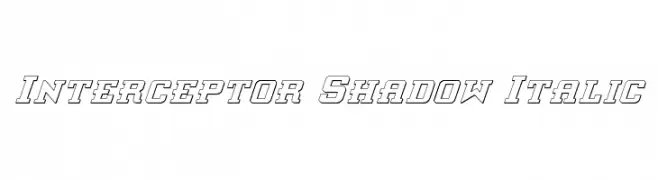
Bold, italicized font with a shadow effect for a dynamic, three-dimensional look.
![Interceptor Shadow Italic font caratteri gratis]() Scaricare 155 Downloads@WebFont
Scaricare 155 Downloads@WebFont -
( Fonts by Galdino Otten - Personal-use only. For commercial use please contact owner. )
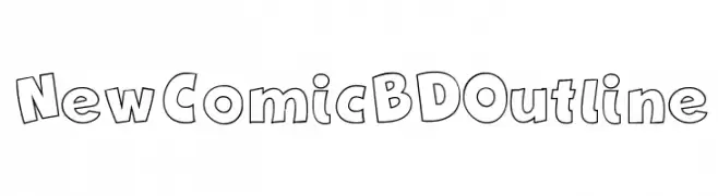
A playful, bold outline font with a comic-like appearance.
![New Comic BD Outline font caratteri gratis]() Scaricare 155 Downloads@WebFont
Scaricare 155 Downloads@WebFont -
( Fonts by weknow - Wino S Kadir - Personal-use only. For commercial use please contact owner. )
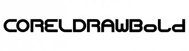
A bold, geometric font with a modern, futuristic style.
![CORELDRAW Bold font caratteri gratis]() Scaricare 155 Downloads@WebFont
Scaricare 155 Downloads@WebFont -
( Fonts by Dirtyline Studio )
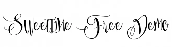
An elegant and artistic script font with flowing, intricate letterforms.
![Sweetline Free Demo font caratteri gratis]() Scaricare 155 Downloads@WebFont
Scaricare 155 Downloads@WebFont -
( Fonts by 4th february - Personal-use only. For commercial use please contact owner. )
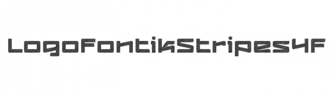
A bold, geometric font with diagonal stripes, ideal for striking display use.
![LogofontikStripes4F font caratteri gratis]() Scaricare 155 Downloads@WebFont
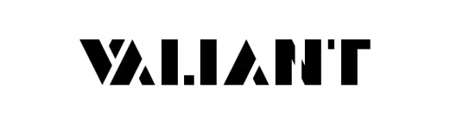
Scaricare 155 Downloads@WebFont -
![Valiant font caratteri gratis]() Scaricare 155 Downloads@WebFont
Scaricare 155 Downloads@WebFont -
( Fonts by twinletter - Rozikan - Personal-use only. For commercial use please contact owner. )
A bold, textured font with a distressed, vintage style.
![Brefa Personal Use font caratteri gratis]() Scaricare 154 Downloads@WebFont
Scaricare 154 Downloads@WebFont -
( Fonts by a Max Infeld - XEROGRAPHER FONTS - xerographer.blogspot.com . Personal-use only. For commercial use please contact owner. )
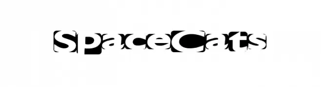
A bold, futuristic font with geometric shapes and sharp angles.
![SpaceCats font caratteri gratis]() Scaricare 154 Downloads@WebFont
Scaricare 154 Downloads@WebFont -
( Personal-use only. For commercial use please contact owner. )
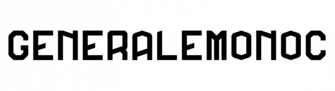
A bold, geometric font with an industrial and modern design.
![GeneraleMonoC font caratteri gratis]() Scaricare 154 Downloads@WebFont
Scaricare 154 Downloads@WebFont -
( Darrell Flood )
A bold, geometric font with sharp angles and a futuristic style.
![Alien Wars font caratteri gratis]() Scaricare 154 Downloads@WebFont
Scaricare 154 Downloads@WebFont -
( Fonts by Bumbayo Font Fabrik )
A bold, distressed font with a grunge, weathered appearance.
![BurliwehSans-Normal font caratteri gratis]() Scaricare 154 Downloads@WebFont
Scaricare 154 Downloads@WebFont -
( Fonts by Don Marciano )
A bold, playful font with rounded characters and a whimsical touch.
![Sandy Bold font caratteri gratis]() Scaricare 154 Downloads@WebFont
Scaricare 154 Downloads@WebFont -
( Fonts by Letterena Studios )
Elegant script font with a handwritten style.
![Delttras font caratteri gratis]() Scaricare 154 Downloads@WebFont
Scaricare 154 Downloads@WebFont -
( Fonts by madeDeduk )
A bold, brush-style font with dynamic, hand-painted strokes.
![BllodyRainan font caratteri gratis]() Scaricare 154 Downloads@WebFont
Scaricare 154 Downloads@WebFont -
( Fonts by Adobe )
A bold, monospaced font ideal for coding and technical documents.
![Source Code Pro Bold font caratteri gratis]() Scaricare 154 Downloads@WebFont
Scaricare 154 Downloads@WebFont -
( Fonts by Manfred Klein. Free for private and charity use. Free for commercial with donation to organizations )
An artistic font with abstract, Picasso-inspired face designs for each character.
![PablosChildren font caratteri gratis]() Scaricare 154 Downloads@WebFont
Scaricare 154 Downloads@WebFont -
( Fonts by junkohanhero )
A chaotic, ransom note-style font with mismatched characters.
![Lievidence font caratteri gratis]() Scaricare 154 Downloads@WebFont
Scaricare 154 Downloads@WebFont -
![LiersonMattenhauer font caratteri gratis]() Scaricare 154 Downloads@WebFont
Scaricare 154 Downloads@WebFont -
( Fonts by dot colon - Personal-use only. For commercial use please contact owner. )
A sleek, modern, and italicized thin font with elegant strokes.
![Aileron Thin Italic font caratteri gratis]() Scaricare 154 Downloads@WebFont
Scaricare 154 Downloads@WebFont -
( Fonts by Typia Nesia - Personal-use only. For commercial use please contact owner. )
A bold, dynamic script font with sweeping, fluid strokes and a modern calligraphic style.
![Historea Demo font caratteri gratis]() Scaricare 154 Downloads@WebFont
Scaricare 154 Downloads@WebFont -
( Fonts by K_IN Studio )
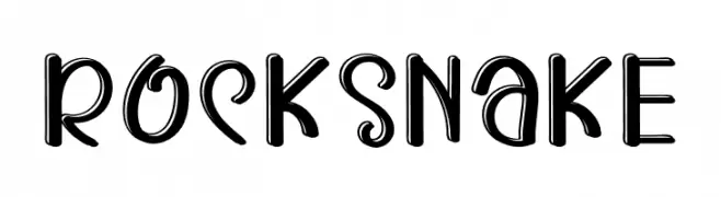
A playful, bold, hand-drawn font with a lively and energetic style.
![ROCK SNAKE font caratteri gratis]() Scaricare 154 Downloads@WebFont
Scaricare 154 Downloads@WebFont -
( Fonts by Lars Manenschijn )
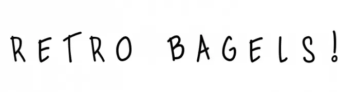
A playful, handwritten font with a quirky and informal style.
![Retro Bagels! font caratteri gratis]() Scaricare 154 Downloads@WebFont
Scaricare 154 Downloads@WebFont -
( Fonts by Daniel Zadorozny - www.iconian.com - Free for personal use )
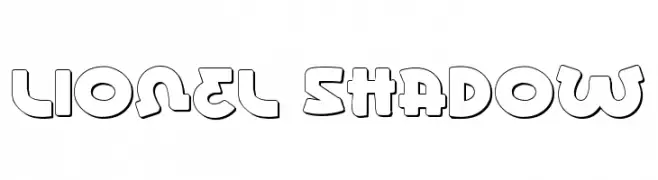
A bold, playful font with a three-dimensional shadow effect.
![Lionel Shadow font caratteri gratis]() Scaricare 154 Downloads@WebFont
Scaricare 154 Downloads@WebFont -
( Fonts by Mantra Aksara - Personal-use only. For commercial use please contact owner. )
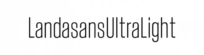
A sleek, ultra-light font with tall, narrow letters and a modern aesthetic.
![Landasans Ultra Light font caratteri gratis]() Scaricare 154 Downloads@WebFont
Scaricare 154 Downloads@WebFont -
( Fonts by Thor Christopher Arisland )
A modern, geometric font with thin lines and a clean, elegant style.
![KlubKatz font caratteri gratis]() Scaricare 154 Downloads@WebFont
Scaricare 154 Downloads@WebFont


Quali sono i font più popolari adesso?
Poppins, Roboto, Montserrat, Open Sans e Lato sono molto usati per le forme pulite e l'ampia applicabilità — dall'identità di marca alle landing page e ai poster.
Quali font si usano spesso nei loghi?
Le sans serif geometriche (es. Poppins, famiglie in stile Gotham) sono scelte comuni per un branding pulito e scalabile. Per un tocco personale restano valide script e stili manoscritti. Abbina un display deciso per i titoli a un corpo testo neutro per riconoscibilità ed equilibrio.
Ogni quanto si aggiorna la lista?
Con regolarità, in base ai download e all'attività reale. Torna spesso per scoprire in anticipo le nuove preferite.
💡 Consiglio: aggiungi ai preferiti — le tendenze cambiano in fretta e i font top di oggi possono ispirare il rebranding di domani.