Benvenuto nelle Font Più Popolari — dove popolarità e qualità si incontrano. Qui trovi i font più scaricati e usati dell'anno. Se cerchi scelte sicure per logo, web o social, inizia da qui.
Ogni font top si distingue per equilibrio, leggibilità e versatilità. Troverai sans serif moderne, script eleganti, serif vintage e display minimalisti.
-
Caratteri di joorgemoron. For commercial use please contact the owner.
( Free for personal use )
A bold, textured font with a playful, scale-like pattern.
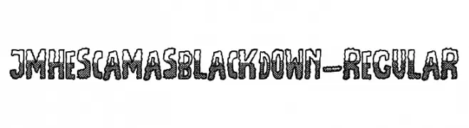 Scaricare 151 Downloads@WebFont
 -
( Fonts by Daniel Zadorozny - www.iconian.com )
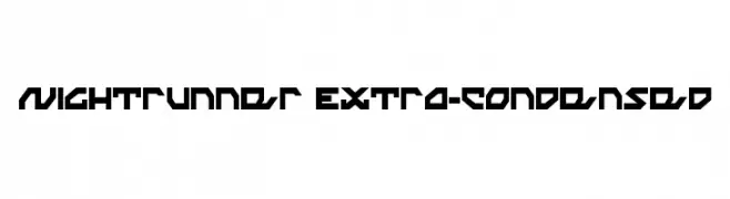
A bold, angular font with a futuristic and geometric design.
![Nightrunner Extra-Condensed font caratteri gratis]() Scaricare 151 Downloads@WebFont
Scaricare 151 Downloads@WebFont -
( Fonts by Graphix Line Studio )
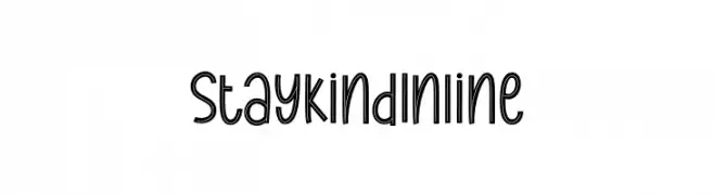
A playful, inline font with rounded, elongated characters and a whimsical style.
![Stay Kind Inline font caratteri gratis]() Scaricare 151 Downloads@WebFont
Scaricare 151 Downloads@WebFont -
( Fonts by Din Studio )
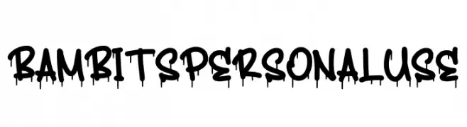
A bold, graffiti-inspired font with a dripping effect, perfect for urban-themed projects.
![Bambits Personal Use font caratteri gratis]() Scaricare 151 Downloads@WebFont
Scaricare 151 Downloads@WebFont -
( Fonts by Dan P. Lyons - Personal-use only. For commercial use please contact owner. )
A playful, rounded font with smooth curves and consistent stroke width.
![Bloq font caratteri gratis]() Scaricare 151 Downloads@WebFont
Scaricare 151 Downloads@WebFont -
( Fonts by Iconian Fonts )
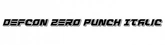
A bold, italicized font with a futuristic, three-dimensional style.
![Defcon Zero Punch Italic font caratteri gratis]() Scaricare 151 Downloads@WebFont
Scaricare 151 Downloads@WebFont -
( Fonts by Manfred Klein. Free for private and charity use. Free for commercial with donation to organizations )
Cartoonish, dentistry-themed illustrative font with playful characters.
![TrustYourDentist font caratteri gratis]() Scaricare 151 Downloads@WebFont
Scaricare 151 Downloads@WebFont -
![Stryx font caratteri gratis]() Scaricare 151 Downloads
Scaricare 151 Downloads -
( Fonts by Shara Weber )
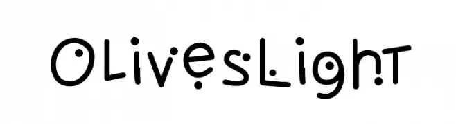
A playful, bubbly font with rounded characters and circular accents.
![OlivesLight font caratteri gratis]() Scaricare 151 Downloads@WebFont
Scaricare 151 Downloads@WebFont -
( Fonts by Billy Argel Fonts - www.billyargel.com - Personal-use only. For commercial use please contact owner. )
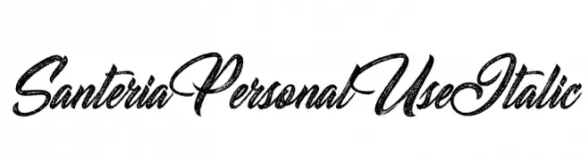
A textured, italic script font with flowing, cursive strokes and artistic flourishes.
![Santeria Personal Use Italic font caratteri gratis]() Scaricare 151 Downloads@WebFont
Scaricare 151 Downloads@WebFont -
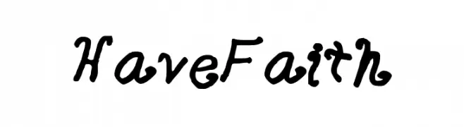
Caratteri di faithprovost. For commercial use please contact the owner.
![HaveFaith font caratteri gratis]() Scaricare 151 Downloads@WebFont
Scaricare 151 Downloads@WebFont -
( Fonts by Alyssha Swanson - Personal-use only. For commercial use please contact owner. )
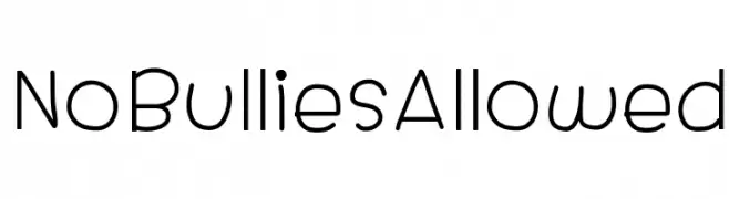
A modern, rounded font with a friendly and clean appearance.
![NoBulliesAllowed font caratteri gratis]() Scaricare 151 Downloads@WebFont
Scaricare 151 Downloads@WebFont -
( Fonts by Daniel Zadorozny - www.iconian.com - Free for personal use )
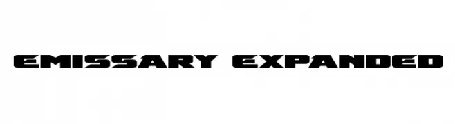
A bold, expanded, and futuristic font with sharp, angular edges.
![Emissary Expanded font caratteri gratis]() Scaricare 151 Downloads@WebFont
Scaricare 151 Downloads@WebFont -
( Fonts by Kong Font - Personal-use only. For commercial use please contact owner. )
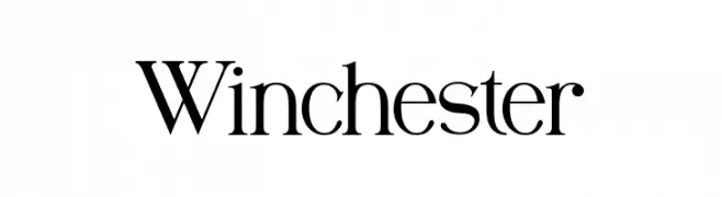
A classic serif font with elegant strokes and modern refinement.
![Winchester font caratteri gratis]() Scaricare 151 Downloads@WebFont
Scaricare 151 Downloads@WebFont -
![iCiel Altus Extra font caratteri gratis]() Scaricare 151 Downloads@WebFont
Scaricare 151 Downloads@WebFont -
( Fonts by Morice Kastoun )
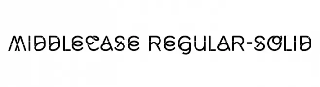
A modern, geometric font with rounded edges and consistent stroke width.
![Middlecase Regular-Solid font caratteri gratis]() Scaricare 151 Downloads@WebFont
Scaricare 151 Downloads@WebFont -
( Fonts by Daniel Zadorozny - www.iconian.com )
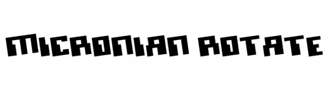
A bold, geometric font with a futuristic, blocky design.
![Micronian Rotate font caratteri gratis]() Scaricare 151 Downloads@WebFont
Scaricare 151 Downloads@WebFont -
( Hauke Petersen )
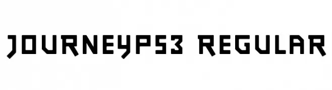
A bold, geometric font with a modern and futuristic aesthetic.
![JourneyPS3 Regular font caratteri gratis]() Scaricare 151 Downloads@WebFont
Scaricare 151 Downloads@WebFont -
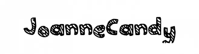
( www.superjoanne.tumblr.com )
A playful, hand-drawn font with bold, striped characters.
![JoanneCandy font caratteri gratis]() Scaricare 151 Downloads@WebFont
Scaricare 151 Downloads@WebFont -
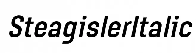
( Fonts by Situjuh Nazara - 7ntypes.com - Personal-use only. For commercial use please contact owner. )
A sleek, modern italic font with a dynamic and professional appearance.
![Steagisler Italic font caratteri gratis]() Scaricare 151 Downloads@WebFont
Scaricare 151 Downloads@WebFont -
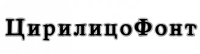
( Fonts by www.woodcutter.es - woodcutter Manero - Personal-use only. For commercial use please contact owner. )
A bold, decorative font with outlined characters and a three-dimensional effect.
![Cirilico Font font caratteri gratis]() Scaricare 151 Downloads@WebFont
Scaricare 151 Downloads@WebFont -
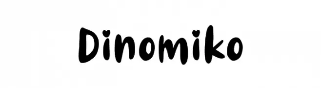
( Fonts by 7NTypes )
A playful, bold handwritten font with rounded, whimsical characters.
![Dinomiko font caratteri gratis]() Scaricare 151 Downloads@WebFont
Scaricare 151 Downloads@WebFont -
( Fonts by a Max Infeld - XEROGRAPHER FONTS - xerographer.blogspot.com . Personal-use only. For commercial use please contact owner. )
A bold, brush-style font with dynamic, hand-drawn strokes.
![LoveRiot font caratteri gratis]() Scaricare 151 Downloads@WebFont
Scaricare 151 Downloads@WebFont -
( Fonts by Font People - Personal-use only. For commercial use please contact owner. )
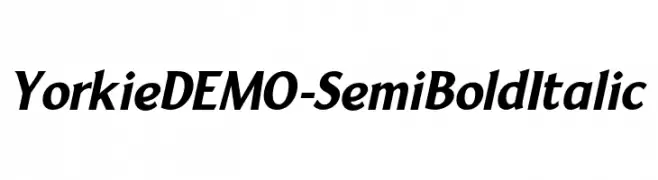
A semi-bold italic font with a dynamic and compact style, featuring moderate stroke contrast.
![YorkieDEMO-SemiBoldItalic font caratteri gratis]() Scaricare 151 Downloads@WebFont
Scaricare 151 Downloads@WebFont -
( Fonts by Daniel Zadorozny - www.iconian.com - Free for personal use )
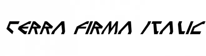
A bold, angular, and futuristic italic font with a dynamic and energetic style.
![Terra Firma Italic font caratteri gratis]() Scaricare 151 Downloads@WebFont
Scaricare 151 Downloads@WebFont -
( Fonts by Letterara )
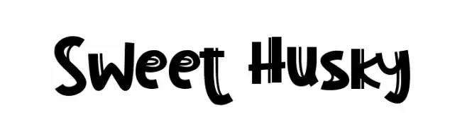
A playful and bold font with dynamic strokes and whimsical flair.
![Sweet Husky font caratteri gratis]() Scaricare 151 Downloads@WebFont
Scaricare 151 Downloads@WebFont -
![Nordica Classic Light Extended Oblique Outline font caratteri gratis]() Scaricare 151 Downloads@WebFont
Scaricare 151 Downloads@WebFont -
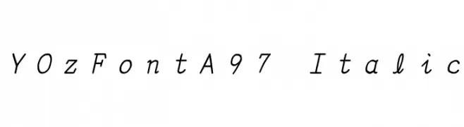
![YOzFontA97 Italic font caratteri gratis]() Scaricare 151 Downloads@WebFont
Scaricare 151 Downloads@WebFont -
( Fargun Studio - Fajar Gunawan - creativemarket.com/FargunStudio )
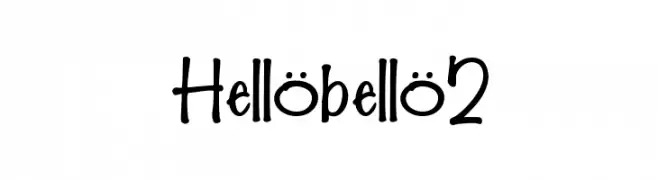
A playful, hand-drawn font with whimsical and irregular strokes.
![Hellobello2 font caratteri gratis]() Scaricare 151 Downloads@WebFont
Scaricare 151 Downloads@WebFont -
( Fonts by Kat`s Fun Fonts - Personal-use only. For commercial use please contact owner. )
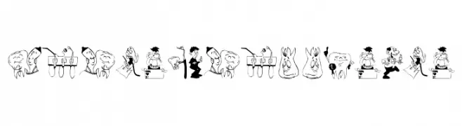
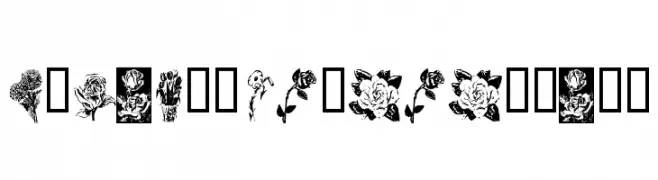
Ornamental font with unique floral illustrations for each character.
![KR Beautiful Flowers font caratteri gratis]() Scaricare 151 Downloads@WebFont
Scaricare 151 Downloads@WebFont -
Caratteri di fontsnthings. For commercial use please contact the owner.
![Fontsnthings 250th font caratteri gratis]() Scaricare 151 Downloads@WebFont
Scaricare 151 Downloads@WebFont -
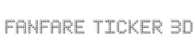
( Iconian Fonts - Daniel Zadorozny - www.iconian.com )
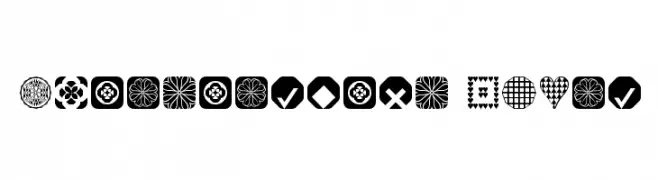
A dot-based, 3D digital display font with a modern, tech-inspired look.
![Fanfare Ticker 3D font caratteri gratis]() Scaricare 151 Downloads@WebFont
Scaricare 151 Downloads@WebFont -
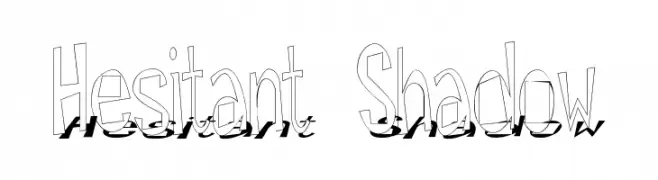
![Hesitant Shadow font caratteri gratis]() Scaricare 151 Downloads@WebFont
Scaricare 151 Downloads@WebFont -
![Detonator Italic font caratteri gratis]() Scaricare 151 Downloads@WebFont
Scaricare 151 Downloads@WebFont -
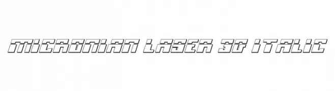
( Fonts by Daniel Zadorozny - www.iconian.com )
A futuristic, 3D italic font with bold outlines and geometric shapes.
![Micronian Laser 3D Italic font caratteri gratis]() Scaricare 151 Downloads@WebFont
Scaricare 151 Downloads@WebFont


Quali sono i font più popolari adesso?
Poppins, Roboto, Montserrat, Open Sans e Lato sono molto usati per le forme pulite e l'ampia applicabilità — dall'identità di marca alle landing page e ai poster.
Quali font si usano spesso nei loghi?
Le sans serif geometriche (es. Poppins, famiglie in stile Gotham) sono scelte comuni per un branding pulito e scalabile. Per un tocco personale restano valide script e stili manoscritti. Abbina un display deciso per i titoli a un corpo testo neutro per riconoscibilità ed equilibrio.
Ogni quanto si aggiorna la lista?
Con regolarità, in base ai download e all'attività reale. Torna spesso per scoprire in anticipo le nuove preferite.
💡 Consiglio: aggiungi ai preferiti — le tendenze cambiano in fretta e i font top di oggi possono ispirare il rebranding di domani.