Benvenuto nelle Font Più Popolari — dove popolarità e qualità si incontrano. Qui trovi i font più scaricati e usati dell'anno. Se cerchi scelte sicure per logo, web o social, inizia da qui.
Ogni font top si distingue per equilibrio, leggibilità e versatilità. Troverai sans serif moderne, script eleganti, serif vintage e display minimalisti.
-
( Fonts by Manfred Klein - manfred-klein.ina-mar.com )
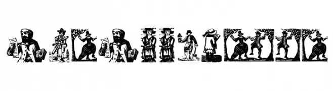
Ornate woodcut illustrations with a vintage, handcrafted feel.
 Scaricare 151 Downloads@WebFont
 -
( Fonts by Manfred Klein. Free for private and charity use. Free for commercial with donation to organizations )
An artistic and decorative font filled with intricate illustrations.
![ForgottenArtOne font caratteri gratis]() Scaricare 151 Downloads@WebFont
Scaricare 151 Downloads@WebFont -
( Fonts by Situjuh Nazara - 7ntypes.com - Personal-use only. For commercial use please contact owner. )
A modern, elegant font with clean lines and balanced proportions.
![Cruncho font caratteri gratis]() Scaricare 151 Downloads@WebFont
Scaricare 151 Downloads@WebFont -
( Fonts by Maulana Creative - Gilang Maulana - Personal-use only. For commercial use please contact owner. )
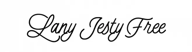
An elegant script font with flowing, cursive letterforms and a classic, refined style.
![Lany Jesty Free font caratteri gratis]() Scaricare 151 Downloads@WebFont
Scaricare 151 Downloads@WebFont -
( Fonts by www.kimberlygeswein.com - Kimberly Geswein )
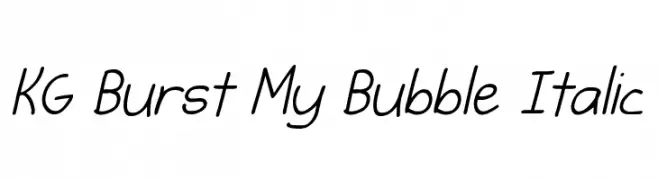
A playful, handwritten font with a slight slant and rounded characters.
![KG Burst My Bubble Italic font caratteri gratis]() Scaricare 151 Downloads@WebFont
Scaricare 151 Downloads@WebFont -
( Fonts by HENRIavecunK - Henrik - Personal-use only. For commercial use please contact owner. )
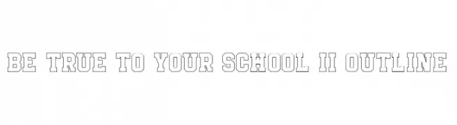
A bold, outlined font with a collegiate, varsity style.
![Be True To Your School II Outline font caratteri gratis]() Scaricare 151 Downloads@WebFont
Scaricare 151 Downloads@WebFont -
( Fonts by or from www.graffitifonts.net )
An edgy, gothic-style font with jagged edges and dynamic strokes.
![DreadLox font caratteri gratis]() Scaricare 151 Downloads@WebFont
Scaricare 151 Downloads@WebFont -
( Fonts by Sensatype Studio )
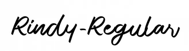
A lively and elegant script font with smooth, flowing strokes.
![Rindy-Regular font caratteri gratis]() Scaricare 151 Downloads@WebFont
Scaricare 151 Downloads@WebFont -
![Phlekzi font caratteri gratis]() Scaricare 151 Downloads@WebFont
Scaricare 151 Downloads@WebFont -
( Fonts by David Espinosa [Type Sailor] - www.facebook.com/typesailor - Personal-use only. For commercial use please contact owner. )
A bold slab serif font with strong lines and a classic style.
![Pelida Regular font caratteri gratis]() Scaricare 151 Downloads@WebFont
Scaricare 151 Downloads@WebFont -
( Fonts by imagex )
A bold, textured font with a rugged, industrial aesthetic.
![Big Bad Bugs font caratteri gratis]() Scaricare 151 Downloads@WebFont
Scaricare 151 Downloads@WebFont -
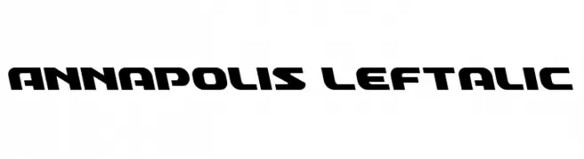
![Annapolis Leftalic font caratteri gratis]() Scaricare 151 Downloads@WebFont
Scaricare 151 Downloads@WebFont -
( Fonts by Daniel Zadorozny - www.iconian.com - Free for personal use )
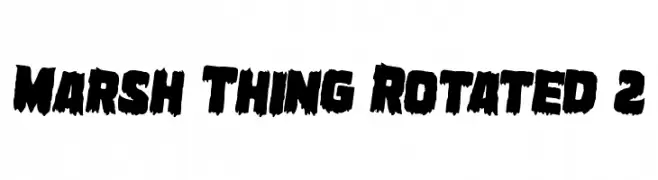
A bold, rugged font with a distressed, organic texture and jagged edges.
![Marsh Thing Rotated 2 font caratteri gratis]() Scaricare 151 Downloads@WebFont
Scaricare 151 Downloads@WebFont -
( Fonts by Daniel Zadorozny - www.iconian.com )
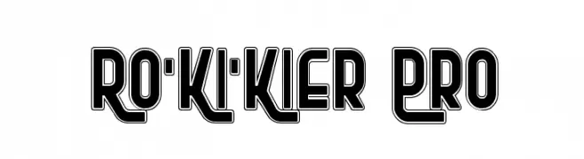
A bold, modern font with a distinctive outlined, three-dimensional appearance.
![Ro'Ki'Kier Pro font caratteri gratis]() Scaricare 151 Downloads@WebFont
Scaricare 151 Downloads@WebFont -
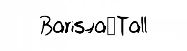
![Barista_Tall font caratteri gratis]() Scaricare 151 Downloads@WebFont
Scaricare 151 Downloads@WebFont -
( Fonts by Blue Vinyl - Jess Latham - www.bvfonts.com )
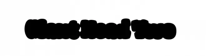
A bold, playful, and decorative font with thick, rounded letters.
![Giant Head Two font caratteri gratis]() Scaricare 151 Downloads@WebFont
Scaricare 151 Downloads@WebFont -
Caratteri di danny91194. For commercial use please contact the owner.
( tricky )
A whimsical, rounded script font with a casual, handwritten feel.
![Fluzze font caratteri gratis]() Scaricare 151 Downloads@WebFont
Scaricare 151 Downloads@WebFont -
( Fonts by Manfred Klein. Free for private and charity use. Free for commercial with donation to organizations )
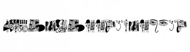
Hand-drawn, abstract face sketches used as letterforms.
![HeadsHandsSketches font caratteri gratis]() Scaricare 151 Downloads@WebFont
Scaricare 151 Downloads@WebFont -
( Fonts by CannotIntoSpaceFonts - KineticPlasma Fonts - Personal-use only. For commercial use please contact owner. )
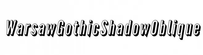
Bold, shadowed, and oblique font with a modern, dynamic style.
![Warsaw Gothic Shadow Oblique font caratteri gratis]() Scaricare 151 Downloads@WebFont
Scaricare 151 Downloads@WebFont -
( Fonts by a Neale Davidson - www.pixelsagas.com. Personal-use only. For commercial use please contact owner. )
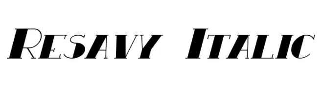
A dynamic italic font with high contrast and elegant slanted characters.
![Resavy Italic font caratteri gratis]() Scaricare 151 Downloads@WebFont
Scaricare 151 Downloads@WebFont -
![oceanography font caratteri gratis]() Scaricare 151 Downloads@WebFont
Scaricare 151 Downloads@WebFont -
( Fonts by Edric Studio - Personal-use only. For commercial use please contact owner. )
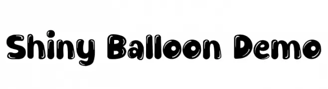
A playful, shiny balloon-like font with a bold and rounded appearance.
![Shiny Balloon Demo font caratteri gratis]() Scaricare 151 Downloads@WebFont
Scaricare 151 Downloads@WebFont -
( Fonts by Andy Krahling - Sunwalk )
A decorative and artistic font with intricate, whimsical letterforms.
![Cyprian font caratteri gratis]() Scaricare 151 Downloads@WebFont
Scaricare 151 Downloads@WebFont -
( www.qkila.com/font )
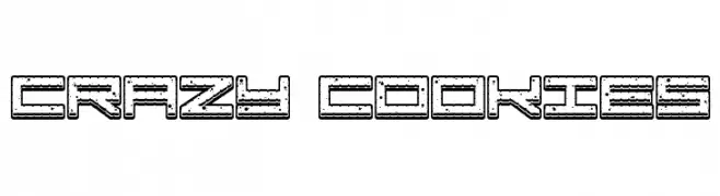
A playful, cookie-themed decorative font with a textured, outlined style.
![Crazy COokies font caratteri gratis]() Scaricare 151 Downloads@WebFont
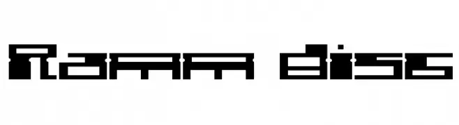
Scaricare 151 Downloads@WebFont -
![Ramm disc font caratteri gratis]() Scaricare 151 Downloads@WebFont
Scaricare 151 Downloads@WebFont -
( Fonts by Jetsmax Studio )
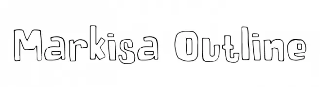
A playful, bold outline font with a hand-drawn, casual appearance.
![Markisa Outline font caratteri gratis]() Scaricare 151 Downloads@WebFont
Scaricare 151 Downloads@WebFont -
( Janna - janna-art.wz.cz/ )
A playful, casual handwritten font with a whimsical style.
![Jannafont font caratteri gratis]() Scaricare 151 Downloads@WebFont
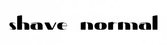
Scaricare 151 Downloads@WebFont -
![Shave Normal font caratteri gratis]() Scaricare 151 Downloads@WebFont
Scaricare 151 Downloads@WebFont -
( Fonts by www.typodermicfonts.com - Ray Larabie )
A tall, narrow, and modern font with a sleek and sophisticated style.
![Urkelian-Regular font caratteri gratis]() Scaricare 151 Downloads@WebFont
Scaricare 151 Downloads@WebFont -
( گالری فانت فارسی پژوهش آريانا - only compatible with Farsi and Arabic )
A geometric and futuristic font with elongated, sharp characters.
![Arghawaan font caratteri gratis]() Scaricare 151 Downloads@WebFont
Scaricare 151 Downloads@WebFont -
![SaviaRegular//ANTIPIXEL.COM.AR font caratteri gratis]() Scaricare 151 Downloads@WebFont
Scaricare 151 Downloads@WebFont -
( Fonts by softerviews.org )
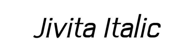
A sleek, modern italic font with consistent stroke width and dynamic style.
![Jivita Italic font caratteri gratis]() Scaricare 151 Downloads@WebFont
Scaricare 151 Downloads@WebFont -
( Fonts by CannotIntoSpaceFonts - KineticPlasma Fonts - Personal-use only. For commercial use please contact owner. )
A modern, geometric oblique font with a ghost outline and super-extended width.
![Hussar Simple SuperExtended Ghost Oblique3 font caratteri gratis]() Scaricare 151 Downloads@WebFont
Scaricare 151 Downloads@WebFont -
( www.greatmade.de/ )
A quirky, hand-drawn font with irregular, organic shapes.
![Ute font caratteri gratis]() Scaricare 151 Downloads@WebFont
Scaricare 151 Downloads@WebFont -
( Fonts by Maurice The Hormone Monster AUTTP )
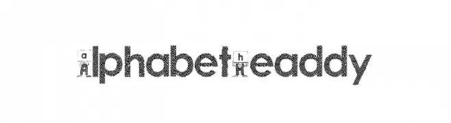
A playful, human-figure integrated font with a bold, dotted texture.
![Alphabet Headdy font caratteri gratis]() Scaricare 151 Downloads@WebFont
Scaricare 151 Downloads@WebFont


Quali sono i font più popolari adesso?
Poppins, Roboto, Montserrat, Open Sans e Lato sono molto usati per le forme pulite e l'ampia applicabilità — dall'identità di marca alle landing page e ai poster.
Quali font si usano spesso nei loghi?
Le sans serif geometriche (es. Poppins, famiglie in stile Gotham) sono scelte comuni per un branding pulito e scalabile. Per un tocco personale restano valide script e stili manoscritti. Abbina un display deciso per i titoli a un corpo testo neutro per riconoscibilità ed equilibrio.
Ogni quanto si aggiorna la lista?
Con regolarità, in base ai download e all'attività reale. Torna spesso per scoprire in anticipo le nuove preferite.
💡 Consiglio: aggiungi ai preferiti — le tendenze cambiano in fretta e i font top di oggi possono ispirare il rebranding di domani.