Benvenuto nelle Font Più Popolari — dove popolarità e qualità si incontrano. Qui trovi i font più scaricati e usati dell'anno. Se cerchi scelte sicure per logo, web o social, inizia da qui.
Ogni font top si distingue per equilibrio, leggibilità e versatilità. Troverai sans serif moderne, script eleganti, serif vintage e display minimalisti.
-
( Fonts by BBA Key - Personal-use only. For commercial use please contact owner. )
A modern, rounded sans-serif font with uniform stroke width and excellent readability.
 Scaricare 150 Downloads@WebFont
 -
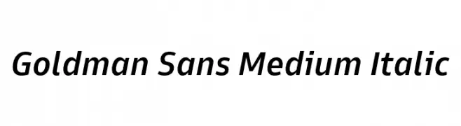
( Fonts by Goldman Sans - https://design.gs.com/d/design-system/foundation/typography/ - Personal-use only. For commercial use please contact owner. )
A modern, medium-weight italic sans-serif font with a sleek and professional look.
![Goldman Sans Medium Italic font caratteri gratis]() Scaricare 150 Downloads@WebFont
Scaricare 150 Downloads@WebFont -
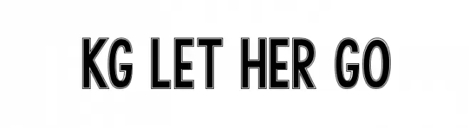
( Fonts by www.kimberlygeswein.com - Kimberly Geswein )
A bold, outlined geometric sans-serif font with a modern and assertive style.
![KG LET HER GO font caratteri gratis]() Scaricare 150 Downloads@WebFont
Scaricare 150 Downloads@WebFont -
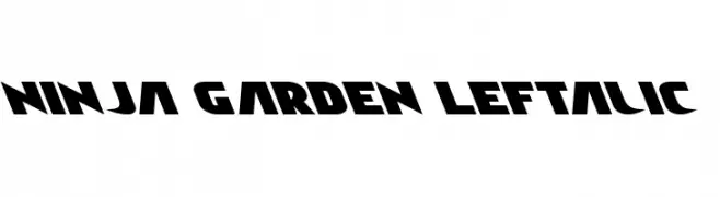
( Iconian Fonts - Daniel Zadorozny - www.iconian.com )
A bold, left-slanted font with a dynamic and modern style.
![Ninja Garden Leftalic font caratteri gratis]() Scaricare 150 Downloads@WebFont
Scaricare 150 Downloads@WebFont -
( Fonts by Manfred Klein. Free for private and charity use. Free for commercial with donation to organizations )
A pictorial, cave-art inspired decorative font with hand-drawn glyphs.
![ArteCave font caratteri gratis]() Scaricare 150 Downloads@WebFont
Scaricare 150 Downloads@WebFont -
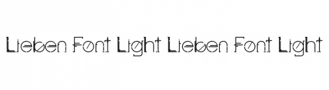
( Fonts by Yai Salinas )
A modern, geometric font with thin lines and circular elements.
![Lieben Font Light Lieben Font Light font caratteri gratis]() Scaricare 150 Downloads@WebFont
Scaricare 150 Downloads@WebFont -
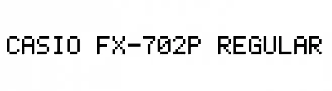
( Fonts by myname5749 - Personal-use only. For commercial use please contact owner. )
A pixelated, monospaced font with a retro digital aesthetic.
![Casio FX-702P Regular font caratteri gratis]() Scaricare 150 Downloads@WebFont
Scaricare 150 Downloads@WebFont -
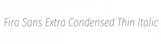
( Copyright (c) 2012-2015, The Mozilla Foundation and Telefonica S.A. )
A sleek, extra-condensed thin italic font with a modern and elegant style.
![Fira Sans Extra Condensed Thin Italic font caratteri gratis]() Scaricare 150 Downloads@WebFont
Scaricare 150 Downloads@WebFont -
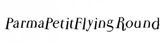
( Fonts by Manfred Klein. Free for private and charity use. Free for commercial with donation to organizations )
A dynamic and elegant font with flowing, cursive-like strokes and high contrast.
![ParmaPetitFlyingRound font caratteri gratis]() Scaricare 150 Downloads@WebFont
Scaricare 150 Downloads@WebFont -
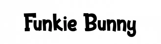
( Fonts by Figuree Studio )
A bold, playful font with a hand-drawn, whimsical style.
![Funkie Bunny font caratteri gratis]() Scaricare 150 Downloads@WebFont
Scaricare 150 Downloads@WebFont -
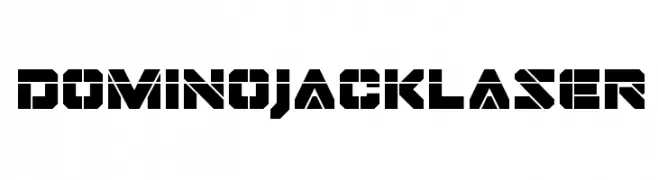
( Fonts by Iconian Fonts )
A bold, geometric font with a futuristic, industrial design and stencil-like appearance.
![Domino Jack Laser font caratteri gratis]() Scaricare 150 Downloads@WebFont
Scaricare 150 Downloads@WebFont -
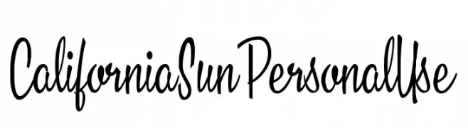
( Fonts by Billy Argel - Personal-use only. For commercial use please contact owner. )
A dynamic and elegant font with bold, slender strokes and cursive-like lowercase letters.
![California Sun Personal Use font caratteri gratis]() Scaricare 150 Downloads@WebFont
Scaricare 150 Downloads@WebFont -
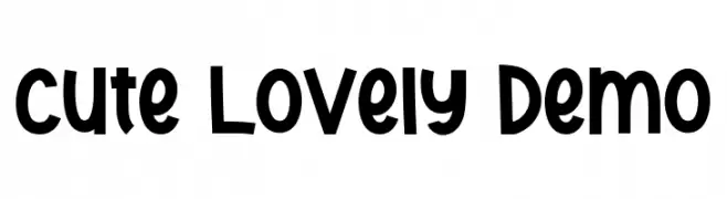
( Fonts by Edric Studio - Personal-use only. For commercial use please contact owner. )
A playful, bold font with heart-shaped accents and rounded characters.
![Cute Lovely Demo font caratteri gratis]() Scaricare 150 Downloads@WebFont
Scaricare 150 Downloads@WebFont -
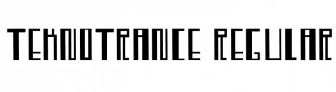
( shfonts.com )
A futuristic, geometric font with sharp angles and clean lines.
![TeknoTrance-Regular font caratteri gratis]() Scaricare 150 Downloads@WebFont
Scaricare 150 Downloads@WebFont -
( Fonts by Daniel Zadorozny - www.iconian.com )
A bold, decorative font with a military-inspired theme and star accents.
![Army Rangers Engraved Regular font caratteri gratis]() Scaricare 150 Downloads@WebFont
Scaricare 150 Downloads@WebFont -
( Fonts by www.woodcutter.es - woodcutter Manero - Personal-use only. For commercial use please contact owner. )
Surf-inspired pictogram font with bold, silhouette icons.
![Surf font caratteri gratis]() Scaricare 150 Downloads@WebFont
Scaricare 150 Downloads@WebFont -
( Fonts by EvasUniqueFonts )
A bold, decorative font with intricate patterns inside each character.
![Hapyster Demo font caratteri gratis]() Scaricare 150 Downloads@WebFont
Scaricare 150 Downloads@WebFont -
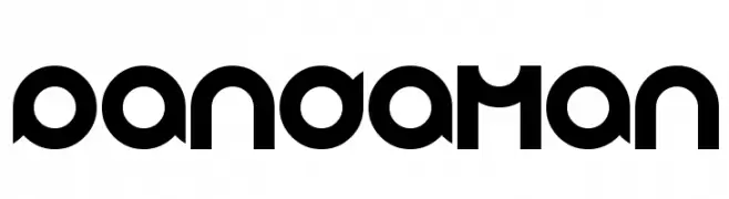
( Fonts by Wino S Kadir - weknow - www.revolge.com/shop/weknow/ - Personal-use only. For commercial use please contact owner. )
A bold, geometric font with a futuristic and abstract design.
![pandaman font caratteri gratis]() Scaricare 150 Downloads@WebFont
Scaricare 150 Downloads@WebFont -
Caratteri di NicholasJudy456. For commercial use please contact the owner.
![HeadsoftheHousehold font caratteri gratis]() Scaricare 150 Downloads@WebFont
Scaricare 150 Downloads@WebFont -
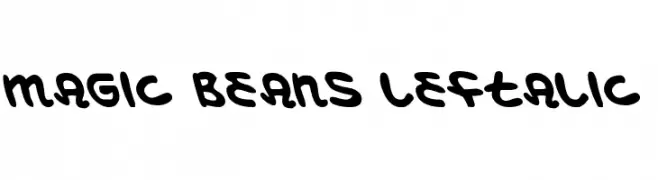
( Fonts by Daniel Zadorozny - www.iconian.com - Free for personal use )
A bold, rounded, and playful font with a leftward slant.
![Magic Beans Leftalic font caratteri gratis]() Scaricare 150 Downloads@WebFont
Scaricare 150 Downloads@WebFont -
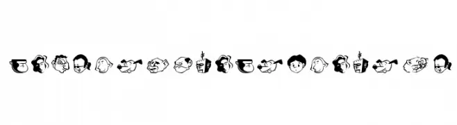
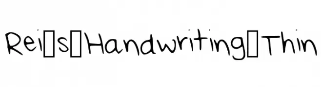
( Fonts by Rei K )
A playful, casual handwritten font with thin, irregular strokes.
![Rei_s_Handwriting_Thin font caratteri gratis]() Scaricare 150 Downloads@WebFont
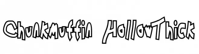
Scaricare 150 Downloads@WebFont -
![Chunkmuffin HollowThick font caratteri gratis]() Scaricare 150 Downloads@WebFont
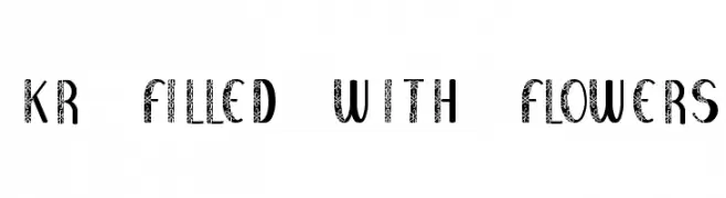
Scaricare 150 Downloads@WebFont -
![KR Filled With Flowers font caratteri gratis]() Scaricare 150 Downloads@WebFont
Scaricare 150 Downloads@WebFont -
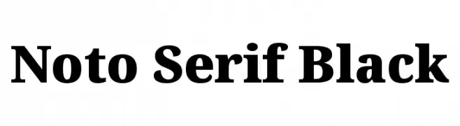
( Noto is a trademark of Google Inc. Noto fonts are open source. All Noto fonts are published under the SIL Open Font License, Version 1.1 )
A bold, high-contrast serif typeface with strong, thick strokes and prominent serifs.
![Noto Serif Black font caratteri gratis]() Scaricare 150 Downloads@WebFont
Scaricare 150 Downloads@WebFont -
( Fonts by Sara Lombardo )
A playful, bold font with rounded, thick strokes and a whimsical style.
![Mypeachnotes Regular font caratteri gratis]() Scaricare 150 Downloads@WebFont
Scaricare 150 Downloads@WebFont -
( Fonts by typeformerstudio.com - Personal-use only. For commercial use please contact owner. )
A bold, modern font with geometric lines and a strong presence.
![Wondra font caratteri gratis]() Scaricare 150 Downloads@WebFont
Scaricare 150 Downloads@WebFont -
( گالری فانت فارسی پژوهش آريانا - only compatible with Farsi and Arabic )
A bold, vintage-inspired font with a modern twist, ideal for headlines and branding.
![Bist font caratteri gratis]() Scaricare 150 Downloads@WebFont
Scaricare 150 Downloads@WebFont -
![Alachua Bold font caratteri gratis]() Scaricare 150 Downloads@WebFont
Scaricare 150 Downloads@WebFont -
( Fonts by Iconian Fonts )
A bold, italic, textured font with an expanded width and dynamic style.
![Wolf Brothers Expanded Italic font caratteri gratis]() Scaricare 150 Downloads@WebFont
Scaricare 150 Downloads@WebFont -
![Destinys Designs font caratteri gratis]() Scaricare 150 Downloads@WebFont
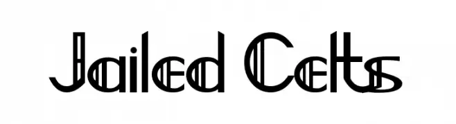
Scaricare 150 Downloads@WebFont -
![Jailed Celts font caratteri gratis]() Scaricare 150 Downloads@WebFont
Scaricare 150 Downloads@WebFont -
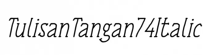
( Fonts by a Situjuh Nazara - c7n1.wordpress.com. Personal-use only. For commercial use please contact owner. )
A handwritten italic font with elegant curves and consistent stroke width.
![Tulisan Tangan 74 Italic font caratteri gratis]() Scaricare 150 Downloads@WebFont
Scaricare 150 Downloads@WebFont -
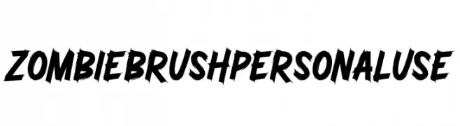
( Fonts by Ditatype )
A bold, brush-style font with dynamic and jagged strokes for an energetic look.
![Zombie Brush Personal Use font caratteri gratis]() Scaricare 150 Downloads@WebFont
Scaricare 150 Downloads@WebFont -
( Fonts by Nick Curtis - www.nicksfonts.com )
A bold, tall, and narrow font with minimal serifs and a modern touch.
![PointsWest font caratteri gratis]() Scaricare 150 Downloads@WebFont
Scaricare 150 Downloads@WebFont -
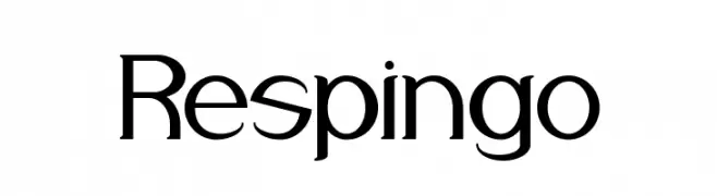
( Fonts by a Alberto Villanueva - www.av.nixiweb.com. Personal-use only. For commercial use please contact owner. )
A modern decorative font with geometric shapes and stylish curves.
![Respingo font caratteri gratis]() Scaricare 150 Downloads@WebFont
Scaricare 150 Downloads@WebFont


Quali sono i font più popolari adesso?
Poppins, Roboto, Montserrat, Open Sans e Lato sono molto usati per le forme pulite e l'ampia applicabilità — dall'identità di marca alle landing page e ai poster.
Quali font si usano spesso nei loghi?
Le sans serif geometriche (es. Poppins, famiglie in stile Gotham) sono scelte comuni per un branding pulito e scalabile. Per un tocco personale restano valide script e stili manoscritti. Abbina un display deciso per i titoli a un corpo testo neutro per riconoscibilità ed equilibrio.
Ogni quanto si aggiorna la lista?
Con regolarità, in base ai download e all'attività reale. Torna spesso per scoprire in anticipo le nuove preferite.
💡 Consiglio: aggiungi ai preferiti — le tendenze cambiano in fretta e i font top di oggi possono ispirare il rebranding di domani.