Benvenuto nelle Font Più Popolari — dove popolarità e qualità si incontrano. Qui trovi i font più scaricati e usati dell'anno. Se cerchi scelte sicure per logo, web o social, inizia da qui.
Ogni font top si distingue per equilibrio, leggibilità e versatilità. Troverai sans serif moderne, script eleganti, serif vintage e display minimalisti.
-
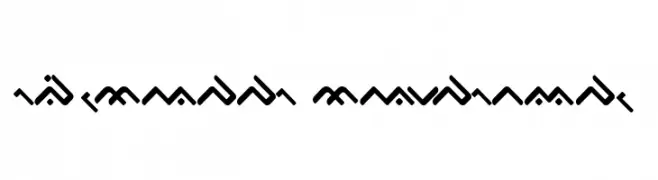
( Fonts by Daniel Zadorozny - www.iconian.com )
A bold, italic, futuristic font with sharp angles and high contrast.
 Scaricare 150 Downloads@WebFont
 -
( Fonts by Joseph Dawson - Personal-use only. For commercial use please contact owner. )
A sleek, modern font with geometric lines and a futuristic style.
![Future Light font caratteri gratis]() Scaricare 150 Downloads@WebFont
Scaricare 150 Downloads@WebFont -
( Fonts by Manuel Ramos - www.infinitismo.com - Personal-use only. For commercial use please contact owner. )
A playful, graffiti-inspired outline font with a bold and artistic style.
![Graff font caratteri gratis]() Scaricare 150 Downloads@WebFont
Scaricare 150 Downloads@WebFont -
( Fonts by Wino S Kadir - weknow - www.revolge.com/shop/weknow/ - Personal-use only. For commercial use please contact owner. )
A playful, flowing script font with smooth, rounded characters.
![Brother Army font caratteri gratis]() Scaricare 150 Downloads@WebFont
Scaricare 150 Downloads@WebFont -
( Fonts by Iconian Fonts )
A bold, italic, and angular font with a modern and dynamic style.
![Master Breaker Italic font caratteri gratis]() Scaricare 150 Downloads@WebFont
Scaricare 150 Downloads@WebFont -
( Jen Jones - www.jenjonesfonts.com )
A playful, handwritten font with bold, irregular strokes.
![HelloMilkMoney font caratteri gratis]() Scaricare 150 Downloads@WebFont
Scaricare 150 Downloads@WebFont -
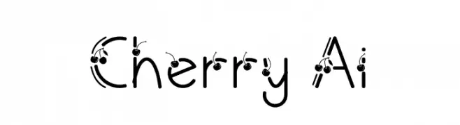
( Fonts by Nur Aisyah Amalia )
A playful, cherry-adorned font with bold, rounded characters.
![Cherry Ai font caratteri gratis]() Scaricare 150 Downloads@WebFont
Scaricare 150 Downloads@WebFont -
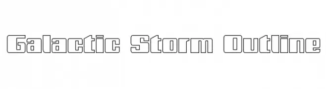
( Fonts by Daniel Zadorozny - www.iconian.com - Free for personal use )
A bold, geometric outline font with a futuristic and dynamic style.
![Galactic Storm Outline font caratteri gratis]() Scaricare 150 Downloads@WebFont
Scaricare 150 Downloads@WebFont -
![JustSomeRandomDoodles font caratteri gratis]() Scaricare 150 Downloads@WebFont
Scaricare 150 Downloads@WebFont -
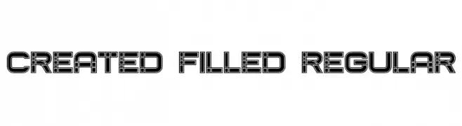
( Vladimir Nikolic - www.coroflot.com/vladimirnikolic )
A bold, geometric font with a filled, block-like design and parallel line detailing.
![Created Filled Regular font caratteri gratis]() Scaricare 150 Downloads@WebFont
Scaricare 150 Downloads@WebFont -
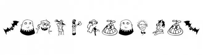
( Fonts by Manfred Klein - manfred-klein.ina-mar.com )
Cartoonish, character-based decorative font with playful illustrations.
![StrangeTypes font caratteri gratis]() Scaricare 150 Downloads@WebFont
Scaricare 150 Downloads@WebFont -
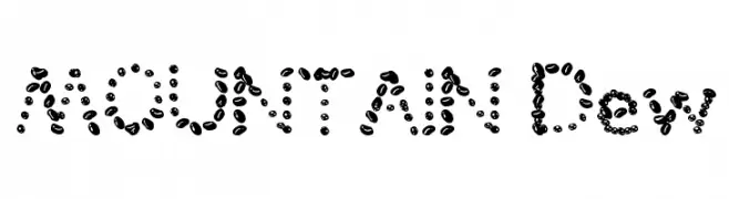
( weknow - Wino S Kadir - www.creativefabrica.com/designer/weknow/ )
A playful font made of coffee bean-like shapes, offering a textured and unique appearance.
![MOUNTAIN Dew font caratteri gratis]() Scaricare 150 Downloads@WebFont
Scaricare 150 Downloads@WebFont -
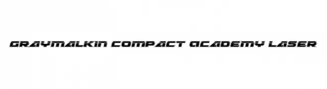
( Fonts by Daniel Zadorozny - www.iconian.com )
A futuristic, geometric font with bold outlines and a compact design.
![Graymalkin Compact Academy Laser font caratteri gratis]() Scaricare 150 Downloads@WebFont
Scaricare 150 Downloads@WebFont -
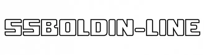
( Fonts by Serge Shi - www.behance.net/positivart )
A bold, geometric font with outlined characters and a modern, futuristic style.
![ssboldin-Line font caratteri gratis]() Scaricare 150 Downloads@WebFont
Scaricare 150 Downloads@WebFont -
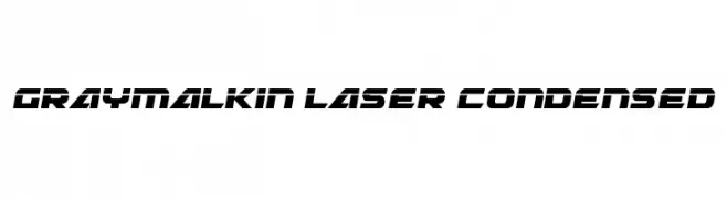
( Fonts by Daniel Zadorozny - www.iconian.com )
A futuristic, angular, and condensed font with a bold and sleek design.
![Graymalkin Laser Condensed font caratteri gratis]() Scaricare 150 Downloads@WebFont
Scaricare 150 Downloads@WebFont -
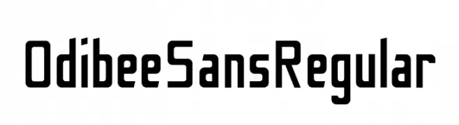
( Fonts by BARNARD.CO )
A bold, geometric sans-serif font with a modern and clean design.
![Odibee Sans Regular font caratteri gratis]() Scaricare 150 Downloads@WebFont
Scaricare 150 Downloads@WebFont -
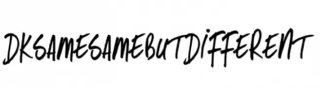
( Hanoded - David Kerkhoff - www.hanodedfonts.com )
A bold, dynamic handwritten font with expressive strokes.
![DKSameSameButDifferent font caratteri gratis]() Scaricare 150 Downloads@WebFont
Scaricare 150 Downloads@WebFont -
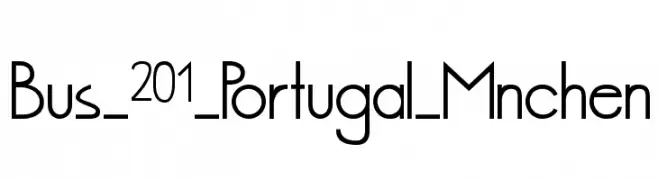
( Daniel Frohwein - www.aleatoric.de/ )
A modern, geometric sans-serif font with clean lines and balanced proportions.
![Bus_201_Portugal_Mnchen font caratteri gratis]() Scaricare 150 Downloads@WebFont
Scaricare 150 Downloads@WebFont -
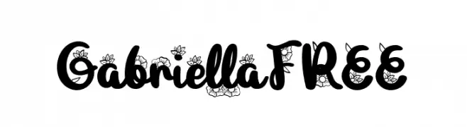
( Fonts by Vunira Design )
A playful, decorative font with floral embellishments on each letter.
![GabriellaFREE font caratteri gratis]() Scaricare 150 Downloads@WebFont
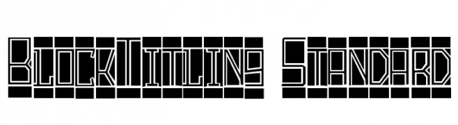
Scaricare 150 Downloads@WebFont -
![BlockTitling Standard font caratteri gratis]() Scaricare 150 Downloads@WebFont
Scaricare 150 Downloads@WebFont -
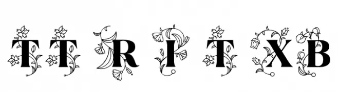
( Fonts by Ivan Gladkikh )
An ornate, floral-decorated font with bold, elegant characters.
![TT Ramillas Initials Trl XBd font caratteri gratis]() Scaricare 150 Downloads@WebFont
Scaricare 150 Downloads@WebFont -
( Free for personal use - new.myfonts.com/foundry/Intellecta_Design/?refby=paulow )
A collection of intricate decorative elements and calligraphic ornaments.
![Cornucopia Caligrafica font caratteri gratis]() Scaricare 150 Downloads@WebFont
Scaricare 150 Downloads@WebFont -
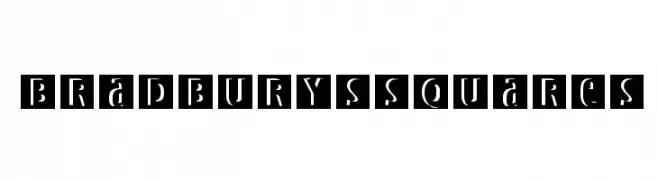
( Fonts by Manfred Klein. Free for private and charity use. Free for commercial with donation to organizations )
A bold, geometric font with characters enclosed in squares, featuring unique cutouts.
![BradburysSquares font caratteri gratis]() Scaricare 150 Downloads@WebFont
Scaricare 150 Downloads@WebFont -
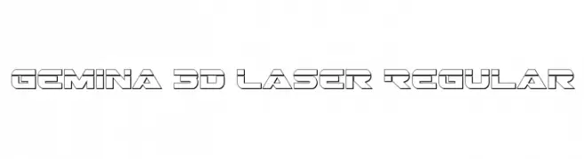
( Fonts by Iconian Fonts - Daniel Zadorozny )
A futuristic, 3D geometric font with bold, angular lines.
![Gemina 3D Laser Regular font caratteri gratis]() Scaricare 150 Downloads@WebFont
Scaricare 150 Downloads@WebFont -
![Twee font caratteri gratis]() Scaricare 150 Downloads@WebFont
Scaricare 150 Downloads@WebFont -
( www.vextorart.blogspot.com )
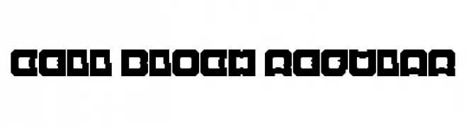
A bold, geometric font with a strong, block-like appearance.
![Cell Bloch Regular font caratteri gratis]() Scaricare 150 Downloads@WebFont
Scaricare 150 Downloads@WebFont -
( Fonts by www.selawetype.com - Personal-use only. FOR DONATION https://www.paypal.me/selawe . For commercial use please contact owner. )
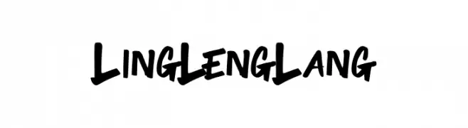
A bold, energetic script font with brush-like strokes and playful curves.
![LingLengLang font caratteri gratis]() Scaricare 150 Downloads@WebFont
Scaricare 150 Downloads@WebFont -
( Fonts by Jetsmax Studio )
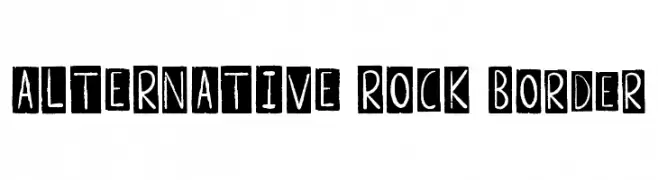
A bold, hand-drawn font with characters in black squares, offering a raw, edgy style.
![ALTERNATIVE ROCK Border font caratteri gratis]() Scaricare 150 Downloads@WebFont
Scaricare 150 Downloads@WebFont -
( Fonts by Chequered Ink - Personal-use only. For commercial use please contact owner. )
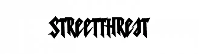
A bold, edgy font with sharp angles and a graffiti-inspired style.
![Street Threat font caratteri gratis]() Scaricare 150 Downloads@WebFont
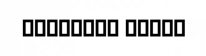
Scaricare 150 Downloads@WebFont -
( گالری فانت فارسی پژوهش آريانا - only compatible with Farsi and Arabic )
A bold, geometric font with a strong, blocky appearance.
![Badakhsh Black font caratteri gratis]() Scaricare 150 Downloads@WebFont
Scaricare 150 Downloads@WebFont -
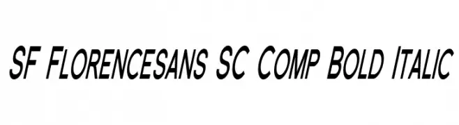
![SF Florencesans SC Comp Bold Italic font caratteri gratis]() Scaricare 150 Downloads@WebFont
Scaricare 150 Downloads@WebFont -
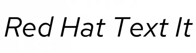
( Copyright 2019 The Red Hat Project Authors (https://github.com/RedHatOfficial/RedHatFont) )
A modern, italic sans-serif font with clean lines and balanced proportions.
![Red Hat Text It font caratteri gratis]() Scaricare 150 Downloads@WebFont
Scaricare 150 Downloads@WebFont -
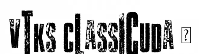
( Fonts by Douglas Vitkauskas - www.vtksdesign.com. Personal-use only. For commercial use please contact owner. )
A bold, distressed font with a grunge and textured style.
![Vtks Classicuda 3 font caratteri gratis]() Scaricare 150 Downloads@WebFont
Scaricare 150 Downloads@WebFont -
![OgieCappo Campotype font caratteri gratis]() Scaricare 150 Downloads@WebFont
Scaricare 150 Downloads@WebFont -
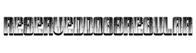
( Fonts by Vladimir Nikolic )
A bold, decorative font with a 3D effect and textured pattern, ideal for impactful headlines.
![Reserved Dogs Regular font caratteri gratis]() Scaricare 150 Downloads@WebFont
Scaricare 150 Downloads@WebFont


Quali sono i font più popolari adesso?
Poppins, Roboto, Montserrat, Open Sans e Lato sono molto usati per le forme pulite e l'ampia applicabilità — dall'identità di marca alle landing page e ai poster.
Quali font si usano spesso nei loghi?
Le sans serif geometriche (es. Poppins, famiglie in stile Gotham) sono scelte comuni per un branding pulito e scalabile. Per un tocco personale restano valide script e stili manoscritti. Abbina un display deciso per i titoli a un corpo testo neutro per riconoscibilità ed equilibrio.
Ogni quanto si aggiorna la lista?
Con regolarità, in base ai download e all'attività reale. Torna spesso per scoprire in anticipo le nuove preferite.
💡 Consiglio: aggiungi ai preferiti — le tendenze cambiano in fretta e i font top di oggi possono ispirare il rebranding di domani.