Benvenuto nelle Font Più Popolari — dove popolarità e qualità si incontrano. Qui trovi i font più scaricati e usati dell'anno. Se cerchi scelte sicure per logo, web o social, inizia da qui.
Ogni font top si distingue per equilibrio, leggibilità e versatilità. Troverai sans serif moderne, script eleganti, serif vintage e display minimalisti.
-
( Fonts by Studio Typo - Personal-use only. For commercial use please contact owner. )
A bold, slab serif typeface with strong, thick strokes and a modern yet classic appeal.
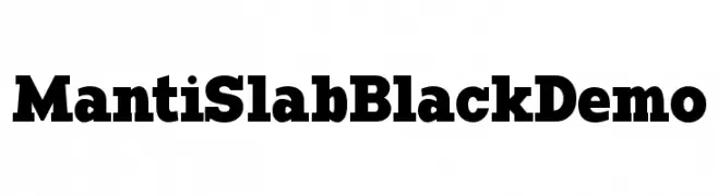 Scaricare 150 Downloads@WebFont
 -
( Fonts by Edric Studio www.creativefabrica.com/designer/edricstudio/ - Personal-use only. For commercial use please contact owner. )
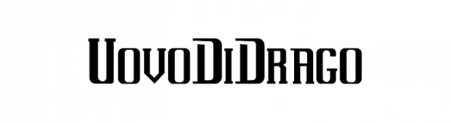
A bold, geometric font with a condensed and striking design.
![Uovo Di Drago font caratteri gratis]() Scaricare 150 Downloads@WebFont
Scaricare 150 Downloads@WebFont -
( Fonts by www.aenigmafonts.com )
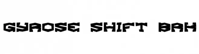
A bold, angular font with a geometric and futuristic style.
![Gyrose Shift BRK font caratteri gratis]() Scaricare 150 Downloads@WebFont
Scaricare 150 Downloads@WebFont -
( Fonts by Allouse Studio - Personal-use only. For commercial use please contact owner. )
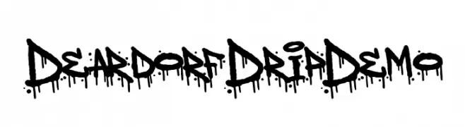
A bold, graffiti-inspired font with a distinctive dripping effect.
![Deardorf Drip Demo font caratteri gratis]() Scaricare 150 Downloads@WebFont
Scaricare 150 Downloads@WebFont -
( Fonts by Maulana Creative - Gilang Maulana - Personal-use only. For commercial use please contact owner. )
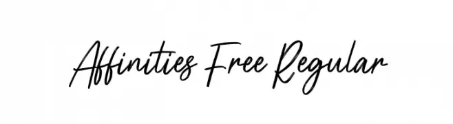
A dynamic handwritten font with fluid, sweeping strokes and a natural flow.
![Affinities Free Regular font caratteri gratis]() Scaricare 150 Downloads@WebFont
Scaricare 150 Downloads@WebFont -
( Down10 - www.down10.com )
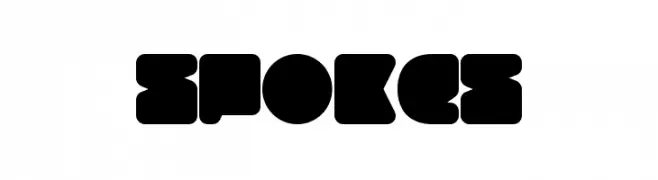
A bold, geometric font with rounded edges and a playful, modern aesthetic.
![Spokes font caratteri gratis]() Scaricare 150 Downloads@WebFont
Scaricare 150 Downloads@WebFont -
( Fonts by Graphicxell )
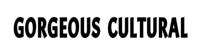
A bold, dynamic font with a slightly condensed and modern style.
![Gorgeous Cultural font caratteri gratis]() Scaricare 150 Downloads@WebFont
Scaricare 150 Downloads@WebFont -
( Fonts by Tokopress )
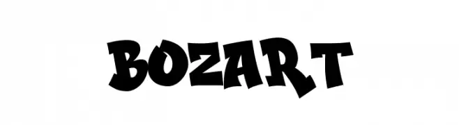
A bold, playful font with exaggerated strokes and a cartoonish flair.
![BOZART font caratteri gratis]() Scaricare 150 Downloads@WebFont
Scaricare 150 Downloads@WebFont -
![Victorian Designs Two font caratteri gratis]() Scaricare 150 Downloads@WebFont
Scaricare 150 Downloads@WebFont -
( Fonts by Fonthead Design - Ethan Dunham - Personal-use only. For commercial use please contact owner. )
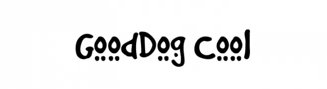
A playful, hand-drawn font with a casual and friendly style.
![GoodDog Cool font caratteri gratis]() Scaricare 150 Downloads@WebFont
Scaricare 150 Downloads@WebFont -
![So Lovable font caratteri gratis]() Scaricare 150 Downloads@WebFont
Scaricare 150 Downloads@WebFont -
( Fonts by Pedro Teixeira Foundry - Pedro Alexandre Teixeira - Personal-use only. For commercial use please contact owner. )
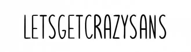
A playful, narrow font with a hand-drawn, whimsical style.
![Letsgetcrazysans font caratteri gratis]() Scaricare 150 Downloads@WebFont
Scaricare 150 Downloads@WebFont -
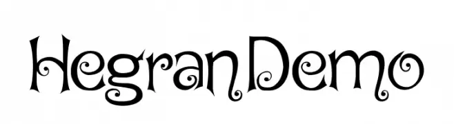
![Hegran Demo font caratteri gratis]() Scaricare 150 Downloads@WebFont
Scaricare 150 Downloads@WebFont -
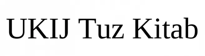
( Fonts by Tursun Sultan - Personal-use only. For commercial use please contact owner. )
A classic serif font with elegant strokes and a professional appearance.
![UKIJ Tuz Kitab font caratteri gratis]() Scaricare 150 Downloads@WebFont
Scaricare 150 Downloads@WebFont -
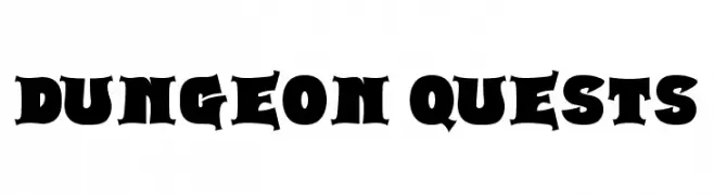
( Fonts by Darrell Flood )
A bold, medieval-inspired font with a strong, gothic presence.
![Dungeon Quests font caratteri gratis]() Scaricare 150 Downloads@WebFont
Scaricare 150 Downloads@WebFont -
( Fonts by Mukhlis Muhammad - variatype.com - Personal-use only. For commercial use please contact owner. )
A bold, vintage serif font with a Western flair.
![Bronco font caratteri gratis]() Scaricare 150 Downloads@WebFont
Scaricare 150 Downloads@WebFont -
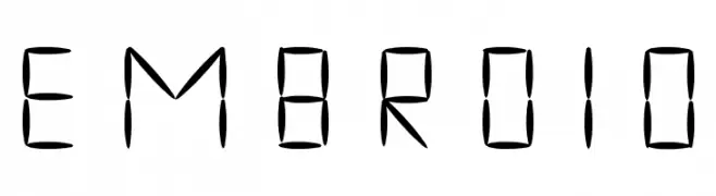
( www.bureaunauta.nl )
A decorative font with an embroidered, cross-stitched style.
![embroid font caratteri gratis]() Scaricare 150 Downloads@WebFont
Scaricare 150 Downloads@WebFont -
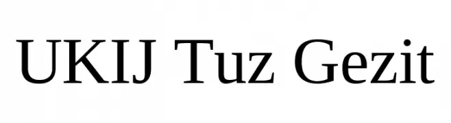
( Fonts by Tursun Sultan - Personal-use only. For commercial use please contact owner. )
A classic serif font with elegant proportions and refined serifs.
![UKIJ Tuz Gezit font caratteri gratis]() Scaricare 150 Downloads@WebFont
Scaricare 150 Downloads@WebFont -
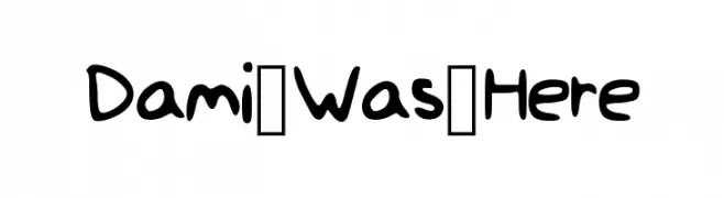
( Fonts by Damilola Oladimeji )
A playful, handwritten-style font with bold, rounded characters.
![Dami_Was_Here font caratteri gratis]() Scaricare 150 Downloads@WebFont
Scaricare 150 Downloads@WebFont -
( Fonts by Apostrophic Lab )
A playful, bold outline font with a bubble-like appearance.
![Thorazone font caratteri gratis]() Scaricare 150 Downloads@WebFont
Scaricare 150 Downloads@WebFont -
( Fonts by Kong Font - fontkong.com - Personal-use only. For commercial use please contact owner. )
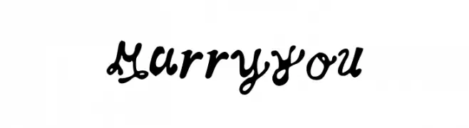
A flowing, cursive font with elegant loops and swashes, perfect for artistic projects.
![Manuscript font caratteri gratis]() Scaricare 150 Downloads@WebFont
Scaricare 150 Downloads@WebFont -
![MarryYou font caratteri gratis]() Scaricare 150 Downloads@WebFont
Scaricare 150 Downloads@WebFont -
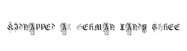
![Kidnapped at German Lands Three font caratteri gratis]() Scaricare 150 Downloads@WebFont
Scaricare 150 Downloads@WebFont -
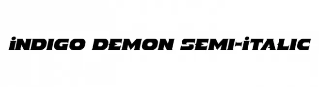
( Fonts by Iconian Fonts )
A bold, angular, and slightly italicized font with a modern and dynamic style.
![Indigo Demon Semi-Italic font caratteri gratis]() Scaricare 150 Downloads@WebFont
Scaricare 150 Downloads@WebFont -
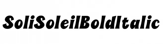
( Fonts by sez_inn )
A bold, italicized font with strong, dynamic strokes and a cohesive design.
![Soli Soleil Bold Italic font caratteri gratis]() Scaricare 150 Downloads@WebFont
Scaricare 150 Downloads@WebFont -
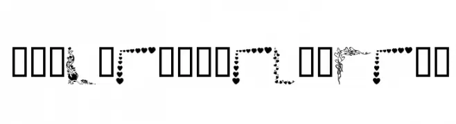
( Fonts by Kat`s Fun Fonts - Personal-use only. For commercial use please contact owner. )
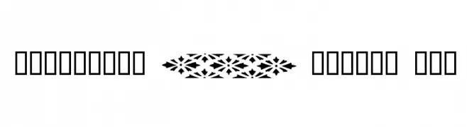
A collection of decorative romantic-themed border elements.
![KR Valentine Borders font caratteri gratis]() Scaricare 150 Downloads@WebFont
Scaricare 150 Downloads@WebFont -
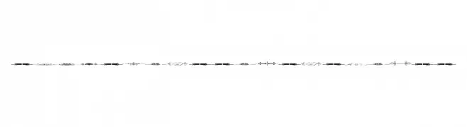
![Sughayer Separates 8 font caratteri gratis]() Scaricare 150 Downloads@WebFont
Scaricare 150 Downloads@WebFont -
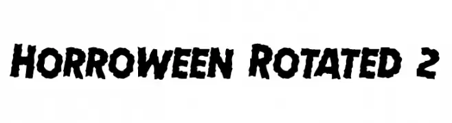
( Fonts by Daniel Zadorozny - www.iconian.com - Free for personal use )
A bold, jagged font perfect for horror-themed designs.
![Horroween Rotated 2 font caratteri gratis]() Scaricare 150 Downloads@WebFont
Scaricare 150 Downloads@WebFont -
( Fonts by Good Java Studio - www.creativefabrica.com/designer/goodjavastudio/ref/236564 - Personal-use only. For commercial use please contact owner. )
A dynamic and elegant script font with flowing, cursive letterforms.
![Bestvibes font caratteri gratis]() Scaricare 150 Downloads@WebFont
Scaricare 150 Downloads@WebFont -
( Fonts by Vladimir Nikolic )
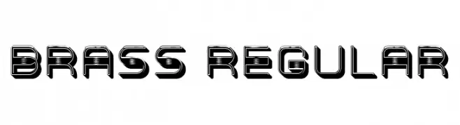
A bold, futuristic font with a three-dimensional, industrial design.
![Brass Regular font caratteri gratis]() Scaricare 150 Downloads@WebFont
Scaricare 150 Downloads@WebFont -
( Fonts by Allouse Studio - Personal-use only. For commercial use please contact owner. )
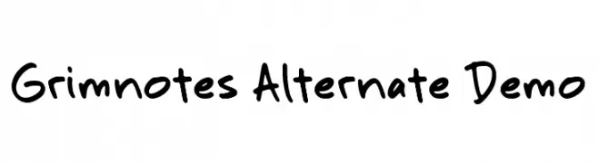
A playful, handwritten font with irregular, organic strokes and a casual vibe.
![Grimnotes Alternate Demo font caratteri gratis]() Scaricare 150 Downloads@WebFont
Scaricare 150 Downloads@WebFont -
( Fonts by a Max Infeld - XEROGRAPHER FONTS - xerographer.blogspot.com . Personal-use only. For commercial use please contact owner. )
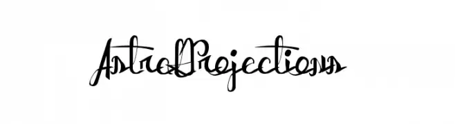
An artistic and decorative script font with intricate, overlapping letterforms.
![AstralProjections font caratteri gratis]() Scaricare 150 Downloads@WebFont
Scaricare 150 Downloads@WebFont -
( Fonts by Omega Font Labs )
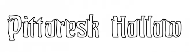
A decorative hollow font with bold outlines and artistic flair.
![Pittoresk Hollow font caratteri gratis]() Scaricare 150 Downloads@WebFont
Scaricare 150 Downloads@WebFont -
![CRU-Todsaporn-Hand-Written-Bold font caratteri gratis]() Scaricare 150 Downloads@WebFont
Scaricare 150 Downloads@WebFont -
( Fonts by a Adrian Candela - http://www.behance.net/takuminokami . Personal-use only. For commercial use please contact owner. )
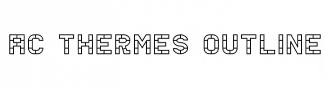
A geometric outline font with a modern and structured design.
![AC Thermes Outline font caratteri gratis]() Scaricare 150 Downloads@WebFont
Scaricare 150 Downloads@WebFont


Quali sono i font più popolari adesso?
Poppins, Roboto, Montserrat, Open Sans e Lato sono molto usati per le forme pulite e l'ampia applicabilità — dall'identità di marca alle landing page e ai poster.
Quali font si usano spesso nei loghi?
Le sans serif geometriche (es. Poppins, famiglie in stile Gotham) sono scelte comuni per un branding pulito e scalabile. Per un tocco personale restano valide script e stili manoscritti. Abbina un display deciso per i titoli a un corpo testo neutro per riconoscibilità ed equilibrio.
Ogni quanto si aggiorna la lista?
Con regolarità, in base ai download e all'attività reale. Torna spesso per scoprire in anticipo le nuove preferite.
💡 Consiglio: aggiungi ai preferiti — le tendenze cambiano in fretta e i font top di oggi possono ispirare il rebranding di domani.