Benvenuto nelle Font Più Popolari — dove popolarità e qualità si incontrano. Qui trovi i font più scaricati e usati dell'anno. Se cerchi scelte sicure per logo, web o social, inizia da qui.
Ogni font top si distingue per equilibrio, leggibilità e versatilità. Troverai sans serif moderne, script eleganti, serif vintage e display minimalisti.
-
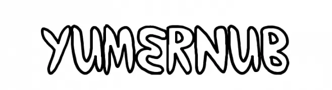
( Fonts by a Max Infeld - XEROGRAPHER FONTS - xerographer.blogspot.com . Personal-use only. For commercial use please contact owner. )
A playful, hand-drawn font with bold, rounded outlines.
 Scaricare 148 Downloads@WebFont
 -
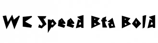
( Fonts by Christophe Feray - www.wcfonts.com )
A bold, angular font with sharp, jagged edges for a dynamic look.
![WC Speed Bta Bold font caratteri gratis]() Scaricare 148 Downloads@WebFont
Scaricare 148 Downloads@WebFont -
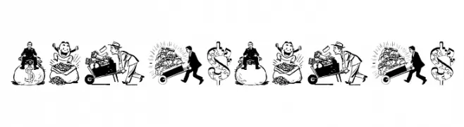
( Fonts by Manfred Klein. Free for private and charity use. Free for commercial with donation to organizations )
Cartoonish, money-themed decorative font with detailed illustrations.
![Moneymoney font caratteri gratis]() Scaricare 148 Downloads@WebFont
Scaricare 148 Downloads@WebFont -
( Fonts by Omega Font Labs )
A playful, bold font with whimsical, exaggerated letterforms.
![Jaunty Normal font caratteri gratis]() Scaricare 148 Downloads@WebFont
Scaricare 148 Downloads@WebFont -
( JoeeCreative - Joe Creative - creativemarket.com/JoeeCreative )
A bold, flowing script font with a modern, handwritten style.
![Jammes font caratteri gratis]() Scaricare 148 Downloads@WebFont
Scaricare 148 Downloads@WebFont -
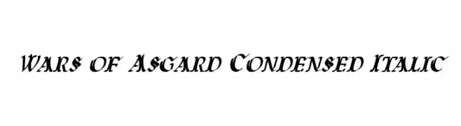
( Fonts by Daniel Zadorozny - www.iconian.com )
A bold, condensed italic font with high contrast and dynamic serifs.
![Wars of Asgard Condensed Italic font caratteri gratis]() Scaricare 148 Downloads@WebFont
Scaricare 148 Downloads@WebFont -
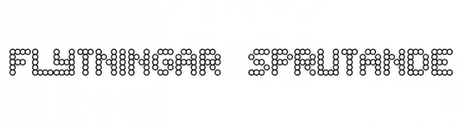
( Fonts by TarmSaft Font Factory - http://www.aska.nu/tarmsaft/ )
A modern, pixelated font composed of small circles, offering a playful and decorative style.
![Flytningar sprutande font caratteri gratis]() Scaricare 148 Downloads@WebFont
Scaricare 148 Downloads@WebFont -
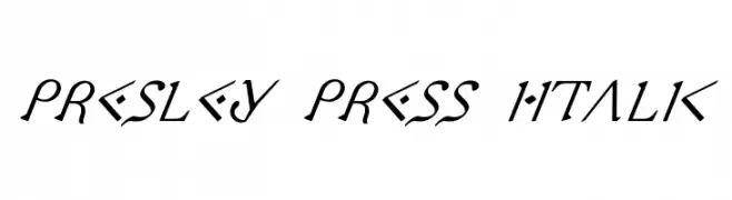
( Fonts by Daniel Zadorozny - www.iconian.com - Free for personal use )
A decorative italic font with geometric and angular elements, offering a futuristic and dynamic style.
![Presley Press Italic font caratteri gratis]() Scaricare 148 Downloads@WebFont
Scaricare 148 Downloads@WebFont -
( Emma_Studios )
A geometric, modern font with consistent stroke width and sharp angles.
![Strike font caratteri gratis]() Scaricare 148 Downloads@WebFont
Scaricare 148 Downloads@WebFont -
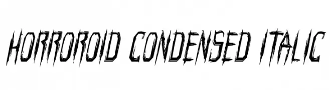
( Fonts by Iconian Fonts )
A jagged, distressed font with a horror-inspired aesthetic, featuring sharp angles and an italic slant.
![Horroroid Condensed Italic font caratteri gratis]() Scaricare 148 Downloads@WebFont
Scaricare 148 Downloads@WebFont -
( Fonts by odi Prasetya - Personal-use only. For commercial use please contact owner. )
A playful handwritten font with a quirky, casual style.
![Parasit font caratteri gratis]() Scaricare 148 Downloads@WebFont
Scaricare 148 Downloads@WebFont -
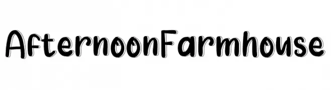
( Fonts by K_IN Studio )
A playful, bold handwritten font with rounded edges and a casual style.
![Afternoon Farmhouse font caratteri gratis]() Scaricare 148 Downloads@WebFont
Scaricare 148 Downloads@WebFont -
![Highnoon Saloon font caratteri gratis]() Scaricare 148 Downloads@WebFont
Scaricare 148 Downloads@WebFont -
( Fonts by typeformerstudio.com - Personal-use only. For commercial use please contact owner. )
A modern, geometric sans-serif font with uniform strokes and excellent readability.
![Nolinga font caratteri gratis]() Scaricare 148 Downloads@WebFont
Scaricare 148 Downloads@WebFont -
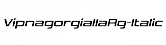
( Fonts by Typodermic Fonts - Raymond Larabie - Personal-use only. For commercial use please contact owner. )
A sleek, modern italic font with dynamic curves and sharp edges.
![VipnagorgiallaRg-Italic font caratteri gratis]() Scaricare 148 Downloads@WebFont
Scaricare 148 Downloads@WebFont -
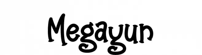
( Fonts by Sudarman Mulka )
A playful, hand-drawn font with thick, rounded strokes and a whimsical style.
![Megayun font caratteri gratis]() Scaricare 148 Downloads@WebFont
Scaricare 148 Downloads@WebFont -
( Fonts by www.houseoflime.com )
Ornate icon set with East Asian-inspired symbols and crests.
![Oriental Icons font caratteri gratis]() Scaricare 148 Downloads@WebFont
Scaricare 148 Downloads@WebFont -
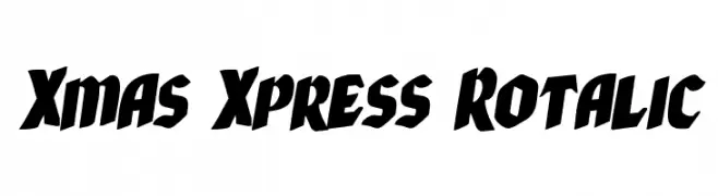
( Fonts by Daniel Zadorozny - www.iconian.com - Free for personal use )
A bold, slanted font with a dynamic and energetic style.
![Xmas Xpress Rotalic font caratteri gratis]() Scaricare 148 Downloads@WebFont
Scaricare 148 Downloads@WebFont -
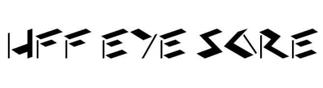
( Fonts by Have Fun with Fonts )
A bold, angular font with sharp, geometric shapes for a striking appearance.
![HFF Eye Sore font caratteri gratis]() Scaricare 148 Downloads@WebFont
Scaricare 148 Downloads@WebFont -
( Fonts by Iconian Fonts )
A bold, geometric font with a three-dimensional effect and strong visual impact.
![Cruiser Fortress Punch font caratteri gratis]() Scaricare 148 Downloads@WebFont
Scaricare 148 Downloads@WebFont -
( Fonts by Giga Typography - GigaType - www.deviantart.com/wolves-fonts - Personal-use only. For commercial use please contact owner. )
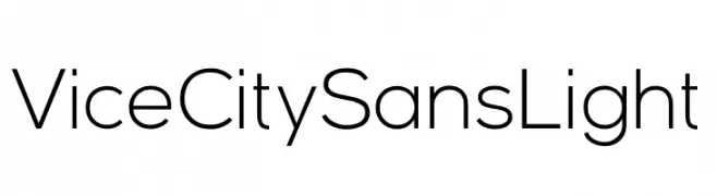
A modern, light sans-serif font with minimal contrast.
![Vice City Sans Light font caratteri gratis]() Scaricare 148 Downloads@WebFont
Scaricare 148 Downloads@WebFont -
( Fonts by Manfred Klein. Free for private and charity use. Free for commercial with donation to organizations )
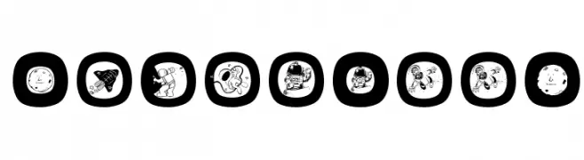
A playful collection of space-themed icons in rounded squares.
![SpaceEggs font caratteri gratis]() Scaricare 148 Downloads@WebFont
Scaricare 148 Downloads@WebFont -
( Noto is a trademark of Google Inc. Noto fonts are open source. All Noto fonts are published under the SIL Open Font License, Version 1.1 )
Error: No valid font characters shown.
![Noto Sans Batak Regular font caratteri gratis]() Scaricare 148 Downloads@WebFont
Scaricare 148 Downloads@WebFont -
( Fonts by Wino S Kadir - weknow - www.revolge.com/shop/weknow/ - Personal-use only. For commercial use please contact owner. )
A modern, futuristic font with rounded edges and geometric structure.
![victory font caratteri gratis]() Scaricare 148 Downloads@WebFont
Scaricare 148 Downloads@WebFont -
( Fonts by www.woodcutter.es - woodcutter Manero - Personal-use only. For commercial use please contact owner. )
A playful, bold, and hand-drawn font with a whimsical style.
![Bad+Quality font caratteri gratis]() Scaricare 148 Downloads@WebFont
Scaricare 148 Downloads@WebFont -
( Maulana Creative - Gilang Maulana - maulanacreative.net/ )
A dynamic, handwritten font with elongated, slanted letterforms.
![Sbastian font caratteri gratis]() Scaricare 148 Downloads@WebFont
Scaricare 148 Downloads@WebFont -
( Fonts by Daniel Zadorozny - www.iconian.com )
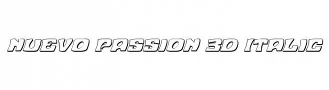
A bold, 3D italic font with outlined characters and a modern, dynamic style.
![Nuevo Passion 3D Italic font caratteri gratis]() Scaricare 148 Downloads@WebFont
Scaricare 148 Downloads@WebFont -
( Fonts by a Max Infeld - XEROGRAPHER FONTS - xerographer.blogspot.com . Personal-use only. For commercial use please contact owner. )
A bold, three-dimensional font with a dotted texture and playful style.
![VeryRich font caratteri gratis]() Scaricare 148 Downloads@WebFont
Scaricare 148 Downloads@WebFont -
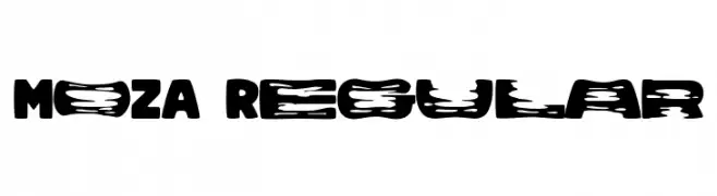
( Fonts by alphArtype )
A bold, textured font with a distressed, vintage style.
![MOZA Regular font caratteri gratis]() Scaricare 148 Downloads@WebFont
Scaricare 148 Downloads@WebFont -
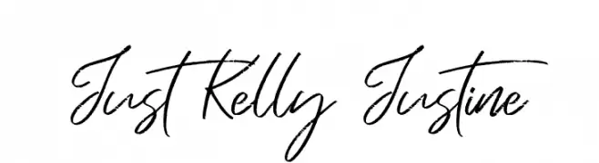
( Fonts by Syaf Rizal - Khurasan - Personal-use only. For commercial use please contact owner. )
A lively, cursive handwritten font with fluid strokes and a personal touch.
![Just Kelly Justine font caratteri gratis]() Scaricare 148 Downloads@WebFont
Scaricare 148 Downloads@WebFont -
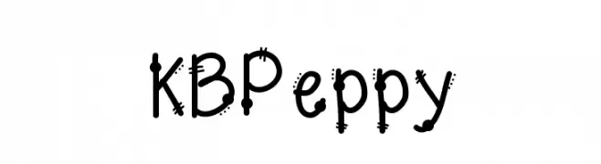
( Fonts by Khrys Bosland )
A playful, hand-drawn font with quirky details and a lively appearance.
![KBPeppy font caratteri gratis]() Scaricare 148 Downloads@WebFont
Scaricare 148 Downloads@WebFont -
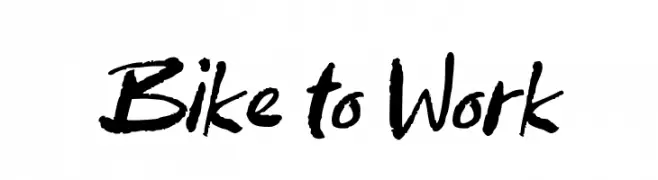
( Fonts by wep - Wahyu Eka Prasetya - Personal-use only. For commercial use please contact owner. )
A bold, brush-style handwritten font with dynamic strokes.
![Bike to Work font caratteri gratis]() Scaricare 148 Downloads@WebFont
Scaricare 148 Downloads@WebFont -
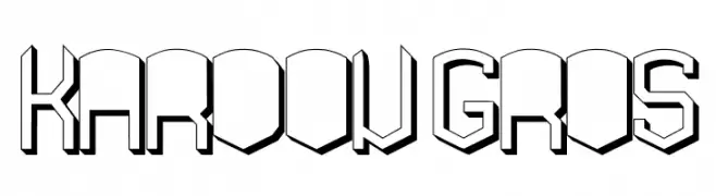
![KARDON GROS font caratteri gratis]() Scaricare 148 Downloads@WebFont
Scaricare 148 Downloads@WebFont -
( Fonts by www.kimberlygeswein.com - Kimberly Geswein )
A geometric, modular font with a playful and modern design.
![KG Teacher Helpers font caratteri gratis]() Scaricare 148 Downloads@WebFont
Scaricare 148 Downloads@WebFont -
( Fonts by Kong Font - https://fontkong.com/ - Personal-use only. For commercial use please contact owner. )
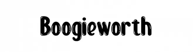
A bold, playful font with rounded, shadowed letters for a lively retro feel.
![Boogie worth font caratteri gratis]() Scaricare 148 Downloads@WebFont
Scaricare 148 Downloads@WebFont


Quali sono i font più popolari adesso?
Poppins, Roboto, Montserrat, Open Sans e Lato sono molto usati per le forme pulite e l'ampia applicabilità — dall'identità di marca alle landing page e ai poster.
Quali font si usano spesso nei loghi?
Le sans serif geometriche (es. Poppins, famiglie in stile Gotham) sono scelte comuni per un branding pulito e scalabile. Per un tocco personale restano valide script e stili manoscritti. Abbina un display deciso per i titoli a un corpo testo neutro per riconoscibilità ed equilibrio.
Ogni quanto si aggiorna la lista?
Con regolarità, in base ai download e all'attività reale. Torna spesso per scoprire in anticipo le nuove preferite.
💡 Consiglio: aggiungi ai preferiti — le tendenze cambiano in fretta e i font top di oggi possono ispirare il rebranding di domani.