Benvenuto nelle Font Più Popolari — dove popolarità e qualità si incontrano. Qui trovi i font più scaricati e usati dell'anno. Se cerchi scelte sicure per logo, web o social, inizia da qui.
Ogni font top si distingue per equilibrio, leggibilità e versatilità. Troverai sans serif moderne, script eleganti, serif vintage e display minimalisti.
-
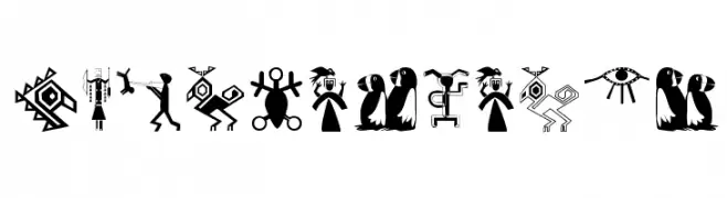
( Fonts by Manfred Klein. Free for private and charity use. Free for commercial with donation to organizations )
A pictographic font inspired by African art, featuring bold and expressive symbols.
 Scaricare 147 Downloads@WebFont
 -
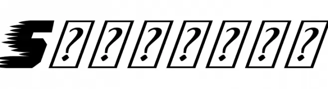
( Fonts by imagex - Personal-use only. For commercial use please contact owner. )
A bold, italicized font with a dynamic, speedy appearance.
![Speedway font caratteri gratis]() Scaricare 147 Downloads@WebFont
Scaricare 147 Downloads@WebFont -
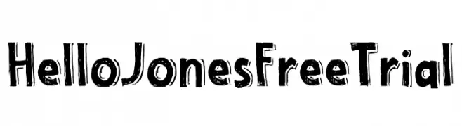
( Fonts by Type Factory )
A bold, hand-drawn font with an artistic and dynamic style.
![Hello Jones Free Trial font caratteri gratis]() Scaricare 147 Downloads@WebFont
Scaricare 147 Downloads@WebFont -
( Fonts by www.kimberlygeswein.com - Kimberly Geswein )
A bold, decorative font with dot accents above each character.
![KG WhY yOu GoTtA Be So MeAn 2 font caratteri gratis]() Scaricare 147 Downloads@WebFont
Scaricare 147 Downloads@WebFont -
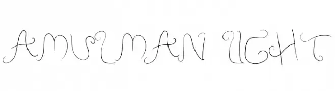
( Fonts by Jetsmax Studio )
An elegant, whimsical font with flowing, cursive-like strokes and intricate swirls.
![Amulman Light font caratteri gratis]() Scaricare 147 Downloads@WebFont
Scaricare 147 Downloads@WebFont -
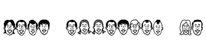
( Fonts by Jeff Levine. FREEWARE )
A decorative font with cartoon faces representing each character.
![Hair Apparent JL font caratteri gratis]() Scaricare 147 Downloads@WebFont
Scaricare 147 Downloads@WebFont -
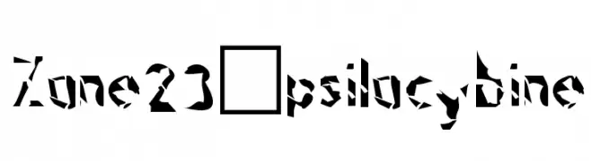
![Zone23_psilocybine font caratteri gratis]() Scaricare 147 Downloads@WebFont
Scaricare 147 Downloads@WebFont -
![Pixelstars & Stripes Regular font caratteri gratis]() Scaricare 147 Downloads@WebFont
Scaricare 147 Downloads@WebFont -
( Fonts by Miss Tiina at www.misstiina.com (please check the website before use) )
A playful, heart-adorned font with bold, rounded characters.
![MTF Olive You font caratteri gratis]() Scaricare 147 Downloads@WebFont
Scaricare 147 Downloads@WebFont -
![qdrd font caratteri gratis]() Scaricare 147 Downloads@WebFont
Scaricare 147 Downloads@WebFont -
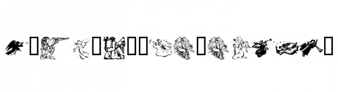
( Fonts by Kat`s Fun Fonts - Personal-use only. For commercial use please contact owner. )
A decorative font featuring detailed Christmas angel illustrations.
![KR Christmas Angels font caratteri gratis]() Scaricare 147 Downloads@WebFont
Scaricare 147 Downloads@WebFont -
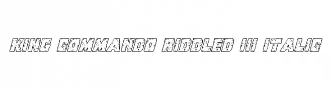
( Fonts by Daniel Zadorozny - www.iconian.com )
A bold, italicized decorative font with a riddled texture and adventurous style.
![King Commando Riddled III Italic font caratteri gratis]() Scaricare 147 Downloads@WebFont
Scaricare 147 Downloads@WebFont -
( Fonts by Daniel Zadorozny - www.iconian.com )
A bold, distressed, and italic font with a riddled texture.
![King Commando Riddled II Italic font caratteri gratis]() Scaricare 147 Downloads@WebFont
Scaricare 147 Downloads@WebFont -
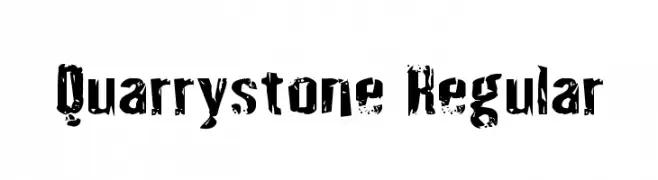
( Fonts by Daniel Zadorozny - www.iconian.com - Free for personal use )
A rugged, distressed font with a textured, weathered appearance.
![Quarrystone Regular font caratteri gratis]() Scaricare 147 Downloads@WebFont
Scaricare 147 Downloads@WebFont -
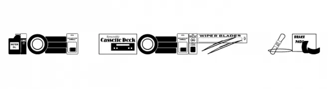
( Fonts by Jeff Levine. FREEWARE )
A decorative font inspired by automotive parts and accessories, featuring bold, blocky letters with intricate details.
![Auto Store JL font caratteri gratis]() Scaricare 147 Downloads@WebFont
Scaricare 147 Downloads@WebFont -
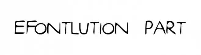
( Fonts by www.lars-manenschijn.nl )
A playful, hand-drawn font with a whimsical and artistic style.
![efontlution_part3 font caratteri gratis]() Scaricare 147 Downloads@WebFont
Scaricare 147 Downloads@WebFont -
( Fonts by Daniel Zadorozny - www.iconian.com )
A bold, condensed, and italicized futuristic font with sharp angles.
![Soldier Laser Condensed Italic font caratteri gratis]() Scaricare 147 Downloads@WebFont
Scaricare 147 Downloads@WebFont -
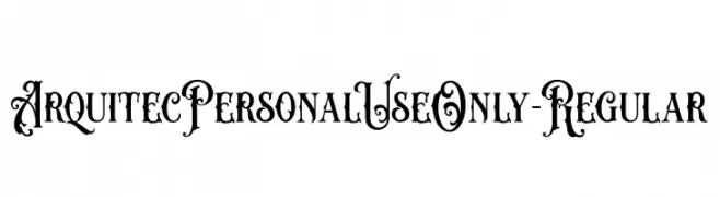
( Fonts by ilhamtaro - Personal-use only. For commercial use please contact owner. )
An ornate and decorative font with intricate swirls and embellishments.
![ArquitecPersonalUseOnly-Regular font caratteri gratis]() Scaricare 147 Downloads@WebFont
Scaricare 147 Downloads@WebFont -
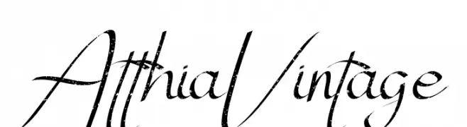
( Fonts by Edric Studio www.creativefabrica.com/designer/edricstudio/ - Personal-use only. For commercial use please contact owner. )
A vintage script font with elegant, flowing characters and a distressed texture.
![Atthia Vintage font caratteri gratis]() Scaricare 147 Downloads@WebFont
Scaricare 147 Downloads@WebFont -
( Fonts by Awansenja Type )
A playful, bold, and whimsical handwritten font with decorative elements.
![saferick font caratteri gratis]() Scaricare 147 Downloads@WebFont
Scaricare 147 Downloads@WebFont -
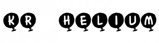
![KR Helium font caratteri gratis]() Scaricare 147 Downloads@WebFont
Scaricare 147 Downloads@WebFont -
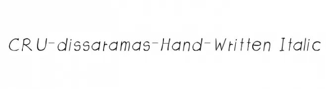
![CRU-dissaramas-Hand-Written Italic font caratteri gratis]() Scaricare 147 Downloads@WebFont
Scaricare 147 Downloads@WebFont -
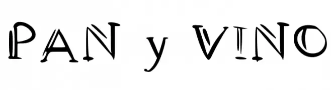
( Fonts by Ramiro Baldivieso - behance.net/baldivieso. Personal-use only. For commercial use please contact owner. )
A playful, artistic font with irregular strokes and a hand-drawn feel.
![PAN y VINO font caratteri gratis]() Scaricare 147 Downloads@WebFont
Scaricare 147 Downloads@WebFont -
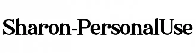
( Fonts by Haksen Studio - Sarwo Edhi Prayitno - Personal-use only. For commercial use please contact owner. )
A classic serif font with elegant serifs and medium contrast, ideal for traditional and formal uses.
![Sharon - Personal Use font caratteri gratis]() Scaricare 147 Downloads@WebFont
Scaricare 147 Downloads@WebFont -
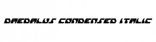
( Fonts by Daniel Zadorozny - www.iconian.com - Free for personal use )
A bold, angular, and condensed italic font with a futuristic style.
![Daedalus Condensed Italic font caratteri gratis]() Scaricare 147 Downloads@WebFont
Scaricare 147 Downloads@WebFont -
( Fonts by FONTS BY LYAJKA - Personal-use only. For commercial use please contact owner. )
A bold, distressed font with a gritty, urban aesthetic.
![Broken Detroit(RUS BY LYAJKA) font caratteri gratis]() Scaricare 147 Downloads@WebFont
Scaricare 147 Downloads@WebFont -
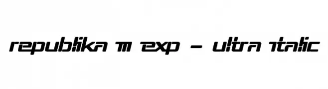
( Fonts by Apostrophic Lab )
A bold, italic, and futuristic font with a geometric design.
![Republika III Exp - Ultra Italic font caratteri gratis]() Scaricare 147 Downloads@WebFont
Scaricare 147 Downloads@WebFont -
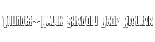
( Fonts by Daniel Zadorozny - www.iconian.com )
A bold, angular font with a shadow drop effect for a three-dimensional look.
![Thunder-Hawk Shadow Drop Regular font caratteri gratis]() Scaricare 147 Downloads@WebFont
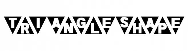
Scaricare 147 Downloads@WebFont -
![Triangleshape font caratteri gratis]() Scaricare 147 Downloads@WebFont
Scaricare 147 Downloads@WebFont -
( Fonts by IBM )
A bold, italicized sans-serif font with a modern and dynamic appearance.
![IBM Plex Sans Bold Italic font caratteri gratis]() Scaricare 147 Downloads@WebFont
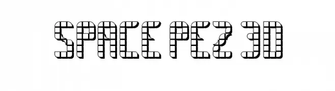
Scaricare 147 Downloads@WebFont -
![SPACE PEZ 3D font caratteri gratis]() Scaricare 147 Downloads@WebFont
Scaricare 147 Downloads@WebFont -
( Fonts by Balpirick Studio - https://www.creativefabrica.com/designer/balpirick/ref/308299/ - Personal-use only. For commercial use please contact owner. )
A playful, bold font with rounded, dynamic letterforms.
![Winter Candle font caratteri gratis]() Scaricare 147 Downloads@WebFont
Scaricare 147 Downloads@WebFont -
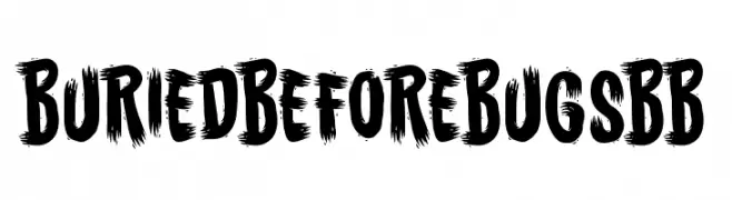
( Fonts by www.blambot.com )
A bold, brushstroke-style font with dynamic and textured characters.
![BuriedBeforeBugsBB font caratteri gratis]() Scaricare 147 Downloads@WebFont
Scaricare 147 Downloads@WebFont -
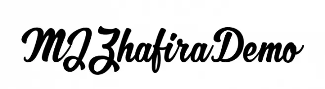
( Fonts by Mikrojihad Inc - www.behance.net/mikrojihad - Personal-use only. For commercial use please contact owner. )
A bold, flowing script font with elegant cursive letterforms.
![MJZhafiraDemo font caratteri gratis]() Scaricare 147 Downloads@WebFont
Scaricare 147 Downloads@WebFont -
![NeatifiedRegular font caratteri gratis]() Scaricare 147 Downloads@WebFont
Scaricare 147 Downloads@WebFont


Quali sono i font più popolari adesso?
Poppins, Roboto, Montserrat, Open Sans e Lato sono molto usati per le forme pulite e l'ampia applicabilità — dall'identità di marca alle landing page e ai poster.
Quali font si usano spesso nei loghi?
Le sans serif geometriche (es. Poppins, famiglie in stile Gotham) sono scelte comuni per un branding pulito e scalabile. Per un tocco personale restano valide script e stili manoscritti. Abbina un display deciso per i titoli a un corpo testo neutro per riconoscibilità ed equilibrio.
Ogni quanto si aggiorna la lista?
Con regolarità, in base ai download e all'attività reale. Torna spesso per scoprire in anticipo le nuove preferite.
💡 Consiglio: aggiungi ai preferiti — le tendenze cambiano in fretta e i font top di oggi possono ispirare il rebranding di domani.