Benvenuto nelle Font Più Popolari — dove popolarità e qualità si incontrano. Qui trovi i font più scaricati e usati dell'anno. Se cerchi scelte sicure per logo, web o social, inizia da qui.
Ogni font top si distingue per equilibrio, leggibilità e versatilità. Troverai sans serif moderne, script eleganti, serif vintage e display minimalisti.
-
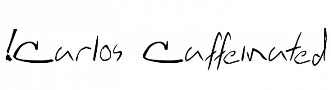
( !Exclamachine Type Foundry - exclamachine.com/ )
A dynamic, handwritten font with fluid and irregular strokes.
 Scaricare 2397 Downloads@WebFont
 -
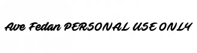
![Ave Fedan PERSONAL USE ONLY font caratteri gratis]() Scaricare 2397 Downloads@WebFont
Scaricare 2397 Downloads@WebFont -
( Fonts by www.fugit-tempus.de )
A bold, dynamic script font with elegant, flowing letterforms.
![Holla font caratteri gratis]() Scaricare 2397 Downloads@WebFont
Scaricare 2397 Downloads@WebFont -
( Fonts by Graham Meade - GemFonts )
A modern, oblique font with a sleek and dynamic design.
![Choktoff Oblique font caratteri gratis]() Scaricare 2397 Downloads@WebFont
Scaricare 2397 Downloads@WebFont -
( Fonts by Regenerated by Nadim Shaikli - Personal-use only. For commercial use please contact owner. )
A classic serif font with elegant, sharp serifs and balanced stroke contrast.
![Tholoth font caratteri gratis]() Scaricare 2396 Downloads@WebFont
Scaricare 2396 Downloads@WebFont -
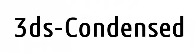
![3ds-Condensed font caratteri gratis]() Scaricare 2396 Downloads@WebFont
Scaricare 2396 Downloads@WebFont -
![Qaskin Black Personal Use font caratteri gratis]() Scaricare 2396 Downloads@WebFont
Scaricare 2396 Downloads@WebFont -
![Secrets font caratteri gratis]() Scaricare 2396 Downloads@WebFont
Scaricare 2396 Downloads@WebFont -
( Fonts by Paul Miller )
A bold, italic font with smooth curves and a slightly slanted style.
![Bainsley Bold Italic font caratteri gratis]() Scaricare 2395 Downloads@WebFont
Scaricare 2395 Downloads@WebFont -
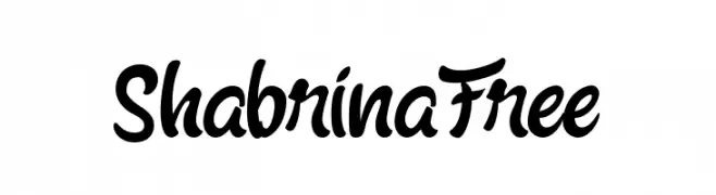
![Shabrina Free font caratteri gratis]() Scaricare 2395 Downloads@WebFont
Scaricare 2395 Downloads@WebFont -
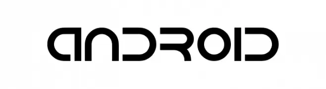
( Fonts by Isaac K. Personal-use only. For commercial use please contact owner. )
A futuristic, geometric font with bold strokes and tight spacing.
![Android font caratteri gratis]() Scaricare 2395 Downloads@WebFont
Scaricare 2395 Downloads@WebFont -
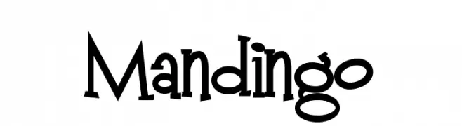
( Fonts by www.fontalicious.com )
A playful, whimsical font with exaggerated serifs and a hand-drawn feel.
![Mandingo font caratteri gratis]() Scaricare 2394 Downloads@WebFont
Scaricare 2394 Downloads@WebFont -
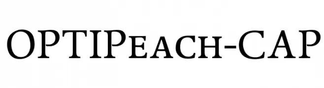
( Fonts by Castcraft Software - OPTI Fonts Archive - opti.netii.net - Personal-use only. For commercial use please contact owner. )
A classic serif font with elegant curves and medium contrast, ideal for formal and creative uses.
![OPTIPeach-CAP font caratteri gratis]() Scaricare 2393 Downloads@WebFont
Scaricare 2393 Downloads@WebFont -
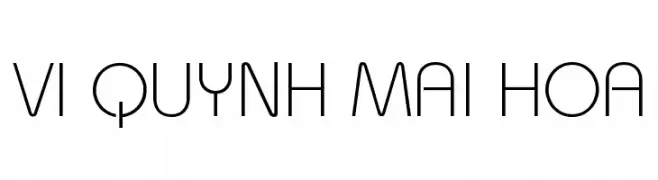
![VI Quynh Mai Hoa font caratteri gratis]() Scaricare 2393 Downloads@WebFont
Scaricare 2393 Downloads@WebFont -
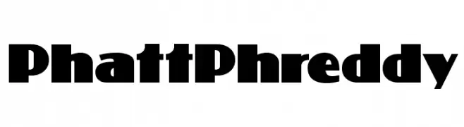
( Fonts by Nick Curtis - www.nicksfonts.com )
A bold, rounded font ideal for impactful and attention-grabbing designs.
![PhattPhreddy font caratteri gratis]() Scaricare 2393 Downloads@WebFont
Scaricare 2393 Downloads@WebFont -
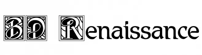
![BD Renaissance font caratteri gratis]() Scaricare 2393 Downloads@WebFont
Scaricare 2393 Downloads@WebFont -
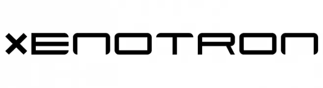
( Font by http://home.luna.nl/~xino/ )
A futuristic, geometric font with clean lines and angular shapes.
![Xenotron font caratteri gratis]() Scaricare 2393 Downloads@WebFont
Scaricare 2393 Downloads@WebFont -
![RoadTrip font caratteri gratis]() Scaricare 2392 Downloads@WebFont
Scaricare 2392 Downloads@WebFont -
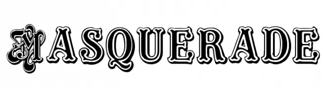
![Masquerade font caratteri gratis]() Scaricare 2392 Downloads@WebFont
Scaricare 2392 Downloads@WebFont -
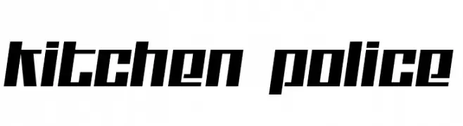
( Fonts by Jacob Fisher - www.pizzadude.dk )
A bold, angular font with a geometric and modern style.
![Kitchen police font caratteri gratis]() Scaricare 2392 Downloads@WebFont
Scaricare 2392 Downloads@WebFont -
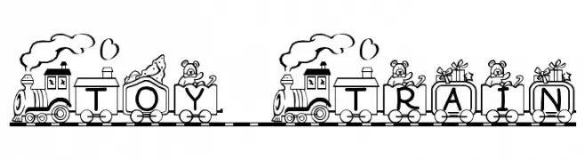
![Toy Train font caratteri gratis]() Scaricare 2392 Downloads@WebFont
Scaricare 2392 Downloads@WebFont -
( Fonts by Situjuh Nazara - 7ntypes.com - Personal-use only. For commercial use please contact owner. )
A playful, handwritten font with rounded, irregular letterforms.
![Hastoler font caratteri gratis]() Scaricare 2391 Downloads@WebFont
Scaricare 2391 Downloads@WebFont -
( Copyright (c) 2012, vernon adams (vern@newtypography.co.uk), with Reserved Font Names 'Anaheim' )
A modern, geometric sans-serif font with clean lines and excellent legibility.
![Anaheim font caratteri gratis]() Scaricare 2391 Downloads@WebFont
Scaricare 2391 Downloads@WebFont -
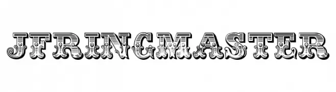
( Fonts by Jester Font Studio )
A bold, decorative font with vintage circus-inspired detailing.
![JFRingmaster font caratteri gratis]() Scaricare 2391 Downloads@WebFont
Scaricare 2391 Downloads@WebFont -
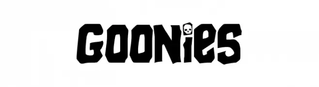
( Fonts by Jens R. Ziehn - www.filmhimmel.com )
A bold, playful font with a rugged, adventurous style.
![Goonies font caratteri gratis]() Scaricare 2391 Downloads@WebFont
Scaricare 2391 Downloads@WebFont -
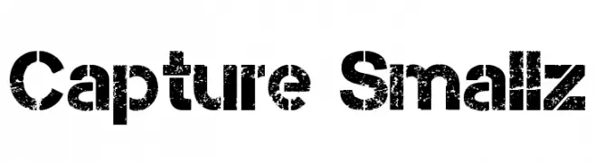
( Magique Fonts - www.facebook.com/typesgal/ )
A bold, distressed font with a grunge, vintage appearance.
![Capture Smallz font caratteri gratis]() Scaricare 2390 Downloads@WebFont
Scaricare 2390 Downloads@WebFont -
( Fonts by Christopher Hansen )
A classic serif font with elegant, sharp serifs and subtle medieval influences.
![Sell Your Soul font caratteri gratis]() Scaricare 2390 Downloads@WebFont
Scaricare 2390 Downloads@WebFont -
![BatMan font caratteri gratis]() Scaricare 2390 Downloads@WebFont
Scaricare 2390 Downloads@WebFont -
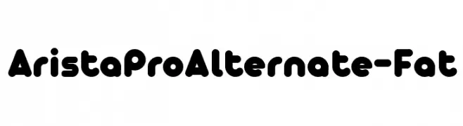
( Fonts by Zetafonts - Personal-use only. For commercial use please contact owner. )
A bold, rounded font with a playful and modern style.
![AristaProAlternate-Fat font caratteri gratis]() Scaricare 2389 Downloads@WebFont
Scaricare 2389 Downloads@WebFont -
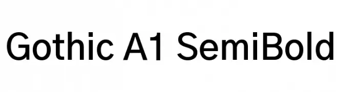
( Copyright HanYang I&C Co.,Ltd. All rights reserved. )
A modern sans-serif font with a semi-bold weight, offering clarity and versatility.
![Gothic A1 SemiBold font caratteri gratis]() Scaricare 2389 Downloads@WebFont
Scaricare 2389 Downloads@WebFont -
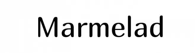
( Copyright (c) 2011, Cyreal (www.cyreal.org) )
A modern, clean sans-serif font with balanced proportions and excellent readability.
![Marmelad font caratteri gratis]() Scaricare 2389 Downloads@WebFont
Scaricare 2389 Downloads@WebFont -
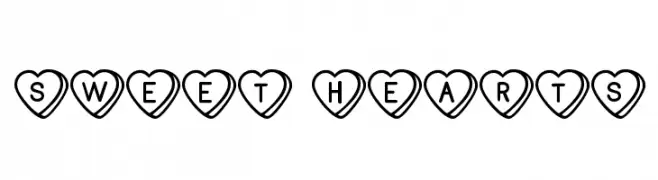
( Free for Personal Use. To use commercially please visit the www.bvfonts.com )
A decorative font with characters inside heart shapes, perfect for romantic themes.
![Sweet Hearts font caratteri gratis]() Scaricare 2389 Downloads@WebFont
Scaricare 2389 Downloads@WebFont -
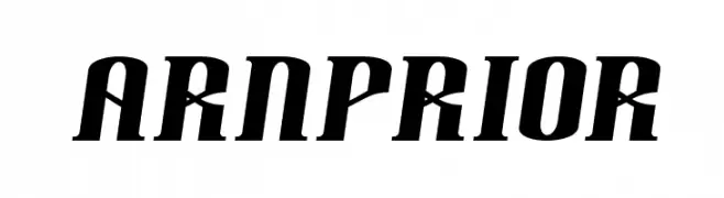
![Arnprior font caratteri gratis]() Scaricare 2389 Downloads@WebFont
Scaricare 2389 Downloads@WebFont -
![AntigoniBd Bold font caratteri gratis]() Scaricare 2389 Downloads@WebFont
Scaricare 2389 Downloads@WebFont -
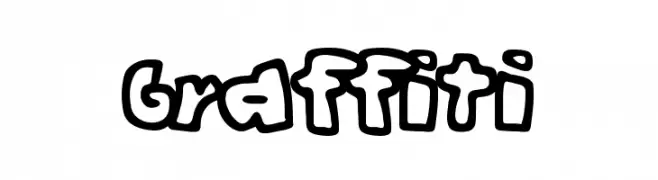
( Fonts by or from www.graffitifonts.net )
A bold, playful graffiti-style font with thick, rounded characters.
![Graffiti font caratteri gratis]() Scaricare 2389 Downloads@WebFont
Scaricare 2389 Downloads@WebFont


Quali sono i font più popolari adesso?
Poppins, Roboto, Montserrat, Open Sans e Lato sono molto usati per le forme pulite e l'ampia applicabilità — dall'identità di marca alle landing page e ai poster.
Quali font si usano spesso nei loghi?
Le sans serif geometriche (es. Poppins, famiglie in stile Gotham) sono scelte comuni per un branding pulito e scalabile. Per un tocco personale restano valide script e stili manoscritti. Abbina un display deciso per i titoli a un corpo testo neutro per riconoscibilità ed equilibrio.
Ogni quanto si aggiorna la lista?
Con regolarità, in base ai download e all'attività reale. Torna spesso per scoprire in anticipo le nuove preferite.
💡 Consiglio: aggiungi ai preferiti — le tendenze cambiano in fretta e i font top di oggi possono ispirare il rebranding di domani.