Benvenuto nelle Font Più Popolari — dove popolarità e qualità si incontrano. Qui trovi i font più scaricati e usati dell'anno. Se cerchi scelte sicure per logo, web o social, inizia da qui.
Ogni font top si distingue per equilibrio, leggibilità e versatilità. Troverai sans serif moderne, script eleganti, serif vintage e display minimalisti.
-
( Fonts by a Max Infeld - XEROGRAPHER FONTS - xerographer.blogspot.com . Personal-use only. For commercial use please contact owner. )
A whimsical, hand-drawn font with playful, irregular strokes.
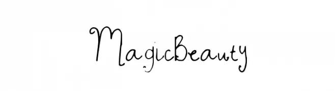 Scaricare 144 Downloads@WebFont
 -
( Southype - Rodrigo Gonzalez - www.southype.com )
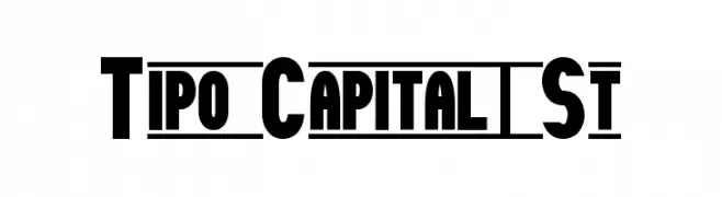
A bold, modern sans-serif font with uniform thickness and geometric shapes.
![Tipo Capital1 St font caratteri gratis]() Scaricare 144 Downloads@WebFont
Scaricare 144 Downloads@WebFont -
( Fonts by Des Gomez )
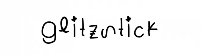
A playful, handwritten font with a whimsical and casual style.
![Glitzstick font caratteri gratis]() Scaricare 144 Downloads@WebFont
Scaricare 144 Downloads@WebFont -
( Iconian Fonts - Daniel Zadorozny - www.iconian.com )
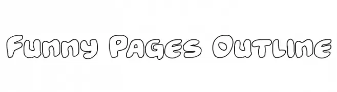
A playful, outlined font with bold, rounded characters ideal for comic-style designs.
![Funny Pages Outline font caratteri gratis]() Scaricare 144 Downloads@WebFont
Scaricare 144 Downloads@WebFont -
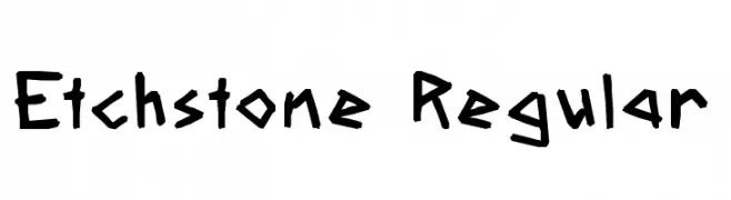
( Fonts by Brixdee - jack-oatley.com - Personal-use only. For commercial use please contact owner. )
A bold, hand-drawn font with jagged edges and a dynamic, energetic style.
![Etchstone Regular font caratteri gratis]() Scaricare 144 Downloads@WebFont
Scaricare 144 Downloads@WebFont -
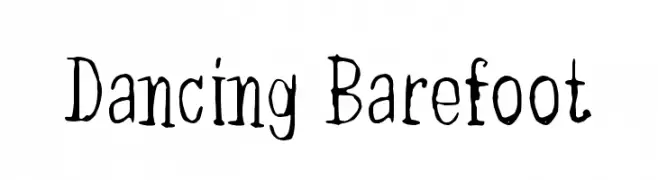
( Fonts by junkohanhero - Personal-use only. For commercial use please contact owner. )
A whimsical, hand-drawn font with playful and irregular strokes.
![Dancing Barefoot font caratteri gratis]() Scaricare 144 Downloads@WebFont
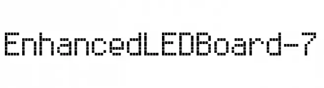
Scaricare 144 Downloads@WebFont -
![Enhanced LED Board-7 font caratteri gratis]() Scaricare 144 Downloads@WebFont
Scaricare 144 Downloads@WebFont -
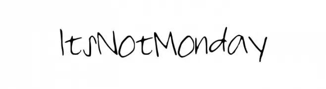
( lizalawson.com )
A casual, handwritten font with a playful and informal style.
![ItsNotMonday font caratteri gratis]() Scaricare 144 Downloads@WebFont
Scaricare 144 Downloads@WebFont -
( Fonts by Scratchones )
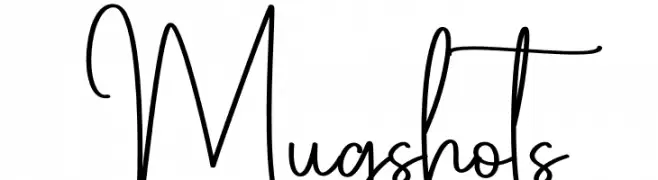
A playful, handwritten font with flowing, interconnected letterforms.
![Mugshots font caratteri gratis]() Scaricare 144 Downloads@WebFont
Scaricare 144 Downloads@WebFont -
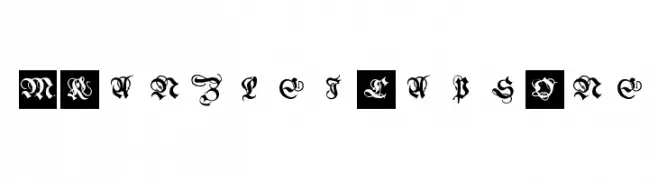
( Fonts by Manfred Klein. Free for private and charity use. Free for commercial with donation to organizations )
A decorative blackletter font with intricate, medieval-inspired letterforms.
![MKanzleiCaps-One font caratteri gratis]() Scaricare 144 Downloads@WebFont
Scaricare 144 Downloads@WebFont -
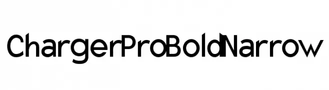
![Charger Pro Bold Narrow font caratteri gratis]() Scaricare 144 Downloads@WebFont
Scaricare 144 Downloads@WebFont -
( Fonts by Luke Owens - Personal-use only. For commercial use please contact owner. )
A classic serif typeface with a slight slant, offering elegance and readability.
![Portland LDO Sinistral font caratteri gratis]() Scaricare 144 Downloads@WebFont
Scaricare 144 Downloads@WebFont -
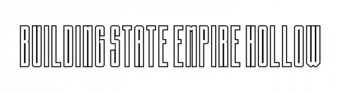
( imagex - www.imagex-fonts.com )
A bold, geometric font with a hollow outline, perfect for modern designs.
![Building State Empire Hollow font caratteri gratis]() Scaricare 144 Downloads@WebFont
Scaricare 144 Downloads@WebFont -
( Fonts by GGBotNet )
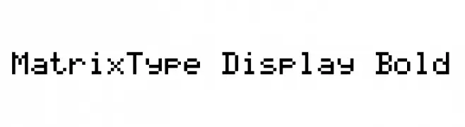
A pixelated, grid-based font with a retro digital style.
![MatrixType Display Bold font caratteri gratis]() Scaricare 144 Downloads@WebFont
Scaricare 144 Downloads@WebFont -
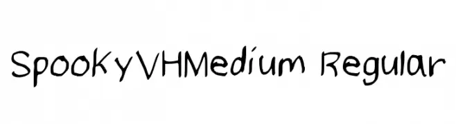
![SpookyVHMedium Regular font caratteri gratis]() Scaricare 144 Downloads@WebFont
Scaricare 144 Downloads@WebFont -
( Fonts by www.kimberlygeswein.com - Kimberly Geswein )
A playful, hand-drawn font with irregular, whimsical characters.
![The Truth of a Thousand Lies font caratteri gratis]() Scaricare 144 Downloads@WebFont
Scaricare 144 Downloads@WebFont -
( Fonts by Kat`s Fun Fonts - Personal-use only. For commercial use please contact owner. )
A playful and whimsical font with quirky, decorative letterforms.
![KR Scrappin Babies font caratteri gratis]() Scaricare 144 Downloads@WebFont
Scaricare 144 Downloads@WebFont -
( Fonts by Vladimir Nikolic )
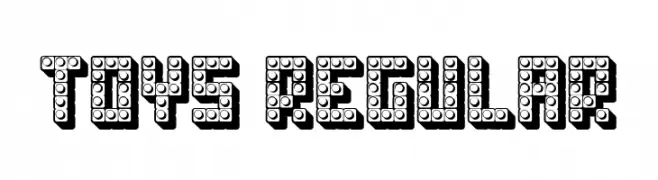
A playful, block-like font with a 3D effect, ideal for children's themes.
![Toys Regular font caratteri gratis]() Scaricare 144 Downloads@WebFont
Scaricare 144 Downloads@WebFont -
( Fonts by Apostrophic Lab )
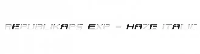
A futuristic, italicized font with geometric precision and a dynamic haze effect.
![Republikaps Exp - Haze Italic font caratteri gratis]() Scaricare 144 Downloads@WebFont
Scaricare 144 Downloads@WebFont -
( Fonts by Daniel Zadorozny - www.iconian.com - Free for personal use )
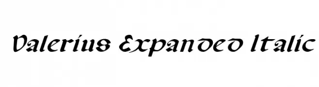
An elegant, italic font with calligraphic influences and expanded character spacing.
![Valerius Expanded Italic font caratteri gratis]() Scaricare 144 Downloads@WebFont
Scaricare 144 Downloads@WebFont -
( Fonts by FontGrube AH - Andreas Höfeld - Personal-use only. For commercial use please contact owner. )
A playful and informal font with dynamic curves and sharp edges.
![Jorvik Informal font caratteri gratis]() Scaricare 144 Downloads@WebFont
Scaricare 144 Downloads@WebFont -
( Fonts by wep - Wahyu Eka Prasetya - Personal-use only. For commercial use please contact owner. )
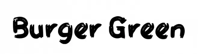
A bold, brush-style font with a playful, hand-painted appearance.
![Burger Green font caratteri gratis]() Scaricare 144 Downloads@WebFont
Scaricare 144 Downloads@WebFont -
( Fonts by Wahyu Eka Prasetya - wepfont.com - Personal-use only. For commercial use please contact owner. )
A bold, expressive handwritten font with fluid, cursive letterforms.
![Framish font caratteri gratis]() Scaricare 144 Downloads@WebFont
Scaricare 144 Downloads@WebFont -
( Fonts by Press Gang Studios - Andeh Pinkard - www.pressgang-studios.com )
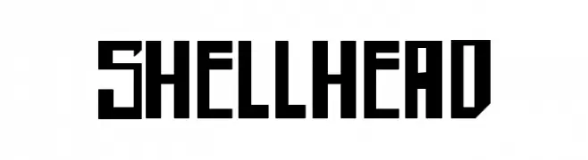
A bold, geometric font with sharp angles and a strong, industrial presence.
![shellhead font caratteri gratis]() Scaricare 144 Downloads@WebFont
Scaricare 144 Downloads@WebFont -
( 123456 )
A playful, handwritten font with a casual and friendly style.
![Classy font caratteri gratis]() Scaricare 144 Downloads@WebFont
Scaricare 144 Downloads@WebFont -
![Suyog font caratteri gratis]() Scaricare 144 Downloads@WebFont
Scaricare 144 Downloads@WebFont -
( Fonts by Arterfak Project - Ahmad Ramzi Fahruddin - Personal-use only. For commercial use please contact owner. )
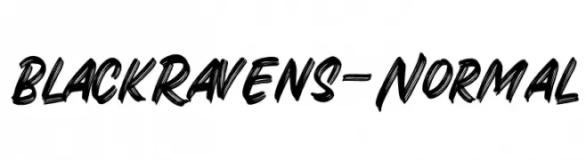
A bold, hand-drawn font with dynamic strokes and a textured finish.
![BlackRavens-Normal font caratteri gratis]() Scaricare 144 Downloads@WebFont
Scaricare 144 Downloads@WebFont -
( Fonts by Zetafonts - Personal-use only. For commercial use please contact owner. )
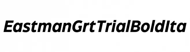
A bold, italicized font with strong strokes and a modern aesthetic.
![Eastman Grt Trial Bold Ita font caratteri gratis]() Scaricare 144 Downloads@WebFont
Scaricare 144 Downloads@WebFont -
( Fonts by wep - Wahyu Eka Prasetya - Personal-use only. For commercial use please contact owner. )
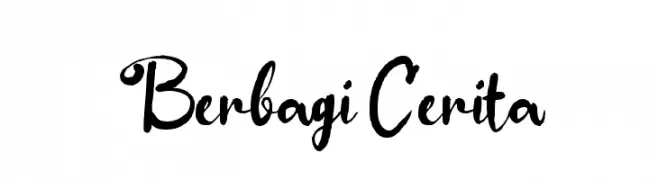
A lively and expressive script font with fluid, cursive strokes.
![Berbagi Cerita font caratteri gratis]() Scaricare 144 Downloads@WebFont
Scaricare 144 Downloads@WebFont -
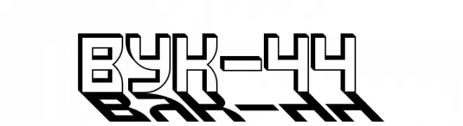
![VUK-44 font caratteri gratis]() Scaricare 144 Downloads@WebFont
Scaricare 144 Downloads@WebFont -
( Fonts by Masato Shimojima - Personal-use only. For commercial use please contact owner. )
A bold, slanted font with a modern and dynamic style.
![Contactbold font caratteri gratis]() Scaricare 144 Downloads@WebFont
Scaricare 144 Downloads@WebFont -
( Fonts by Manfred Klein. Free for private and charity use. Free for commercial with donation to organizations )
A pictogram font with diverse animal and human vector illustrations.
![VectorAnimalsOrPeople font caratteri gratis]() Scaricare 144 Downloads@WebFont
Scaricare 144 Downloads@WebFont -
( Fonts by Manfred Klein. Free for private and charity use. Free for commercial with donation to organizations )
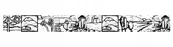
Hand-drawn decorative font featuring landscape illustrations.
![Landscapes font caratteri gratis]() Scaricare 144 Downloads@WebFont
Scaricare 144 Downloads@WebFont -
( Fonts by Andrew Hart - dirt2.com )
A whimsical, handwritten font with flowing curves and dynamic contrast.
![LittleBliss font caratteri gratis]() Scaricare 144 Downloads@WebFont
Scaricare 144 Downloads@WebFont -
( Fonts by Irfan Hidayat - Personal-use only. For commercial use please contact owner. )
An elegant, high-contrast serif font with artistic flair.
![ArchwaltzDemo-Regular font caratteri gratis]() Scaricare 144 Downloads@WebFont
Scaricare 144 Downloads@WebFont


Quali sono i font più popolari adesso?
Poppins, Roboto, Montserrat, Open Sans e Lato sono molto usati per le forme pulite e l'ampia applicabilità — dall'identità di marca alle landing page e ai poster.
Quali font si usano spesso nei loghi?
Le sans serif geometriche (es. Poppins, famiglie in stile Gotham) sono scelte comuni per un branding pulito e scalabile. Per un tocco personale restano valide script e stili manoscritti. Abbina un display deciso per i titoli a un corpo testo neutro per riconoscibilità ed equilibrio.
Ogni quanto si aggiorna la lista?
Con regolarità, in base ai download e all'attività reale. Torna spesso per scoprire in anticipo le nuove preferite.
💡 Consiglio: aggiungi ai preferiti — le tendenze cambiano in fretta e i font top di oggi possono ispirare il rebranding di domani.