Benvenuto nelle Font Più Popolari — dove popolarità e qualità si incontrano. Qui trovi i font più scaricati e usati dell'anno. Se cerchi scelte sicure per logo, web o social, inizia da qui.
Ogni font top si distingue per equilibrio, leggibilità e versatilità. Troverai sans serif moderne, script eleganti, serif vintage e display minimalisti.
-
( Copyright (c) 2011 by Brian J. Bonislawsky DBA Astigmatic (AOETI) )
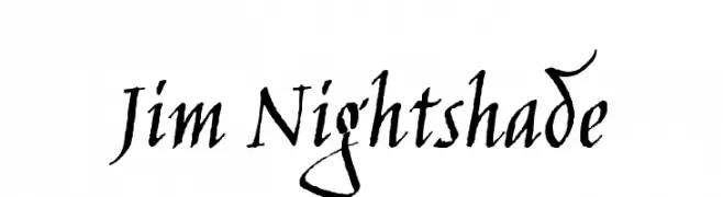
A dynamic, calligraphic font with sharp, angular strokes and a bold presence.
 Scaricare 735 Downloads@WebFont
 -
( Fonts by Mans Greback - www.mawns.com )
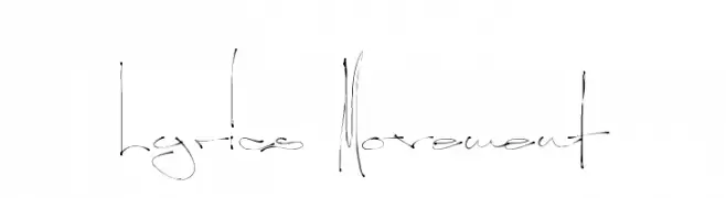
A dynamic, handwritten font with fluid, elongated strokes and artistic flair.
![Lyrics Movement font caratteri gratis]() Scaricare 735 Downloads@WebFont
Scaricare 735 Downloads@WebFont -
![Storch font caratteri gratis]() Scaricare 735 Downloads@WebFont
Scaricare 735 Downloads@WebFont -
( Fonts by Dieter Steffmann )
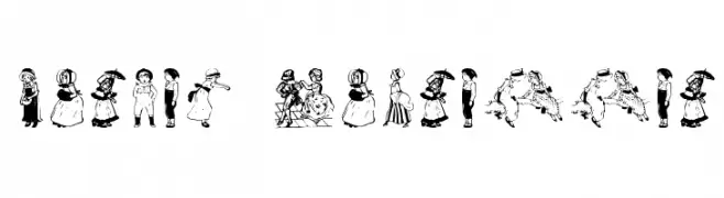
Vintage children vignette illustrations with detailed line art.
![Kinder-Vignetten font caratteri gratis]() Scaricare 735 Downloads@WebFont
Scaricare 735 Downloads@WebFont -
( Fonts by Manfred Klein. Free for private and charity use. Free for commercial with donation to organizations )
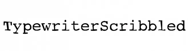
A vintage, typewriter-inspired font with monospaced, slightly irregular strokes.
![TypewriterScribbled font caratteri gratis]() Scaricare 735 Downloads@WebFont
Scaricare 735 Downloads@WebFont -
-
![Schlimeyer Book font caratteri gratis]() Scaricare 735 Downloads
Scaricare 735 Downloads -
( Fonts by Dieter Steffmann )
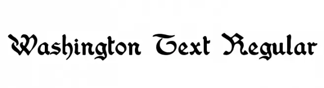
A classic blackletter font with ornate, historical elegance.
![Washington Text Regular font caratteri gratis]() Scaricare 735 Downloads@WebFont
Scaricare 735 Downloads@WebFont -
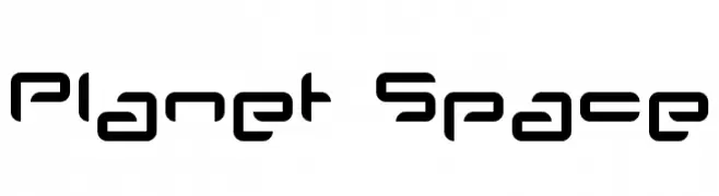
( Fonts by www.planet.dk )
A futuristic, geometric font with rounded edges and consistent line thickness.
![Planet Space font caratteri gratis]() Scaricare 735 Downloads@WebFont
Scaricare 735 Downloads@WebFont -
( Fonts by Sinister Visions - Chad Savage - www.sinisterfonts.com )
A gothic, elongated font with sharp serifs and a dramatic presence.
![Nosferotica font caratteri gratis]() Scaricare 735 Downloads@WebFont
Scaricare 735 Downloads@WebFont -
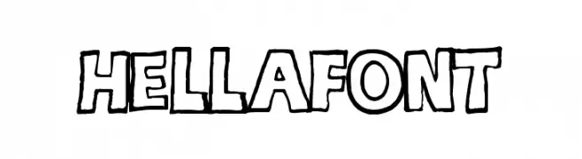
( Fonts by Kirk Shelton - www.kirkshelton.com )
A playful, hand-drawn font with bold outlines and a whimsical style.
![hellafont font caratteri gratis]() Scaricare 735 Downloads@WebFont
Scaricare 735 Downloads@WebFont


Quali sono i font più popolari adesso?
Poppins, Roboto, Montserrat, Open Sans e Lato sono molto usati per le forme pulite e l'ampia applicabilità — dall'identità di marca alle landing page e ai poster.
Quali font si usano spesso nei loghi?
Le sans serif geometriche (es. Poppins, famiglie in stile Gotham) sono scelte comuni per un branding pulito e scalabile. Per un tocco personale restano valide script e stili manoscritti. Abbina un display deciso per i titoli a un corpo testo neutro per riconoscibilità ed equilibrio.
Ogni quanto si aggiorna la lista?
Con regolarità, in base ai download e all'attività reale. Torna spesso per scoprire in anticipo le nuove preferite.
💡 Consiglio: aggiungi ai preferiti — le tendenze cambiano in fretta e i font top di oggi possono ispirare il rebranding di domani.