Benvenuto nelle Font Più Popolari — dove popolarità e qualità si incontrano. Qui trovi i font più scaricati e usati dell'anno. Se cerchi scelte sicure per logo, web o social, inizia da qui.
Ogni font top si distingue per equilibrio, leggibilità e versatilità. Troverai sans serif moderne, script eleganti, serif vintage e display minimalisti.
-
( Fonts by Studio Typo )
A bold, modern sans-serif font with strong, uniform strokes.
 Scaricare 729 Downloads@WebFont
 -
( Noto is a trademark of Google Inc. Noto fonts are open source. All Noto fonts are published under the SIL Open Font License, Version 1.1 )
A modern sans-serif typeface with clean lines and excellent readability.
![Noto Sans Bengali Regular font caratteri gratis]() Scaricare 729 Downloads@WebFont
Scaricare 729 Downloads@WebFont -
( Fonts by Vít Čondák )
A bold, slanted font with dynamic and energetic characteristics.
![Indiana Jonas font caratteri gratis]() Scaricare 729 Downloads@WebFont
Scaricare 729 Downloads@WebFont -
![Romances Script Font font caratteri gratis]() Scaricare 729 Downloads@WebFont
Scaricare 729 Downloads@WebFont -
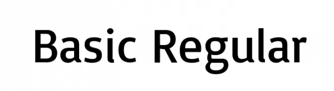
( Copyright (c) 2011 by Sorkin Type Co (www.sorkintype.com) )
A clean, modern sans-serif font with uniform strokes and excellent readability.
![Basic Regular font caratteri gratis]() Scaricare 729 Downloads@WebFont
Scaricare 729 Downloads@WebFont -
-
Caratteri di SvNProd. For commercial use please contact the owner.
![Monsieur Pomme font caratteri gratis]() Scaricare 729 Downloads@WebFont
Scaricare 729 Downloads@WebFont -
![Bodega Script font caratteri gratis]() Scaricare 729 Downloads
Scaricare 729 Downloads -
( Fonts by Daniel Zadorozny - www.iconian.com )
A bold, italicized font with a futuristic and dynamic design.
![Gunship Bold Italic font caratteri gratis]() Scaricare 729 Downloads@WebFont
Scaricare 729 Downloads@WebFont -
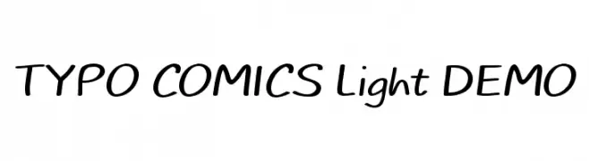
( Fonts by Studio Typo )
A playful, handwritten font with smooth, rounded edges and a casual, friendly appearance.
![TYPO COMICS Light DEMO font caratteri gratis]() Scaricare 729 Downloads@WebFont
Scaricare 729 Downloads@WebFont -
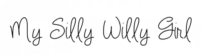
( Fonts by Vanessa Bays - bythebutterfly.com )
A playful, handwritten script font with looping strokes and dynamic line thickness.
![My Silly Willy Girl font caratteri gratis]() Scaricare 729 Downloads@WebFont
Scaricare 729 Downloads@WebFont


Quali sono i font più popolari adesso?
Poppins, Roboto, Montserrat, Open Sans e Lato sono molto usati per le forme pulite e l'ampia applicabilità — dall'identità di marca alle landing page e ai poster.
Quali font si usano spesso nei loghi?
Le sans serif geometriche (es. Poppins, famiglie in stile Gotham) sono scelte comuni per un branding pulito e scalabile. Per un tocco personale restano valide script e stili manoscritti. Abbina un display deciso per i titoli a un corpo testo neutro per riconoscibilità ed equilibrio.
Ogni quanto si aggiorna la lista?
Con regolarità, in base ai download e all'attività reale. Torna spesso per scoprire in anticipo le nuove preferite.
💡 Consiglio: aggiungi ai preferiti — le tendenze cambiano in fretta e i font top di oggi possono ispirare il rebranding di domani.