Benvenuto nelle Font Più Popolari — dove popolarità e qualità si incontrano. Qui trovi i font più scaricati e usati dell'anno. Se cerchi scelte sicure per logo, web o social, inizia da qui.
Ogni font top si distingue per equilibrio, leggibilità e versatilità. Troverai sans serif moderne, script eleganti, serif vintage e display minimalisti.
-
 Scaricare 2358 Downloads@WebFont
 -
( Fonts by Sharkshock )
A bold, textured font with a hand-drawn, artistic style.
![Café Françoise font caratteri gratis]() Scaricare 2357 Downloads@WebFont
Scaricare 2357 Downloads@WebFont -
![DejaVu Serif Condensed font caratteri gratis]() Scaricare 2357 Downloads@WebFont
Scaricare 2357 Downloads@WebFont -
( Fonts by Fonts by Alex Slobzheninov & Chris M. Simpson / Changes by Cristiano Sobral - Personal-use only. For commercial use please contact owner. )
A modern sans-serif font with clean lines and excellent readability.
![Metropolitano font caratteri gratis]() Scaricare 2356 Downloads@WebFont
Scaricare 2356 Downloads@WebFont -
( Fonts by David Kerkhoff - www.hanodedphotography.com )
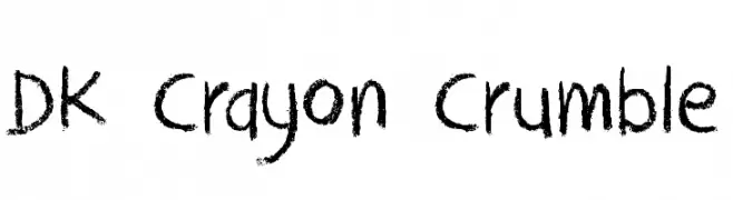
A playful, crayon-like font with a hand-drawn, textured appearance.
![DK Crayon Crumble font caratteri gratis]() Scaricare 2356 Downloads@WebFont
Scaricare 2356 Downloads@WebFont -
( Please visit www.fontsite.com before you use! )
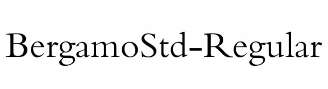
A classic serif font with elegant, balanced letterforms and medium contrast.
![BergamoStd-Regular font caratteri gratis]() Scaricare 2356 Downloads@WebFont
Scaricare 2356 Downloads@WebFont -
![Distant Galaxy Outline font caratteri gratis]() Scaricare 2356 Downloads@WebFont
Scaricare 2356 Downloads@WebFont -
( Fonts by Dieter Schumacher )
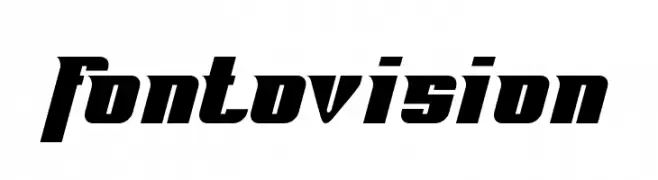
A bold, angular font with a dynamic, modern style.
![Fontovision font caratteri gratis]() Scaricare 2356 Downloads@WebFont
Scaricare 2356 Downloads@WebFont -
( Fonts by Castcraft Software - OPTI Fonts Archive - opti.netii.net - Personal-use only. For commercial use please contact owner. )
A bold, gothic-inspired font with sharp, angular edges and a medieval flair.
![OPTIOndineFive font caratteri gratis]() Scaricare 2355 Downloads@WebFont
Scaricare 2355 Downloads@WebFont -
![lucy font caratteri gratis]() Scaricare 2355 Downloads@WebFont
Scaricare 2355 Downloads@WebFont -
![Damned Architect font caratteri gratis]() Scaricare 2355 Downloads@WebFont
Scaricare 2355 Downloads@WebFont -
![Cassandra Regular font caratteri gratis]() Scaricare 2355 Downloads@WebFont
Scaricare 2355 Downloads@WebFont -
( Fonts by www.tepidmonkey.net )
A bold, modern, and condensed font with uniform strokes and rounded edges.
![Qhytsdakx font caratteri gratis]() Scaricare 2355 Downloads@WebFont
Scaricare 2355 Downloads@WebFont -
( Fonts by CannotIntoSpaceFonts - KineticPlasma Fonts - Personal-use only. For commercial use please contact owner. )
A bold, ultra-black italic font with a modern and dynamic style.
![Trueno UltraBlack Italic font caratteri gratis]() Scaricare 2354 Downloads@WebFont
Scaricare 2354 Downloads@WebFont -
( Fonts by Apostrophic Lab )
A clean, modern semi-bold font with a friendly and balanced design.
![Charrington SemiBold font caratteri gratis]() Scaricare 2354 Downloads@WebFont
Scaricare 2354 Downloads@WebFont -
( Lettersiro Studio - Muhammad Sirojuddin - creativemarket.com/Lettersiro )
A bold, flowing script font with elegant, cursive letterforms.
![Hunters font caratteri gratis]() Scaricare 2353 Downloads@WebFont
Scaricare 2353 Downloads@WebFont -
( Fonts by Have Fun with Fonts )
A tall, narrow, and bold font with tight spacing and a modern aesthetic.
![HFF Jammed Pack font caratteri gratis]() Scaricare 2353 Downloads@WebFont
Scaricare 2353 Downloads@WebFont -
![SF Fourche Condensed font caratteri gratis]() Scaricare 2353 Downloads@WebFont
Scaricare 2353 Downloads@WebFont -
![Astrolab Regular font caratteri gratis]() Scaricare 2352 Downloads@WebFont
Scaricare 2352 Downloads@WebFont -
![newFont-Regular font caratteri gratis]() Scaricare 2352 Downloads@WebFont
Scaricare 2352 Downloads@WebFont -
( Fonts by a Neale Davidson - www.pixelsagas.com. Personal-use only. For commercial use please contact owner. )
A bold, italicized font with a modern and dynamic style.
![Imaki Bold Italic font caratteri gratis]() Scaricare 2352 Downloads@WebFont
Scaricare 2352 Downloads@WebFont -
( Copyright (c) 2010, Sebastian Kosch (sebastian@aldusleaf.org) )
A classic serif font with semi-bold weight and elegant italics.
![Crimson Text SemiBold Italic font caratteri gratis]() Scaricare 2352 Downloads@WebFont
Scaricare 2352 Downloads@WebFont -
![Ageone Regular font caratteri gratis]() Scaricare 2352 Downloads@WebFont
Scaricare 2352 Downloads@WebFont -
![AI kelso B font caratteri gratis]() Scaricare 2352 Downloads@WebFont
Scaricare 2352 Downloads@WebFont -
( Fonts by www.vicfieger.com )
A bold, geometric stencil font with a military-industrial aesthetic.
![Major Snafu font caratteri gratis]() Scaricare 2352 Downloads@WebFont
Scaricare 2352 Downloads@WebFont -
( Copyright 2013 Seoul Metropolitan Government (gonabis@seoul.go.kr) )
A bold, modern sans-serif typeface with excellent readability.
![SeoulNamsan EB font caratteri gratis]() Scaricare 2351 Downloads@WebFont
Scaricare 2351 Downloads@WebFont -
![Cybertron font caratteri gratis]() Scaricare 2351 Downloads@WebFont
Scaricare 2351 Downloads@WebFont -
( Fonts by humanabase )
A modern, geometric sans-serif font with uniform strokes and clear legibility.
![yorkville font caratteri gratis]() Scaricare 2351 Downloads@WebFont
Scaricare 2351 Downloads@WebFont -
( Fonts by Levi Halmos )
A decorative serif font with a blend of traditional and modern elements.
![Celtic Garamond the 2nd font caratteri gratis]() Scaricare 2351 Downloads@WebFont
Scaricare 2351 Downloads@WebFont -
( Copyright (c) 2015 Ek Type (www.ektype.in) )
A playful, rounded font with a bold and friendly appearance.
![Baloo Da Regular font caratteri gratis]() Scaricare 2350 Downloads@WebFont
Scaricare 2350 Downloads@WebFont -
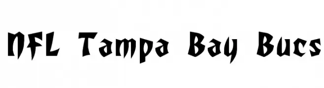
![NFL Tampa Bay Bucs font caratteri gratis]() Scaricare 2350 Downloads@WebFont
Scaricare 2350 Downloads@WebFont -
( Fonts by Docallisme HAS )
A bold, graffiti-inspired font with a three-dimensional effect and urban style.
![DOCALLISME ON STREET font caratteri gratis]() Scaricare 2350 Downloads@WebFont
Scaricare 2350 Downloads@WebFont -
( Copyright (c) 2009-2011 by Accademia di Belle Arti di Urbino and students of MA course of Visual design. Some rights reserved. )
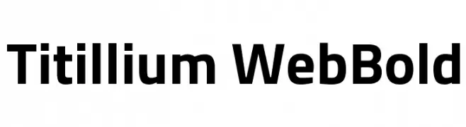
A modern, bold sans-serif font with excellent readability and versatility.
![Titillium WebBold font caratteri gratis]() Scaricare 2350 Downloads@WebFont
Scaricare 2350 Downloads@WebFont -
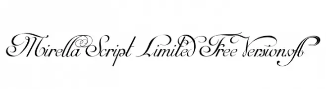
![Mirella Script Limited Free Version.vfb font caratteri gratis]() Scaricare 2350 Downloads@WebFont
Scaricare 2350 Downloads@WebFont -
![Nikodecs font caratteri gratis]() Scaricare 2350 Downloads@WebFont
Scaricare 2350 Downloads@WebFont


Quali sono i font più popolari adesso?
Poppins, Roboto, Montserrat, Open Sans e Lato sono molto usati per le forme pulite e l'ampia applicabilità — dall'identità di marca alle landing page e ai poster.
Quali font si usano spesso nei loghi?
Le sans serif geometriche (es. Poppins, famiglie in stile Gotham) sono scelte comuni per un branding pulito e scalabile. Per un tocco personale restano valide script e stili manoscritti. Abbina un display deciso per i titoli a un corpo testo neutro per riconoscibilità ed equilibrio.
Ogni quanto si aggiorna la lista?
Con regolarità, in base ai download e all'attività reale. Torna spesso per scoprire in anticipo le nuove preferite.
💡 Consiglio: aggiungi ai preferiti — le tendenze cambiano in fretta e i font top di oggi possono ispirare il rebranding di domani.