Benvenuto nelle Font Più Popolari — dove popolarità e qualità si incontrano. Qui trovi i font più scaricati e usati dell'anno. Se cerchi scelte sicure per logo, web o social, inizia da qui.
Ogni font top si distingue per equilibrio, leggibilità e versatilità. Troverai sans serif moderne, script eleganti, serif vintage e display minimalisti.
-
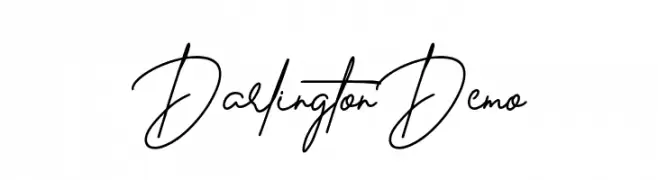
( Fonts by Glyphstyle - Dimas Ardhi - Personal-use only. For commercial use please contact owner. )
A fluid and elegant handwritten font with a natural cursive style.
 Scaricare 139 Downloads@WebFont
 -
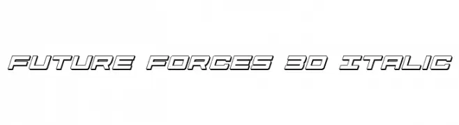
( Fonts by Daniel Zadorozny - www.iconian.com - Free for personal use )
A futuristic 3D italic font with bold outlines and a dynamic style.
![Future Forces 3D Italic font caratteri gratis]() Scaricare 139 Downloads@WebFont
Scaricare 139 Downloads@WebFont -
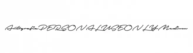
( Fonts by Mans Greback - Personal-use only. For commercial use please contact owner. )
A modern, cursive script font with a flowing, handwritten style.
![Autografia PERSONAL USE ONLY Medium font caratteri gratis]() Scaricare 139 Downloads@WebFont
Scaricare 139 Downloads@WebFont -
![EP Roundie font caratteri gratis]() Scaricare 139 Downloads@WebFont
Scaricare 139 Downloads@WebFont -
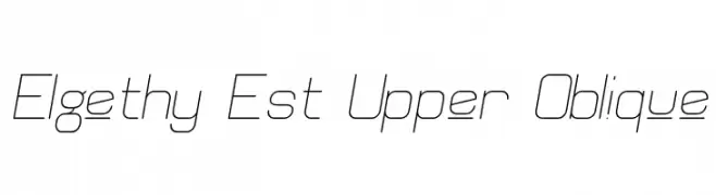
( Fonts by Graham Meade - GemFonts )
A modern, oblique font with thin lines and a geometric style.
![Elgethy Est Upper Oblique font caratteri gratis]() Scaricare 139 Downloads@WebFont
Scaricare 139 Downloads@WebFont -
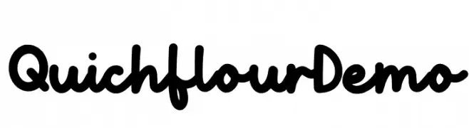
( Fonts by Allouse Studio - Personal-use only. For commercial use please contact owner. )
A bold, playful handwritten font with rounded edges and a casual style.
![Quichflour Demo font caratteri gratis]() Scaricare 139 Downloads@WebFont
Scaricare 139 Downloads@WebFont -
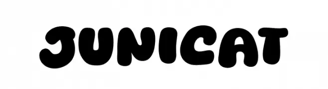
( Fonts by Khurasan )
A playful, bold font with rounded, bubble-like characters.
![Junicat font caratteri gratis]() Scaricare 139 Downloads@WebFont
Scaricare 139 Downloads@WebFont -
![Federal Blue Condensed Italic font caratteri gratis]() Scaricare 139 Downloads@WebFont
Scaricare 139 Downloads@WebFont -
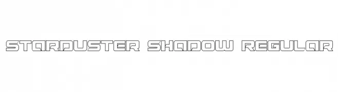
( Fonts by Iconian Fonts - Daniel Zadorozny )
A bold, geometric font with a futuristic, outlined shadow effect.
![Starduster Shadow Regular font caratteri gratis]() Scaricare 139 Downloads@WebFont
Scaricare 139 Downloads@WebFont -
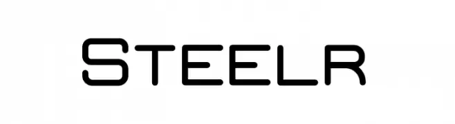
( Fonts by Jadatype - Jada Akbal - Personal-use only. For commercial use please contact owner. )
A modern, geometric font with rounded edges and consistent stroke widths.
![Steelr font caratteri gratis]() Scaricare 139 Downloads@WebFont
Scaricare 139 Downloads@WebFont -
( Fonts by Iconian Fonts )
A bold, futuristic font with a halftone effect and geometric shapes.
![Strike Fighter Halftone font caratteri gratis]() Scaricare 139 Downloads@WebFont
Scaricare 139 Downloads@WebFont -
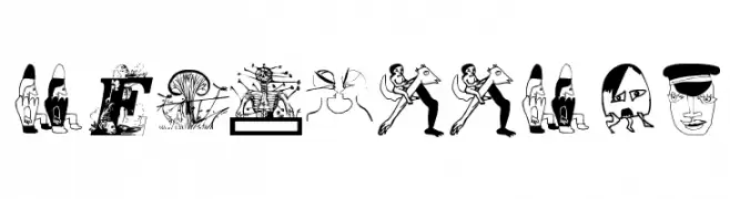
( Fonts by www.dcoxy.com )
A whimsical, cartoonish dingbat font featuring illustrated faces and totem symbols.
![teubé1 font caratteri gratis]() Scaricare 139 Downloads@WebFont
Scaricare 139 Downloads@WebFont -
( Fonts by Manfred Klein. Free for private and charity use. Free for commercial with donation to organizations )
A bold, geometric font with characters encased in 3D cubes, offering a modern and playful look.
![FolksInCube font caratteri gratis]() Scaricare 139 Downloads@WebFont
Scaricare 139 Downloads@WebFont -
( Fonts by Syaf Rizal - Khurasan - Personal-use only. For commercial use please contact owner. )
A bold, playful script font with rounded strokes and smooth curves.
![Big Snow font caratteri gratis]() Scaricare 139 Downloads@WebFont
Scaricare 139 Downloads@WebFont -
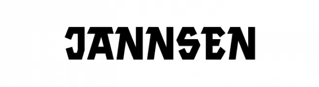
( www.keidirehedesign.com )
A bold, geometric font with sharp angles and a strong, modern presence.
![Jannsen font caratteri gratis]() Scaricare 139 Downloads@WebFont
Scaricare 139 Downloads@WebFont -
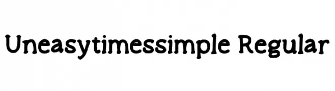
( Fonts by Jennifer Gonzalez )
A playful, hand-drawn font with irregular strokes and a whimsical style.
![Uneasytimes_simple Regular font caratteri gratis]() Scaricare 139 Downloads@WebFont
Scaricare 139 Downloads@WebFont -
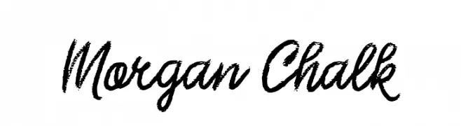
( Fonts by Tan Cundrawan - cove703 - creativemarket.com/cove703 - Personal-use only. For commercial use please contact owner. )
A bold, textured font with a hand-drawn, chalk-like appearance.
![Morgan Chalk font caratteri gratis]() Scaricare 139 Downloads@WebFont
Scaricare 139 Downloads@WebFont -
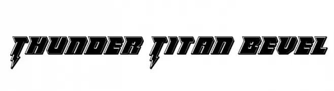
( Iconian Fonts - Daniel Zadorozny - www.iconian.com )
A bold, dynamic font with a striking bevel and lightning bolt accents.
![Thunder Titan Bevel font caratteri gratis]() Scaricare 139 Downloads@WebFont
Scaricare 139 Downloads@WebFont -
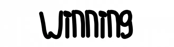
( Fonts by Des Gomez )
A playful, bold handwritten font with rounded edges and a casual style.
![Winning font caratteri gratis]() Scaricare 139 Downloads@WebFont
Scaricare 139 Downloads@WebFont -
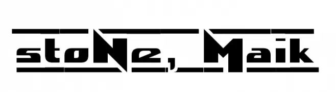
( Fonts by Maik Henschel - Personal-use only. For commercial use please contact owner. )
A bold, futuristic font with geometric and angular design elements.
![stoNe, Maik font caratteri gratis]() Scaricare 139 Downloads@WebFont
Scaricare 139 Downloads@WebFont -
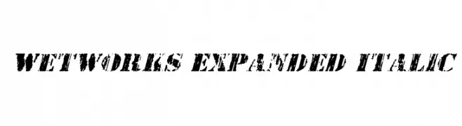
( Fonts by Daniel Zadorozny - www.iconian.com - Free for personal use )
A bold, distressed, expanded italic font with a rugged texture.
![Wetworks Expanded Italic font caratteri gratis]() Scaricare 139 Downloads@WebFont
Scaricare 139 Downloads@WebFont -
( Fonts by Meir Sadan - www.sadan.com Commerciali Caratteri )
A distressed, gothic-style font with a bold, grunge appearance.
![Tfu Tfu font caratteri gratis]() Scaricare 139 Downloads
Scaricare 139 Downloads -
![Purple Burple font caratteri gratis]() Scaricare 139 Downloads@WebFont
Scaricare 139 Downloads@WebFont -
( Fonts by www.junkohanhero.com - Personal-use only. For commercial use please contact owner. )
A playful, hand-drawn font with an organic and casual style.
![Lost in the supermarket font caratteri gratis]() Scaricare 139 Downloads@WebFont
Scaricare 139 Downloads@WebFont -
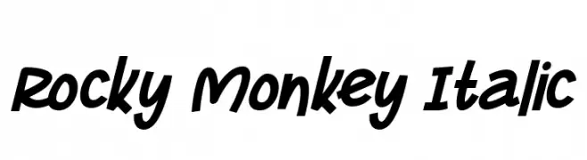
( Fonts by Letterena Studios )
A bold, italic script font with a playful and dynamic style.
![Rocky Monkey Italic font caratteri gratis]() Scaricare 139 Downloads@WebFont
Scaricare 139 Downloads@WebFont -
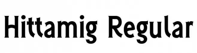
( Fonts by 177studio - Personal-use only. For commercial use please contact owner. )
A bold, modern font with elegant curvature and strong character definition.
![Hittamig Regular font caratteri gratis]() Scaricare 139 Downloads@WebFont
Scaricare 139 Downloads@WebFont -
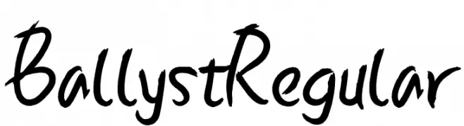
( Fonts by twinletter - Rozikan - Personal-use only. For commercial use please contact owner. )
A dynamic handwritten font with fluid, expressive strokes and a playful style.
![Ballyst Regular font caratteri gratis]() Scaricare 139 Downloads@WebFont
Scaricare 139 Downloads@WebFont -
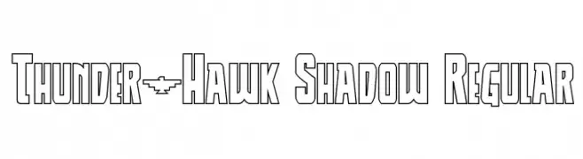
( Fonts by Daniel Zadorozny - www.iconian.com )
A bold, geometric font with an outlined shadow effect, perfect for impactful designs.
![Thunder-Hawk Shadow Regular font caratteri gratis]() Scaricare 139 Downloads@WebFont
Scaricare 139 Downloads@WebFont -
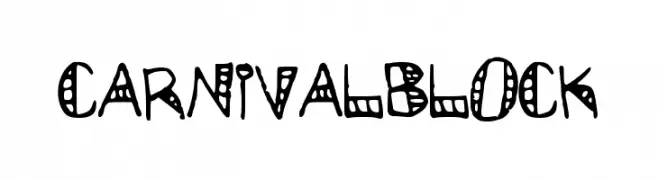
![CarnivalBlock font caratteri gratis]() Scaricare 139 Downloads@WebFont
Scaricare 139 Downloads@WebFont -
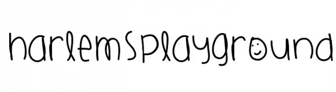
( Fonts by a Des Gomez. Personal-use only. For commercial use please contact owner. )
A playful, handwritten font with a whimsical and friendly style.
![HarlemsPlayground font caratteri gratis]() Scaricare 139 Downloads@WebFont
Scaricare 139 Downloads@WebFont -
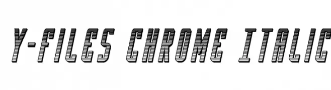
( Fonts by Iconian Fonts )
A bold, italicized 3D font with a chrome-like, retro-futuristic style.
![Y-Files Chrome Italic font caratteri gratis]() Scaricare 139 Downloads@WebFont
Scaricare 139 Downloads@WebFont -
( Fonts by Manfred Klein. Free for private and charity use. Free for commercial with donation to organizations )
An artistic and decorative font with intricate illustrations within each character.
![MiszellMay font caratteri gratis]() Scaricare 139 Downloads@WebFont
Scaricare 139 Downloads@WebFont -
![Black Ornaments Free font caratteri gratis]() Scaricare 139 Downloads@WebFont
Scaricare 139 Downloads@WebFont -
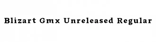
( Fonts by Manuel Martínez )
A bold serif font with a classic yet playful design.
![Blizart Gmx Unreleased Regular font caratteri gratis]() Scaricare 139 Downloads@WebFont
Scaricare 139 Downloads@WebFont -
( Fonts by Din Studio - Donis Miftahudin - Personal-use only. For commercial use please contact owner. )
A bold, expressive handwritten font with dynamic strokes and a brush-like appearance.
![Best Quotes Personal Use font caratteri gratis]() Scaricare 139 Downloads@WebFont
Scaricare 139 Downloads@WebFont


Quali sono i font più popolari adesso?
Poppins, Roboto, Montserrat, Open Sans e Lato sono molto usati per le forme pulite e l'ampia applicabilità — dall'identità di marca alle landing page e ai poster.
Quali font si usano spesso nei loghi?
Le sans serif geometriche (es. Poppins, famiglie in stile Gotham) sono scelte comuni per un branding pulito e scalabile. Per un tocco personale restano valide script e stili manoscritti. Abbina un display deciso per i titoli a un corpo testo neutro per riconoscibilità ed equilibrio.
Ogni quanto si aggiorna la lista?
Con regolarità, in base ai download e all'attività reale. Torna spesso per scoprire in anticipo le nuove preferite.
💡 Consiglio: aggiungi ai preferiti — le tendenze cambiano in fretta e i font top di oggi possono ispirare il rebranding di domani.