Benvenuto nelle Font Più Popolari — dove popolarità e qualità si incontrano. Qui trovi i font più scaricati e usati dell'anno. Se cerchi scelte sicure per logo, web o social, inizia da qui.
Ogni font top si distingue per equilibrio, leggibilità e versatilità. Troverai sans serif moderne, script eleganti, serif vintage e display minimalisti.
-
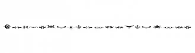
( Fonts by dcoxy )
Highly decorative ornamental glyphs for borders and embellishments.
 Scaricare 137 Downloads@WebFont
 -
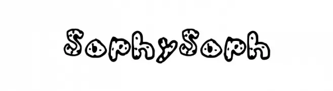
![SophySoph font caratteri gratis]() Scaricare 137 Downloads@WebFont
Scaricare 137 Downloads@WebFont -
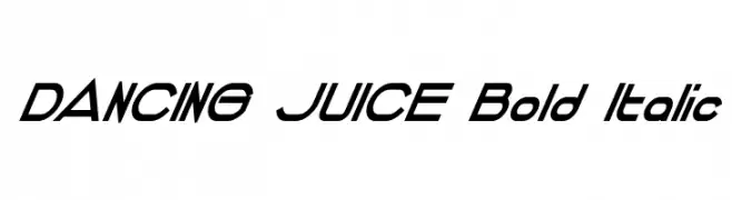
( Fonts by Dondon Nillo )
A bold, italicized font with a dynamic and modern style.
![DANCING JUICE Bold Italic font caratteri gratis]() Scaricare 137 Downloads@WebFont
Scaricare 137 Downloads@WebFont -
( free for non-commercial use. buy commercial license at pixelpropaganda.com )
Pixelated skulls in a retro, arcade-style design.
![Scumskullz font caratteri gratis]() Scaricare 137 Downloads@WebFont
Scaricare 137 Downloads@WebFont -
( Fonts by StringLabs - stringlabscreative.com - Personal-use only. For commercial use please contact owner. )
A bold, energetic script font with a dynamic, handwritten style.
![Reinstay font caratteri gratis]() Scaricare 137 Downloads@WebFont
Scaricare 137 Downloads@WebFont -
( Fonts by StringLabs - stringlabscreative.com - Personal-use only. For commercial use please contact owner. )
A bold, energetic script font with a brush-like texture and flowing strokes.
![Reinstay font caratteri gratis]() Scaricare 137 Downloads@WebFont
Scaricare 137 Downloads@WebFont -
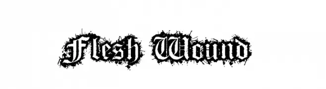
( Anthony Robinson - www.redbubble.com/people/anfa/portfolio )
A decorative, thorny font with gothic influences and bold, intricate details.
![Flesh Wound font caratteri gratis]() Scaricare 137 Downloads@WebFont
Scaricare 137 Downloads@WebFont -
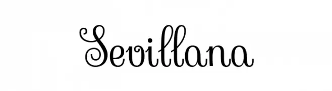
![Sevillana font caratteri gratis]() Scaricare 137 Downloads@WebFont
Scaricare 137 Downloads@WebFont -
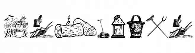
( Fonts by Manfred Klein. Free for private and charity use. Free for commercial with donation to organizations )
Illustrative dingbat font with gardening and outdoor motifs.
![InGarden font caratteri gratis]() Scaricare 137 Downloads@WebFont
Scaricare 137 Downloads@WebFont -
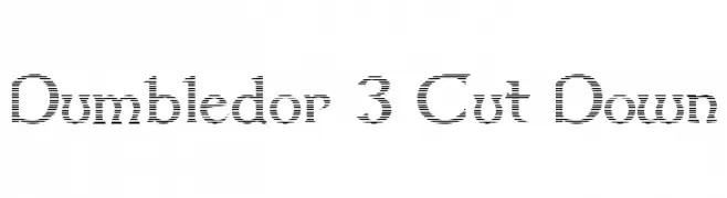
( Fonts by Graham Meade - GemFonts )
A modern serif font with a unique striped pattern and sharp serifs.
![Dumbledor 3 Cut Down font caratteri gratis]() Scaricare 137 Downloads@WebFont
Scaricare 137 Downloads@WebFont -
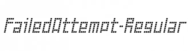
( Fonts by www.typodermicfonts.com - Ray Larabie )
A pixelated, digital-style font with a retro video game aesthetic.
![FailedAttempt-Regular font caratteri gratis]() Scaricare 137 Downloads@WebFont
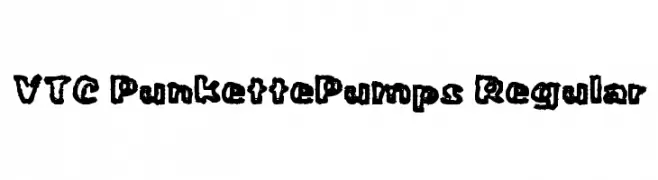
Scaricare 137 Downloads@WebFont -
![VTC PunkettePumps Regular font caratteri gratis]() Scaricare 137 Downloads@WebFont
Scaricare 137 Downloads@WebFont -
![dictator Regular font caratteri gratis]() Scaricare 137 Downloads@WebFont
Scaricare 137 Downloads@WebFont -
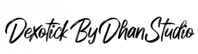
( Fonts by Dhan Studio - Maulizari - Personal-use only. For commercial use please contact owner. )
A dynamic, hand-drawn script font with energetic strokes and a lively appearance.
![DexotickByDhanStudio font caratteri gratis]() Scaricare 137 Downloads@WebFont
Scaricare 137 Downloads@WebFont -
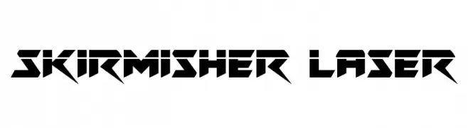
( Fonts by Daniel Zadorozny - www.iconian.com - Free for personal use )
A bold, futuristic font with sharp angles and geometric shapes.
![Skirmisher Laser font caratteri gratis]() Scaricare 137 Downloads@WebFont
Scaricare 137 Downloads@WebFont -
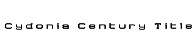
( Iconian Fonts - Daniel Zadorozny - www.iconian.com )
A modern, geometric font with bold, clean lines and a compact design.
![Cydonia Century Title font caratteri gratis]() Scaricare 137 Downloads@WebFont
Scaricare 137 Downloads@WebFont -
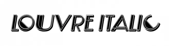
( Fonts by Vladimir Nikolic - www.creativefabrica.com/designer/vladimirnikolic/ - Personal-use only. For commercial use please contact owner. )
Bold, italicized font with a 3D shadow effect and geometric design.
![Louvre Italic font caratteri gratis]() Scaricare 137 Downloads@WebFont
Scaricare 137 Downloads@WebFont -
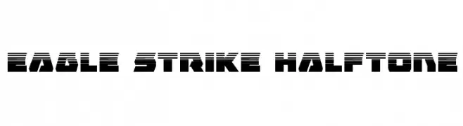
( Fonts by Daniel Zadorozny - www.iconian.com - Free for personal use )
A bold, geometric font with a halftone effect, ideal for dynamic and modern designs.
![Eagle Strike Halftone font caratteri gratis]() Scaricare 137 Downloads@WebFont
Scaricare 137 Downloads@WebFont -
( Fonts by Din Studio - Donis Miftahudin - Personal-use only. For commercial use please contact owner. )
A decorative, vintage-style font with intricate loops and swirls.
![Antique Heritage Personal use Regular font caratteri gratis]() Scaricare 137 Downloads@WebFont
Scaricare 137 Downloads@WebFont -
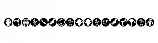
( Fonts by Manfred Klein. Free for private and charity use. Free for commercial with donation to organizations )
Pictographic, tribal-inspired decorative font with hand-drawn symbols in black circles.
![AfricanissimaOSix font caratteri gratis]() Scaricare 137 Downloads@WebFont
Scaricare 137 Downloads@WebFont -
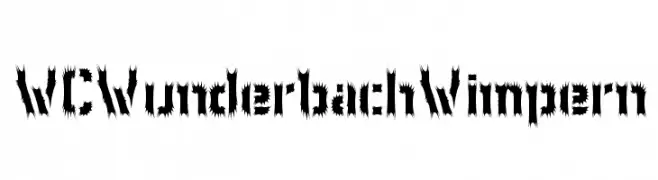
( Fonts by Christophe Feray - www.wcfonts.com )
A bold, jagged, and decorative font with a dynamic and edgy style.
![WCWunderbachWimpern font caratteri gratis]() Scaricare 137 Downloads@WebFont
Scaricare 137 Downloads@WebFont -
( Lloyd Garmadon Studios - ninjago-chronicles.blogspot.ro )
A modern, decorative font with sharp serifs and high contrast.
![NINJAGOCHRONICLESFONT font caratteri gratis]() Scaricare 137 Downloads@WebFont
Scaricare 137 Downloads@WebFont -
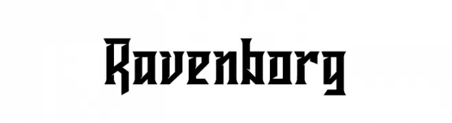
( Fonts by Kong Font - https://fontkong.com/ - Personal-use only. For commercial use please contact owner. )
A bold, angular font with a Gothic, medieval flair.
![Ravenborg font caratteri gratis]() Scaricare 137 Downloads@WebFont
Scaricare 137 Downloads@WebFont -
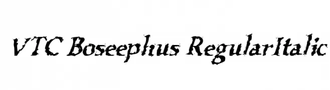
![VTC Boseephus RegularItalic font caratteri gratis]() Scaricare 137 Downloads@WebFont
Scaricare 137 Downloads@WebFont -
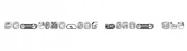
( Free - new.myfonts.com/foundry/Intellecta_Design/?refby=paulow )
A decorative font inspired by Mesoamerican art, featuring intricate and bold glyphs.
![MesoAmerica Dings Two font caratteri gratis]() Scaricare 137 Downloads@WebFont
Scaricare 137 Downloads@WebFont -
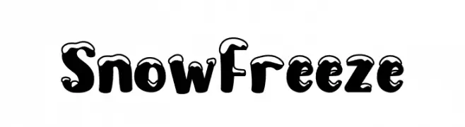
( Fonts by PutraCetol Studio )
A playful, snow-capped font with bold, rounded characters perfect for winter themes.
![Snow Freeze font caratteri gratis]() Scaricare 137 Downloads@WebFont
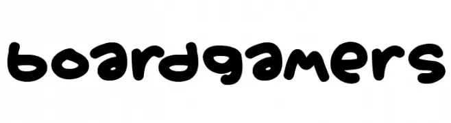
Scaricare 137 Downloads@WebFont -
![Boardgamers font caratteri gratis]() Scaricare 137 Downloads@WebFont
Scaricare 137 Downloads@WebFont -
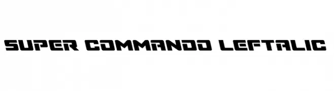
( Fonts by Daniel Zadorozny - www.iconian.com )
A bold, angular font with a dynamic, slanted design.
![Super Commando Leftalic font caratteri gratis]() Scaricare 137 Downloads@WebFont
Scaricare 137 Downloads@WebFont -
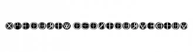
![XPFourTwoContour Medium font caratteri gratis]() Scaricare 137 Downloads@WebFont
Scaricare 137 Downloads@WebFont -
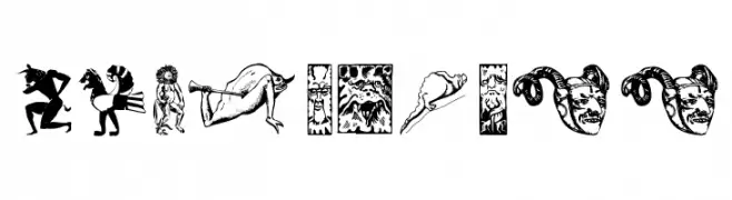
( Fonts by Manfred Klein. Free for private and charity use. Free for commercial with donation to organizations )
A collection of detailed and imaginative character illustrations with mythical themes.
![IdolsThree font caratteri gratis]() Scaricare 137 Downloads@WebFont
Scaricare 137 Downloads@WebFont -
( Fonts by Beautypes )
A bold, playful font with a hand-drawn, whimsical style.
![AyamJago font caratteri gratis]() Scaricare 137 Downloads@WebFont
Scaricare 137 Downloads@WebFont -
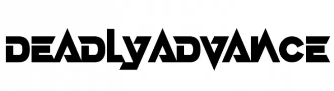
( Fonts by Darrell Flood - Personal-use only. For commercial use please contact owner. )
A bold, futuristic font with sharp, angular edges and geometric shapes.
![Deadly Advance font caratteri gratis]() Scaricare 137 Downloads@WebFont
Scaricare 137 Downloads@WebFont -
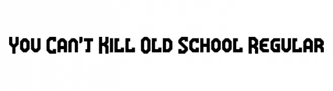
( Fonts by www.chequered.ink - Chequered Ink - Personal-use only. For commercial use please contact owner. )
A bold, geometric font with sharp angles and a blocky appearance.
![You Can't Kill Old School Regular font caratteri gratis]() Scaricare 137 Downloads@WebFont
Scaricare 137 Downloads@WebFont -
![Cirth Erebor 1 font caratteri gratis]() Scaricare 137 Downloads
Scaricare 137 Downloads -
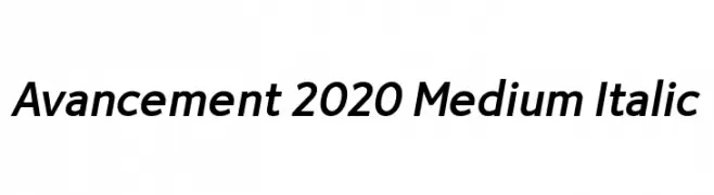
( Fonts by LyonsType - Daniel Lyons - Personal-use only. For commercial use please contact owner. )
A sleek, modern italic font with medium weight and balanced proportions.
![Avancement 2020 Medium Italic font caratteri gratis]() Scaricare 137 Downloads@WebFont
Scaricare 137 Downloads@WebFont


Quali sono i font più popolari adesso?
Poppins, Roboto, Montserrat, Open Sans e Lato sono molto usati per le forme pulite e l'ampia applicabilità — dall'identità di marca alle landing page e ai poster.
Quali font si usano spesso nei loghi?
Le sans serif geometriche (es. Poppins, famiglie in stile Gotham) sono scelte comuni per un branding pulito e scalabile. Per un tocco personale restano valide script e stili manoscritti. Abbina un display deciso per i titoli a un corpo testo neutro per riconoscibilità ed equilibrio.
Ogni quanto si aggiorna la lista?
Con regolarità, in base ai download e all'attività reale. Torna spesso per scoprire in anticipo le nuove preferite.
💡 Consiglio: aggiungi ai preferiti — le tendenze cambiano in fretta e i font top di oggi possono ispirare il rebranding di domani.