Benvenuto nelle Font Più Popolari — dove popolarità e qualità si incontrano. Qui trovi i font più scaricati e usati dell'anno. Se cerchi scelte sicure per logo, web o social, inizia da qui.
Ogni font top si distingue per equilibrio, leggibilità e versatilità. Troverai sans serif moderne, script eleganti, serif vintage e display minimalisti.
-
( Fonts by Rokas Cicenas - www.roci.lt )
A bold, energetic handwritten font with expressive strokes and a lively appearance.
 Scaricare 2310 Downloads@WebFont
 -
( Fonts by Ward Zwart - wardzwart.blogspot.com - free for personal use only! )
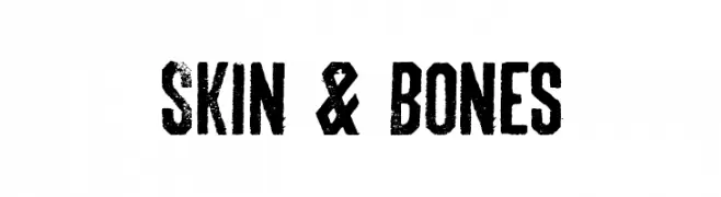
A bold, distressed font with a grunge aesthetic and irregular edges.
![Skin & Bones font caratteri gratis]() Scaricare 2310 Downloads@WebFont
Scaricare 2310 Downloads@WebFont -
![Mignon-SemiboldIt font caratteri gratis]() Scaricare 2308 Downloads@WebFont
Scaricare 2308 Downloads@WebFont -
Caratteri di samanthaevans. For commercial use please contact the owner.
![FatCow Italic font caratteri gratis]() Scaricare 2308 Downloads@WebFont
Scaricare 2308 Downloads@WebFont -
![FHACondensedFrenchNC font caratteri gratis]() Scaricare 2307 Downloads@WebFont
Scaricare 2307 Downloads@WebFont -
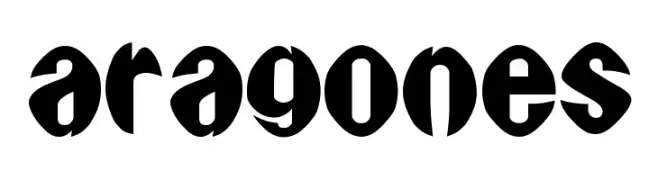
( Fonts by Uddi Uddi )
A bold, rounded font with a playful and modern style.
![Aragones font caratteri gratis]() Scaricare 2307 Downloads@WebFont
Scaricare 2307 Downloads@WebFont -
![003 Mikey font caratteri gratis]() Scaricare 2306 Downloads@WebFont
Scaricare 2306 Downloads@WebFont -
![fs galactica Regular font caratteri gratis]() Scaricare 2306 Downloads@WebFont
Scaricare 2306 Downloads@WebFont -
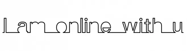
![I am online with u font caratteri gratis]() Scaricare 2306 Downloads@WebFont
Scaricare 2306 Downloads@WebFont -
![Schoon font caratteri gratis]() Scaricare 2306 Downloads@WebFont
Scaricare 2306 Downloads@WebFont -
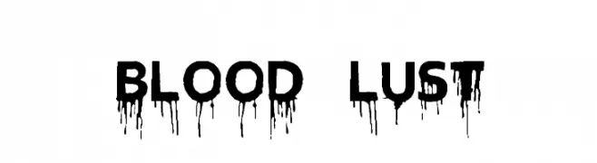
( Fonts by Chris Vile )
A bold, dripping font ideal for horror or thriller themes.
![Blood Lust font caratteri gratis]() Scaricare 2305 Downloads@WebFont
Scaricare 2305 Downloads@WebFont -
( Fonts by Billy Argel - www.billyargel.com - Personal-use only. For commercial use please contact owner. )
A festive script font with elegant, flowing letters and holiday-themed symbols.
![Christmas Time Personal Use Regular font caratteri gratis]() Scaricare 2305 Downloads@WebFont
Scaricare 2305 Downloads@WebFont -
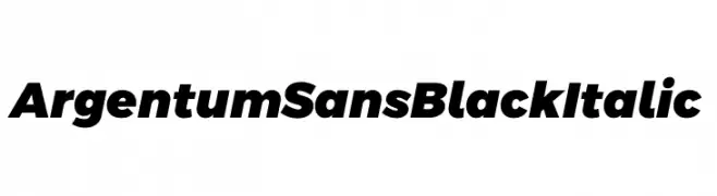
( Fonts by Cristiano Sobral - Personal-use only. For commercial use please contact owner. )
A bold, italicized sans-serif font with a modern and dynamic style.
![Argentum Sans Black Italic font caratteri gratis]() Scaricare 2304 Downloads@WebFont
Scaricare 2304 Downloads@WebFont -
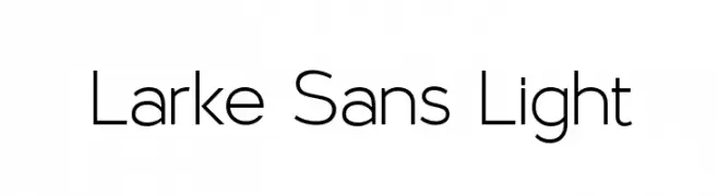
( Fonts by Steve Gardner - www.explogos.com. Personal-use only. For commercial use please contact owner. )
A clean, minimalist sans-serif font with geometric shapes and uniform line thickness.
![Larke Sans Light font caratteri gratis]() Scaricare 2304 Downloads@WebFont
Scaricare 2304 Downloads@WebFont -
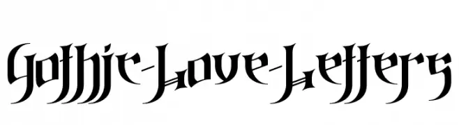
![Gothic-Love-Letters font caratteri gratis]() Scaricare 2304 Downloads@WebFont
Scaricare 2304 Downloads@WebFont -
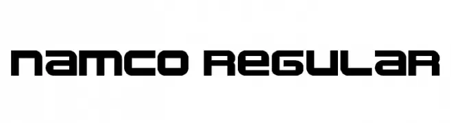
![namco regular font caratteri gratis]() Scaricare 2304 Downloads@WebFont
Scaricare 2304 Downloads@WebFont -
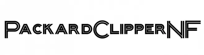
( Fonts by Nick Curtis - www.nicksfonts.com )
A bold, geometric font with an Art Deco influence, featuring a double-line effect.
![PackardClipperNF font caratteri gratis]() Scaricare 2304 Downloads@WebFont
Scaricare 2304 Downloads@WebFont -
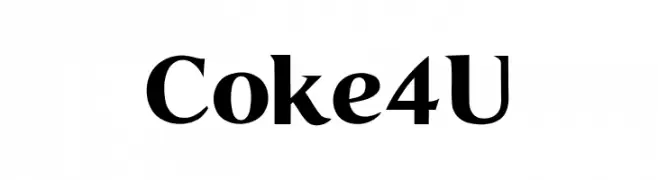
![Coke4U font caratteri gratis]() Scaricare 2303 Downloads@WebFont
Scaricare 2303 Downloads@WebFont -
( Studio Typo - www.studiotypo.com )
A bold, rounded font with smooth curves and a modern, playful style.
![Typo Hoop Demo Bold font caratteri gratis]() Scaricare 2303 Downloads@WebFont
Scaricare 2303 Downloads@WebFont -
![Harlem font caratteri gratis]() Scaricare 2303 Downloads@WebFont
Scaricare 2303 Downloads@WebFont -
![Photonica Straight font caratteri gratis]() Scaricare 2303 Downloads@WebFont
Scaricare 2303 Downloads@WebFont -
Caratteri di HammerBro101. For commercial use please contact the owner.
![HelveticaNowText-ExtBdIta font caratteri gratis]() Scaricare 2302 Downloads@WebFont
Scaricare 2302 Downloads@WebFont -
![Maximus Bold font caratteri gratis]() Scaricare 2302 Downloads@WebFont
Scaricare 2302 Downloads@WebFont -
![Western Regular:001.001 font caratteri gratis]() Scaricare 2302 Downloads@WebFont
Scaricare 2302 Downloads@WebFont -
( Fonts by www.fontalicious.com )
A bold, geometric sans-serif font with a modern and structured design.
![Kravitz Extra Thermal font caratteri gratis]() Scaricare 2302 Downloads@WebFont
Scaricare 2302 Downloads@WebFont -
![Bimini Italic font caratteri gratis]() Scaricare 2302 Downloads@WebFont
Scaricare 2302 Downloads@WebFont -
( Fonts by Graham Meade - GemFonts )
A decorative, pirate-themed font with jagged, hand-carved edges.
![Freebooter font caratteri gratis]() Scaricare 2302 Downloads@WebFont
Scaricare 2302 Downloads@WebFont -
( Fonts by Staircase Studio )
A flowing, italic script font with dynamic contrast and elegant curves.
![Purple Bougenville Italic font caratteri gratis]() Scaricare 2301 Downloads@WebFont
Scaricare 2301 Downloads@WebFont -
![MASTERPLAN Billy Argel fonts All Rights Reserved personal use only font caratteri gratis]() Scaricare 2301 Downloads@WebFont
Scaricare 2301 Downloads@WebFont -
![Simpsons Treehouse of Horror font caratteri gratis]() Scaricare 2301 Downloads@WebFont
Scaricare 2301 Downloads@WebFont -
![Pixelated font caratteri gratis]() Scaricare 2301 Downloads@WebFont
Scaricare 2301 Downloads@WebFont -
( Copyright (c) 2011, Cyreal (www.cyreal.org) )
A modern serif font with elegant curves and balanced proportions.
![Artifika Medium font caratteri gratis]() Scaricare 2300 Downloads@WebFont
Scaricare 2300 Downloads@WebFont -
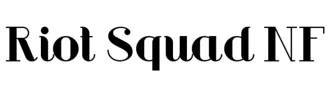
( Fonts by Nick Curtis - www.nicksfonts.com )
A bold, modern font with high contrast and elegant curves.
![Riot Squad NF font caratteri gratis]() Scaricare 2300 Downloads@WebFont
Scaricare 2300 Downloads@WebFont -
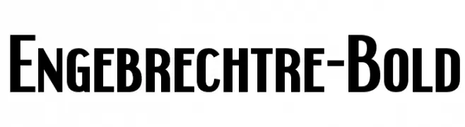
( Fonts by www.typodermicfonts.com - Ray Larabie )
A bold, modern font with strong vertical strokes and slightly condensed letterforms.
![Engebrechtre-Bold font caratteri gratis]() Scaricare 2300 Downloads@WebFont
Scaricare 2300 Downloads@WebFont -
( Fonts by Omega Font Labs )
A decorative font with star and sparkle embellishments for a festive look.
![Glitter Font font caratteri gratis]() Scaricare 2300 Downloads@WebFont
Scaricare 2300 Downloads@WebFont


Quali sono i font più popolari adesso?
Poppins, Roboto, Montserrat, Open Sans e Lato sono molto usati per le forme pulite e l'ampia applicabilità — dall'identità di marca alle landing page e ai poster.
Quali font si usano spesso nei loghi?
Le sans serif geometriche (es. Poppins, famiglie in stile Gotham) sono scelte comuni per un branding pulito e scalabile. Per un tocco personale restano valide script e stili manoscritti. Abbina un display deciso per i titoli a un corpo testo neutro per riconoscibilità ed equilibrio.
Ogni quanto si aggiorna la lista?
Con regolarità, in base ai download e all'attività reale. Torna spesso per scoprire in anticipo le nuove preferite.
💡 Consiglio: aggiungi ai preferiti — le tendenze cambiano in fretta e i font top di oggi possono ispirare il rebranding di domani.